
.svg)
One Page,


One Goal, One
Action Worth Taking
A landing page has one job: get the visitor to do one thing. Most fail trying to do five. We design landing pages built around a single action, audience, and message.


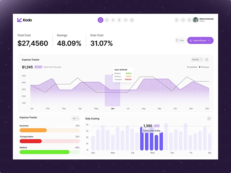
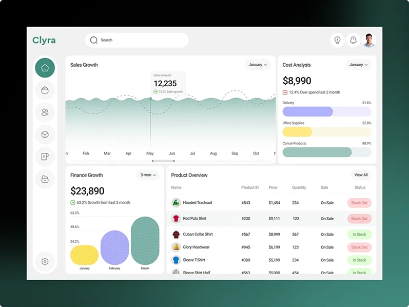
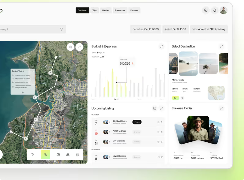
You Pay for Traffic,
Your Page Wastes It
Unclear —
The visitor lands and doesn't immediately understand what they're being offered. The headline is clever instead of clear. Five seconds later, they're gone. Clarity converts. Cleverness bounces.
Crowded —
Too many CTAs. Sign up here. Book a demo there. Download this. Read that. When you ask for five things, visitors do none of them. One page, one action.
Mismatched —
The ad promised one thing. The landing page shows another. The visitor clicked expecting a specific offer and landed on a generic homepage. The disconnect kills the conversion instantly.
Slow —
The page takes 4 seconds to load. On mobile, it's worse. Every second of delay drops conversion. Paid visitors don't wait. They bounce back to the search results.
(80+ SaaS homepages shipped)
(40+ tested pages)
Every Landing Page Your Campaigns Need.
Different campaigns need different pages. Pick the one that matches what you're running, or start with the audit and we'll tell you what's costing you conversions.
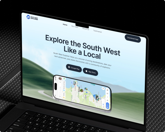
Product Launch Landing Pages
A product launch gets one moment of attention. Your landing page has to capture it. We design launch pages with a single clear CTA, a story that builds excitement, and a design that makes visitors act before the moment passes. Built for high conversion, not just good looks.
Responsive Mobile Web Design
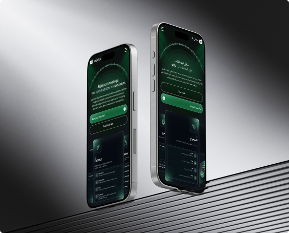
Not every user will download your app. Many will access your product from a mobile browser first. If the web experience is broken on mobile, they'll never download the app. We design responsive web interfaces that work perfectly on every screen size. Same product. Same quality. No download required.
.png)
Mobile Dashboard Design
A desktop dashboard crammed into a phone screen is unreadable. Charts overlap. Numbers are too small. Filters disappear. We design mobile dashboards that show the right data at the right size. Key metrics first. Details on demand. Touch-friendly controls that make sense on a 6-inch screen.
Cross-Platform App Design
Building separate designs for each platform doubles the cost and triples the inconsistency. We design unified component systems that work across iOS, Android, and web. One design source. Platform-specific adjustments where it matters. Consistent everywhere else.
.png)
.png)
Mobile Navigation Patterns
Tab bars, drawers, bottom sheets, gesture navigation. Mobile has its own rules for getting around. The wrong pattern buries features. The right pattern makes the app feel effortless. We design navigation systems built for how people actually hold and use their phones. Thumb zones. Reachability. Muscle memory.
Only 19% of users complete onboarding. The rest leak out. We redesign your signup-to-paid flow so the value is obvious at every step. Clearer paywall. Smarter upgrade triggers. Users understand exactly why they should convert.
Conversion rate increases
Average improvement
55% of SaaS users churn within 30 days. They never reach your core value. We rebuild your onboarding so users hit the 'aha moment' in days, not weeks. Smart defaults. Progressive disclosure. Contextual guidance. Every step earns the next.
Maximizing time-to-value
Activation rate increases
80% of SaaS features get little or no usage. Not because they're bad — because they're buried. We restructure your interface so new users see what matters first. Better hierarchy. Clearer navigation. Progressive disclosure. Power without the overwhelm.
Higher & faster onboarding
Support tickets reduction
Users drop off sharply in the first two months and you can't see where. We design your product for retention from day one. Smooth activation flows. Clear paths to core features. Habit-forming interactions. Users don't just try your product — they come back.
Day 7 retention improves
Day 30 retention improves
23% of SaaS churn comes from users who don't understand the product. We build clarity into every interaction. Smarter onboarding. Contextual help. Obvious workflows. Design eliminates the questions.
Team capacity increases
COGS reduces
80% of SaaS features get little or no usage. You keep shipping but users never find them. We redesign your product for discoverability, visual hierarchy. Features get recommended and stop being invisible.
Higher feature adoption
Usage increases

.svg)
What Great Design Delivers
+65%
When the app feels native and matches the device, users come back not because you reminded them, but because it's worth opening.
-40%
Most mobile support tickets come from confusion, not bugs. When navigation is clear and flows are short, users stop asking how things work.
2 Seconds
Mobile users are less patient than desktop users. Every screen loads fast. Every transition is smooth. No skeleton screens that last forever.
3 Taps
The most important thing a user does in your app should take 3 taps or fewer. We design every flow around this constraint. If it takes more, we simplify.
Audit, Design, Test, Ship
We don't design mobile on desktop and hope. We design for the device from day one.
Audit the Current Experience
If you have an existing mobile app, we review it. Session recordings, user flows, drop-off points, and device-specific issues. If you're building from scratch, we audit your desktop product and define what belongs on mobile and what doesn't. Not everything needs to travel.
Design for the Device
Every screen is designed at real device dimensions. Touch targets are sized for thumbs. Navigation follows platform conventions. Content is prioritized for small screens. We design in Figma with interactive prototypes you can test on your actual phone.
Test on Real Devices
Prototypes are tested on real iPhones, Androids, and tablets. Not just Figma previews. We catch spacing issues, gesture conflicts, and readability problems that only show up on actual hardware. What looks good on a monitor might fail on a phone.
Ship and Measure
We hand off to your development team with specs, assets, and component documentation. After launch, we track mobile-specific metrics: session duration, task completion rate, and device-specific drop-offs. If something underperforms, we iterate.
Our Top-Tier
Creative Works
Case studies show the full story. Client works show the output. Both are real projects with real stakes.
.png)


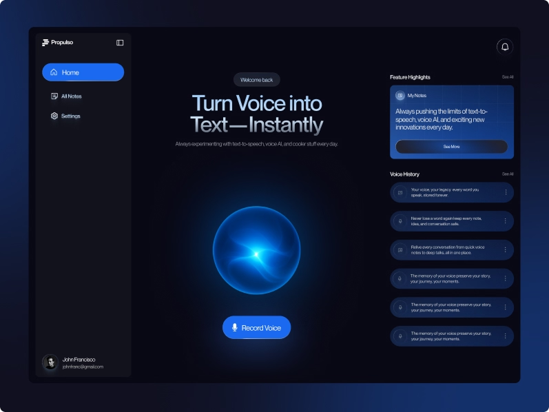
Users were signing up, recording once, and leaving, thinking Propulso was just another transcription tool. The real value, turning a voice note into a client-ready proposal, was invisible.
.png)
Users were signing up, recording once, and leaving, thinking Propulso was just another transcription tool. The real value, turning a voice note into a client-ready proposal, was invisible.
.png)
Users were signing up, recording once, and leaving, thinking Propulso was just another transcription tool. The real value, turning a voice note into a client-ready proposal, was invisible.
Clients Feedback
Simple Pricing. No Surprises.
Start free.
Pay only when you're ready to fix
what's broken or build what's next.
We take on 3 new clients per month.
1 spot remaining this month.
If after the first sprint the direction isn't right we redesign it.
No extra charge. No argument.
We review your product or website, audit your data, and tell you exactly what's broken and what to fix first. No pitch. No fluff.
/month
No contracts. No lock-in. Cancel with 30 days notice.

One dedicated expert per month (UX/UI/Motion/Visual/Developer your choice)
2-week/sprint
All 5 services covered
Direct expert access no account manager
Unlimited revisions within each sprint
Month-to-month cancel with 30 days notice
Two dedicated expert per month (UX/UI/Motion/Visual/Developer your choice)
2-week/sprint
All 5 services covered
Direct expert access no account manager
Unlimited revisions within each sprint
Month-to-month cancel with 30 days notice
Questions We Get, Answered Honestly

2 to 4 weeks for a typical mobile app. Complex apps with multiple user roles or heavy data might take longer. We scope it during the free audit so you know exactly what to expect before anything starts.
Yes. We design inside your existing system. Your colors, your components, your rules. If the system has gaps, we flag them. But we don't override what's already working.
Yes. We design inside your existing system. Your colors, your components, your rules. If the system has gaps, we flag them. But we don't override what's already working.
depends on scope. A single dashboard redesign is 5 to 10 screens. A full web app with onboarding, dashboard, tables, settings, and admin is 30 to 80 screens. We scope it during the free audit so you know exactly what you're paying for before we start.
Both. We can deliver design files your developers build from, or we can build the front-end ourselves. Either way, what was approved is what gets shipped. No gap between design and code.
Figma. Every screen delivered with named layers, proper spacing, responsive breakpoints, and component documentation. Your developers can inspect and export without asking us anything.
We start by understanding what question the user is trying to answer on that screen. Then we design around that question. Most data-heavy screens fail because they try to show everything. We show what matters and let users dig deeper if they want to.
Website design is for your marketing site. The pages visitors see before they sign up. Web app design is for the product itself. The screens users log into and use every day. Different goals, different design approach. We do both, but they're separate services.
.avif)












.svg)
%201.svg)
