Ichy
Your Eczema Companion
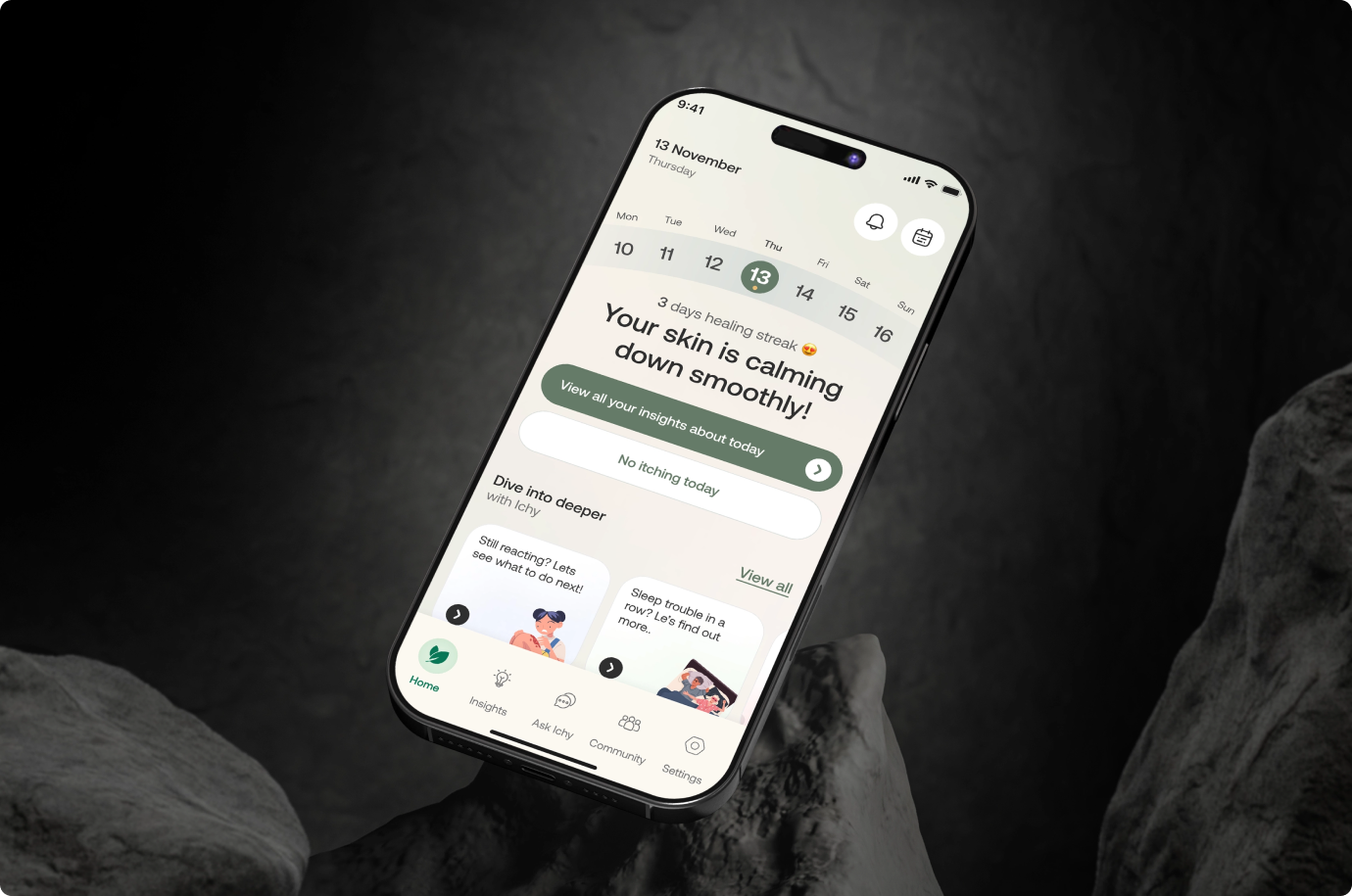
Ichy helps people with eczema understand what sets their skin off, without guessing. Taqwah designed the mobile app, marketing website, and brand identity, built around a founder who lives with the condition every day.
The Project,
At a Glance
End to end product and brand design for an AI eczema companion that helps users track flares, log triggers, and share clear health data with their doctor.
Living With Eczema Feels Like
Guessing
People with eczema spend years trying to figure out what causes their flares. Food, weather, stress, skincare, sleep. The patterns are real, but no one has time to track them by hand, and most apps were not built for this.
- Flares feel random because triggers hide across food, weather, sleep and daily stress patterns
- Patients often feel dismissed by doctors who have minutes, not hours, to listen properly
- Generic health apps treat eczema like a side note, not a condition worth its own tools
- Writing symptoms in a notebook rarely lasts, and the data never reaches the right doctor
Brand Identity Design
for Ichy
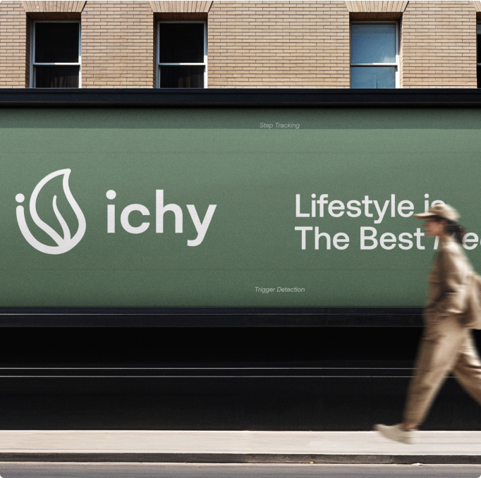
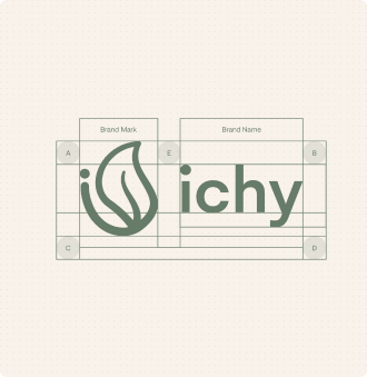
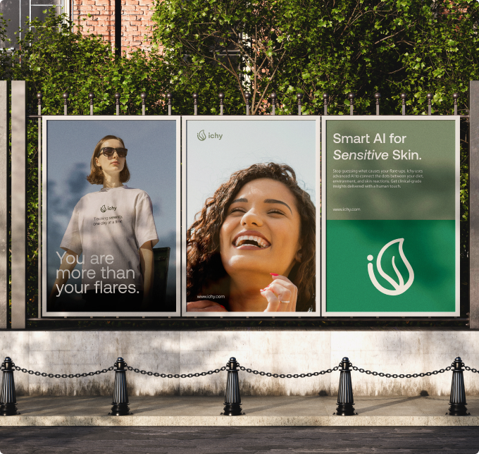
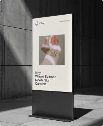
Most skin health brands look clinical or scream wellness. Ichy sits in between. A sage and deep green palette, warm cream background, and soft pastel accents give the brand calm. Aeonik for the logo, Gelion for the UI. Reassuring, never cold.
A Health App That
Feels Human
Eczema is personal, and the app had to feel like it. We solved for daily use without burnout, trust around sensitive data, and a tone that treats users like people managing a condition, not patients in a chart.
Logging That Does Not Feel Like Work
People give up on tracking when it takes too long. We designed checkins and trigger logs that take seconds, not minutes, daily.
Trust Built Into Every Screen
Users share skin photos, moods, and symptoms. Privacy, export, and delete controls stay visible, so people never wonder where their data went.
Insights, Not Diagnoses
Ichy shows patterns, not verdicts. The app helps people spot what sets off their skin, without pretending to replace a real doctor.
Empathy First,
Then Everything Else
We started with the founder's own story and talked to people who live with eczema. Every design decision traced back to one question: does this make a hard day easier? The flows, the tone, and the brand all followed from there.
Mobile App Design for
Doctor Ready Reports
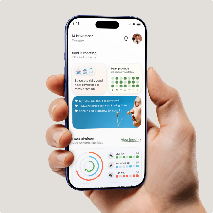
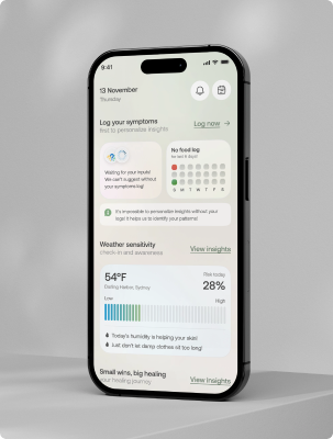
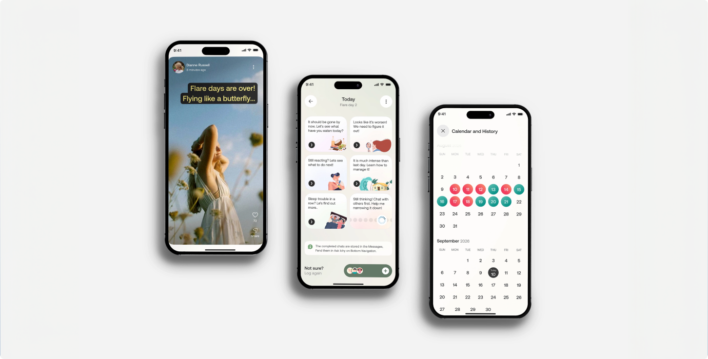
A calendar of green and red days, a trigger history that updates as users log, and a one tap export that turns months of data into a PDF doctors can actually read.
The UX Decisions
Behind the Product

Lived experience beats assumptions. Designing around someone who manages the condition daily kept every decision grounded in real needs, not a healthy person’s guess.
Chronic skin conditions come with anxiety and fatigue. A gentle, encouraging companion lowers the emotional load that a cold medical UI would only add to.
The hardest part of eczema is identifying triggers. Framing the app around answering that one question makes its value immediately clear.
Flare-ups are pattern-driven. Quick, consistent logging is what surfaces the triggers the data only becomes insight
The colors set the emotional tone. Calm, skin-friendly tones make the app feel supportive and human rather than like a hospital portal.
From Founder Story
to Shipped Product
Three phases, six months, one goal: make eczema feel manageable. We moved from research and brand into product design, then stress tested every flow against real daily use before handoff.
Research the Real Experience
We spoke with the founder and users to map the triggers, frustrations, and moments where current tools quietly fail eczema patients.
Design the Brand and System
Sage, cream, and pastels became the base. Aeonik and Gelion carried the voice. Every component was built to scale calmly.
Build the Full Experience
Mobile app, marketing website, and brand identity, delivered as one connected system, ready for development and launch.
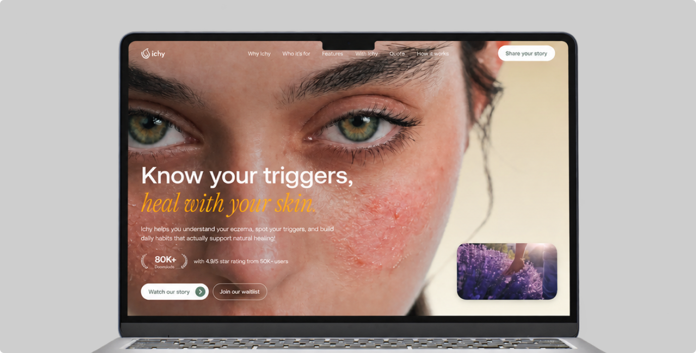
A Website That
Earns Trust
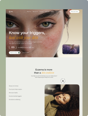
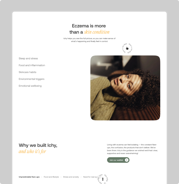
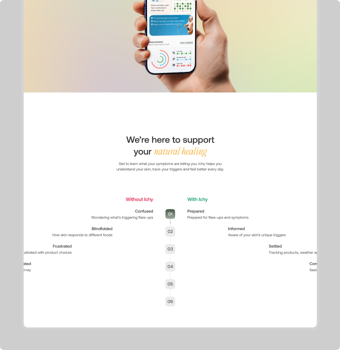
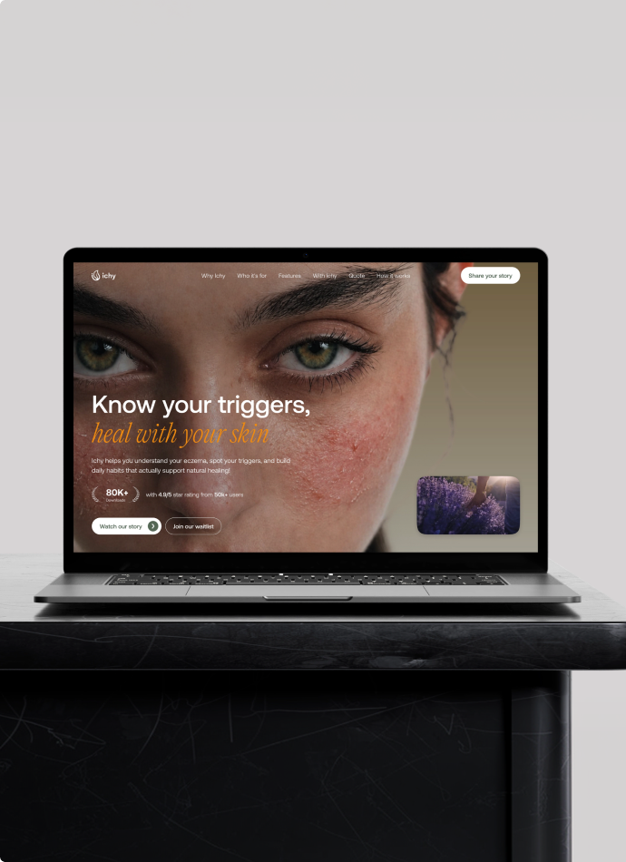
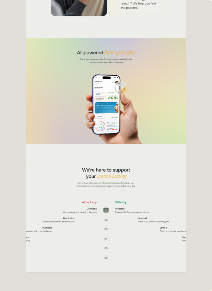
The site introduces Ichy without overclaiming. Clear sections, honest founder story, a Without Ichy vs With Ichy comparison, and a waitlist built to turn curiosity into early access.
A Companion,Ready to Help
+62%
Ask Ichy replaced long forms with short, warm conversations. The chat flow removes friction from daily logging, so users return to check in without feeling like they are filling out paperwork. Streak reminders and recovery states keep engagement steady without pressure.
85%
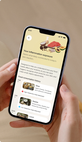
Trigger logging was broken into bite-sized prompts tied to food, sleep, weather, and skincare. Each input takes seconds, with smart defaults based on past entries. The result is a logging flow users finish instead of abandoning halfway through.
3x
Insights that show patterns in a user's own data give people a reason to come back. The green and red day calendar turns scattered logs into something visual, so users see progress and keep tracking across weeks, not just days.
48%
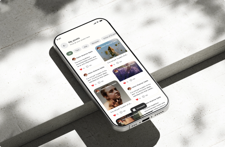
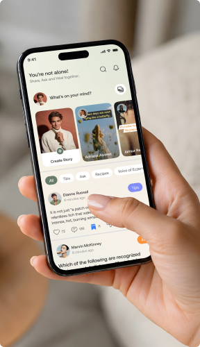
Anonymous posts, stories, and comments let users share without exposing themselves. The design kept the space calm and moderated, so people felt safe speaking up about a condition they usually hide.