South West Explorer
Travel Like a Local
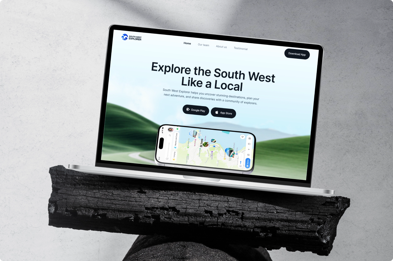
South West Explorer turns a map into a game. Pin hidden coves, trails, and viewpoints across Devon, Cornwall, Dorset and Somerset, earn passport stamps for every visit, and share discoveries with a community of real explorers.
The Project,
At a Glance
A complete brand and website project, from the first discussions to the final live website. We connected visual identity, content structure, responsive design, and development into one consistent experience.
Travelers Keep Missing the
Best Parts of the South West
Devon, Cornwall, Dorset and Somerset are packed with hidden coves, coastal viewpoints, and local trails. But most people visit the same five famous spots and leave without ever finding them.
- Generic map apps show businesses and chain stores, not curated local discoveries
- Travel blogs go stale fast and never update once published
- Locals know the best spots but have no simple way to share them beyond word of mouth
- Nothing gives travelers a reason to come back once they have seen the obvious attractions
Brand Identity Design
for South West Explorer
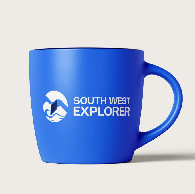
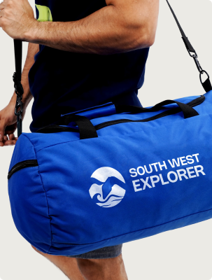
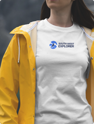
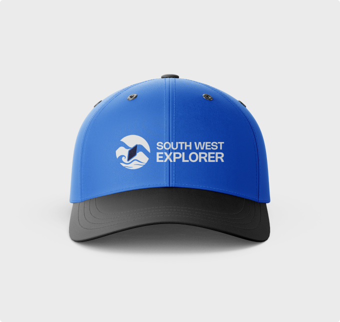
A circular emblem brings coast, land, and navigation together: a cresting wave, a headland cliff, and a boat sail in one mark. Heavy condensed geometric type anchors it. A royal blue and deep navy palette with warm off-whites gives the brand coastal confidence without a tourist cliche.

A Discovery App That
Earns Repeat Visits
Most travel apps get used once and forgotten. South West Explorer had to pull users back week after week, give them a reason to log every visit, and feel just as useful on a trail with no signal as on a sofa at home.
A Map Worth Opening Daily
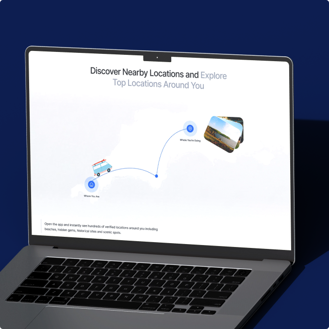
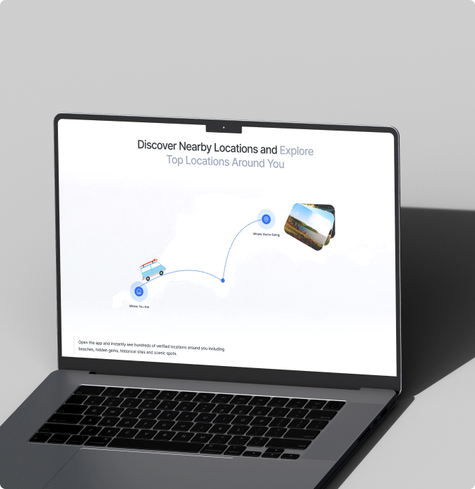
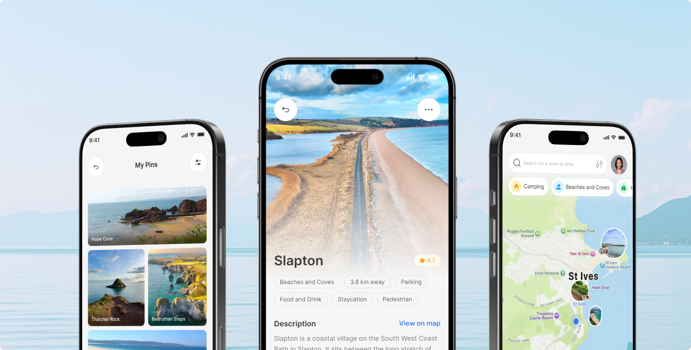
Users had to spot something new every time they opened the app. Curated pins, nearby filters, and category chips make discovery feel fresh on every scroll.
A Reason to Come Back
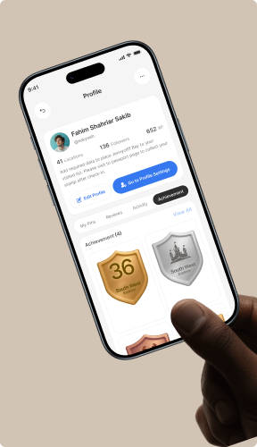
Visits had to feel rewarding. The Digital Passport turns every check-in into a collectible stamp, and tiered badges give explorers a long-term goal worth chasing.
Built for Real Field Use
Trails do not have WiFi. Offline maps, cached location data, and a one-tap online/offline toggle keep the app useful where travel actually happens.
Turning Every Visit Into
a Collectible
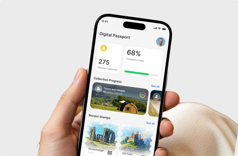
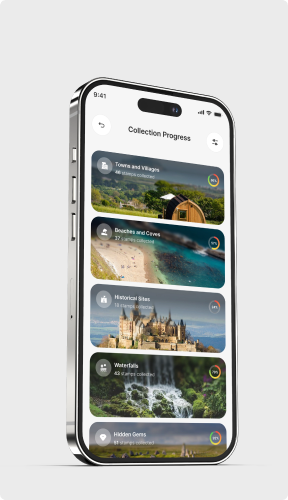
Check in at a location and the app rewards you with a perforated postage stamp marker. Dashboard tracks stamps collected, completion rate, and progress by category.
Mobile App Design for
Everyday Discovery
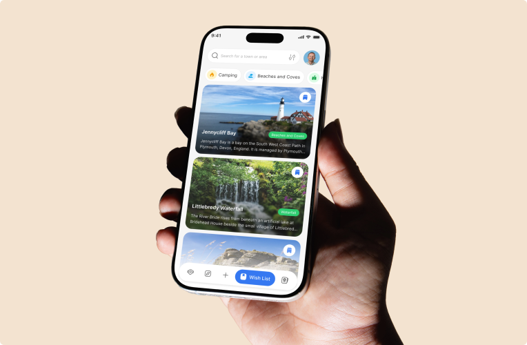
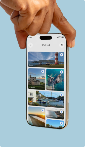
The core product. 150+ screens across 12 flows: onboarding, auth, home, explore, location detail, check in, add a pin, passport, wishlist, profile, and settings. Every screen state is covered, from empty and loading to offline and error, so the app holds up in real travel conditions.
Turning Every Visit
Into a Collectible
Check in at a location and the app rewards you with a perforated postage stamp marker. Dashboard tracks stamps collected, completion rate, and progress by category.
The UX Decisions
Behind the Product

You book a free audit or a strategy call. We look at your product or idea within 48 hours and tell you exactly what's broken and what to fix first. If it makes sense to work together, we agree on what gets designed, what the result should be, and when you'll see it. No payment before you've seen our thinking.
You book a free audit or a strategy call. We look at your product or idea within 48 hours and tell you exactly what's broken and what to fix first. If it makes sense to work together, we agree on what gets designed, what the result should be, and when you'll see it. No payment before you've seen our thinking.
You book a free audit or a strategy call. We look at your product or idea within 48 hours and tell you exactly what's broken and what to fix first. If it makes sense to work together, we agree on what gets designed, what the result should be, and when you'll see it. No payment before you've seen our thinking.
You book a free audit or a strategy call. We look at your product or idea within 48 hours and tell you exactly what's broken and what to fix first. If it makes sense to work together, we agree on what gets designed, what the result should be, and when you'll see it. No payment before you've seen our thinking.
You book a free audit or a strategy call. We look at your product or idea within 48 hours and tell you exactly what's broken and what to fix first. If it makes sense to work together, we agree on what gets designed, what the result should be, and when you'll see it. No payment before you've seen our thinking.
You book a free audit or a strategy call. We look at your product or idea within 48 hours and tell you exactly what's broken and what to fix first. If it makes sense to work together, we agree on what gets designed, what the result should be, and when you'll see it. No payment before you've seen our thinking.
From Brand Mark to
Launch Ready Product
The product covers 12 user flows, 150+ screens, and a full brand book. We built it in layers: brand first, then the map, then the gamification system, then every surrounding flow.
Build the Brand Mark
The logo had to carry coast, land, and navigation in one mark. Royal blue and navy with heavy geometric type set the trust and exploration tone for every screen that followed.
Design the Map Experience
Map-first home, clustered photo pins, category chips, nearby radius control. The map had to feel alive on first open and useful by the second tap.
Build the Passport System
Collectible stamps, achievement shields, completion dashboards, and category progress. The gamification layer gave users a long-term reason to keep coming back.
A Landing Page That
Pulls Visitors Into the Map
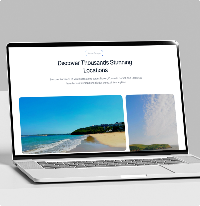
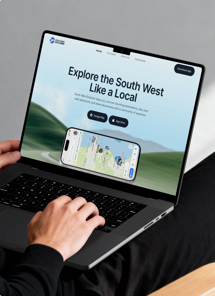
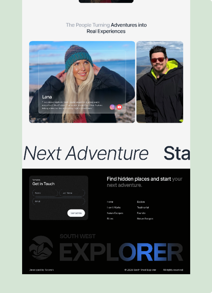
Desktop runs on a 1920 canvas with full cosmic scale. Mobile strips to 430 wide with a hamburger menu, stacked fund columns, and the Croatian coast replacing the cosmos. Same brand, same conviction, two experiences shaped for how each audience actually arrives.
A Travel App Built to Keep People Coming Back
3x
A travel app is only worth the install if people reopen it. The achievement tiers and passport turn one trip into an ongoing goal, so explorers come back to log the next location instead of deleting the app after one use.
-45%
All 12 flows were mapped end to end, so no one hits a dead end on the way in. A smooth path from first open to first discovery means more new users actually reach the point where the app proves itself.
+60%
Every check-in moves an explorer toward the next shield. That single loop turns passive browsing into active exploring, the behavior that drives retention, word of mouth, and organic growth.