AYMO Ventures
Backing the Outliers
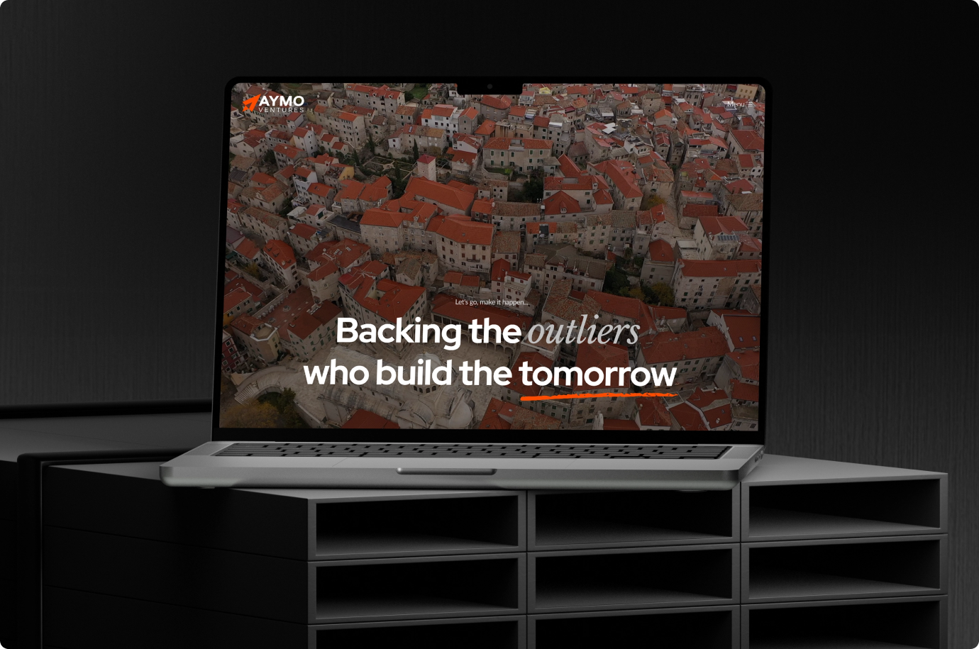
AYMO Ventures invests in founders who build the tomorrow. Taqwah designed the brand and marketing site: a bold, space themed experience that makes an early stage VC fund feel ambitious, trustworthy, and ready to back the next wave of Croatian innovation.
The Project,
At a Glance
Brand identity and responsive marketing website for a two fund early stage VC firm and startup accelerator focused on Croatia's innovation ecosystem.
Brand Identity Design
for AYMO Ventures
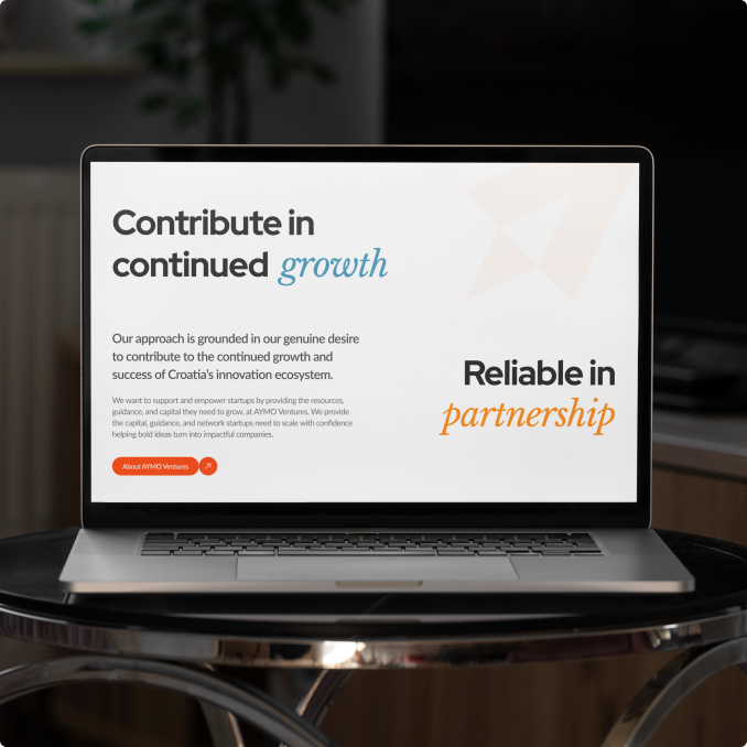
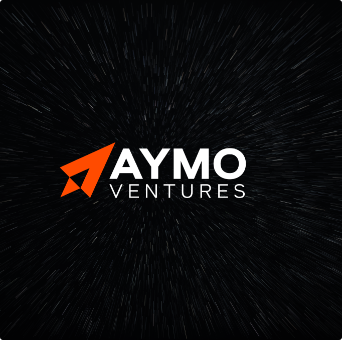
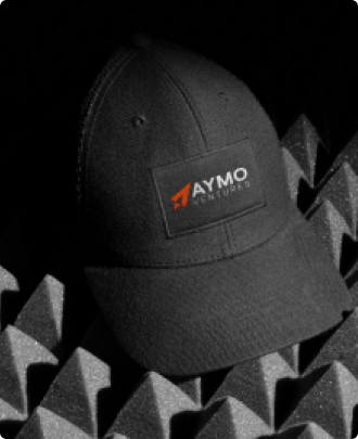
An orange origami paper plane marks the logo: launch, trajectory, and the push behind every founder they back. Pure black and warm cream alternate across the site. A bold geometric sans carries the weight, with an italic serif in orange emphasizing the words that matter: founders, growth, partnership.
Early-Stage Funds Rarely
Feel Worth Betting On
Founders have hundreds of VC websites to choose from. Most look the same: safe grids, stock photography, vague mission statements. AYMO needed to feel like a fund with real conviction before a founder even scrolled past the hero.
- Most VC sites feel corporate and interchangeable, with no clear point of view on who they back
- Early-stage funds struggle to signal ambition without overclaiming on results they do not have yet
- Croatia's innovation story is underrepresented in global VC visuals and messaging
- A fund with two separate vehicles needs to explain both without confusing founders about which fits them
Momentum Through Space,
Grounded in a Real Region
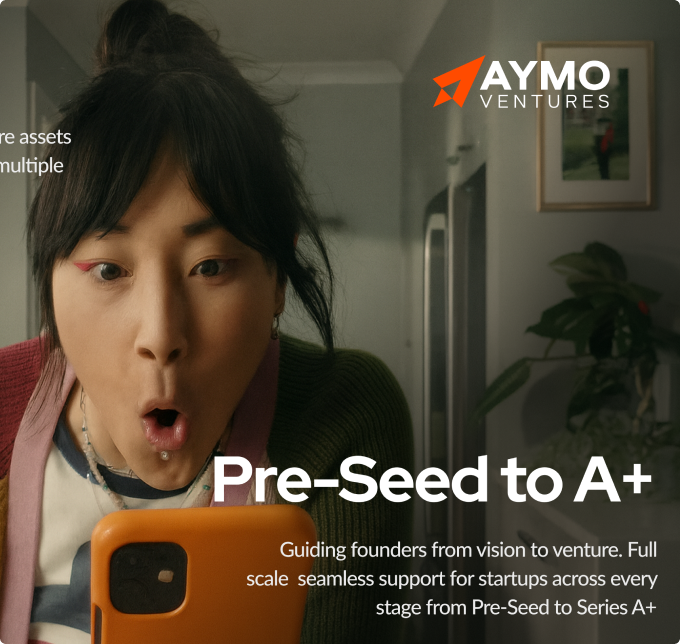
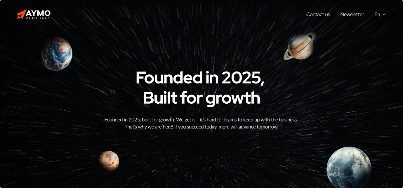
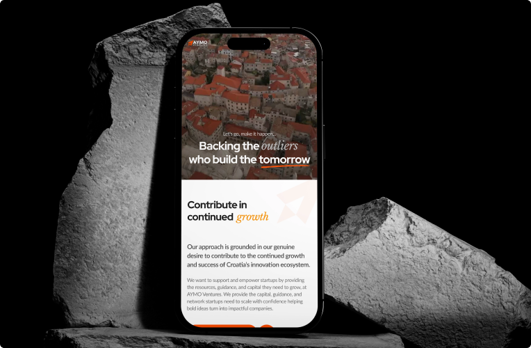
The creative concept is simple: a fund that backs outliers has to look like one. A warp-speed starfield, drifting planets, and multicolor sparkles sit behind an ultra bold headline. On mobile, the cosmos gives way to an aerial shot of a Croatian coastal town, tying the ambition back to the real place AYMO was built to serve.
One Site, Two Audiences,
Two Conversion Goals
AYMO had to speak to founders and investors in the same scroll without diluting either message. We solved for a conversion funnel that handles both, a clear two-fund story, and a brand ambitious enough to earn trust from both sides.
A Clear Two-Fund Story
Founders needed to know in seconds whether the VC Fund or the Accelerator Fund fit them. Separate sections, clear criteria, and specific ticket ranges removed the guesswork.
A Pitch Funnel That Converts
Every section pointed to one of two actions: Submit Pitch for founders, Newsletter signup for investors. Primary CTAs stayed one scroll away throughout the page.
A Brand That Signals Conviction
Space imagery, oversized type, and the orange paper plane turn an early-stage fund into something founders want to be associated with before they even read the criteria.
One-Page Marketing Site
Built to Convert
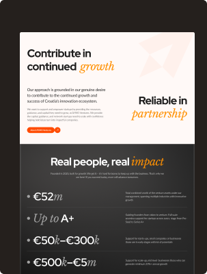
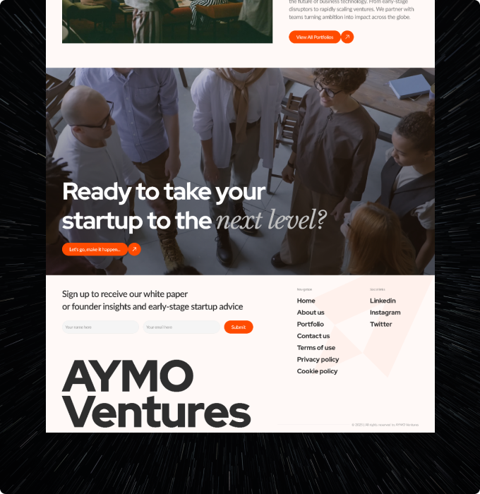
Full-width scroll through eleven sections: hero, investment range, approach, both funds, the 8 week accelerator program, FAQ, partners, contact form, final pitch CTA, and newsletter. Alternating black and cream sections give the page rhythm.
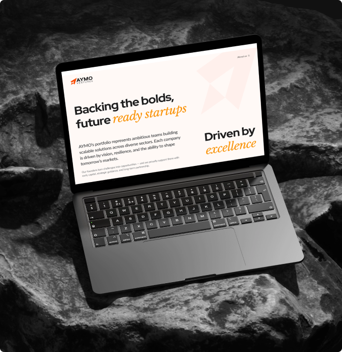
Two Funds, One Mission,
Backed by an 8 Week Program
The AYMO VC Fund backs growth and Series A companies in B2B Software, Bio, Climate, Consumer, Deep Tech, Fintech, and Health, with checks up to €300K. The Accelerator Fund supports pre seed and seed teams through an intensive 8 week program ending in a Demo Day.
AYMO VC Fund
Growth and Series A companies across B2B Software, Bio, Climate, Consumer, Deep Tech, Fintech, and Health.
Accelerator Fund
Pre-seed and seed teams supported through an intensive, hands-on program ending in a Demo Day.
The UX Decisions
Behind the Brand

AYMO backs growth and Series A companies through the VC Fund, and pre-seed and seed teams through the Accelerator Fund.
Submit your pitch through the form on the site. The partners review every submission and respond within a few weeks.
B2B Software, Bio, Climate, Consumer, Deep Tech, Fintech, and Health.
One Month,
Brand to Launch
Brand first, then art direction, then the full one-page scroll, then every interaction and state the site needed to feel alive from first load. Delivered in one month, now live at aymoventures.com.
Define the Brand Voice
Ambitious, founder-friendly, regionally grounded. Three words that shaped every color, headline, and emphasis across the site.
Build the Art Direction
Warp-speed cosmos, orange paper plane, italic-serif emphasis, hand-drawn underline. The creative system set AYMO apart from every other VC site at a glance.
Design the Full One-Page Scroll
Eleven sections built on an alternating black-and-cream rhythm. Each section had one job: explain, differentiate, or convert.
Desktop Ambition,
Mobile Clarity
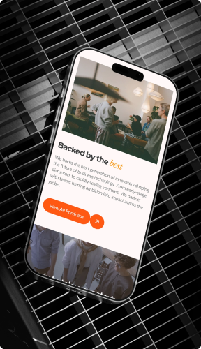
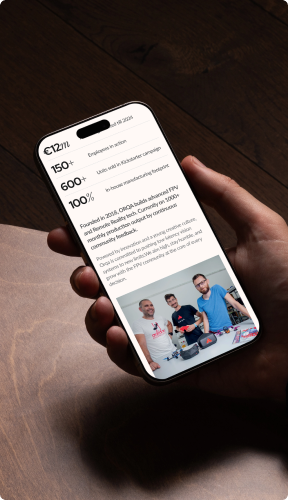
Desktop runs on a 1920 canvas with full cosmic scale. Mobile strips to 430 wide with a hamburger menu, stacked fund columns, and the Croatian coast replacing the cosmos. Same brand, same conviction, two experiences shaped for how each audience actually arrives.

A Brand That Earns Founder Trustand Deal Flow
+2x
A VC lives on deal flow, and the website is the top of that funnel. Sharper positioning and one clear path to apply mean more of the right founders reach out, turning passive site traffic into real pipeline the fund can invest from.
10 Seconds
Founders and LPs judge a fund in seconds. The site makes what AYMO backs and who it's for clear before anyone scrolls, so the right people lean in and the wrong fit self-selects out, saving the partners' time either way.
Investor Grade
Credibility That Punches Above Stage Early stage funds compete on trust before track record. A considered identity and a polished site make AYMO read like an established firm, so founders feel safe putting it on their cap table and LPs take the first call seriously.
1 Month
Brand and site shipped in about a month, so AYMO started attracting founders and conversations immediately instead of waiting a quarter. Fast time-to-credibility is itself the return on the project.