
.svg)
Chompo
Bold Burger Brand
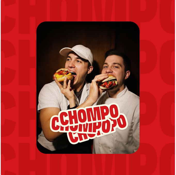
Chompo needed a brand that felt as loud and honest as the food itself. Taqwah designed it all from scratch identity, website, mobile app, and motion, as one connected system for a new generation of flavor seekers.
.png)
The Project,
At a Glance
End-to-end brand and product design for a fast-casual burger brand, from visual identity to a launch-ready digital experience.
Great Burgers Deserve
A Brand That Matches
The fast-casual space is crowded. Most burger brands look and feel the same. Chompo needed to stand out without trying too hard, and connect with Gen Z without pretending to be them.
- Generic fast-casual branding blends into the background on every delivery app
- Gen Z spots inauthenticity in seconds, so playful design has to feel earned, not forced
- A restaurant brand lives on Instagram and delivery apps before anyone tastes the food.
- Every touchpoint from menu to app to social had to feel like the same brand
Brand Identity Design
for Chompo
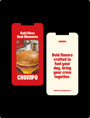
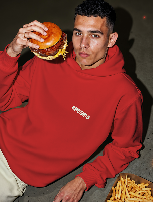
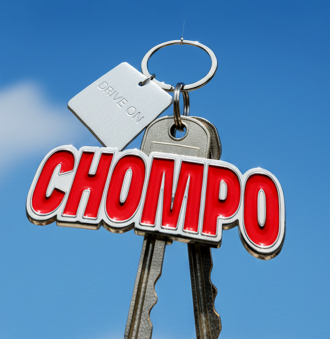
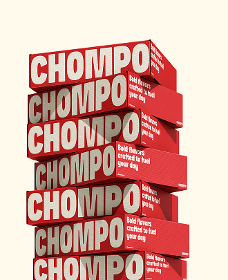
Chompo's visual language leads with confidence red and cream palette, bold type, hand-drawn food icons, personality without noise. Works loud on a signboard, clean on a phone screen. Same brand, wherever people meet it.
.png)
A Restaurant Brand
That Works Everywhere
Chompo had to win in three places at once: on the street, on a phone, and in a delivery app. Every design decision had to hold up in all three, without watering the brand down for any of them.
Loud But Not Loud For Nothing
Chompo had to grab attention in a crowded market without leaning on gimmicks. Every design choice had to earn its place
Built for Gen Z, Not About Them
The audience is young, digital-first, and skeptical of marketing. The brand had to feel real, not like a pitch.
One Brand, Every Surface
From packaging to delivery apps to the website, Chompo had to look and feel like the same place, everywhere.
Flow First, Then Identity,
Then Onboarding
Recording had to feel effortless. The AI summary had to earn trust. And the path from "I recorded something" to " have a proposal ready" had to feel natural, not like extra work.
.png)
.png)
Mobile App Design for
Anywhere, Anytime
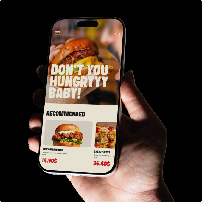
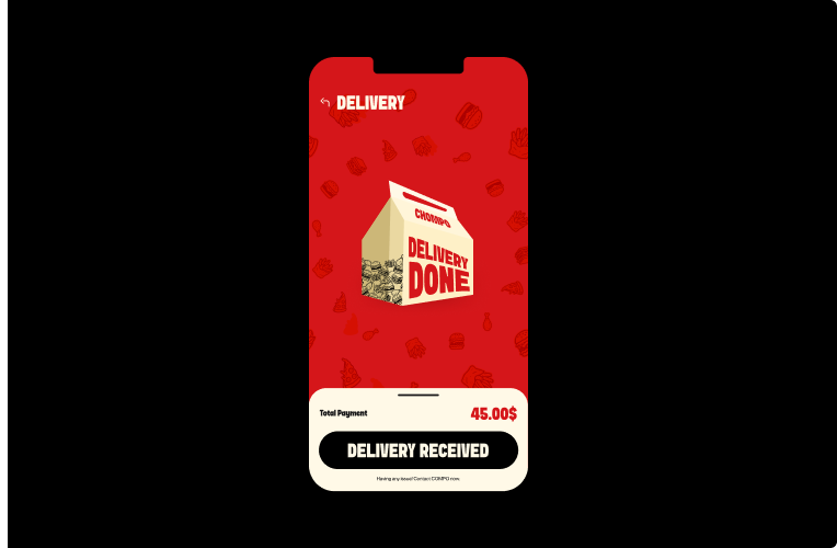
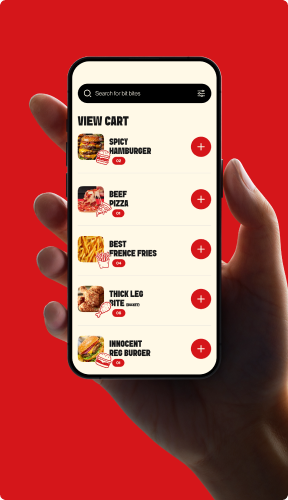
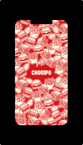
Most orders happen on a phone. The Chompo app keeps the same bold identity, wrapped around a fast ordering flow: browse the menu, customize the burger, pay, track. Designed for people who know what they want and expect to get it fast.
%20(1).avif)
Voice-to-Text Web
App UI Design
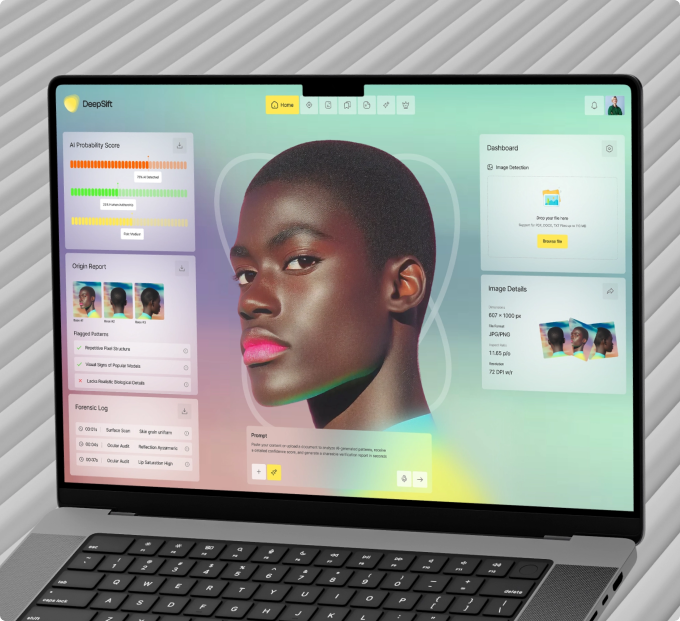
The core product. Every screen cuts a step between speaking and shipping. One click turns voice notes into business documents via "Generate a Proposal.
.png)
.png)
.png)
The UX Decisions
Behind the Brand

Yellow-and-red screams generic fast food. Cream gives Chompo warmth and makes the red feel intentional, not defensive.
You book a free audit or a strategy call. We look at your product or idea within 48 hours and tell you exactly what's broken and what to fix first. If it makes sense to work together, we agree on what gets designed, what the result should be, and when you'll see it. No payment before you've seen our thinking.
You book a free audit or a strategy call. We look at your product or idea within 48 hours and tell you exactly what's broken and what to fix first. If it makes sense to work together, we agree on what gets designed, what the result should be, and when you'll see it. No payment before you've seen our thinking.
From First Sketch
to Launch-Ready Brand
Every step traced back to one question: does this make Chompo feel more like Chompo? Brand first, then digital, then motion, all built on the same foundation.
Define the Brand Voice Body
Bold, playful, honest. The three words that shaped every color, type choice, and word that followed.
Build the Visual Identity Body
Red-and-cream palette, hand-drawn icons, minimalist type. A system that scales from a burger wrapper to a billboard.
Design the Digital Experience Body
Website and mobile app, both built to move visitors from browsing to ordering fast, without losing the brand's warmth.
Landing Page That Sells
Before Recording
One job: make switching to AI voice-to-text feel obvious. Clear messaging, contextual visuals, and a structure built to convert visitors into signups.
.png)
.png)
AI Voice-to-Text Product Ready to Build
+50%
Most users sign up and never come back. Not because your product is bad because the first experience is confusing. When we fix how users get started, more of them reach the moment where your product actually clicks. That's when they stay.
2.3%→5.1%
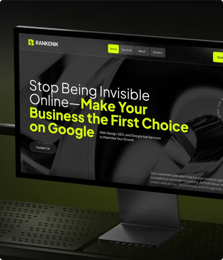
More visitors signing up without spending more on ads. When your website clearly explains what your product does and makes it easy to get started, the same traffic converts at more than double the rate.
3x Faster
Every screen delivered with specs, component documentation, and responsive breakpoints. Your developers build exactly what was designed. No back and forth. No guessing.
-40%
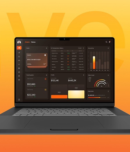
When tables are sortable, settings are findable, and notifications are clear, users stop asking your team for help. Every screen that explains itself is a support ticket that never gets written.


.png)
.avif)













.svg)
%201.svg)
