.svg)
%201.svg)

Most SaaS landing pages fail for the same three reasons: no single value proposition, an onboarding flow that loses users before they see value, and a hero section that describes the product instead of showing what changes for the user.
These examples break down what high-converting SaaS landing pages actually get right, from hero structure to CTA placement, and what your page is probably missing.
The 29 SaaS landing page examples are listed below.
1. Notion
Notion's landing page does one thing we've rarely seen early-stage SaaS products do: it commits to a single outcome before the visitor scrolls.
"Write, plan, share. With AI at your side." That's not a feature list. That's a result. The hero section shows a real product screenshot, no stock photos, no abstract illustrations, paired with one CTA: "Get Notion free."
What works:
The page answers the visitor's first question, "what does this do for me?" in under three seconds. The social proof bar sits immediately below the fold with enterprise logos, which kills the credibility objection before it forms.
What most SaaS founders miss here:
Notion earned this simplicity by removing everything that didn't serve the conversion. In our audits of 40+ SaaS homepages, the pattern is almost always the same, five value propositions competing for attention, three CTAs pulling the visitor in different directions, and a hero section that describes the product instead of showing what changes for the user.
The design decision that actually matters:
One outcome. One CTA. One screenshot. If your landing page has more than one of any of these, that's where your conversion is leaking.
2. Asana
Asana's landing page solves a problem most horizontal SaaS products never figure out: how do you speak to five different buyer types without losing all of them?
The answer is department segmentation. Below the fold, Asana breaks the page into team-specific sections: marketing, operations, IT, product, each with its own use case and CTA. The hero doesn't try to say everything. It commits to one outcome, then lets the visitor self-select into the version of the product that's relevant to them.
What works:
The two-button CTA structure, "Get started" and "See how it works" — handles two different buyer mindsets on the same page. The visitor who is ready converts. The visitor who needs more context stays engaged. Neither one bounces. The real product dashboard appears immediately below the hero, which removes the biggest objection before it forms: "Does this actually work?"
What most SaaS founders miss here:
In our audits, horizontal SaaS products consistently make the same mistake — one generic homepage trying to speak to every user type at once. The result is a page that feels relevant to no one. Asana's department segmentation is not a design choice. It is a conversion architecture decision.
The design decision that actually matters:
If your product serves more than one type of user, your landing page should let visitors self-qualify. "This is for my team" is a more powerful conversion trigger than any headline you can write.
3. HubSpot
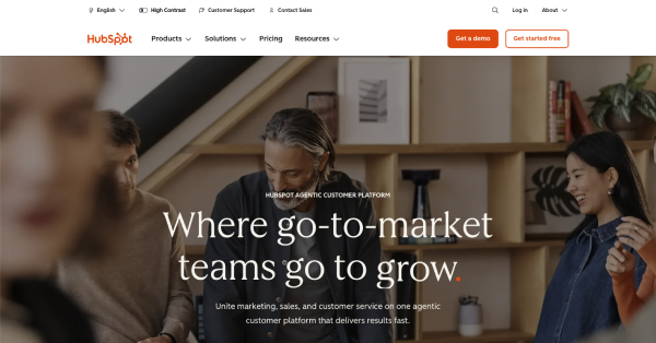
HubSpot's landing page is built for a specific anxiety: the founder or marketing leader who has sales data in one place, customer support in another, and marketing in a third, and cannot figure out why growth feels so hard. The headline, "Where go-to-market teams go to scale," is not about the product. It is about the destination the buyer already wants to reach.
What makes this page structurally different from most SaaS landing pages is that it does not try to sell one thing. HubSpot has earned the right to show an entire platform because its brand already carries the weight. The page segments itself by use case so each visitor self-selects into the product most relevant to their pain point without HubSpot needing a separate page for each.
The social proof bar leads with a specific number, "205,000+ customers across 135 countries," not a vague claim. Two CTAs serve two different buyer stages on the same page. "Get a demo" for enterprise buyers who need a conversation. "Get started free" for founders who want to try before they commit. Neither competes with the other because they target different levels of purchase intent.
What founders get wrong trying to copy HubSpot: they see the multi-use-case structure and think their early-stage product needs the same breadth. It does not. HubSpot can show eight product hubs on one page because each hub has its own established audience. If your product is at $10K MRR, one page with one use case and one CTA will always outperform a page trying to be everything.
4. ActiveCampaign
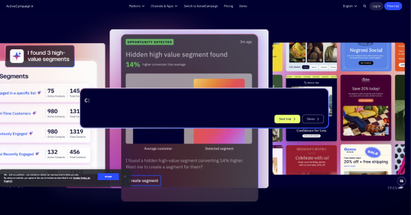
ActiveCampaign's landing page for email automation leads with a specific outcome: "Automate smarter. Grow faster." The page uses a 30-second start time signal, "Set up in under 30 seconds," which reduces friction at the point of decision.
What works: ActiveCampaign displays measurable outcomes from real customers ("Increased open rates by 47%"), creating E-E-A-T signals that search engines reward and readers trust.
5. Canva
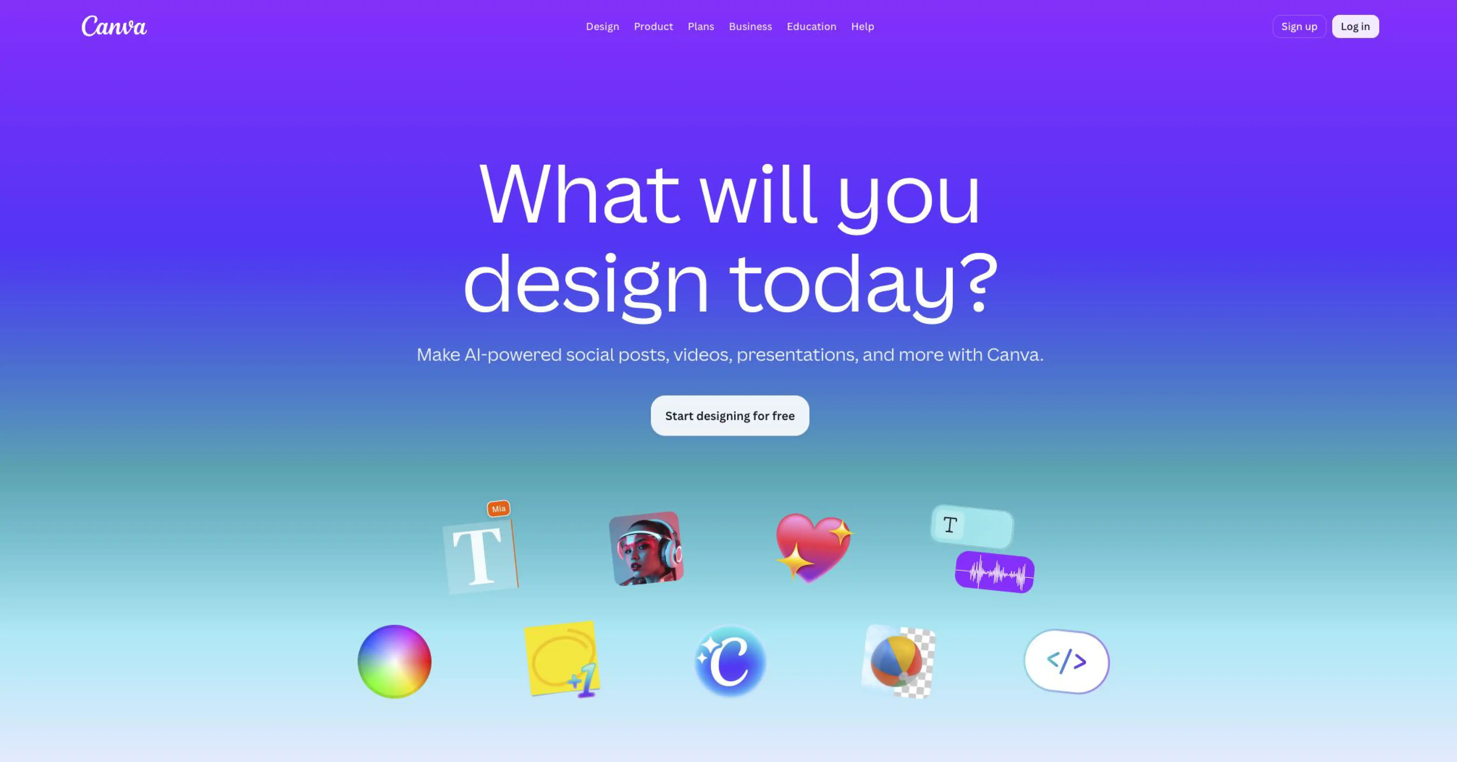
Canva's SaaS landing page targets a non-designer ICP with a specific outcome: "Design anything. Publish anywhere." The hero section shows the product in action: a drag-and-drop editor with real templates, rather than a marketing illustration.
What works: Canva uses a free trial CTA with no credit card required, paired with a social proof bar showing 135 million monthly active users. Specificity signals authority.
6. Slack
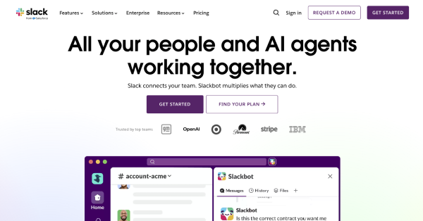
Slack's landing page eliminates every word that adds no semantic value. The headline is a specific promise: "Made for people. Built for productivity." The hero section includes a product screenshot, a single CTA ("Get started free"), and a social proof bar featuring Fortune 500 logos.
What works: Slack's mobile-first design ensures the CTA button renders above the fold on all screen sizes, which is a critical factor in reducing bounce rate from mobile PPC traffic.
7. Monday.com
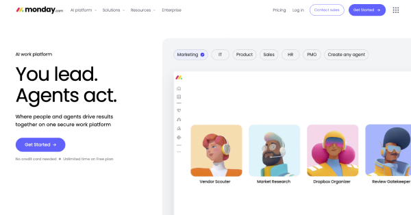
Monday.com uses a landing page structure optimized for purchase-intent keywords. The hero section opens with: "The Work OS that makes teamwork click." Below the fold, the page shows the product in action using an embedded product demo, not a video placeholder, but a live interactive preview.
What works: Monday.com uses a "No credit card required" signal next to the CTA button, reducing the 3 most common purchase objections in a single line.
8. Shopify
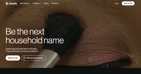
Shopify's SaaS landing page speaks to a specific pain point for e-commerce entrepreneurs. The headline delivers a measurable outcome: "Start your business and grow your brand." The hero section includes a 3-day free trial CTA, which is a specific number, not "free trial."
What works: Shopify displays social proof as a specific number, "millions of businesses powered by Shopify," then qualifies it with named customer logos, building entity salience for the Knowledge Graph.
9. Intercom
Intercom targets enterprise SaaS teams with a hero section that leads with a specific outcome: "The complete AI-first customer service platform." The page uses a dark mode UI for the product screenshot section, matching the design aesthetic of a developer and product audience.
What works: Intercom's landing page segments CTAs by ICP: "Start free" for SMBs, "Contact sales" for enterprise, serving 2 customer journey stages from a single page without splitting attention.
10. Figma
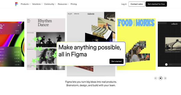
Figma's landing page leads with collaborative design as the core value proposition: "Nothing great is made alone." The hero section shows authentic visuals: real design files, real collaboration cursors, not marketing illustrations.
What works: Figma removes form friction entirely. The CTA ("Get started for free") requires only a work email. Minimized form fields increase conversion rate measurably across A/B testing cycles.
11. Framer
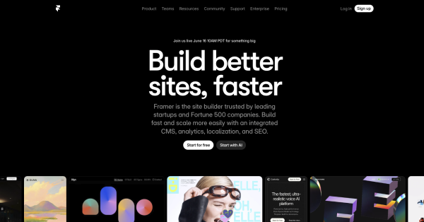
Framer's landing page targets a developer and designer audience with a dark mode UI and a headline that delivers a specific outcome: "Build your site with AI, in minutes." The 30-second start time signal ("Publish in 60 seconds") reduces friction at the first decision point.
What works: Framer uses micro-animations throughout the hero section to demonstrate the product's core capability: speed and interactivity, without a separate demo video.
12. Linear
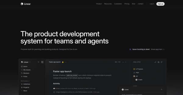
Linear's landing page uses enterprise-ready design with a clean, dark-mode hero section targeting engineering teams. The headline is precise: "Linear is the issue tracking tool you'll actually enjoy using." The specificity of "you'll actually enjoy" addresses a hidden objection: that project management tools are painful to use.
What works: Linear minimizes form fields ruthlessly. The CTA asks for a work email only. No name, no phone, no company size, removing every possible friction point.
13. Deel
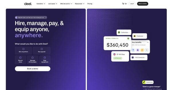
Deel's landing page leads with global payroll as the primary entity and targets a specific ICP: HR leaders at companies with international employees. The headline delivers a measurable outcome: "Run global payroll and HR in one place." The hero section shows a real product screenshot of the Deel dashboard.
What works: Deel displays 3 trust signals above the fold: SOC 2 compliance badge, GDPR compliance badge, and a customer count with a specific number, "35,000+ companies." Competitor comparisons appear below the fold for bottom-of-funnel visitors.
14. Betterstack
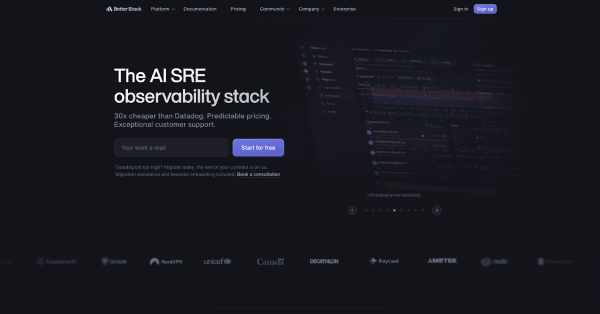
BetterStack's landing page targets a developer audience with uptime monitoring as the core use case. The headline is specific: "Monitor your entire stack." The hero section uses a dark mode UI and a real-time product screenshot showing live uptime data.
What works: BetterStack leads with "No credit card required" and a "30-second start time" signal. Specific numbers beat feature lists every time. These 2 signals remove friction before the visitor reaches the CTA.
15. Wrike
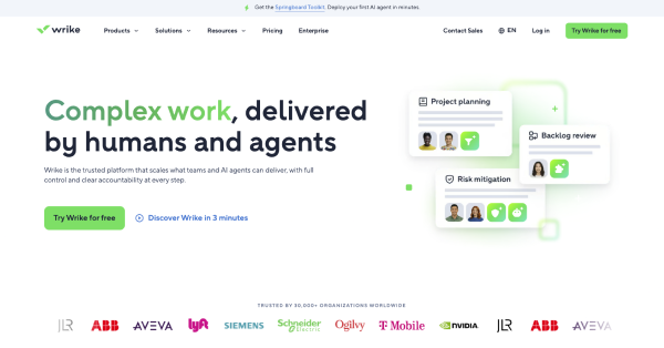
Wrike's landing page targets enterprise project management teams. The hero section leads with a specific outcome: "Collaborate, plan, and execute work in one platform." The page uses an enterprise-ready design with security and compliance badges: SOC 2, ISO 27001, GDPR, visible above the fold.
What works: Wrike's landing page structure separates use cases into 4 distinct sections: marketing, PMO, operations, and IT, allowing one page to address multiple ICP pain points without losing specificity.
16. Airtable
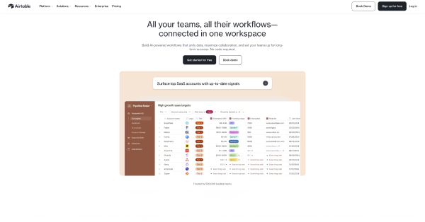
Airtable's landing page opens with a measurable outcome: "Create workflows that work for you." The hero section shows the product in action with a real screenshot of an Airtable base, no stock photos, no marketing illustrations.
What works: Airtable uses a social proof bar with specific customer logos and a "join 450,000+ companies" statement. Specific numbers signal factual precision to both ranking algorithms and skeptical visitors.
17. SEMrush
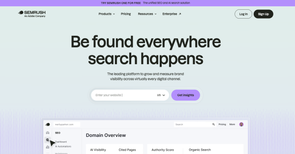
SEMrush's landing pages are built for purchase-intent keywords: "SEO tool," "keyword research tool," "competitor analysis." Each page targets one use case, one ICP, and one CTA. The hero section leads with a specific outcome: "Grow your business with the #1 SEO tool."
What works: SEMrush displays a specific claim, "#1 SEO tool," then immediately supports it with third-party trust signals: G2 Leader badge, Capterra rating, and a user count ("10 million marketing professionals").
18. Loom
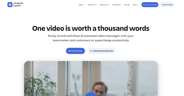
s Loom' landing page targets async communication as the primary use case. The headline delivers a specific outcome: "Record and share video messages with Loom." The hero section includes a product demo embedded directly in the page, not a link to a YouTube video.
What works: Loom uses a free trial CTA with no credit card required, paired with a 30-second start time signal. Visitors understand the value within the first 10 seconds above the fold.
19. Typeform
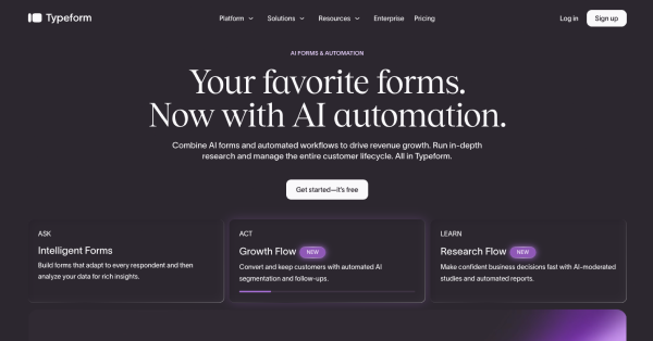
Typeform's landing page leads with a specific outcome: "Create forms people actually enjoy filling out." The hero section shows an animated product demonstration: a live Typeform responding to a user's input, which demonstrates the product's core differentiator in real time.
What works: Typeform uses a competitor comparison section below the fold to capture bottom-of-funnel buyers searching "Typeform vs Google Forms" and similar purchase-intent keywords.
20. Webflow
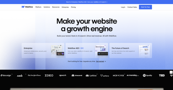
Webflow's landing page targets designers who want to build without code. The hero section leads with a specific outcome: "Build with the power of code, without writing it." The page uses a dark mode UI with a real product screenshot.
What works: Webflow segments its CTA by ICP: "Start building for free" for individual designers, "Get a demo" for enterprise teams. Two CTAs serve 2 customer journey stages without competing.
21. Hotjar
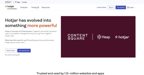
Hotjar's landing page leads with a specific outcome for a defined ICP: product and UX teams: "See how your users really experience your site." The hero section shows a real heatmap screenshot from an actual website, not a marketing graphic.
What works: Hotjar uses a free trial CTA with "No credit card required" and a specific user count, "1,000,000+ websites use Hotjar," to build authority before the visitor reaches the first feature section.
22. Calendly
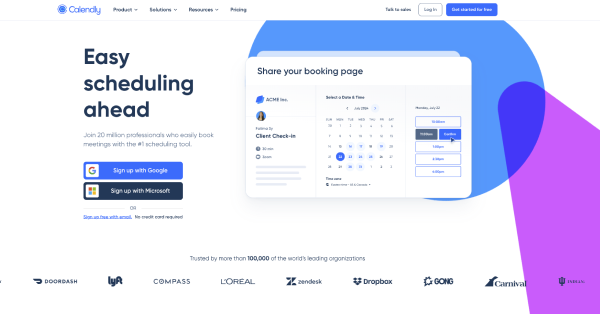
Calendly's Calendly landing page reduces friction to zero. The headline delivers a specific outcome: "Easy scheduling ahead." The CTA says "Sign up free," no "trial," no "demo," no ambiguity. The hero section shows the Calendly scheduling interface in a real product screenshot.
What works: Calendly's landing page uses a social proof bar with Fortune 500 logos immediately below the hero section, turning skeptical visitors into paying customers by associating Calendly with enterprise-grade credibility.
23. Zapier
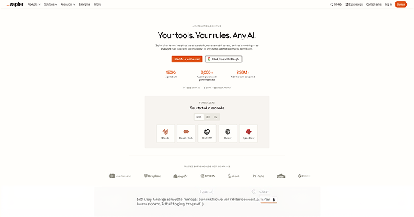
Zapier's landing page leads with automation as the primary value proposition: "Automate your work across 7,000+ apps." The specificity of "7,000+" beats "thousands" on both E-E-A-T signals and conversion rate. The hero section includes a real product screenshot of a Zap workflow.
What works: Zapier uses a "No coding required" signal in the hero section, addressing the single biggest hidden objection for its non-developer ICP.
24. Miro
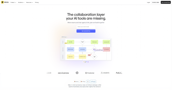
Miro's landing page targets collaborative teams with a specific outcome: "The visual workspace for innovation." The hero section shows an authentic product screenshot: a real Miro board with sticky notes, diagrams, and collaborator cursors.
What works: Miro segments social proof by industry, "Used by 99% of Fortune 100 companies," then shows 5 named enterprise logos to validate the claim. Specificity and named examples build entity salience.
25. ClickUp
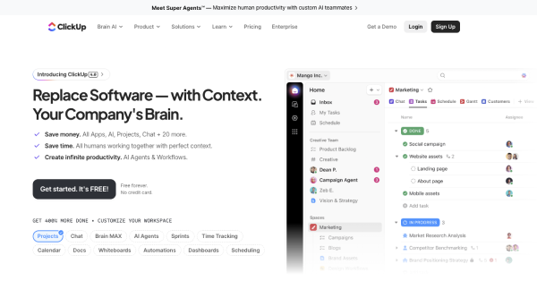
ClickUp's landing page leads with a direct competitor comparison in the headline: "One app to replace them all." This targets bottom-of-funnel buyers actively evaluating multiple project management tools.
What works: ClickUp's hero section includes a specific metric, "Save 1 day every week," as a measurable outcome. The page uses a competitor comparison table below the fold with ClickUp, Asana, Monday.com, and Notion side by side.
26. Pitch
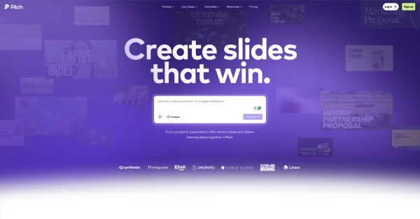
Pitch's landing page targets presentation teams with a specific outcome: "Build better decks, faster." The hero section uses micro-animations to show templates loading and slides populating in real time, demonstrating speed as the core differentiator.
What works: Pitch uses pricing transparency on its landing page: Free, Pro, and Enterprise tiers displayed with specific monthly charges, reducing the need for a sales call and shortening the customer journey.
27. Mailchimp
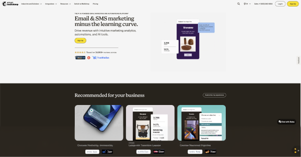
Mailchimp's landing page leads with email automation as the primary entity. The headline delivers a specific outcome: "Turn emails into revenue." The hero section shows the email editor in a real product screenshot, no stock photo of a person at a laptop.
What works: Mailchimp's CTA uses "Start free," 2 words, zero friction, zero ambiguity. The "No credit card required" signal appears directly below the button, removing the final purchase objection.
28. Stripe
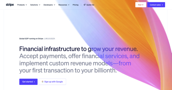
Stripe's landing page targets developers and finance teams with an enterprise-ready design. The headline is precise: "Financial infrastructure to grow your revenue." The hero section uses a real API code snippet, the most authentic visual possible for a developer ICP.
What works: Stripe displays 3 trust signals above the fold: PCI DSS compliance, 99.99% uptime monitoring status, and a specific transaction volume claim. All 3 are verifiable facts, not opinion-based statements.
29. Vercel
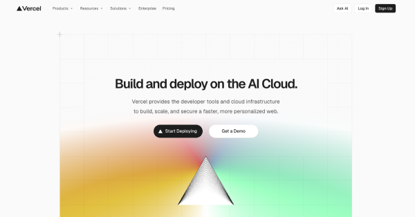
Vercel's landing page targets frontend developers with a specific outcome: "Deploy web projects with zero configuration." The dark mode UI matches the design aesthetic of its developer audience. The hero section shows a real deployment dashboard, not a diagram.
What works: Vercel uses a specific start time signal, "Deploy in 30 seconds," and a free tier CTA with no credit card required. These 2 signals remove the 2 most common friction points for developer-led product adoption.
What Are the Essential Elements of a SaaS Landing Page?
There are 12 essential elements every high-converting SaaS landing page includes. Each element serves a specific function in the customer journey, from the hero section above the fold to the footer CTA at the bottom. These elements also reflect SaaS design principles that apply across every page type: clarity, hierarchy, and friction reduction.
1. Hero Section
The hero section is the first element a visitor sees above the fold. It includes a headline, subheadline, CTA button, and a product screenshot or demo. Design the hero section to answer 3 questions in under 5 seconds: What is it? Who is it for? What do I do next?
2. Headline and Subheadline
The headline delivers a specific, measurable outcome for a defined ICP. The subheadline qualifies the outcome and addresses the primary pain point. Match the adjectives, predicates, and nouns in the headline to the search query or ad copy that brought the visitor to the page.
3. CTA Button
Use a single CTA per landing page. The CTA button label must signal the exact next step: "Start free," "Book a demo," "Get started." Avoid generic labels like "Learn more" or "Click here," which provide zero semantic value to the visitor or NLP parsers.
4. Social Proof Bar
Place the social proof bar immediately below the hero section. Include 5 to 8 named customer logos, a specific user count, and at least 1 third-party trust signal: G2, Capterra, or Trustpilot badge. Specific numbers beat vague claims every time.
5. Product Screenshot or Demo
Show the product in action. Screenshots beat stock photos in conversion rate across every A/B testing study. An embedded interactive demo outperforms both. Place the product screenshot in the hero section, not in the features section below the fold. The quality of this screenshot depends directly on how well the SaaS dashboard is designed, since a cluttered or confusing UI in the screenshot creates doubt rather than confidence.
6. Features and Benefits Section
Organize the features section around the customer's pain point, not the product's architecture. Lead with the benefit, the measurable outcome, then support it with the feature. Use numeric values: "3 steps to set up," not "simple setup."
7. How It Works Section
The how-it-works section reduces cognitive friction by showing the customer journey from signup to value in 3 to 5 steps. Use verb-led headings: "Connect your tools," "Set your goals," "Automate your workflow." Match the part-of-speech tag across all steps.
8. Pricing Section
Pricing transparency on a landing page reduces the need for a sales call and shortens the customer journey. Display 3 tiers with specific monthly charges. Mark the recommended tier. Include a "No credit card required" signal below the free tier CTA.
9. Trust Signals
There are 4 categories of trust signals that improve conversion rate: security badges (SOC 2, GDPR, ISO 27001), social proof (customer logos, review ratings), performance claims (uptime monitoring, SLA), and media mentions. Place at least 2 trust signal categories above the fold.
10. Competitor Comparison
A competitor comparison section captures bottom-of-funnel buyers actively evaluating alternatives. Target purchase-intent keywords like "X vs Y" or "best alternative to Z." Use a comparison table with specific, verifiable attributes, not opinion-based claims.
11. Lead Capture Form
Minimize form fields ruthlessly. A free trial CTA requires only a work email. A book-a-demo CTA requires name, work email, and company size: 3 fields maximum. Every additional field reduces conversion rate measurably.
12. Footer CTA
The footer CTA captures visitors who scroll to the bottom without converting. Mirror the hero section CTA, same label, same "No credit card required" signal. The footer CTA is the last opportunity to convert before the visitor leaves.
What Are the Must-Have Features in SaaS Landing Pages?
There are 8 must-have technical features for a high-converting SaaS landing page in 2026:
- Mobile-first design; 63% of SaaS landing page traffic originates from mobile devices
- Page load speed under 2 seconds; every 1-second delay reduces conversion rate by 7%
- A/B testing capability; test 1 variable at a time: headline, CTA label, or hero image
- Smart traffic routing; direct visitors to the highest-converting variant automatically
- Single goal architecture; one page, one CTA, one ICP, one measurable outcome
- Authenticated social proof; verified review badges from G2, Capterra, or Trustpilot
- Micro-animations; use sparingly to demonstrate product value without slowing page load
Landing page builder integration; enable non-developer teams to iterate without engineering bottlenecks
What Is the Anatomy of a Landing Page for SaaS?
The anatomy of a SaaS landing page follows a top-to-bottom conversion architecture. There are 7 anatomical layers, each serving a distinct function in the customer journey:
Layer 1 —Navigation/Header: Minimal. Logo left, single CTA right. Remove all navigation links that lead away from the page.
Layer 2 — Hero Section: Headline, subheadline, CTA button, product screenshot. All 4 elements above the fold.
Layer 3 — Social Proof Bar: Customer logos, user count, third-party trust badges. Immediately below the fold.
Layer 4 — Features/Benefits Section: Pain-point-led. 3 to 6 features with measurable outcomes and product screenshots.
Layer 5 — How It Works Section: 3 to 5 verb-led steps showing the customer journey from signup to value.
Layer 6 — Pricing Section: 3 tiers, specific monthly charges, "No credit card required" on the free tier.
Layer 7 — Footer CTA: Mirror of the hero section CTA. Same label, same friction-reduction signal.
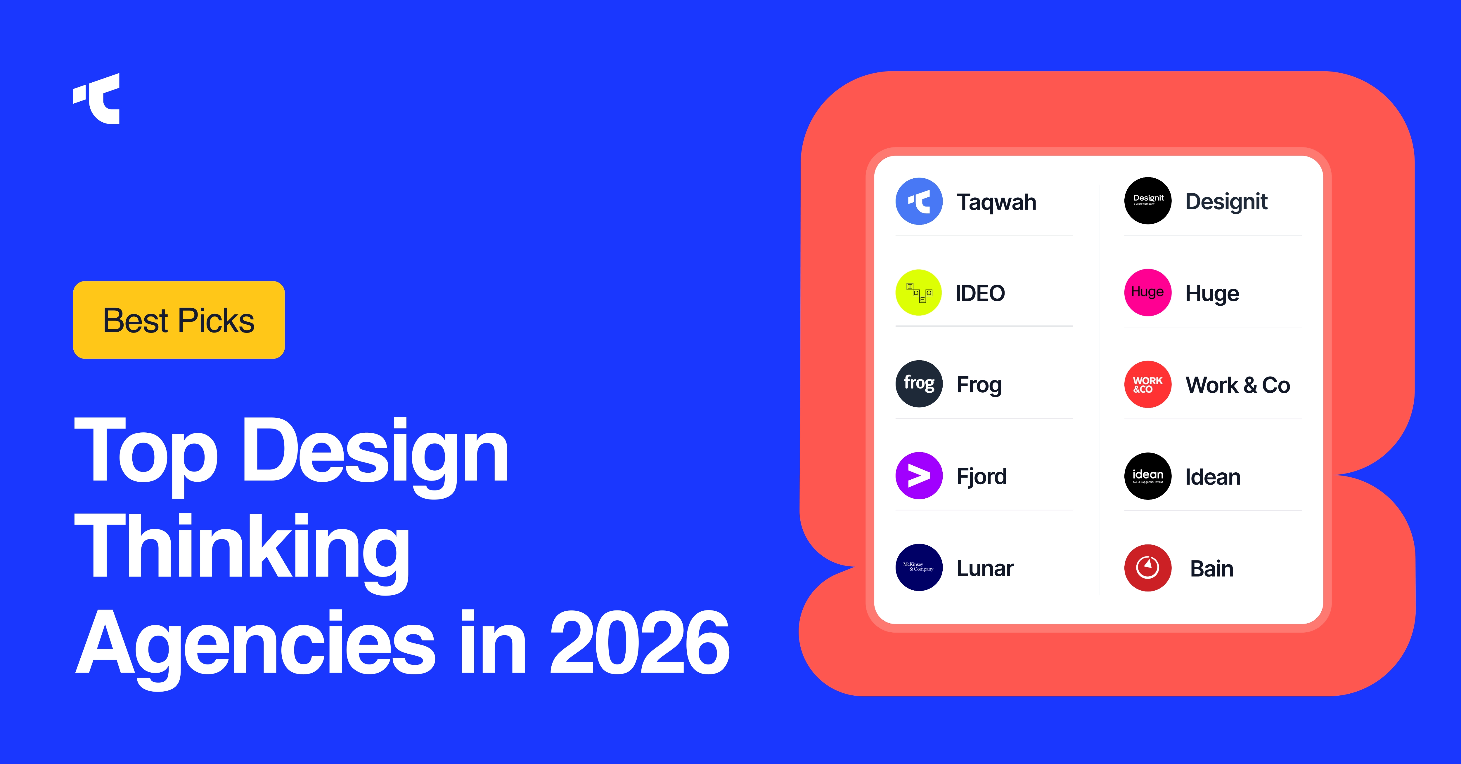
What Is the Best Agency for SaaS Landing Page Design?
There isn't a single universally "best" agency, but Taqwah and Ofspace are widely recognized as top specialists for SaaS landing page design.
Specifically, Taqwah has a proven track record of 154+ SaaS projects and a focus on high-converting pages.
Ofspace also has a proven track record of 200+ SaaS projects and a focus on high-converting pages.
For broader SaaS website design (including landing pages), Halo Lab is also highly ranked for B2B SaaS companies in 2026.
Top Agencies for SaaS Landing Page Design
There are 3 categories of SaaS landing page design providers:
- Landing page builders: Unbounce, Instapage, and SwipePages offer SaaS-specific templates, smart traffic routing, and A/B testing without engineering resources. Unbounce reports an average conversion rate lift of 30% over custom-coded pages for teams without dedicated CRO expertise.
- CRO-focused agencies: KlientBoost specializes in high-converting SaaS landing pages with a bottom-of-funnel focus. KlientBoost's methodology centers on single-CTA page architecture, purchase-intent keyword targeting, and continuous A/B testing cycles.
- Product design agencies: agencies specializing in SaaS product design build landing pages that mirror the product's UI: dark mode for developer tools, clean minimalism for productivity SaaS, enterprise-ready design for B2B platforms. Evaluating the right fit requires knowing how to choose a SaaS UI/UX design agency based on portfolio, methodology, and domain specialization.
What Makes a Good Landing Page for SaaS?
A good SaaS landing page delivers a specific, measurable outcome to a defined ICP without a sales call, without friction, and without ambiguity. There are 6 qualities that separate high-converting SaaS landing pages from average ones:
- Specific outcome in the headline: "Cut payroll errors by 40%" outperforms "Simplify HR."
- Product screenshot above the fold: screenshots beat stock photos every time
- No credit card required signal: removes the single biggest purchase objection
- Third-party trust signals: G2, Capterra, SOC 2 badges, and customer logos
- Minimized form fields: every extra field reduces conversion rate by 11%
- Single CTA: one action per page; two CTAs split attention and lower conversions
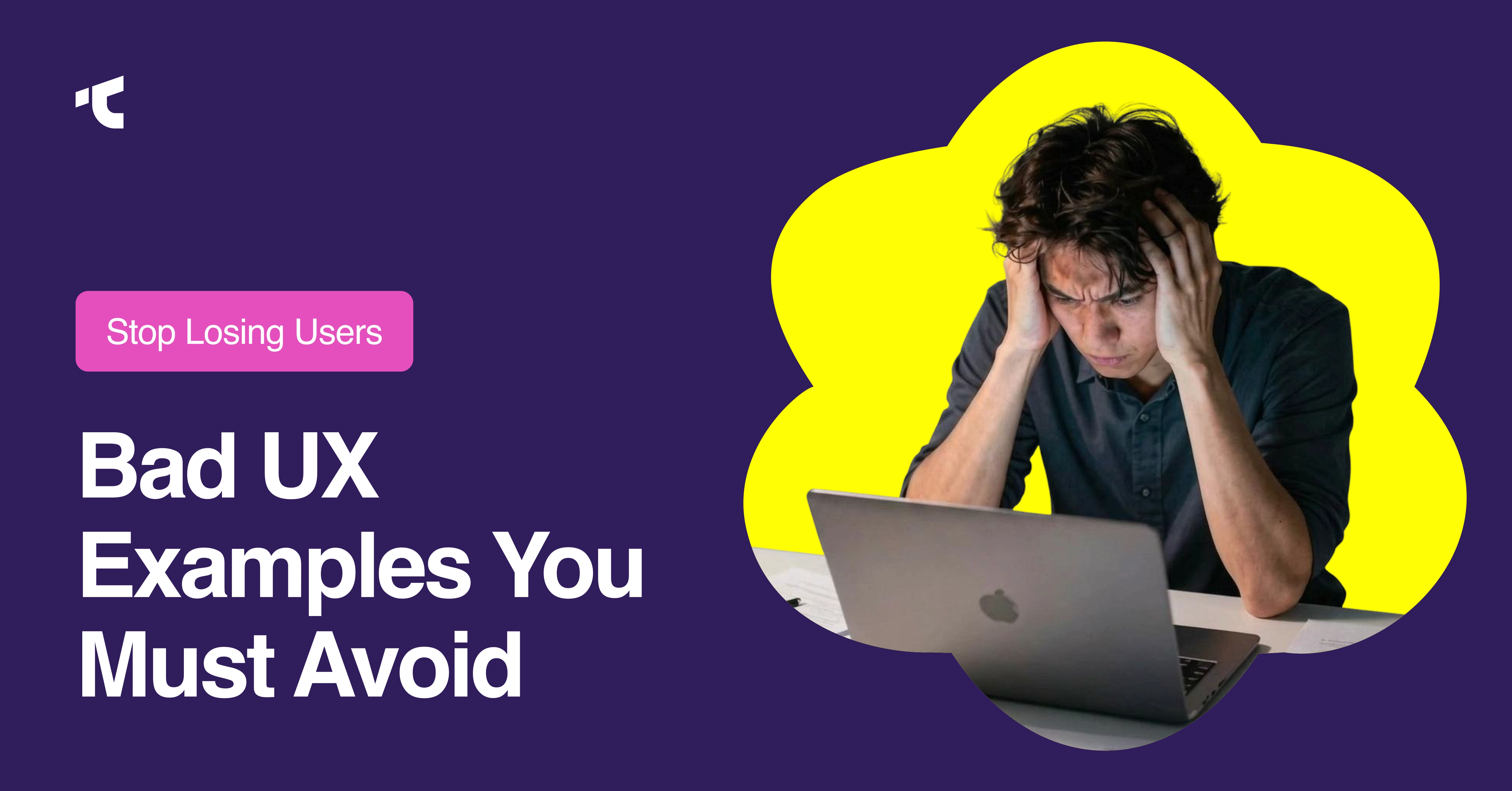
The visual quality of the landing page is also a factor most teams underestimate. Poor UI choices create distrust before a visitor reads a single word. Reviewing common SaaS UX mistakes helps teams avoid the design patterns that silently kill conversion rates.
SaaS Landing Page Trends in 2026
There are 5 observable SaaS landing page trends shaping conversion rate optimization in 2026:
- AI-personalized hero sections; smart traffic routes visitors to ICP-specific variants based on firmographic data, reducing bounce rate without additional page builds.
- Interactive product demos above the fold; embedded demos replace static screenshots, increasing time-on-page and conversion rate simultaneously.
- Pricing transparency as a trust signal: SaaS companies publishing specific monthly charges on landing pages report shorter sales cycles and higher qualified lead volume.
- Dark mode UI for developer ICPs; developer-focused SaaS products such as Linear, Vercel, and BetterStack use dark mode landing pages that match the product's native environment. This mirrors a broader shift in B2B SaaS product design trends toward audience-matched visual environments.
- Pre-launch landing pages for community building: SaaS teams capture work email addresses before launch using pre-launch landing pages with a single CTA and a waitlist counter showing real signup numbers.
Pre-launch landing pages for community building: SaaS teams capture work email addresses before launch using pre-launch landing pages with a single CTA and a waitlist counter showing real signup numbers.
What Is a Pre-Launch Landing Page?
A pre-launch landing page captures early adopter emails before a SaaS product launches publicly. It includes 4 elements: a specific outcome headline, a lead capture form with 1 field (work email), a waitlist counter with a real number, and a referral mechanism to grow the list organically.
Pre-launch landing pages build 3 measurable assets before launch day: an email list of high-intent users, social proof in the form of a waitlist number, and search engine indexing of the primary keyword, giving the product authority before it is available. A complete SaaS product launch guide covers how the pre-launch landing page fits into a broader go-to-market sequence.
What Is a SaaS Landing Page?
A SaaS landing page is a standalone web page designed with a single goal: convert a target audience into trial users, demo bookings, or paying customers. Unlike a homepage, a SaaS landing page eliminates navigation distractions, focuses on a single CTA, and is tied directly to a specific PPC campaign, lead-generation funnel, or purchase-intent keyword.
What is the difference between a SaaS landing page and a homepage?
The difference between a SaaS landing page and a homepage is intent. A homepage serves brand awareness across multiple audience segments. A SaaS landing page serves one ICP (Ideal Customer Profile), one pain point, and one measurable outcome: lower bounce rate, higher conversion rate, and more qualified leads.
What Is the Importance of a Landing Page in SaaS?
Landing pages drive 3 measurable outcomes for SaaS businesses:
- Lead generation: capture work email addresses with minimal form fields
- Pipeline acceleration: move buyers from awareness to the bottom of funnel faster
- Campaign ROI: tie PPC spend to a single CTA with a trackable conversion rate
The average conversion rate for a SaaS landing page sits between 2% and 5%. High-converting SaaS landing pages using smart traffic, A/B testing, and mobile-first design consistently exceed 10%. Understanding SaaS metrics like conversion rate and churn helps teams set realistic benchmarks before building a landing page strategy.
What Types of Landing Pages Are SaaS Marketers Creating?
SaaS marketers build 5 primary landing page types:
- Free trial landing pages: drive signups with "Start free, no credit card required."
- Book a demo landing pages: qualify enterprise leads through a contact form
- Pre-launch landing pages: capture early adopter emails before product launch
- Competitor comparison pages: target bottom-of-funnel buyers searching alternatives
- Use case landing pages: speak directly to one ICP pain point (e.g., "project management for remote teams")
Final Takeaway
There are 29 proven SaaS landing page examples in this guide, from Notion's product-screenshot-led hero to Vercel's developer-first dark mode design. Every high-converting SaaS landing page shares 3 structural properties: a single goal, a specific measurable outcome in the headline, and friction reduced to its minimum at the CTA.
Apply these 3 rules first: Show the product in action. Remove the navigation menu. Put "No credit card required" next to every free trial CTA. These 3 changes improve conversion rate before any A/B testing cycle begins.


.avif)