
.svg)
Your Web App is


Where Users Decide to Stay or Leave
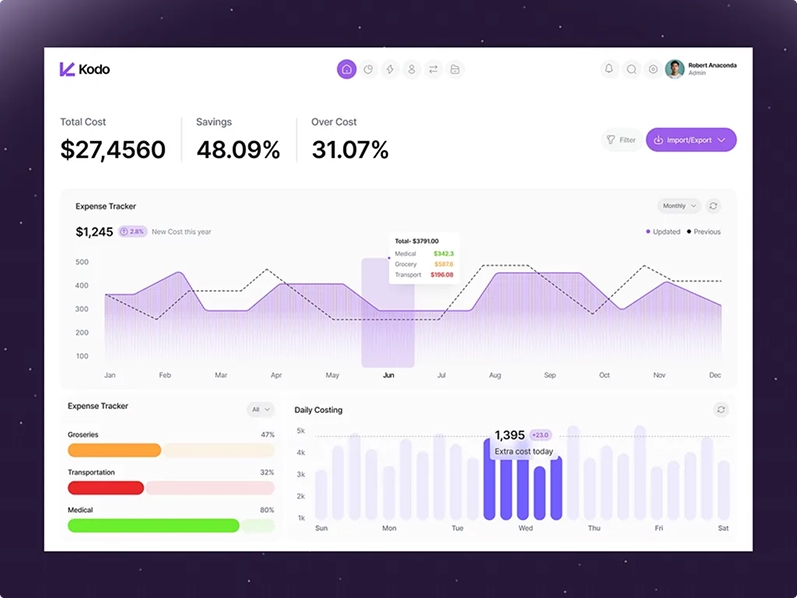
80% of SaaS features get little or no usage. Not because they're bad. Because users can't find them, don't understand them, or give up before they get there. We design web apps that make every screen earn its place.


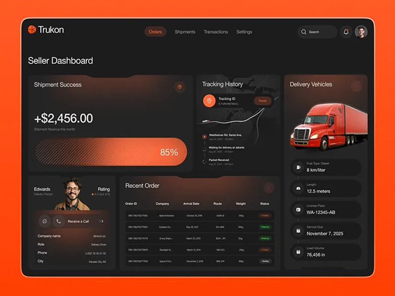
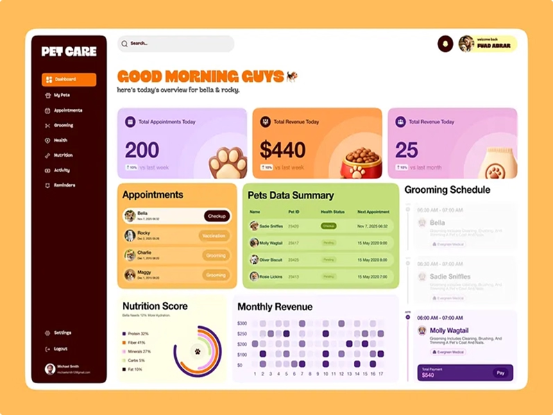
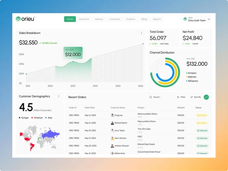
Users Quit Because Your Product Is Hard
Overwhelming —
Users log in and see everything at once. Charts, tables, buttons, sidebars, notifications. Nothing is prioritized. Nothing tells them what to do first. They feel lost before they even start.
Disconnected —
Every screen feels like a different product. Buttons change size. Colors shift. Spacing is inconsistent. Users don't trust products that feel patched together.
Buried —
The features users need most are hidden behind three clicks, a dropdown, and a settings page. Users don't dig for value. If they can't find it fast, it doesn't exist to them.
Fragile —
Nobody designed the empty states, loading screens, or error messages. When something goes wrong, the product breaks visually. Users lose confidence and leave.
Closing Line —
These aren't edge cases. They're the reason your support inbox is full and your retention is flat.
Every Interaction, Designed to Work
12 services. Each one solves a specific web app problem. Pick the one you need, or start with the audit and we'll tell you where to begin.
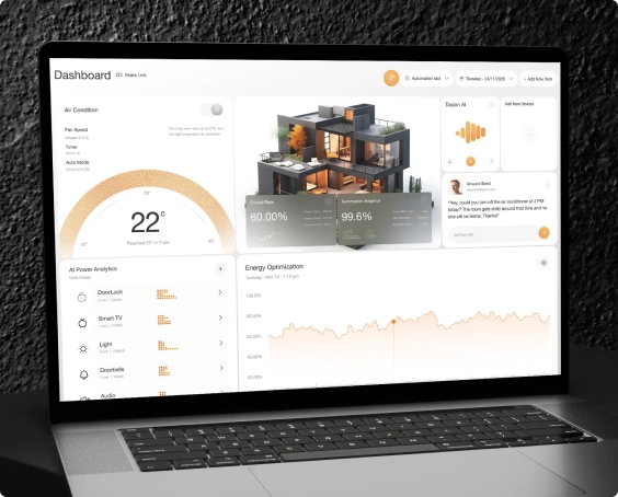
Dashboard Design
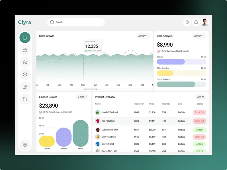
Most dashboards show too much. Users log in and drown in charts and numbers that don't help them do anything. We design dashboards that show what matters first. The right data, in the right order, for the right user. Every widget earns its place.
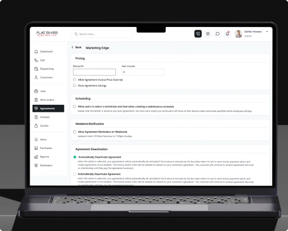
Admin Panel Design
Admin panels are used daily by your team. If they're confusing, your team wastes hours on tasks that should take minutes. We design admin interfaces that are fast to learn, easy to navigate, and built around the tasks your team actually does every day.
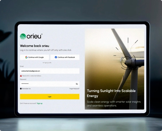
Authentication Flow Design
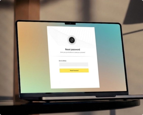
Sign up, sign in, password reset, two-factor verification. These screens look simple but they're where the most users quietly drop off. We design authentication flows that remove every unnecessary step between "I want to try this" and "I'm inside.
Notification & Alert System Design
Alerts, toasts, system messages, error warnings. If they all look the same, users stop reading any of them. We design notification systems that feel helpful instead of noisy. The right message, at the right time, in the right format.
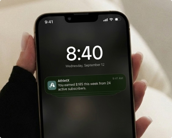
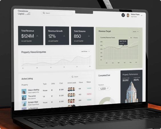
Table & List View Design
Tables are the most used and least loved part of any SaaS product. Sorting, filtering, pagination, inline actions, bulk editing. We design data tables that let users find what they need and act on it without leaving the page.
Onboarding Checklist & Progress UI
Progress bars, checklists, activation tooltips. These small elements do heavy lifting. They turn a confusing first week into a clear path. We design onboarding progress UI that shows users exactly where they are, what to do next, and why it matters.
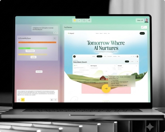
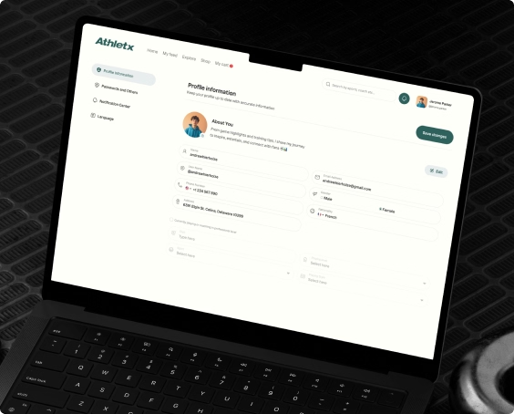
Settings & Account Management
Billing preferences, team permissions, notification controls, profile management. Settings pages are where users go when something isn't right. If this section is confusing, you get support tickets. We design settings that users can navigate without help.
Data Visualization & Analytics UI
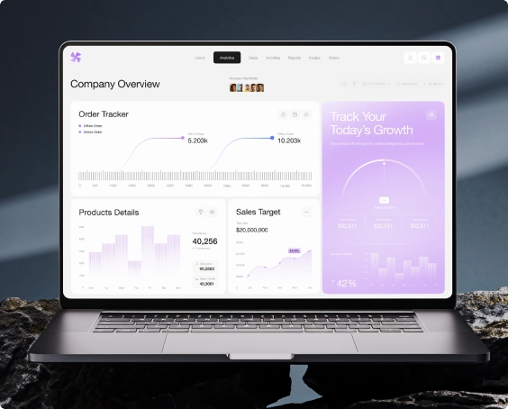
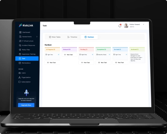
Workflow & Task Management UI
Task boards, approval chains, status tracking, drag-and-drop workflows. When a process has 5 steps and 3 different states, users need to know exactly where they are and what happens next. We design workflow interfaces that guide users through complex processes without confusion.
Real-time Updates & Live Data
Live feeds, auto-refreshing dashboards, status indicators, real-time notifications. If data is stale and users don't know it, they make wrong decisions. We design real-time UI that clearly shows what's live, what's loading, and what's changed since they last looked.
Error State & Edge Case Design
404 pages, empty states, loading screens, timeout messages, broken data views. Most products don't design these screens. Users hit them and feel abandoned. We design every edge case so that when something breaks, users know what happened and what to do next.
Only 19% of users complete onboarding. The rest leak out. We redesign your signup-to-paid flow so the value is obvious at every step. Clearer paywall. Smarter upgrade triggers. Users understand exactly why they should convert.
Conversion rate increases
Average improvement
55% of SaaS users churn within 30 days. They never reach your core value. We rebuild your onboarding so users hit the 'aha moment' in days, not weeks. Smart defaults. Progressive disclosure. Contextual guidance. Every step earns the next.
Maximizing time-to-value
Activation rate increases
80% of SaaS features get little or no usage. Not because they're bad — because they're buried. We restructure your interface so new users see what matters first. Better hierarchy. Clearer navigation. Progressive disclosure. Power without the overwhelm.
Higher & faster onboarding
Support tickets reduction
Users drop off sharply in the first two months and you can't see where. We design your product for retention from day one. Smooth activation flows. Clear paths to core features. Habit-forming interactions. Users don't just try your product — they come back.
Day 7 retention improves
Day 30 retention improves
23% of SaaS churn comes from users who don't understand the product. We build clarity into every interaction. Smarter onboarding. Contextual help. Obvious workflows. Design eliminates the questions.
Team capacity increases
COGS reduces
80% of SaaS features get little or no usage. You keep shipping but users never find them. We redesign your product for discoverability, visual hierarchy. Features get recommended and stop being invisible.
Higher feature adoption
Usage increases
Trusted by 50+ SaaS Companies. From First Idea to Funded Product.
























What Great Design Delivers
+50%
Avg Better design doesn't just look good. It changes how users behave.
19% to 61%
When tables are sortable, settings are findable, and notifications are clear, users stop asking your team for help. Every screen that explains itself is a support ticket that never gets written.
-40%
When tables are sortable, settings are findable, and notifications are clear, users stop asking your team for help. Every screen that explains itself is a support ticket that never gets written.
3x Faster
Every screen delivered with specs, component documentation, and responsive breakpoints. Your developers build exactly what was designed. No back and forth. No guessing.
Design. Ship. Measure.
We don't start with assumptions. We start with your data.
Audit
Before we touch anything, we find out what's actually wrong. We look at how real people are using your product right now. Where they get confused. Where they give up. What's stopping them from completing onboarding, upgrading, or coming back. No guessing. Just data that tells us exactly where to start.
Design
Once we know what's broken, we fix it. Every screen, every flow, every decision is tied to a specific problem we found in step one. We show you work in progress, take your feedback, and keep refining until it's ready to build.
Ship
We either build it ourselves or hand it off to your team. Either way, it goes out exactly as designed. Your developers get everything they need. Every measurement, every detail, every interaction documented. What you approved is what gets built.
Measure
Launching is not the finish line. After every project goes live, we check if it actually worked. Did more users complete onboarding? Did fewer people cancel? Did more go from free to paid? If the numbers haven't moved the way we expected, we go back and fix it. We're done when the results prove it.
Web Apps We've Designed
From AI tools to sports platforms here's what we've designed and built for founders with real problems worth solving.
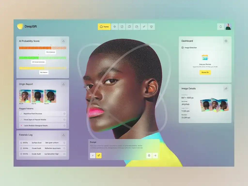

Rated 4.9/5 by 1,200+ Completed Proejects
DeepSift We Built an AI Image Detector Because One of Our Own Got Hurt
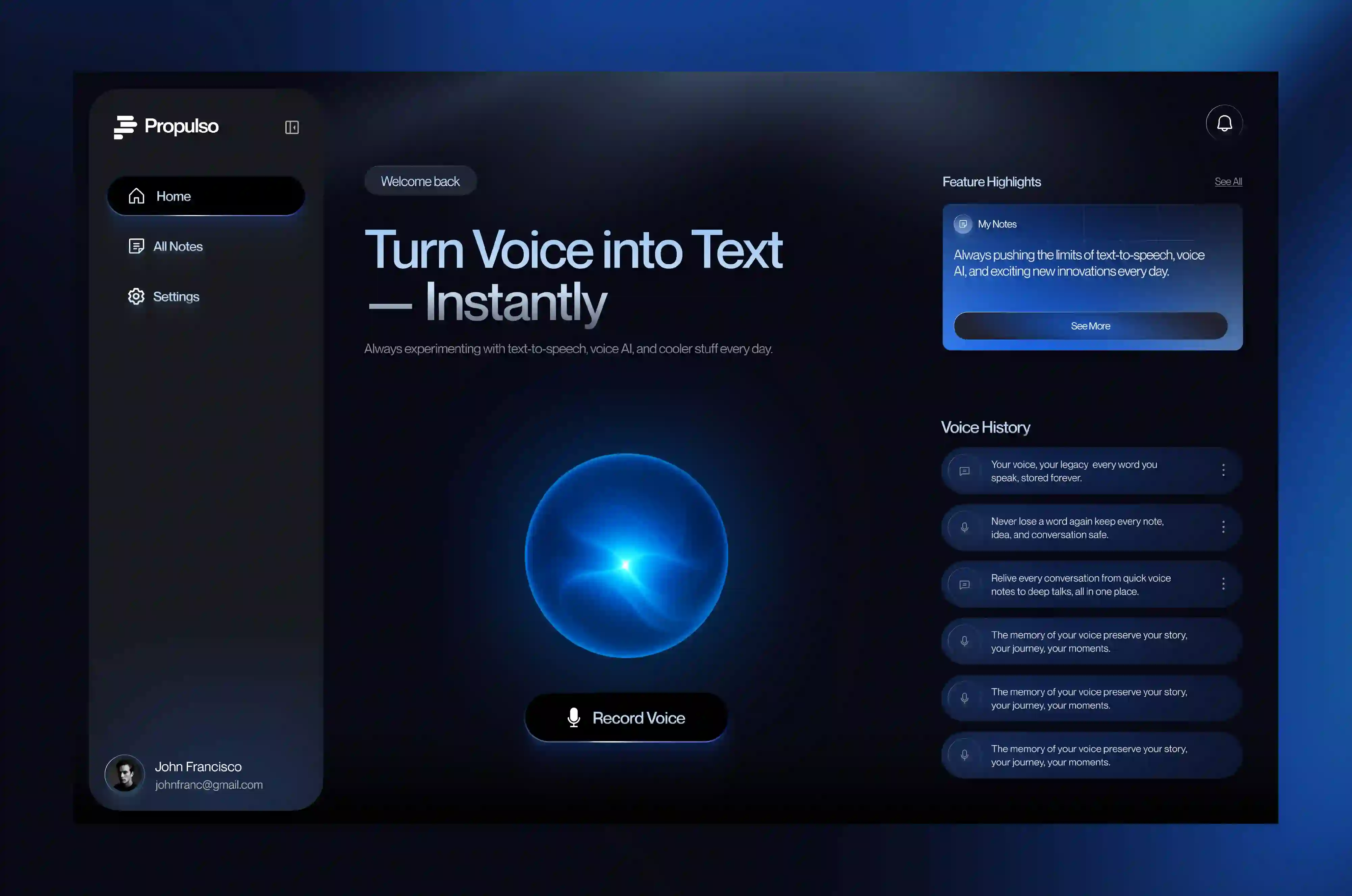
Rated 4.9/5 by 1,200+ Completed Proejects
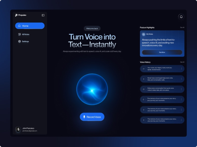
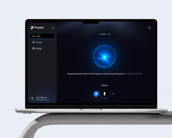
Propulso Designing an AI Voice-to-Text Web App From Idea to Ready-to-Build
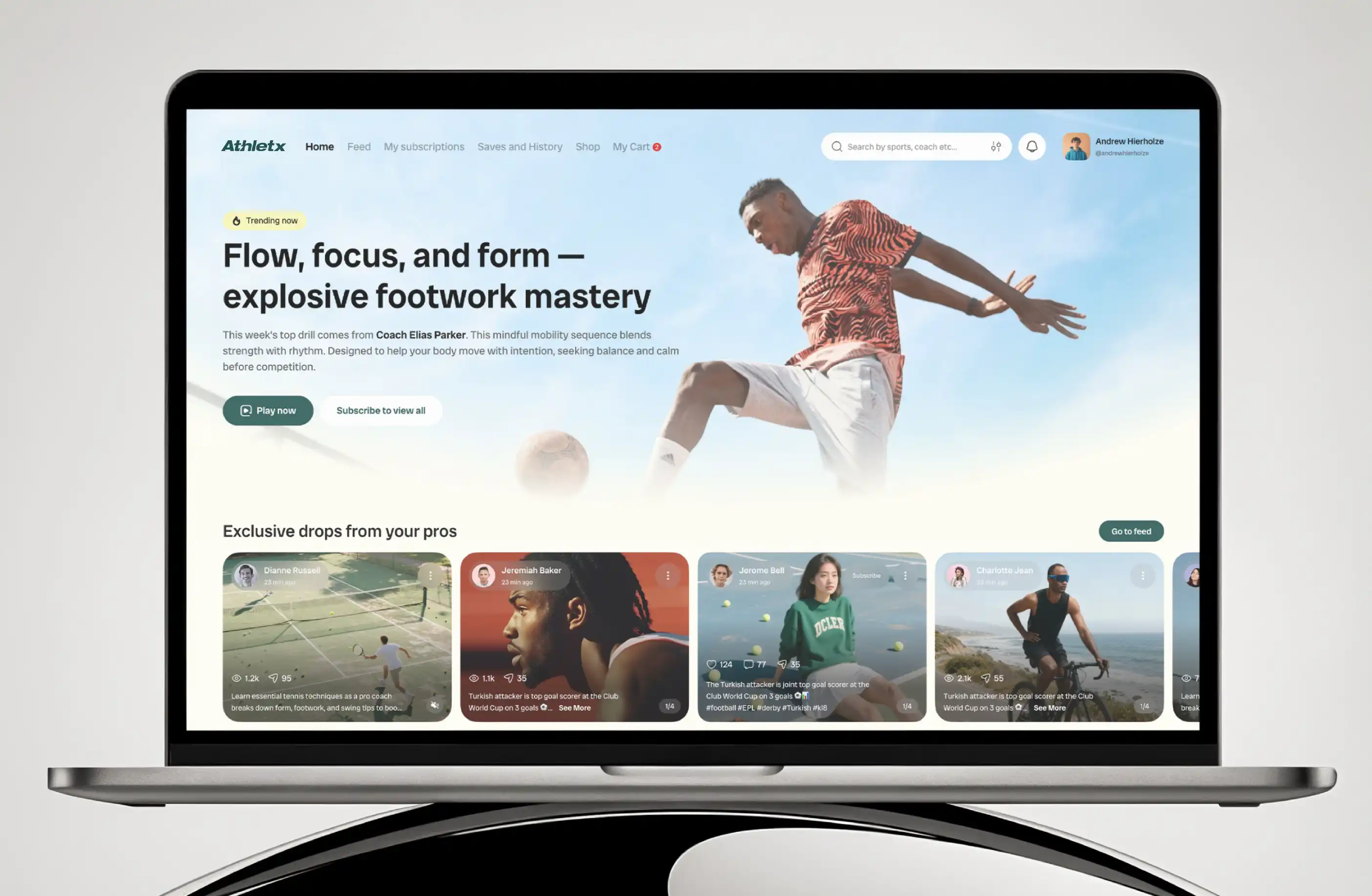
Rated 4.9/5 by 1,200+ Completed Proejects
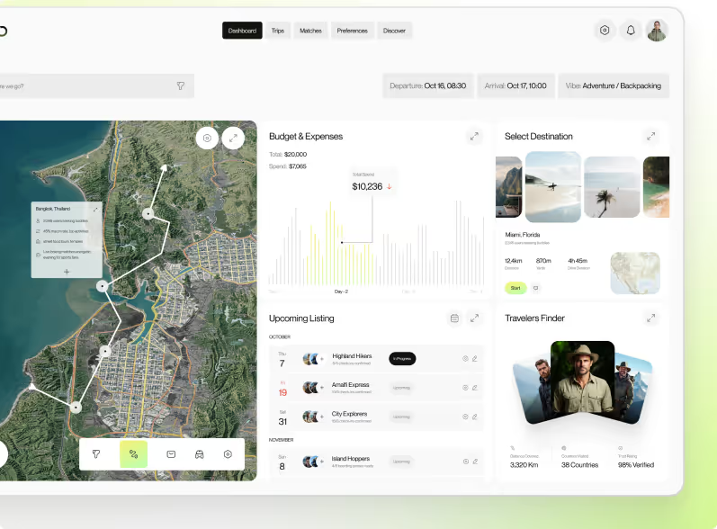
AthleteX Designing a Complete Marketplace and Social Platform for Athletes


Clients Feedback

We Know Your Industry. Not Just Your Product.
Every industry has different users, different trust requirements, and different reasons people drop off. We've designed SaaS products across all of them.
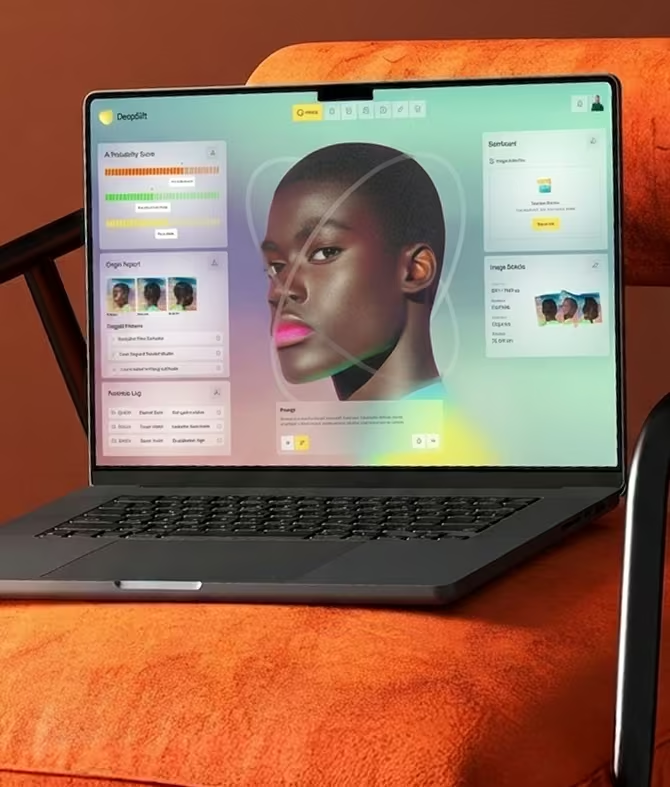
AI & AI-Native SaaS
AI products face a challenge most others don't. They need to feel powerful without feeling complicated. Users need to trust the output before they act on it. We design AI products that make complex functionality feel simple without hiding what makes them useful.
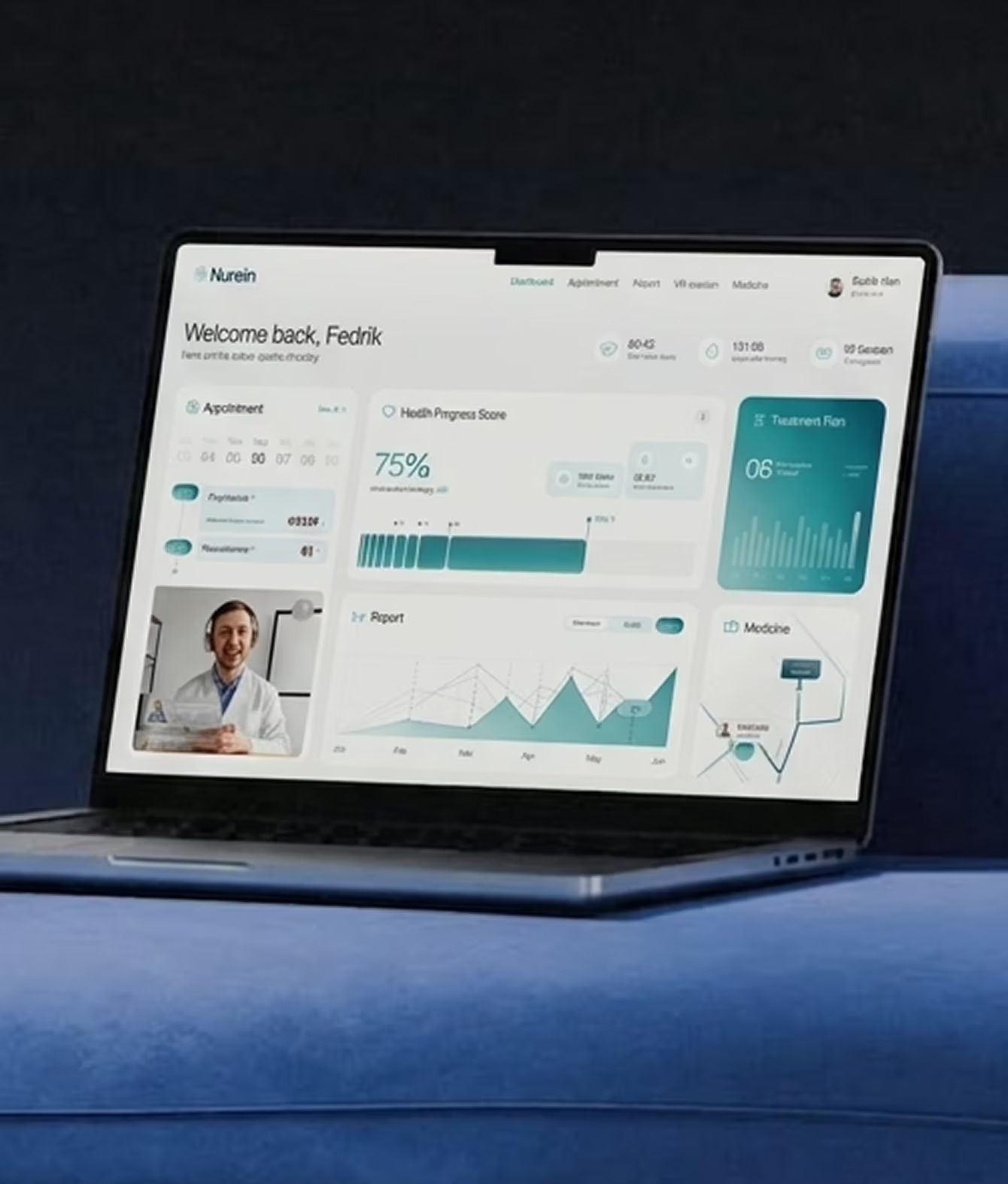
HealthTech & MedTech
Healthcare products carry real weight. Mistakes feel costly. Trust is everything. We design health platforms that feel reliable and clear easy enough for busy clinicians and patients to use without training or support calls.
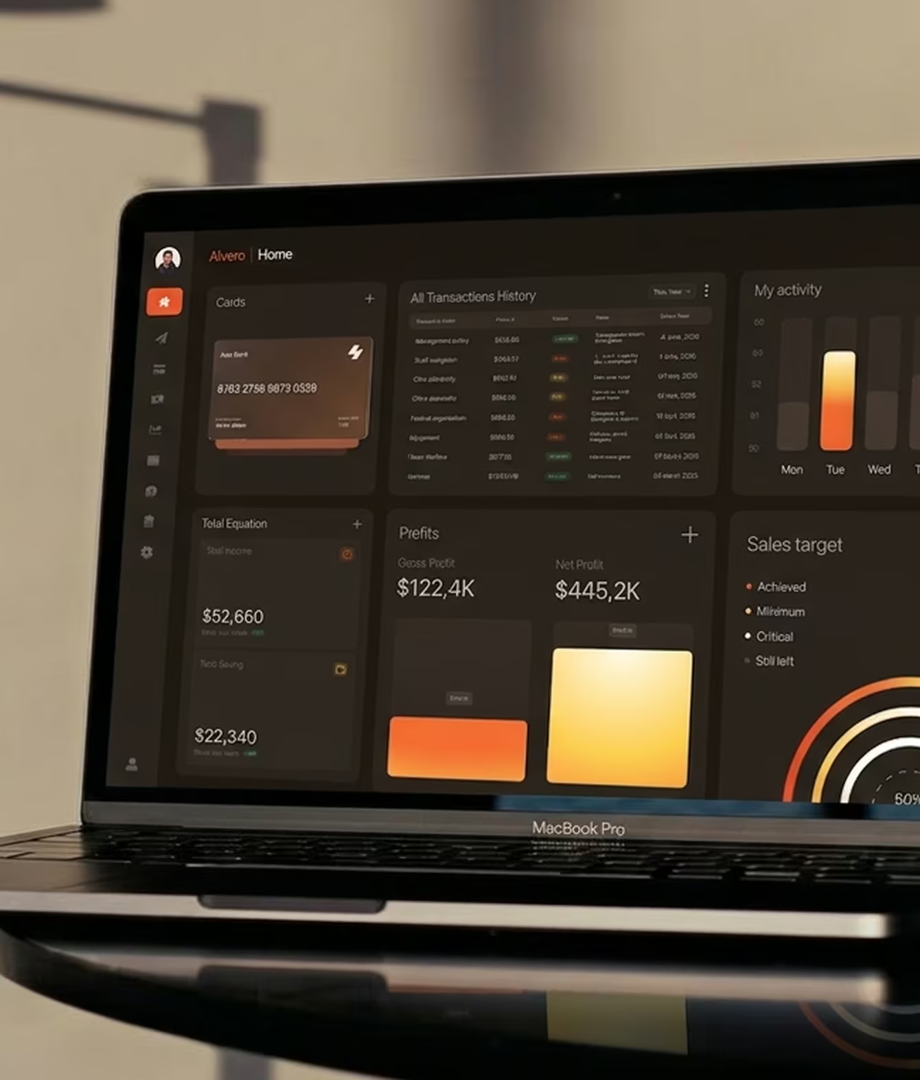
Fintech & Financial SaaS
Money moves fast and trust matters more than anything else. Users decide whether to hand over financial data within seconds. We design fintech products that feel secure, clear, and easy to use — even when the data behind them is complex.
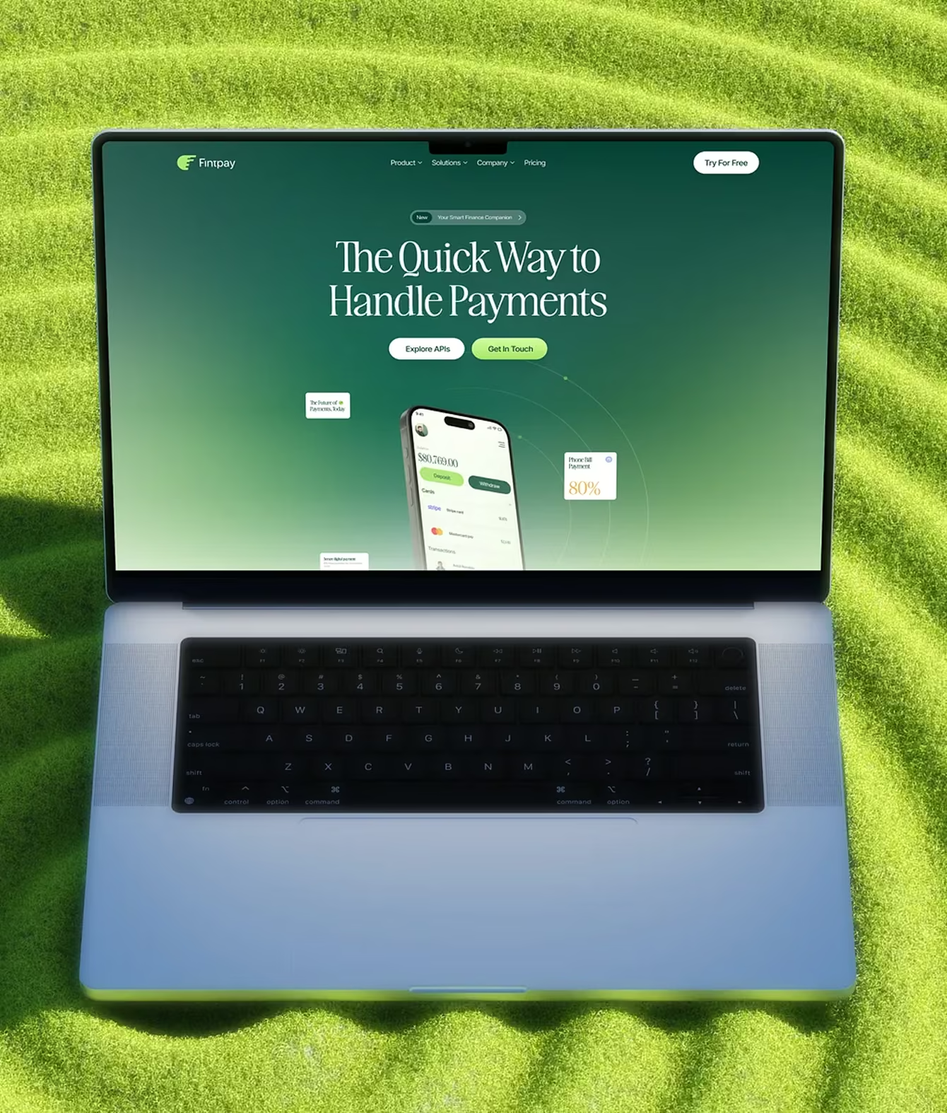
HR Tech & Workforce SaaS
HR tools are used by people who didn't choose to use them. They were assigned to. That means the design has to be so clear that even reluctant users figure it out without any training. We design HR products that people actually want to open.
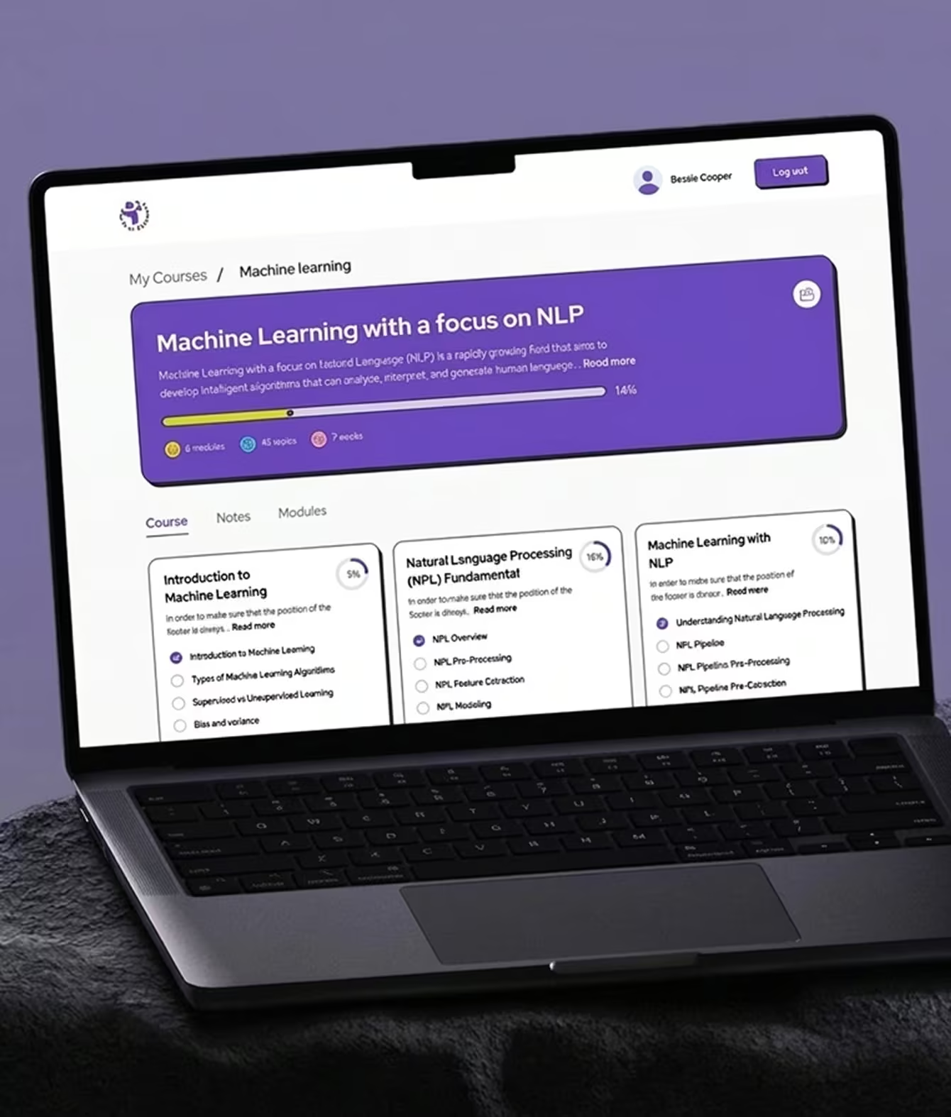
EdTech & Learning Platforms
Learning tools only work if people keep coming back. Friction kills engagement. We design education and learning platforms that make it easy to start, easy to return, and hard to quit.
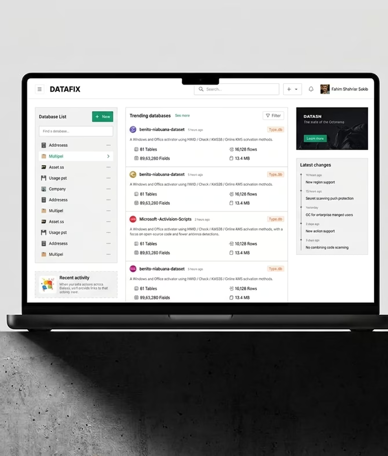
Analytics & Data Platforms
Data products fail when users can't find the insight they came for. We design analytics dashboards and data platforms that show what matters — without burying it under charts nobody reads or numbers nobody understands.
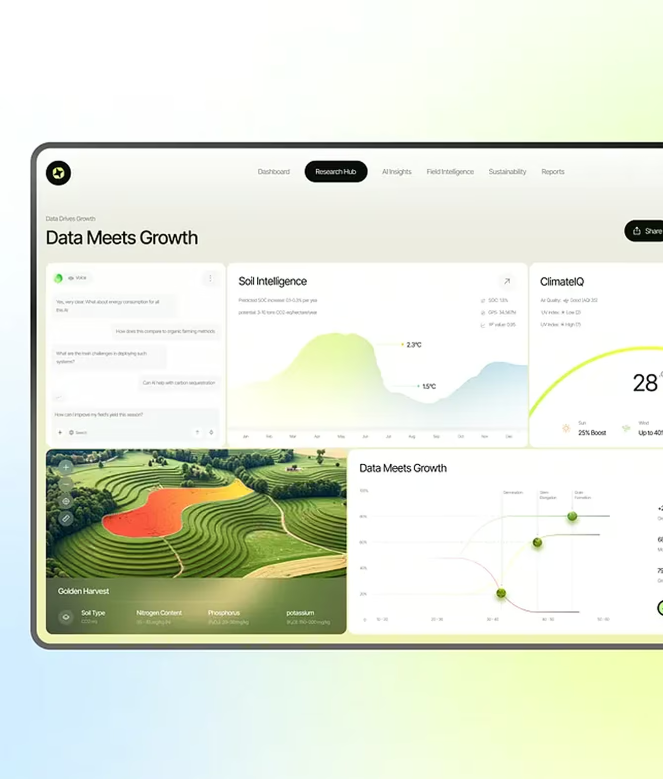
Legal Tech SaaS
Legal professionals are high-value users with zero patience for confusing software. We design legal tech products that respect their time clear workflows, fast navigation, and interfaces that feel as precise as the work they support.
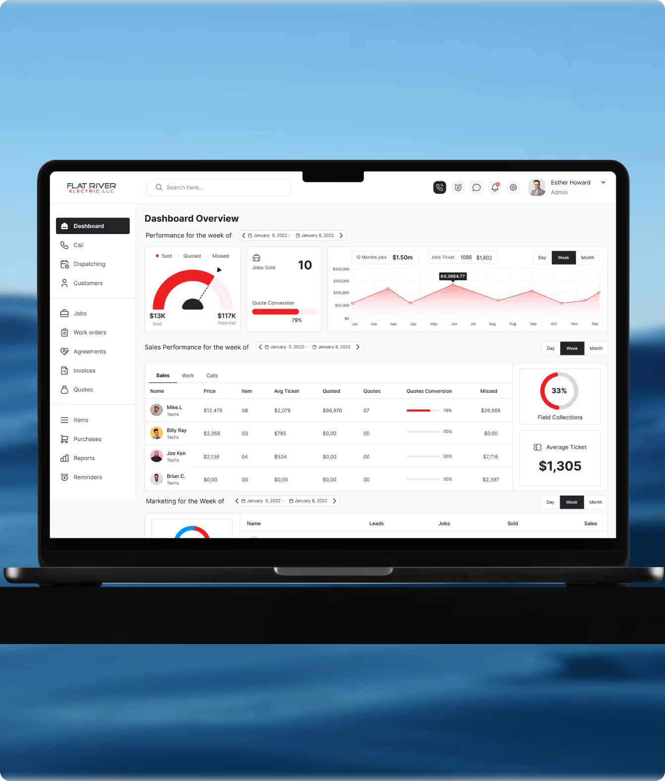
B2B Productivity & Collaboration
B2B tools are used every single day. They need to be fast, predictable, and easy to navigate without thinking. We design productivity tools that get out of the way and let people do their actual work.
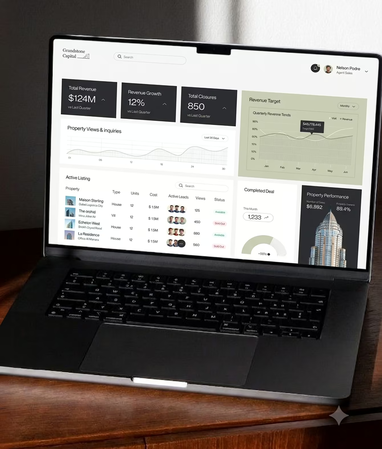
Real Estate & PropTech
Property platforms handle complex data listings, transactions, contracts that need to feel simple to use. We design PropTech products that make the complex feel manageable for both buyers and sellers.
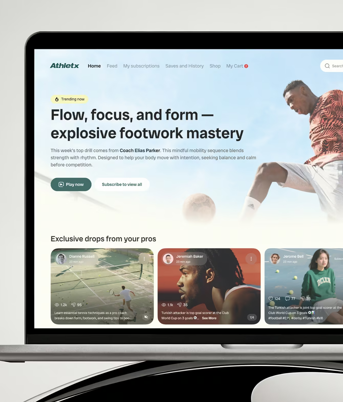
Marketplace & Community
Two-sided platforms have two completely different users with different goals and different reasons to stay. We design marketplaces for both sides at the same time — finding where each type of user gets confused or gives up.
Simple Pricing. No Surprises.
Start free.
Pay only when you're ready to fix
what's broken or build what's next.
We take on 3 new clients per month.
1 spot remaining this month.
If after the first sprint the direction isn't right we redesign it.
No extra charge. No argument.
We review your product or website, audit your data, and tell you exactly what's broken and what to fix first. No pitch. No fluff.
/month
No contracts. No lock-in. Cancel with 30 days notice.

One dedicated expert per month (UX/UI/Motion/Visual/Developer your choice)
2-week/sprint
All 5 services covered
Direct expert access no account manager
Unlimited revisions within each sprint
Month-to-month cancel with 30 days notice
Two dedicated expert per month (UX/UI/Motion/Visual/Developer your choice)
2-week/sprint
All 5 services covered
Direct expert access no account manager
Unlimited revisions within each sprint
Month-to-month cancel with 30 days notice
Questions We Get, Answered Honestly

Yes. Most clients start with one screen or one flow. We find the screen costing you the most users and fix that first. You see the results, then decide if you want to keep going.
Yes. We design inside your existing system. Your colors, your components, your rules. If the system has gaps, we flag them. But we don't override what's already working.
Yes. We design inside your existing system. Your colors, your components, your rules. If the system has gaps, we flag them. But we don't override what's already working.
depends on scope. A single dashboard redesign is 5 to 10 screens. A full web app with onboarding, dashboard, tables, settings, and admin is 30 to 80 screens. We scope it during the free audit so you know exactly what you're paying for before we start.
Both. We can deliver design files your developers build from, or we can build the front-end ourselves. Either way, what was approved is what gets shipped. No gap between design and code.
Figma. Every screen delivered with named layers, proper spacing, responsive breakpoints, and component documentation. Your developers can inspect and export without asking us anything.
We start by understanding what question the user is trying to answer on that screen. Then we design around that question. Most data-heavy screens fail because they try to show everything. We show what matters and let users dig deeper if they want to.
Website design is for your marketing site. The pages visitors see before they sign up. Web app design is for the product itself. The screens users log into and use every day. Different goals, different design approach. We do both, but they're separate services.
.avif)











.svg)
%201.svg)
