.svg)
%201.svg)


From 2021 to 2026 in these years, our team has reviewed hundreds of SaaS dashboard design projects. Startups, mid-market products, enterprise tools, across industries. And the number one thing that kills user engagement is not missing features. It is not bad branding. It is not even pricing.
It is a dashboard that users open, stare at for ten seconds, and quietly close.
They do not complain. They do not file a support ticket. They just stop logging in. And three months later, they churn, leaving you wondering what went wrong.
We know what went wrong. We have seen it too many times. And in this post, we are going to walk you through everything we have gathered from years of hands-on experience designing SaaS dashboards across dozens of live products, so you do not have to learn it the hard way.
This is not a generic SaaS dashboard best practices list. This is what actually happens when real users sit in front of a real SaaS product dashboard design and try to make sense of it.
Read this article about: How Smart SaaS Brands Reduce Churn Before It Destroys Revenue
"Our users are not engaging with the dashboard. What is happening?"
This is one of the first things clients say to us when they come in.
They have built something technically impressive. Charts, graphs, tables, filters, drill-downs- everything is there. The dev team worked hard. The design looks clean at first glance. But users are not using it the way they expected.
Here is what we tell them: your users are not failing. Your dashboard is failing your users.
When 43% of users regularly skip dashboards to do their own analysis in Excel or spreadsheets, that is not a user education problem. That is a design problem. It means your dashboard that users understand has not actually been built yet. The product is showing data, but not delivering an actionable insights dashboard experience that users actually need.
There is a fundamental difference between the two. Data is raw. Insight is what happens when a user looks at your dashboard and immediately knows what to do next. That is what you are designing for. Not the display of information, but the clarity of action.
Why Do Users Find Dashboards Confusing?
We ask this question in almost every client kickoff meeting. And the answers are almost always the same.
"There is too much going on." "I do not know what I am supposed to look at first." "The numbers are there, but I do not know if they are good or bad." "I have to click around too much just to find the one metric I care about."
Sound familiar?
What is happening here is cognitive overload in SaaS UI. Every element on your dashboard, every chart, every number, every label, every color, demands a small amount of mental processing from your user. When too many elements compete for attention at once, the brain does not prioritize. It shuts down. The user gives up.
Working memory and dashboard design are directly connected. Cognitive load theory tells us that human working memory can only hold three to five pieces of information at a time. When your dashboard throws thirty widgets at a user the moment they log in, you are not empowering them. You are exhausting them.
We call this the data vomit dashboard problem internally. Everything is technically there. Nothing is actually useful.
The fix is not removing features. The fix is designing for attention. And that starts with understanding who is actually sitting in front of your dashboard.
Who Is Your User, Really?
Here is a question we ask every single client before we touch a single screen: who will actually use this dashboard, and what decision are they trying to make when they open it?
Not "what data do we have." Not "what do stakeholders want to see." What decision does this specific person need to make, today, in the next five minutes?
This is the most important question in dashboard UX design. And most teams skip it.
The reason this matters is that different users have completely different user mental model dashboard expectations. An executive opening your dashboard at 8 am wants to know one thing: is the business healthy right now? They do not want filters. They do not want drill-downs. They want a number and a direction, up or down.
A product manager wants to know: which features are being used, which are not, and where are users dropping off? They need comparison views, date ranges, and the ability to dig deeper.
A customer success manager wants to know: which accounts are at risk right now, and what should I do about it?
Same product. Three completely different people. Three completely different dashboards, or at least three completely different default views.
This is what role-based dashboard design means. It is not about restricting access. It is about surfacing the right information to the right person without making them hunt for it. A truly user-centered dashboard design puts the right data in front of the right person before they even have to ask. When we build role-based dashboards for our clients, user activation through dashboard metrics consistently improves because users open the product and immediately see what they came for.
Goal-based navigation UX plays a big role here too. When the dashboard is structured around what users are trying to achieve, rather than what data the system has, navigation starts to feel invisible. Users do not think about how to find things. They just find them.
What Should You Show First on a SaaS Dashboard?
We have a rule we use with every client: the most important metric goes top-left primary metric placement, always.
This is not arbitrary. Users in Western cultures naturally scan screens in an F-pattern scanning dashboard layout, eyes go top-left first, then across, then down. There is also a Z-pattern scanning dashboard behavior on simpler, less dense screens. Whatever you put in that top-left position is what your user sees first. It should be the single most critical piece of information for that user's role.
For an executive, that might be MRR or churn rate. For a marketing manager, it might be leads generated this week. For a support team, it might be open tickets right now. This is also where your north star metric dashboard thinking comes in. Every dashboard should have one primary number that answers the most important question for that user type.
Beyond placement, you need to answer the five-second rule UX dashboard test: within five seconds of opening your dashboard, a user should understand at least one key insight. Not five insights. Not a summary of everything. One thing that tells them the current state of what they care about most.
If users are squinting, scrolling, or mentally translating numbers before they understand anything, you have already lost them.
We test this with every dashboard we build. We put a real user in front of the screen, set a timer, and ask: "What does this dashboard tell you?" If they cannot answer confidently in five seconds, something is wrong with the hierarchy, not with the user.
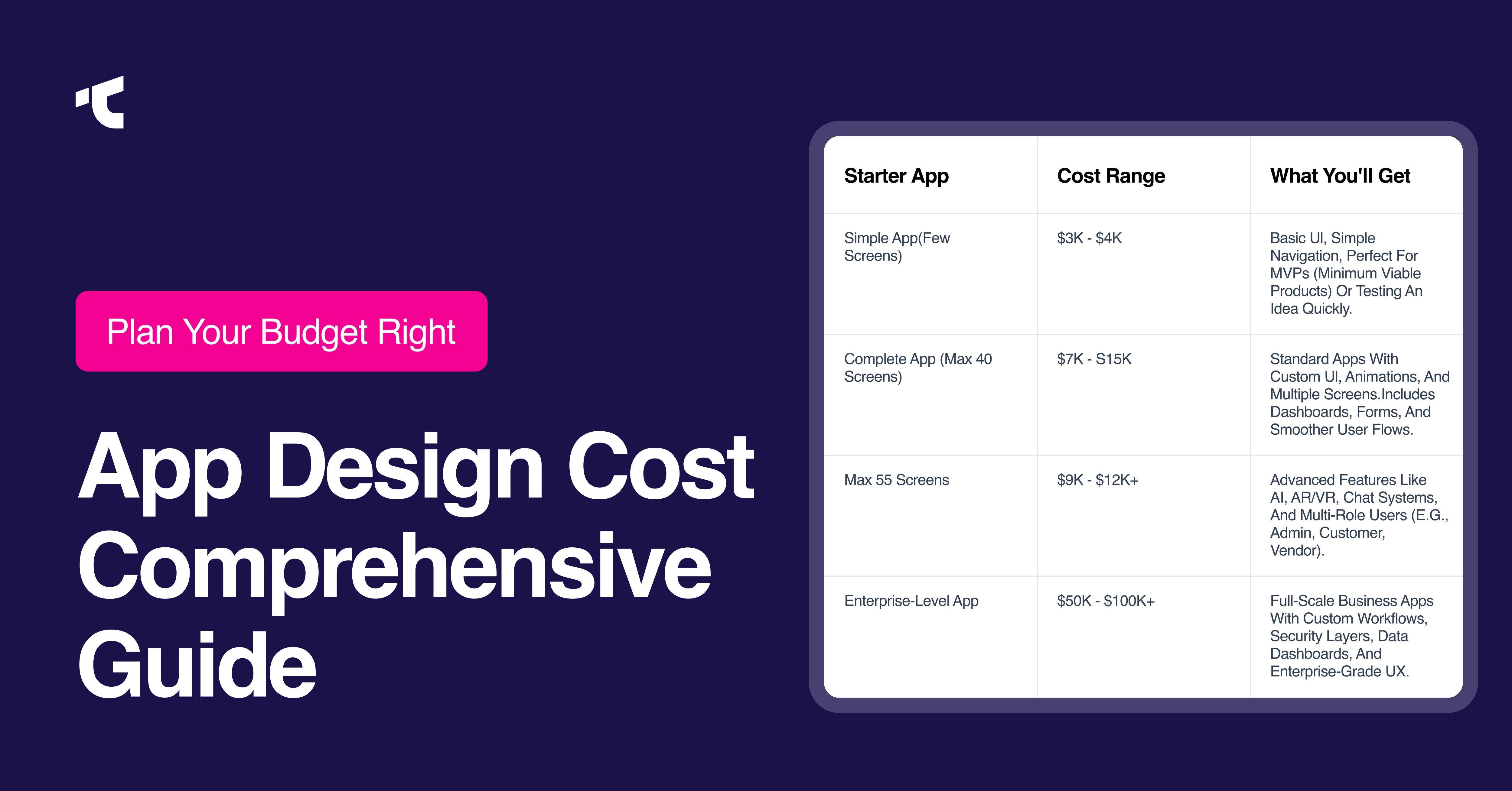
How Many KPIs Should a SaaS Dashboard Show?
Clients always ask us this. And the honest answer is: fewer than you think.
The most effective KPI dashboard layout shows between five and nine core elements on the primary view. Not because that is a magic number, but because that is what users can actually process without feeling overwhelmed.
Every metric you add to your dashboard has a cost. It takes up visual space, it demands attention, and it competes with everything else on the screen. Dashboard clutter reduction is not about making things look pretty. It is about protecting your user's attention. If everything is highlighted, nothing is.
Our process is straightforward. We ask clients to list every metric they want to show. Then we ask: if a user can only look at three things today, what are they? Those three go on the primary view. Everything else gets organized into secondary views, drill-downs, or role-specific tabs. This is a core part of data density vs clarity thinking. More data on screen does not mean more value. It usually means less.
This is not minimalism for the sake of aesthetics. It is information hierarchy dashboard thinking. You are building a hierarchy of importance, and you are doing the cognitive work for your user so they do not have to.
What Is Progressive Disclosure in Dashboard Design, and Why Does It Matter?
Progressive disclosure UX is one of the most powerful techniques in B2B SaaS dashboard design, and one of the most underused.
The idea is simple: do not show everything at once. Show users the most important information first, and reveal deeper layers only when they ask for them. Hide advanced features dashboard behind expandable sections, tabs, or "view details" links rather than forcing them onto the primary screen.
Think about how Stripe's dashboard works. When you log in, you see your total volume and net revenue. That is it. If you want to dig into failed payments, gross volume by product, or individual transaction history, it is all one click away. But it is not in your face the moment you open the app.
This approach does two things. First, it reduces extraneous cognitive load UX on the primary view. Second, it gives power users the depth they need without overwhelming everyone else.
Self-service analytics dashboard design relies heavily on this principle. When users can explore data on their own terms, going deeper when they want and staying high-level when they do not, the product feels both powerful and approachable at the same time.
Drill-down dashboard design is the practical implementation of this. Summary cards that expand on click, collapsible sections, clickable chart segments that reveal breakdowns, and "view all" options rather than showing every row by default. Each of these gives users control over how deep they go.
When our team introduced progressive disclosure in a dashboard redesign for one of our clients in the project management space, average session time on the dashboard increased and support tickets about "confusing interface" dropped significantly within 90 days.
Why Do Users Ignore Dashboards?
You have built the dashboard. You have shipped it. Users log in, click around for a minute, and then go straight to their spreadsheets. Sound familiar?
Here is what is actually happening.
When users bypass your dashboard to do their own analysis in Excel, they are sending you a very clear signal: your dashboard not driving user engagement problem is a design problem, not a user behavior problem. So they go somewhere they can get answers on their own terms.
There are three main reasons users abandon dashboards.
The first is that the data is there, but the insight is missing. Raw numbers without context do not help anyone make decisions. If your dashboard shows a number but does not tell the user whether that number is good, bad, or trending in the wrong direction, they have to do that mental work themselves. And most of them will not bother.
The second reason is that dashboard users do not understand the data because the layout does not match the way they think about the problem. Users come to a dashboard with a question in their head. If the structure does not match their mental model, they cannot find their answer quickly, even if the data is technically there.
The third reason is users not engage with the dashboard because it tries to serve everyone, so it serves no one particularly well. A single universal dashboard built for all user roles will always feel slightly wrong to every user. Too much noise for some. Not enough depth for others.
The solution to all three is the same: design for decisions, not for data. Ask what question each user type is trying to answer, build the layout around that question, and strip out everything that does not contribute to the answer. This is what decision-driven dashboard design actually means in practice.
How to Fix a Confusing SaaS Dashboard?
If users not engaging with the dashboard is a pattern you are seeing, or if your data shows low engagement, high export behavior, or short session times, here is how we approach a dashboard redesign with clients.
We start with a single question: what is this dashboard responsible for? Not what does it show, but what job is it doing? Every dashboard should have one primary storyline. Not five. Not ten. One.
From there, we run a visual hierarchy in a dashboard audit. We look at every element on the screen and ask: does this help the target user answer their primary question faster? If yes, it stays. If no, it gets moved to a secondary view or removed entirely.
We also look at information hierarchy and dashboard structure across the full page. Primary insights go top-left, large, and prominent. Supporting data sits below or to the right, smaller and secondary. Tertiary details go inside drill-downs or expandable sections. When these three layers are clear, users do not feel overwhelmed. They feel guided.
Then we look at grouping. Elements that belong together should look like they belong together. Whitespace in dashboard design is not wasted space. It is a signal that says "this section is one thing, and this section is another." Clear visual groupings create instant order. Users process sections far faster than scattered, unrelated components.
Finally, we test it. Not with stakeholders. Not with the product team. With actual users. Real dashboard usability testing tells you more in thirty minutes than a week of internal review.
What Is the Difference Between a Dashboard and a Report?
This comes up more than you would think. Clients sometimes come to us wanting a dashboard when what they actually need is a report. Getting this wrong wastes significant time and budget.
A SaaS dashboard is an interactive, real-time data display SaaS interface. It shows live KPIs, visual charts, and filters that allow users to explore data and respond to changes immediately. It is built for ongoing monitoring and decision-making. Users interact with it regularly, daily or even multiple times a day.
A report is a generated summary of historical performance. It is detailed, documented, and often exported as a PDF, spreadsheet, or presentation. It is built for a specific moment in time, a weekly review, a board meeting, a quarterly analysis.
The key question is: does the user need to act on this information right now, or do they need to analyze it later? If the answer is "act now," build a dashboard. If the answer is "analyze and present later," build a report.
Many products need both. But they should not look the same, and they should not be designed with the same goals in mind. A simple dashboard vs data-heavy dashboard decision also matters here. Not every product needs the full analytical depth. Sometimes a clean, simple view with five key metrics does more for time-to-value dashboard UX than a feature-rich reporting suite.
Operational vs Analytical vs Strategic Dashboard: Which One Does Your Product Need?
One thing we always clarify with clients early in the process is dashboard type, because designing the wrong type for your users is one of the fastest ways to guarantee low engagement.
Operational dashboards are built for real-time monitoring. The users are checking active metrics that change frequently, open support tickets, live transactions, and current system status. These dashboards prioritize speed and clarity over depth.
Analytical dashboards are built for exploration. The users are data analysts, product managers, or growth teams who need to investigate trends, compare performance across time periods, and dig into the reasons behind the numbers. These dashboards need robust filtering, drill-down capabilities, date range selectors, and comparison tools. Filter and navigation dashboard UX needs to be exceptionally clear here, because the user is actively exploring, not just reading.
Strategic dashboards are built for executive decision-making. The users are leaders who need to understand business health at a glance. These dashboards should show big numbers, simple visuals, minimal clutter, and comparison indicators in dashboard design, like "up 12% vs last quarter." They are not built for exploration. They are built for confidence. This is the classic dashboard for executives vs analysts distinction, and it matters enormously.
Most SaaS products serve multiple user types, which means they may need multiple dashboard views. Not multiple separate dashboards, but context-sensitive layouts that adapt to who is looking.
How to Design a Dashboard for Non-Technical Users
This is one of the most common briefs we receive. The product is powerful. The data is valuable. But the end users are not data analysts. They are business owners, operations managers, or team leads who just want answers.
Designing for non-technical users is not about dumbing the product down. It is about removing the translation layer between the data and the insight.
The first principle is context. A number without context is meaningless. If your dashboard shows "347," that means nothing. "347 active users, up 12% from last week" is immediately understandable. Always show the number, the direction, and the benchmark, whether that is a previous period, a goal, or an industry average.
The second principle is familiar patterns. Jakob's Law dashboard design tells us that users expect your product to work like other products they already know. Similarly, Hick's Law menu design reminds us that more choices slow decisions down. Streamline your menus, reduce your filter options, and lean into familiar dashboard layout patterns to reduce the learning curve. Design system consistency dashboard is what makes this work at scale. When every component looks and behaves predictably, users spend less mental energy figuring out the interface and more energy on the actual data.
The third principle is plain language. Avoid internal jargon in labels, tooltips, and chart titles. Your users should never have to Google what a chart title means.
And always add tooltip design dashboard elements. A small "?" icon next to a metric that explains what it measures and why it matters costs almost nothing in development. For non-technical users, it is the difference between confidence and confusion. Good color coding in data visualization also helps here. Green for healthy, red for at-risk, amber for warning. Consistent color logic means users learn the system once and read it instantly forever.
What Does Good Dashboard Performance Actually Mean?
We need to talk about something that does not get enough attention in dashboard design guide conversations: speed.
Dashboard load time UX is not a technical concern. It is a user experience concern. When a dashboard takes more than two or three seconds to load, users start to distrust the product. In 2025, fast feels professional. Slow feels broken. Performance is part of the experience, not separate from it.
Skeleton loaders in dashboard design are one of the best tools we have here. Instead of showing a blank or spinning screen while data loads, skeleton loaders show the shape of the content that is coming. Users understand the layout immediately, and the perceived wait time drops significantly. It is a small detail that has a measurable impact on how users feel about the product.
Responsive dashboard design is equally non-negotiable. Your users are not always sitting at a 27-inch monitor. They are checking numbers on a phone between meetings, glancing at KPIs on a tablet, or opening the product on a laptop with a smaller screen. A mobile-friendly SaaS dashboard is not a nice-to-have. It is table stakes. If the experience breaks on a smaller screen, you are losing engagement from users who would otherwise check in regularly.
A responsive grid system dashboard layout is how we solve this technically. A well-structured grid adapts components fluidly across screen sizes rather than forcing a desktop layout onto a mobile screen.
Dashboard Personalization and the Future of SaaS Dashboard UX
One trend we are watching closely with our clients is dashboard personalization UX. Users increasingly expect the product to feel like it was built for them specifically, not just for their role category.
This can be as simple as letting users pin their most-used metrics to the top, choose their preferred chart type, or reorder widgets by drag and drop. Modular dashboard design and widget-based dashboard layout make this possible without requiring separate builds for every user type.
The card-based UI layout dashboard is the most common implementation we use. Each metric or data group lives in its own card. Cards can be rearranged, minimized, or expanded. Users feel in control. And when users feel in control, product stickiness through dashboard UX goes up.
For product-led growth dashboard strategies specifically, personalization is a direct driver of activation and retention. When users log in and see a dashboard that reflects their own goals and priorities, the product immediately feels more valuable. That first impression matters enormously for time-to-first-useful-insight dashboard performance, which is one of the strongest predictors of whether a new user will stick around.
AI-assisted dashboard natural language query is the next frontier here. Products that let users type a question and get a direct answer from the dashboard, rather than building their own filter combinations, are dramatically reducing the barrier to insight for non-technical users. We are already integrating early versions of this into client projects, and the engagement data is compelling.
How to Validate Your Dashboard Design With Users
We cannot overstate this enough: internal review is not validation. Watching your own team use the dashboard is not validation. You need real users.
The process does not have to be complicated. We typically run a simple five-task dashboard usability testing session with five to eight real users. We give them tasks that mirror their actual workflow: "find out which feature had the lowest engagement last month," "check whether you are on track to hit your target this quarter," and we watch without guiding them.
We are not looking for opinions. We are looking for behavior. Where do they hesitate? Where do they click the wrong thing? Where do they look for something and not find it? That is where the design is failing.
One thing we have learned across dozens of these tests: the visual hierarchy in dashboard problems reveals itself within the first thirty seconds. If a user cannot identify the most important metric on the screen within five seconds, it is almost always a hierarchy issue, competing element sizes, unclear groupings, or a color scheme that does not guide the eye.
After the test, we prioritize fixes by frequency of failure. If three out of five users struggled with the same thing, that is the first thing we fix. We do not debate it. We fix it, test again, and iterate.
The Most Common SaaS Dashboard Design Mistakes We See
After years of working on B2B SaaS dashboard UX across industries, these are the common SaaS dashboard UX mistakes we encounter most often.
Showing everything at once. This is the most damaging mistake, and it comes from good intentions. Teams want users to have access to all the data. But access is not the same as clarity. Cramming twenty widgets above the fold does not make the product more powerful. It makes it more confusing. Dashboard design mistakes to avoid start here.
Not providing context for numbers. A metric without context forces the user to do interpretive work on your behalf. That is not their job. Your dashboard should tell users not just what the number is, but what it means.
Using the wrong chart type. Bar chart vs pie chart for dashboards: bar charts win almost every time for comparison. Humans interpret bar length 3-4 times faster than they interpret angles. Line charts are the go-to for trends over time. Scatter plots are for correlation. Using the wrong chart type is a subtle but significant friction point.
Designing for desktop only. If your users check the dashboard on mobile and the experience falls apart on a smaller screen, you are creating unnecessary friction and losing engagement.
Building one dashboard for all users. A single dashboard that tries to serve everyone serves no one well. Role-based vs universal dashboard design is not a debate. Role-based wins for engagement, every time.
Ignoring empty state dashboard design. Every dashboard has a moment before the data loads, or before a user has done anything. That empty state is an opportunity. If you show a blank screen with no guidance, new users will feel lost. A well-designed empty state tells users what to do next.
Not thinking about anomaly detection dashboard UX. Users should not have to stare at charts to spot problems. A well-designed dashboard flags anomalies, highlights trends that are moving in the wrong direction, and surfaces risks before users have to go looking for them.
What Good SaaS Dashboard UX Actually Looks Like
We want to leave you with something concrete.
A well-designed intuitive SaaS dashboard answers the user's primary question within five seconds. It uses visual hierarchy in dashboard layout to surface the most important metric first. It uses progressive disclosure UX to hide secondary details until users ask for them. It gives context to every number so users know whether they should be concerned or confident. It adapts to different user roles so everyone sees what is relevant to them. It loads fast because slow feels broken. It works on mobile because your users do not only work at desks. And it is tested with real users, not assumed to work.
The dashboards that retain users are the ones that answer one question fast, not the ones that answer twenty questions slowly.
That is the standard we hold ourselves to in every project. Not "does this look good?" but "does this help the right person make the right decision in the shortest amount of time?"
If your current dashboard is not meeting that standard, if users are disengaged, exports are high, or churn is creeping up, the problem almost certainly lives in your dashboard UX design. And it is almost always fixable.
Frequently Asked Questions
What makes a good SaaS dashboard?
A good SaaS dashboard answers the user's primary question within five seconds, surfaces the most critical metric first, provides context for every number, and adapts to different user roles. It reduces cognitive load rather than adding to it.
How many KPIs should a SaaS dashboard show?
Most high-performing dashboards show between five and nine core elements on the primary view. Additional metrics should be accessible through drill-down views, not displayed upfront by default.
What is the five-second rule in UX?
Within five seconds of opening a dashboard, a user should understand at least one key insight. If they need to scroll, squint, or ask questions to understand anything, the design needs simplification.
What is progressive disclosure in dashboard design?
Progressive disclosure is the practice of showing users the most critical information first, and revealing deeper layers of data only when they actively request them. It reduces cognitive load on the primary view while preserving depth for power users.
What is the difference between a dashboard and a report?
A dashboard is a real-time, interactive interface built for ongoing monitoring and decision-making. A report is a generated summary of historical data built for analysis and presentation. If the user needs to act now, build a dashboard. If they need to analyze later, build a report.
How do you design a dashboard for non-technical users?
Prioritize context over raw numbers, use familiar layout patterns, write in plain language, avoid internal jargon, and add tooltips that explain what each metric measures and why it matters.
Why do users skip dashboards and go to spreadsheets instead?
It is almost always a signal that the dashboard is not answering users' questions fast enough or in the format they think in. The fix is designing around the specific decisions users need to make, not around the data available.
How do you validate a dashboard design before shipping?
Run a simple usability test with five to eight real users. Give them real tasks that mirror their actual workflow. Watch where they hesitate, where they click the wrong thing, and where they get lost. Prioritize fixes by frequency of failure.
What is role-based dashboard design?
Role-based dashboard design means surfacing different default views, metrics, and layouts based on the user's role in the product. An executive, a product manager, and a customer success manager all need different information by default, even if they have access to the same underlying data.
How do you reduce cognitive load in a dashboard?
Limit the primary view to five to nine core elements, use progressive disclosure for secondary data, group related elements visually, use whitespace generously between sections, and always provide context for numbers rather than showing raw figures alone.
What is the difference between operational and analytical dashboards?
Operational dashboards are built for real-time monitoring of live metrics. Analytical dashboards are built for exploration, trend analysis, and historical comparison. They serve different user types and should be designed with different layouts, depths, and interaction patterns.
How should data be organized in a SaaS dashboard?
Data should be organized around user goals, not around the data structure of the product. The most important metric for the user's role goes top-left. Supporting data sits below. Deep-dive details go inside drill-downs or secondary views. Context and comparison indicators sit alongside every primary number.


.avif)