.svg)

.svg)
%201.svg)

Bad UX in SaaS refers to design decisions that confuse, frustrate, or mislead users, leading to higher churn, lower activation rates, and lost revenue. Common bad UX examples include cluttered interfaces, hidden costs, notification overload, and broken navigation that fails to guide users through core workflows.
Most SaaS founders obsess over features. They build, ship, and iterate on functionality, then wonder why users churn after the first week. The answer, more often than not, is bad UX.
Poor user experience is not just a design problem. It is a business problem. Research from Forrester shows that every $1 invested in UX returns between $2 and $100. On the flip side, bad UX design drives users away before they ever see the value of your product. Trial-to-paid conversion drops. Activation stalls. Churn climbs.
This post breaks down 17 real-world examples of bad UX from well-known SaaS and consumer products. Each example comes with a clear lesson for founders building software today.
Table of Contents
- What Is Bad UX and Why Does It Destroy SaaS Growth?
- 17 Bad UX Examples SaaS Founders Should Study
- Why SaaS Products Fail at UX
- Common Bad UX Patterns in Onboarding and Dashboards
- Frequently Asked Questions
- Final Thoughts
What Is Bad UX and Why Does It Destroy SaaS Growth?
Bad UX happens when a product's design fails to meet user needs. It creates confusion, adds unnecessary steps, and leaves users unsure about what to do next. Examples of bad UX design include cluttered interfaces, misleading labels, hidden fees, and inaccessible navigation menus.
For SaaS businesses, bad UX has a direct cost. A user who cannot figure out your onboarding flow will not convert. A user who finds your dashboard overwhelming will cancel their subscription. According to the Baymard Institute, 69.8% of online shopping carts are abandoned, often due to poor UI design and confusing navigation. The stakes in SaaS are just as high.
The good news? Most bad UX is preventable. Learning from real-world bad UX examples is one of the fastest ways to build a better product.
17 Bad UX Examples SaaS Founders Should Study
1. Microsoft Teams: The Cluttered, Overwhelming Interface

Microsoft Teams packs too many features into one screen. New users face channels, tabs, activity feeds, and settings all at once. The cognitive load is enormous. Instead of guiding users toward value, Teams overwhelm them from the start. A minimalist approach with progressive disclosure would have helped users find their footing faster.
2. WhatsApp: The Misleading "Delete for Everyone" Feature
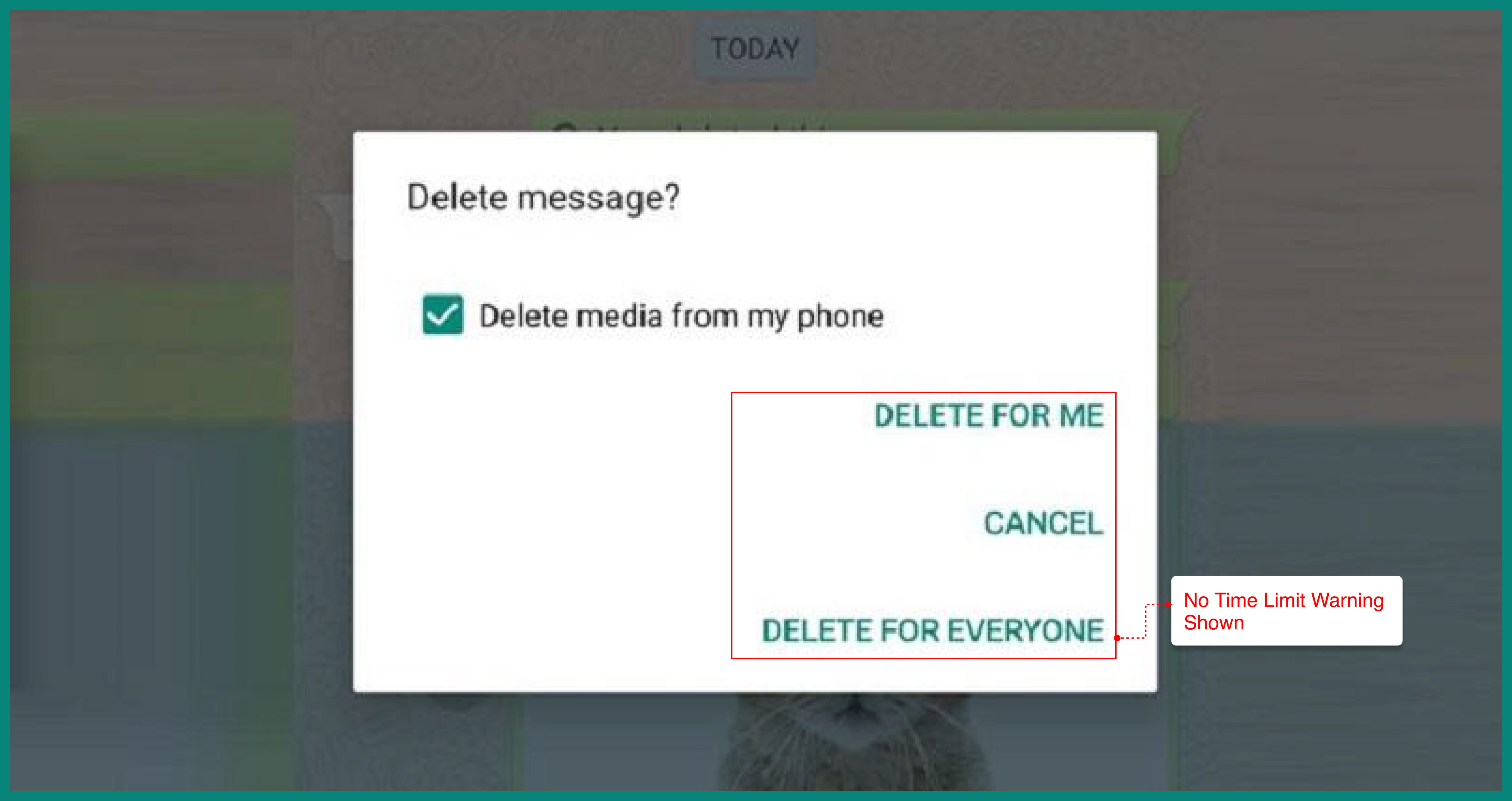
WhatsApp introduced "Delete for Everyone" but failed to communicate its limitations. Messages could only be deleted within a short window, and notification previews sometimes remained on the recipient's device. Users thought they were erasing messages permanently. Misleading error messages and unclear feature labeling create serious trust issues.
3. Ryanair: Dark Pattern Checkout and Hidden Fees
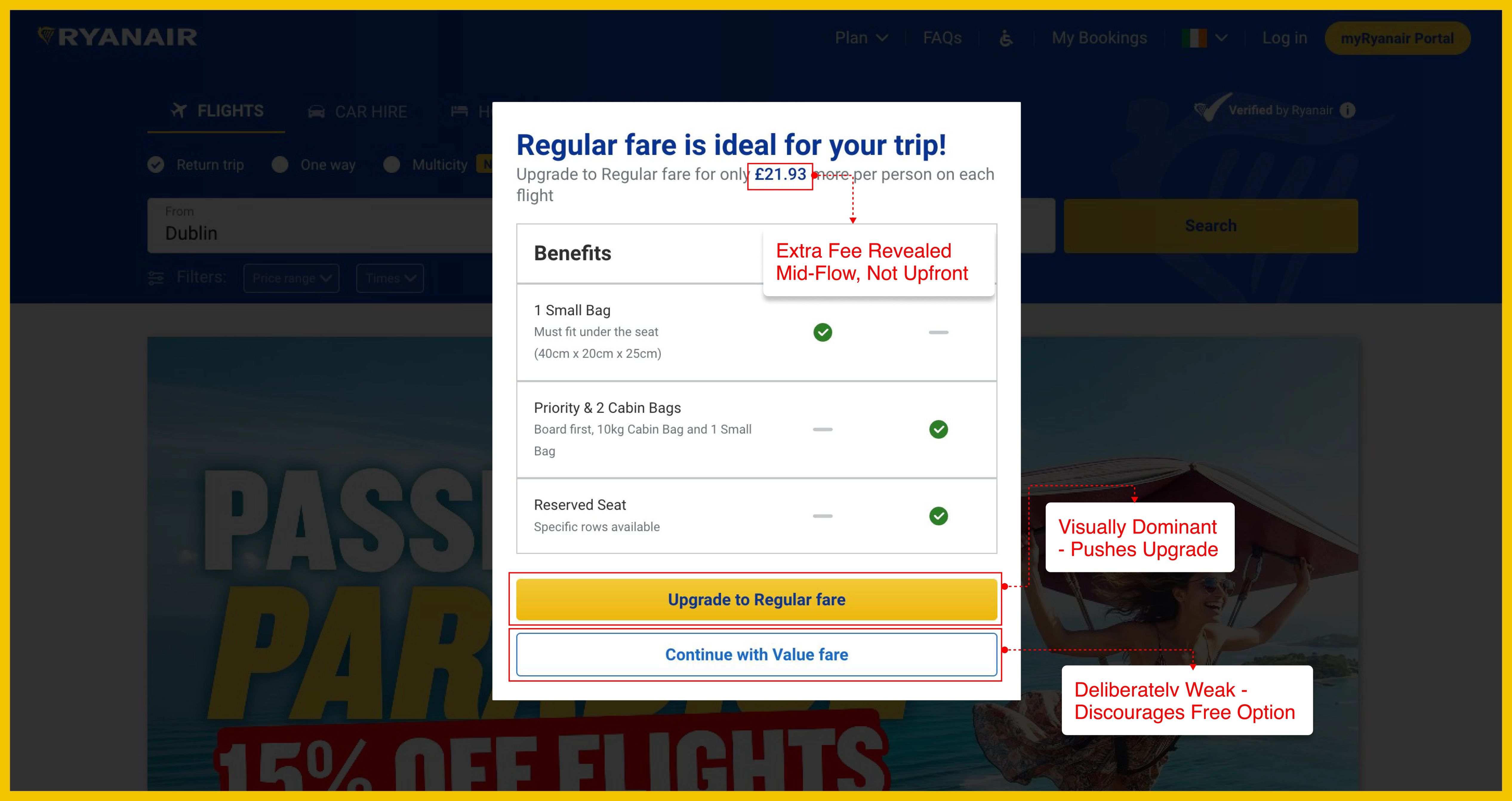
Ryanair is one of the most cited examples of bad UX design in eCommerce. Pre-selected add-ons, confusing seat selection flows, and fees revealed only at checkout are classic dark patterns. These tactics increase short-term revenue but damage user trust and satisfaction over time.
4. Netflix: Unwanted Autoplay Behavior

Netflix autoplays trailers and next episodes without asking users. While Netflix intended this to reduce decision fatigue, many users found it disruptive and annoying. Removing user control is a common UX mistake. Users need to feel in charge of their own experience.
5. Workday: Repetitive, Friction-Heavy Job Application Flow

Workday's job application process is a textbook example of poor UX in enterprise software. Applicants upload a resume, then manually re-enter the same information into individual form fields. The flow is repetitive, time-consuming, and frustrating. This type of unnecessary friction drives candidates away before they even complete their application.
6. Facebook Ads Manager: Confusing UI and Privacy Settings

Facebook's Ads Manager has long been criticized for its complex navigation and cluttered interface. Campaign structures, ad sets, and reporting tools are buried inside menus that confuse even experienced marketers. Facebook's privacy settings face similar criticism, account settings are scattered and deliberately hard to find. This is a bad UX design example where business incentives conflicted with user needs.
7. LinkedIn: Notification Overload

LinkedIn sends notifications for almost everything, views, post likes, job alerts, birthdays, and more. The sheer volume of alerts dilutes their value. Users either ignore them all or become frustrated and disengage. Notification overload is a common UX issue that many SaaS products make without realizing it.
8. Zapier: Onboarding Checklist Overload
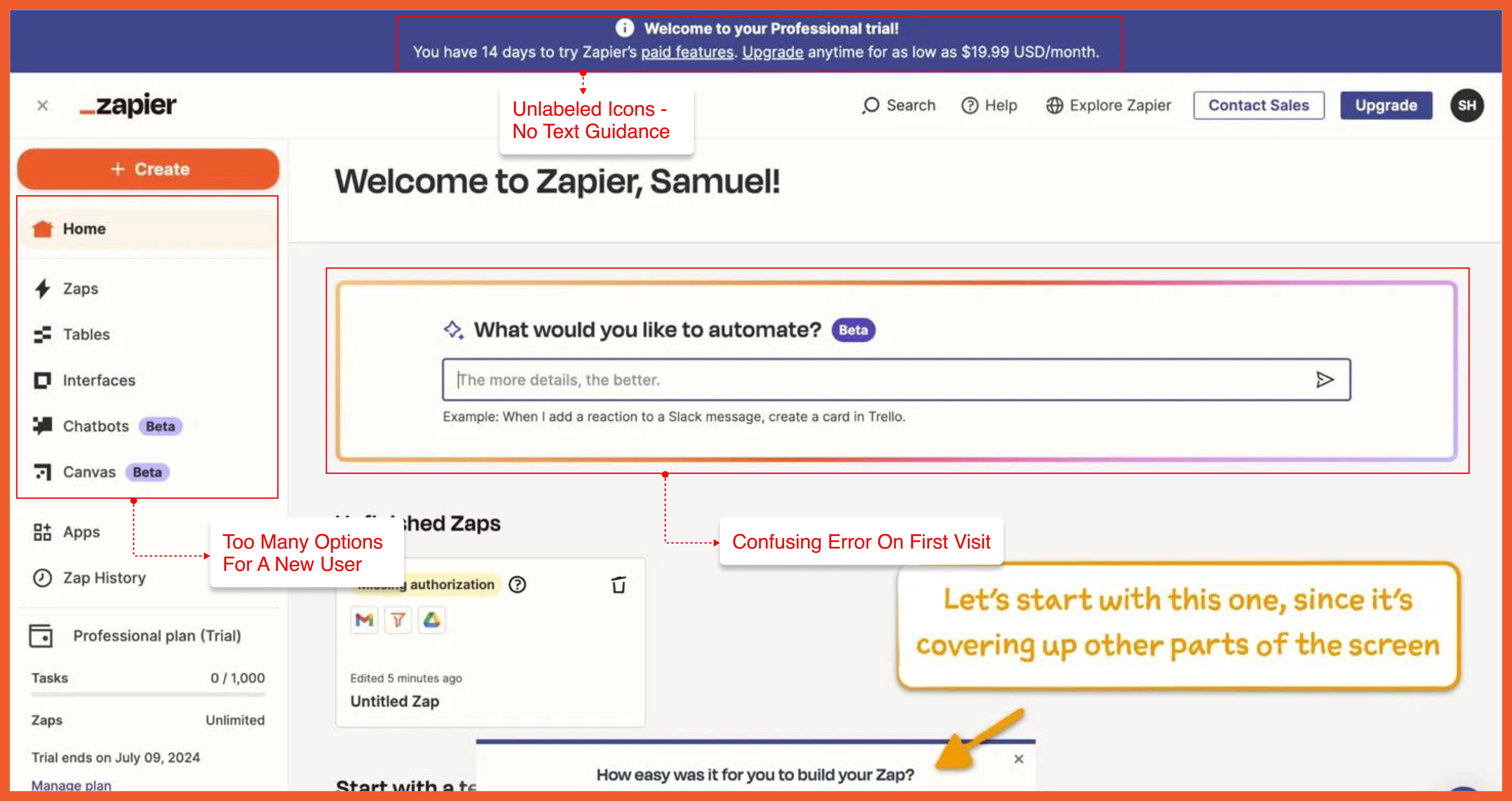
Zapier's onboarding process presents new users with long checklists that feel more like homework than a welcome. When users see ten steps before they have even built their first automation, many abandon the product entirely. Effective onboarding should guide users to one meaningful action, not overwhelm them with a task list.
9. Snapchat: The 2018 Redesign Backlash

Snapchat's 2018 redesign separated Stories and Snaps in a way that confused loyal users. The update blended creator content with friend content and disrupted familiar navigation patterns. Over one million users signed a petition to reverse the changes. The lesson: redesigning core navigation without user feedback is one of the riskiest UX decisions you can make.
10. Uber: Unclear Surge Pricing Communication
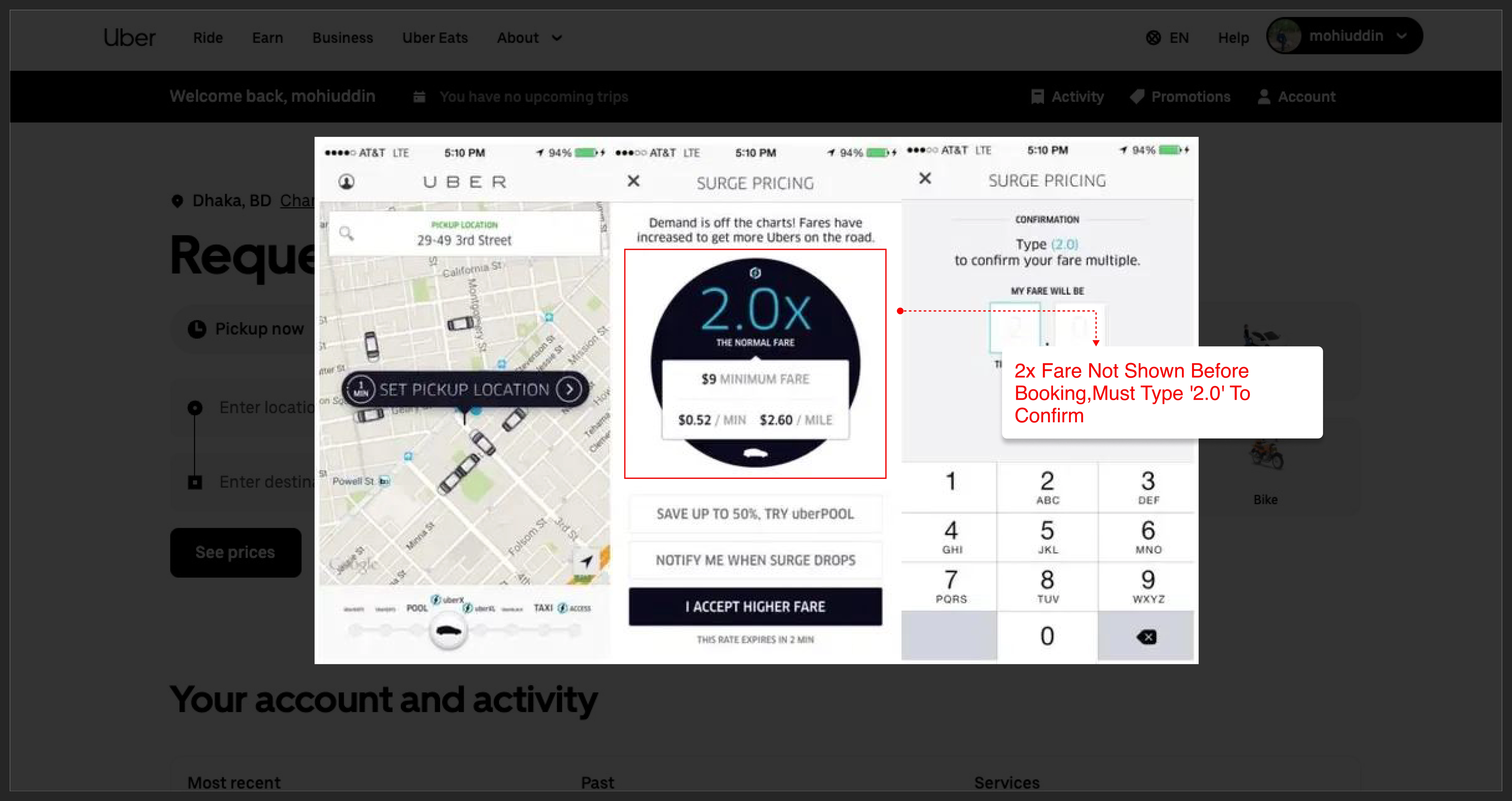
Uber's surge pricing has confused users for years. The app often failed to communicate clearly that a fare was multiplied by two or three times the standard rate. Users accepted rides without fully understanding the cost. Transparent, upfront pricing is a basic UX standard that builds trust with users.
11. Airbnb: Hidden Total Costs Revealed Late in Checkout
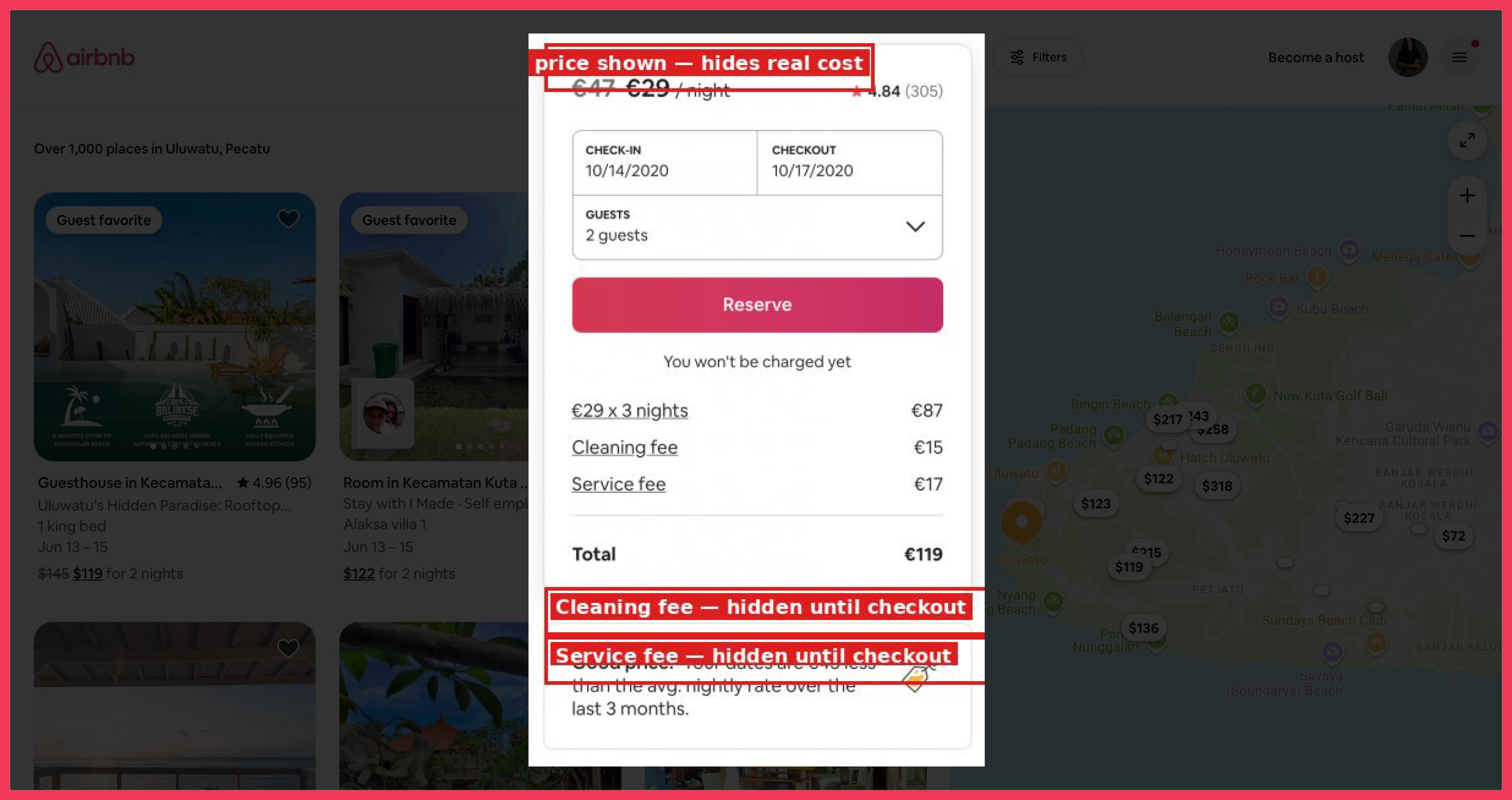
Airbnb has faced widespread criticism for showing base prices in search results, then revealing cleaning fees, service charges, and taxes only at the final checkout step. This pattern frustrates website visitors and increases checkout abandonment. Hiding real costs until the last moment is a negative user experience that erodes trust quickly.
12. HuffPost: Broken Navigation Conventions

HuffPost's navigation bar has historically broken standard web conventions by placing categories in unexpected locations and burying the search bar. When users cannot find what they came for, they leave. A seamless browsing experience depends on meeting users' expectations about where things should be.
13. Zara: Style Over Function Homepage
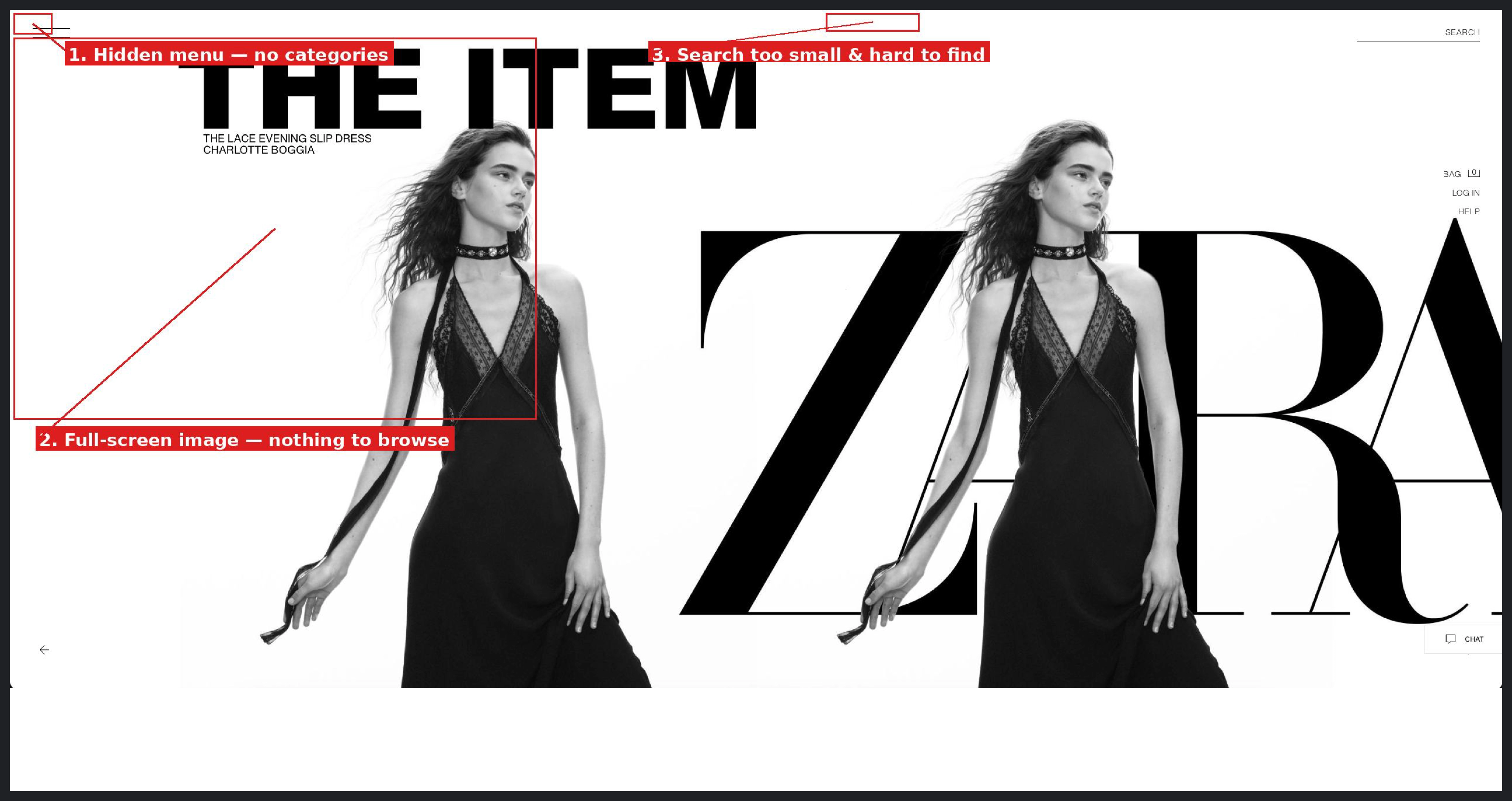
Zara's website prioritizes visual aesthetics over usability. Full-screen images with minimal text make it difficult for users to find product categories quickly. Mobile users face particular challenges with navigation. Great design should look good and work well. Choosing one over the other always costs you users.
14. Wayfair: Overwhelming Mega Dropdown Menu
Wayfair's mega dropdown menus contain dozens of subcategories that overwhelm users before they even click. When a navigation menu requires users to slow down just to parse it, the design is working against them. Simplifying category structures and testing with real users would reduce this friction significantly.
15. Reddit Mobile App: Inconsistent Navigation
Reddit's mobile app suffers from inconsistent navigation patterns across different sections of the platform. Buttons that appear in one context disappear in another. Community pages behave differently from the main feed. This inconsistency creates usability issues and cognitive load that frustrates both new and returning users.
16. Goodreads: Outdated, Hard-to-Navigate Interface
Goodreads has one of the most loyal user bases in the world, yet its interface has barely changed in over a decade. The platform struggles with slow load times, a cluttered dashboard, confusing search functionality, and poor accessibility for users with visual impairments. It is a prime example of what happens when a product stops iterating based on user feedback.
17. Amazon Prime Video: Unclear Free vs. Paid Content Labeling
Amazon Prime Video labels content inconsistently. Subscribers expect their membership to cover all content, but many titles require an additional rental fee. The distinction between included and paid content is unclear until users click through. This confusion creates a negative user experience that undermines confidence in the platform.
Why SaaS Products Fail at UX
Lack of User Testing During Development
Many SaaS teams build products based on internal assumptions rather than real user feedback. Without usability testing, design flaws go undetected until users encounter them in the wild. By then, churn has already begun.
Prioritizing Features Over Simplicity
SaaS products often add features faster than they refine the core experience. The result is a cluttered interface that overwhelms users rather than guiding them toward value. Every new feature adds to cognitive load. Good UX design disciplines teams to ask whether a feature helps users or simply adds noise.
Ignoring Accessibility Standards
Poor accessibility in UX design excludes a significant portion of the population. Users with visual impairments, motor challenges, or cognitive differences need interfaces designed with them in mind. Ignoring accessibility is both a UX failure and a legal risk in many markets.
Failing to Iterate on Behavioral Data
Many teams collect user behavior data but fail to act on it. Heatmaps, session recordings, and funnel drop-off data reveal exactly where users struggle. Ignoring these signals means repeating the same UX mistakes indefinitely.
Common Bad UX Patterns in SaaS Onboarding and Dashboards
Confusing Navigation and Unclear Information Architecture
When users cannot find what they need in the main navigation, they leave. Confusing navigation and unresponsive elements are among the most common UX issues in SaaS dashboards. Clear labels, logical grouping, and consistent placement solve most of these problems.
Cluttered Interfaces With Too Many Options
Cognitive load is the enemy of activation. When users see too many options at once, they freeze. Cluttered interfaces in onboarding flows and dashboards are a leading cause of drop-off. Progressive disclosure, showing users only what they need at each stage—is one of the most effective ways to simplify without losing functionality.
Slow Loading Times and Performance Issues
No matter how good your design is, a slow product kills UX. Performance is part of user experience. Pages that take more than three seconds to load lose a significant portion of mobile users, according to Google research. Speed should be treated as a design requirement, not an afterthought.
Frequently Asked Questions
What is bad UX in SaaS?
Bad UX in SaaS refers to design decisions that make a product harder to use. This includes cluttered interfaces, confusing navigation, misleading labels, poor onboarding flows, and inaccessible design. Bad UX leads to lower activation rates, higher churn, and reduced revenue.
How does bad UX affect SaaS conversion rates?
Poor user experience directly reduces trial-to-paid conversion. When users cannot quickly understand how to get value from a product, they abandon it before reaching the "aha" moment. Simplifying onboarding flows and reducing friction at key steps consistently improves conversion.
What are the most common bad UX patterns in SaaS dashboards?
The most common bad UX patterns in SaaS dashboards include cluttered interfaces with too many options, confusing navigation menus, unclear information hierarchy, slow load times, and inconsistent design across different sections of the product.
How can SaaS founders identify bad UX in their product?
The most effective methods include usability testing with real users, analyzing behavior data through tools like Hotjar or Mixpanel, reviewing support tickets for recurring complaints, and monitoring funnel drop-off points in onboarding and key workflows.
What is the difference between bad UI and bad UX?
Bad UI refers to visual design problems, poor color choices, unreadable typography, or inconsistent layouts. Bad UX is broader and includes the entire user journey: how easy a product is to navigate, how quickly users find value, and how well the product meets user needs. Both matter, but UX has a greater impact on retention and business outcomes.
Why do well-known companies still ship bad UX?
Even large companies ship bad UX because teams grow quickly, design decisions become fragmented, and business goals sometimes override user needs. Organizational structure, lack of user research, and insufficient testing all contribute to UX failures at scale.
What is the first step to improving UX in a SaaS product?
The first step is to watch real users interact with your product. Session recordings, user interviews, and moderated usability tests reveal friction points that internal teams overlook. Fix the most common drop-off point first, then measure the impact before moving to the next issue.
Bad UX Is Preventable, Start Fixing It Now
The 17 bad UX examples in this post share a common thread. Each one represents a moment where the product's needs were prioritized over the user's needs. The fix is rarely complex. It usually starts with watching real users interact with your product and having the discipline to simplify what you find.
Bad UX is not inevitable. It is the result of skipping steps, skipping research, skipping testing, and skipping iteration. Founders who invest in UX early build products that retain users, reduce support costs, and grow through word of mouth. Those who treat UX as secondary tend to learn the hard way.
Start with one area of your product that frustrates users the most. Fix it. Measure the impact. Then do it again.





.avif)