.svg)

.svg)
%201.svg)


Here's a number worth thinking about: 63% of customers say the SaaS onboarding experience directly impacts user decision to subscribe, and when you study real SaaS onboarding examples, the difference between an app that users use and one that users don't love is crystal clear. That's not something that happens after purchase; it's when it decides the purchase itself. And the other side is just as harsh: a huge number of users will delete an app entirely if they can't figure it out within the first few sessions, which is why good SaaS onboarding isn't a bonus feature behind the sign-up button for most users; it is the product in those first ten minutes.
We've spent 8 years inside the onboarding flows of SaaS products, redesigning them, A/B testing them, watching session recordings of real users getting stuck on screens that seemed obvious to everyone in the product review meeting. And the pattern that shows up again and again is this: the products that win at onboarding aren't the ones with the most polished welcome screens. They're the ones that get out of the way fastest.
In this post, we are breaking down for you what separates forgettable onboarding from onboarding that actually converts trial users into paying, retained customers, using real SaaS onboarding examples from products you already know, the UI patterns underneath them, and what we've learned applying these principles to client work.
What Makes the Best SaaS Onboarding?
Before getting into examples, it's worth naming the three principles or best practices for SaaS Onboarding that underlie almost every onboarding flow that works.
1. Time-to-value beats feature coverage. Time-to-value is simply how long it takes a new user to experience the product's core value for the first time, the gap between sign-up and that first real "this is useful" moment. The instinct when you build a feature-rich product is to show people everything it can do, because every feature represents real work and real value, and it feels wrong to hide it. But that instinct backfires with a brand-new user: someone who hasn't yet experienced any value can't appreciate a tour of fifty more things they could do. The goal of onboarding isn't education; it's shrinking that gap as much as possible. A user who sends one message in Slack understands more about why Slack matters than a user who's read every tooltip in a feature tour and never sent anything.
2. Cognitive load is the enemy. Cognitive load is just the mental effort a user has to spend figuring out what to do, every choice, every unfamiliar label, every extra button competing for attention. Every choice you put in front of a new user is a chance for them to hesitate, get confused, or leave. Good onboarding collapses decisions down to one obvious next step at a time. If a user can see seven things they could do, they often do none of them.
3. Personalization through segmentation works better than one-size-fits-all. Segmentation just means sorting users into groups based on who they are or what they need, and giving each group a different experience instead of forcing everyone through the same flow. A solo freelancer and a 200-person operations team are not the same user, even if they signed up for the same product. The best onboarding flows ask a couple of quick questions up front and use the answers to route people down meaningfully different paths, not just swap out a headline, but change which features get surfaced and which actions get prioritized.
Everything below is really just these three ideas, expressed in different UI patterns.
Real SaaS Onboarding Examples
Let's unpack a few of these in more depth, because the "what" matters less than the "why."
Why It's a Strong Example
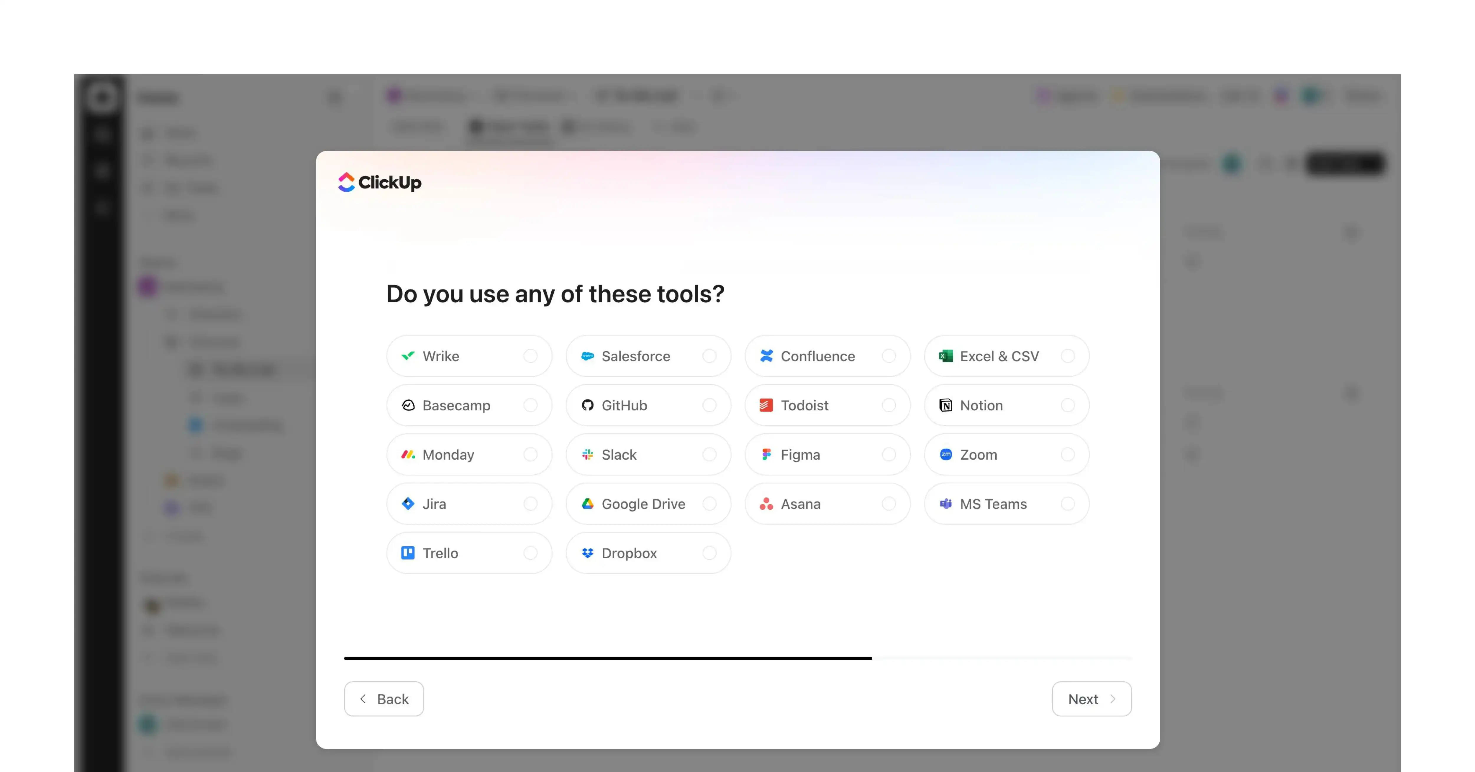
ClickUp is one of the clearest examples of a product solving a genuinely hard onboarding problem: it does everything (tasks, docs, goals, time tracking, sprints, whiteboards), which is a great selling point on a pricing page and a nightmare for a first-time user. A tool with 30 things it can do gives a new user no obvious place to start. Most people in that situation freeze, poke around for two minutes, and leave. ClickUp avoids this with one well-placed question and real discipline in what it shows afterward, which is exactly what makes it worth studying.
The UX Decision: One Question, Asked Early
Before showing any product UI, ClickUp asks essentially one question: are you working alone or managing a team? That single answer lets them hide most of the product from view and only show what's relevant. A freelancer doesn't see automations and team permissions. A project manager doesn't get a bare to-do list, they get pushed toward templates and team invites.
The discipline is in what they didn't ask. Most teams want three or four questions here, role, company size, goal, and how you heard about them, because each feels useful to the business. But every extra question is a moment where the user could leave before touching the real product. Keeping it to one question is a deliberate restraint call, not an obvious one.
The Interface Decisions: How It's Actually Built
- Tappable cards instead of a dropdown. Large clickable tiles with icons, not a form field. Tapping a card feels fast; a dropdown feels like paperwork, same question, different felt effort depending on how it's rendered.
- A visible progress bar, not a text list. The checklist after your answer is a progress component with checkboxes that visibly fill in. A bar sitting at 60% creates a pull to finish that plain text can't.
- In-context highlighting instead of blocking modals. Guidance appears as a soft glow or pointer at the next button, not a greyed-out overlay. The product always feels real, never like a separate tutorial mode.
2. Slack
What Slack's Onboarding Does
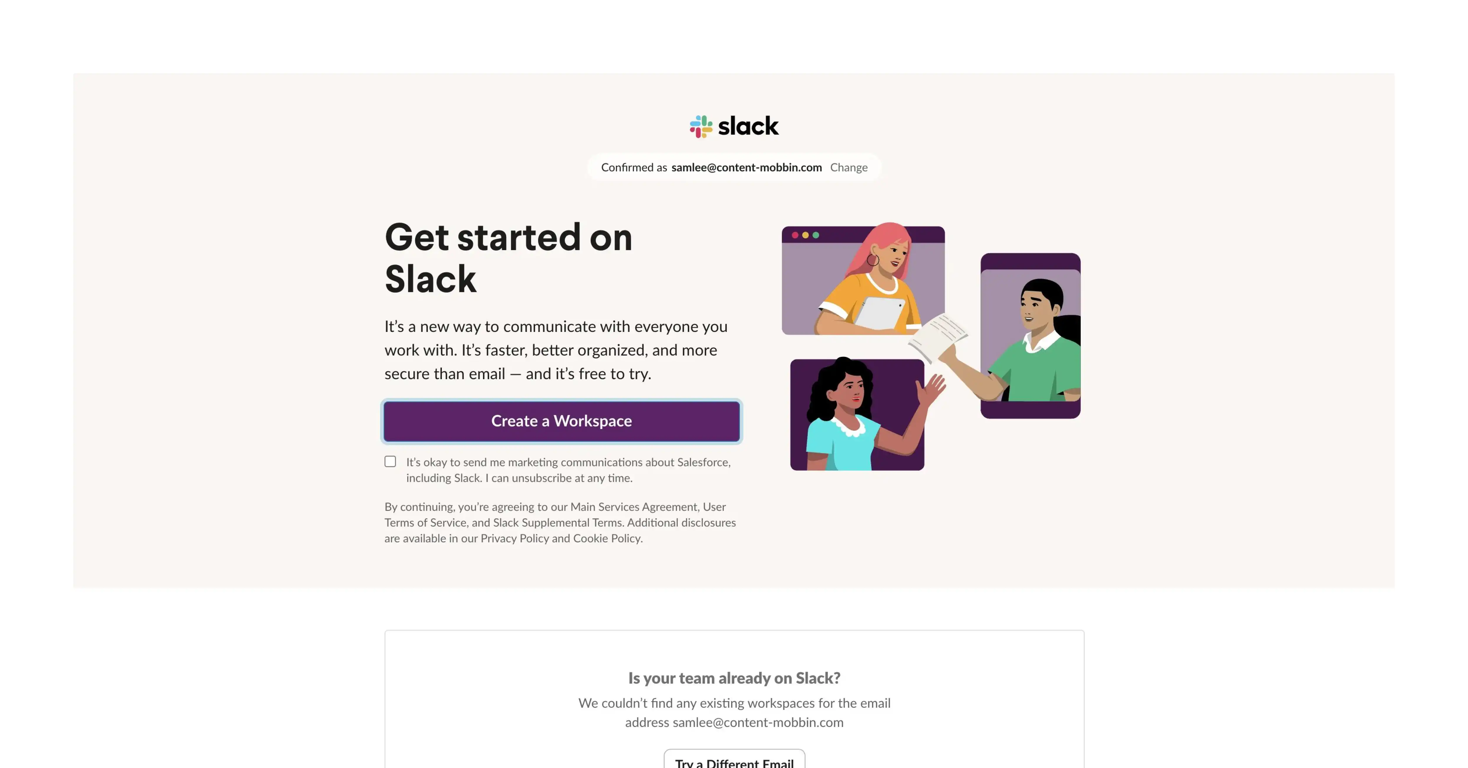
If you're a SaaS owner trying to understand what good onboarding looks like, Slack is one of the clearest cases to study. The product itself isn't simple, channels, threads, huddles, integrations, workflows, it can do a lot. But its onboarding doesn't try to teach any of that upfront. It pushes you toward exactly one action: send a message. That's the entire activation moment. Everything else gets discovered later, when it's actually relevant.
The UX Thinking Behind It
Here's the mistake most SaaS teams make: when a product has many features, the instinct is to show all of them, because the team is proud of what they built and wants the new user to "get" the full value. Slack does the opposite. It identifies the one action that actually proves the product's value, sending a real message in a channel, and removes everything standing between sign-up and that action.
Why this is the right UX call: a user who's sent one real message understands, in their gut, why Slack matters to their team. They don't need fifteen tooltips explaining threads, reactions, and integrations to feel that. Once they've had that one moment of "this is how my team will talk now," everything else becomes optional discovery instead of required learning before they're allowed to start. This is time-to-value in its purest form: shrink the distance between sign-up and the first real value moment down to a single action.
This also reflects good handling of cognitive load. Slack had every reason to show off its feature set early. A full-featured tour would have been technically accurate. Instead, the bet was: get one real action done first, let confidence build from that, and let everything else stay optional until the user goes looking for it.
The UI Thinking Behind It
The UX decision only works because the interface is built to support it, not just describe it.
- Color directs attention instead of decorating. The composer, where you type your message, sits in a clean, light field with strong contrast, while the surrounding navigation is pushed into Slack's dark purple. That contrast isn't branding for its own sake; it visually separates "the thing you act on" from "everything else," so your eye lands on the input box without anyone telling you to look there.
- Visual noise is suppressed everywhere except for one action. During onboarding, there are no loud buttons, badges, or competing colored icons. Most of the screen is intentionally quiet, grey text, muted icons, generous white space, so the one high-contrast send action stands out by comparison rather than by being the only colorful element on a busy screen.
- Typography hierarchy mirrors the UX priority. The placeholder text inside the composer (something like "Message #general") renders in a lighter, smaller weight than the message you actually type. That's a UI cue doing the job an instructional tooltip would otherwise have to do; it's telling you "this is a hint, not content," silently.
- Spacing signals importance. There's noticeably more padding around the message box than around other elements on the same screen. Spacing here is functioning as a design tool: the thing with room to breathe is the thing you're meant to notice first.
- Secondary actions are visually demoted. Emoji reactions, formatting, file attachments, all present in the composer toolbar, are rendered as small, low-contrast grey icons. They're functionally available but visually quiet, so a brand-new user's eye isn't pulled toward them before they've sent their first message.
Why Slack Is the Best SaaS Onboarding Example
The reason Slack keeps coming up as a benchmark isn't that the underlying idea, "pick one activation action," is rare. Plenty of teams know that in theory. What proves it out in practice is that the UX decision and the UI execution are working together as one system: the UX strategy decides what should matter (sending a message), and the interface, through color, contrast, typography, spacing, and icon weight, makes that one thing visually impossible to miss while quietly demoting everything else. Most SaaS products get the strategy right and the interface wrong, or the interface right with no real strategy behind it. Slack is the best example specifically because both layers are pulling in the same direction at once.
3. Typeform
What Typeform's Onboarding Does
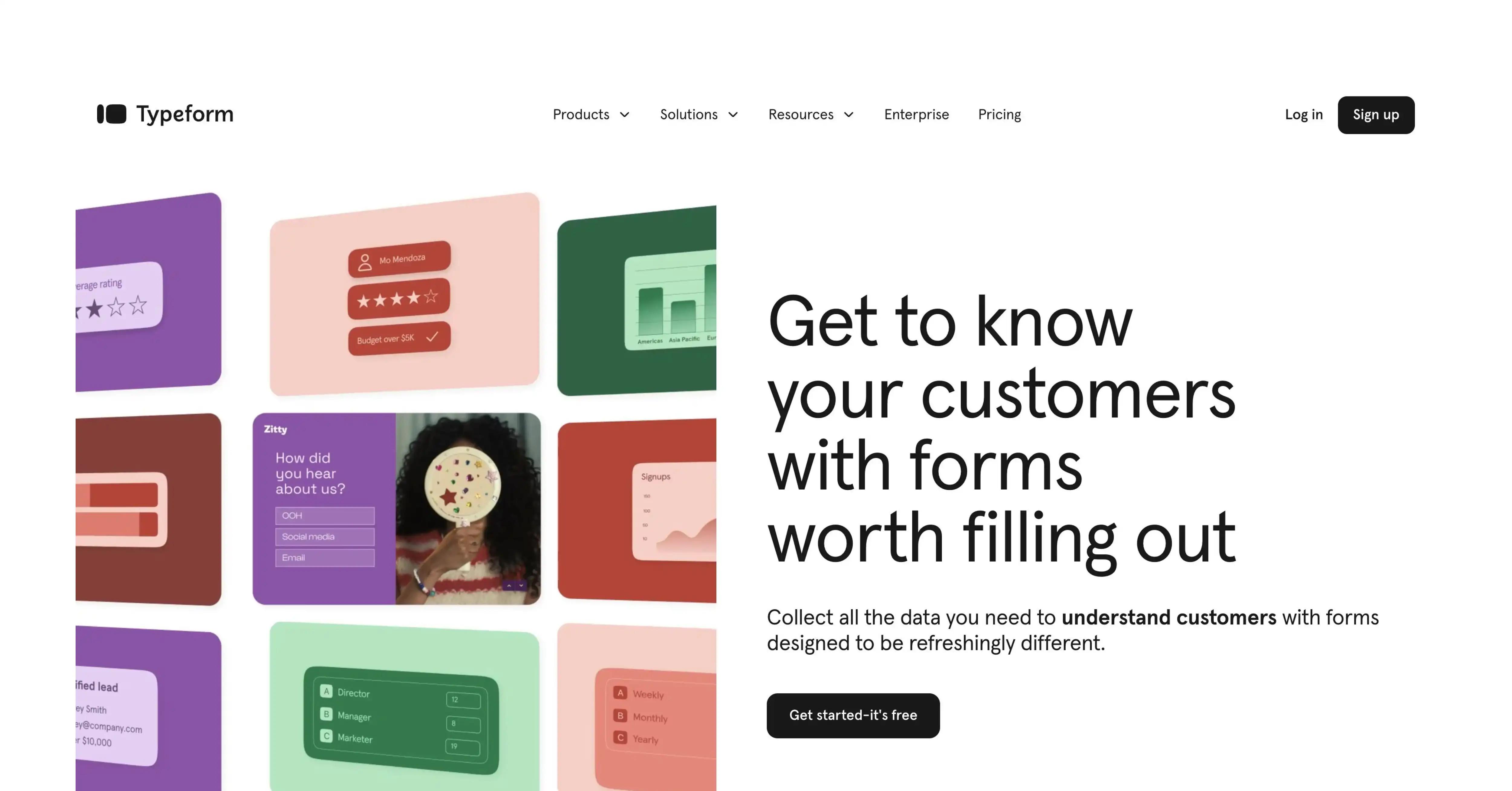
Typeform's whole product is built around a simple promise: forms don't have to feel like forms. So it makes sense that its onboarding doesn't open with a tutorial or an empty editor, it drops you straight into building, using a sample form that's already populated, with a live preview rendering your changes in real time as you make them. You're not reading about how Typeform works. You're already using it, watching your own edits show up in something that looks finished, within the first minute.
The UX Thinking Behind It
Most form-builder tools default to a blank canvas: an empty page with a "+" button, waiting for you to figure out what to add first. That's a reasonable design on paper, but for a brand-new user, it's intimidating; a blank page asks you to decide before you've even understood what the tool is capable of.
Typeform's answer is to skip the blank page entirely. You land inside a sample form that already has a question, an answer field, and a live preview pane showing exactly what a respondent would see. Your first action isn't "create something from nothing," it's "edit something that already exists." That's a much smaller task, and it's also a smarter teaching tool: by editing a real example instead of reading documentation, you learn the product's mental model (one question at a time, conversational flow, instant preview) without anyone having to explain it to you in words.
This is the time-to-value principle applied almost literally: the "aha moment" for Typeform isn't a feature, it's a feeling, seeing your own edit appear instantly in a clean, professional-looking preview. Getting a user to that feeling in under a minute, before they've had to make a single hard decision, is the entire design strategy.
The UI Thinking Behind It
The UX idea of "edit a real example, see it update live" only works because of specific interface choices.
- Split-screen layout, not a single editing view. The editor and the live preview sit side by side (or are one tap apart), so the cause-and-effect relationship between "I changed this" and "this is what changed" is visually immediate. You don't have to imagine the result or click a separate "preview" button; it's simply always there.
- Real-time rendering with no visible lag. When you edit text or change a question type, the preview updates instantly, not after a save action. That immediacy is itself a UI decision (built on instant state updates), and it's what makes the experience feel like play rather than configuration.
- Minimal, conversational typography in the preview pane. Typeform's signature look, large, friendly type, one question visible at a time, generous white space, is present even in this first editing session. It's not just branding; it's reinforcing the product's core differentiator (forms that feel like a conversation, not a spreadsheet) at the exact moment you're deciding whether the product is for you.
- Low-friction editing controls. Changing a question type or adding a field uses simple icon-based menus and inline text editing rather than nested settings panels. The fewer clicks between "I want to change this" and "it's changed," the more the tool feels intuitive rather than technical.
- Progress and structure are shown subtly, not as a separate dashboard. Even though you're inside a sample form, there's a quiet visual indicator of form structure (like a sidebar or step list) so you understand you're building something sequential, without that structure overwhelming the main editing view.
Why Typeform Is the Best SaaS Onboarding Example
The reason Typeform stands out isn't that "let users start with a sample" is a unique idea. Plenty of tools offer templates. What makes it the best example is that the UX decision (teach by editing, not by reading) and the UI execution (split-screen live preview, instant rendering, on-brand typography from the first second) are the same decision expressed twice, once in strategy, once in pixels. The product's core value proposition, that filling out and building forms shouldn't feel like paperwork, is something you experience directly in the onboarding itself, not something you're told about. That alignment between what the product claims to be and what the onboarding actually feels like is what makes it worth studying.
4. Calendly

What Calendly's Onboarding Does
Calendly's onboarding is almost aggressively short: connect your calendar, set your available hours, and get your booking link. Three steps, no detours, no feature tour standing in the way.
The UX Thinking Behind It
Calendly's entire pitch to a user is "stop the back-and-forth of scheduling." If onboarding itself involves back-and-forth, extra screens, optional settings, a tour explaining buffer times and event types before you've even set up your first meeting type, the product would be undercutting its own promise in the first sixty seconds. So the design priority becomes obvious once you see it from that angle: every step that isn't strictly necessary to get a working booking link in your hands is a step that contradicts what you're selling.
This is why personalization here looks different from a product like ClickUp or HubSpot. Calendly doesn't need to ask "what kind of user are you?" because almost every new user wants the exact same first outcome: a link they can send someone, today, that lets that person book time without an email thread. One outcome, one path, no branching required.
The UI Thinking Behind It
A few specific choices carry this off:
- Calendar connection happens through a single, prominent button (Google, Outlook, etc.), not a settings page buried in a menu. It's the first and only real decision on the screen.
- Default availability is pre-filled, typically a standard 9-to-5 window, so a new user isn't forced to configure their working hours from scratch before they can move forward. They can edit it, or just accept it and move on.
- The booking link is generated and shown immediately, front and center, the moment setup finishes, rather than being buried in a dashboard that the user has to go find. It's treated as the reward for finishing onboarding, not an afterthought.
- Visual clutter is kept low throughout, clean white space, one action highlighted per screen, nothing competing for attention.
Why Calendly Is the Best SaaS Onboarding Example
For a SaaS founder, the lesson here is about matching your onboarding's pace to your product's promise. If your value proposition is "we save you time," every extra click in onboarding is a small, visible contradiction. Calendly earns its place as the best example because it doesn't just say it removes friction; the onboarding itself removes friction, from the first screen to the working link in your hand. That alignment between what you claim and what the user actually experiences in their first minute is the real takeaway here, regardless of what your own product does.
5. HubSpot
What HubSpot's Onboarding Does
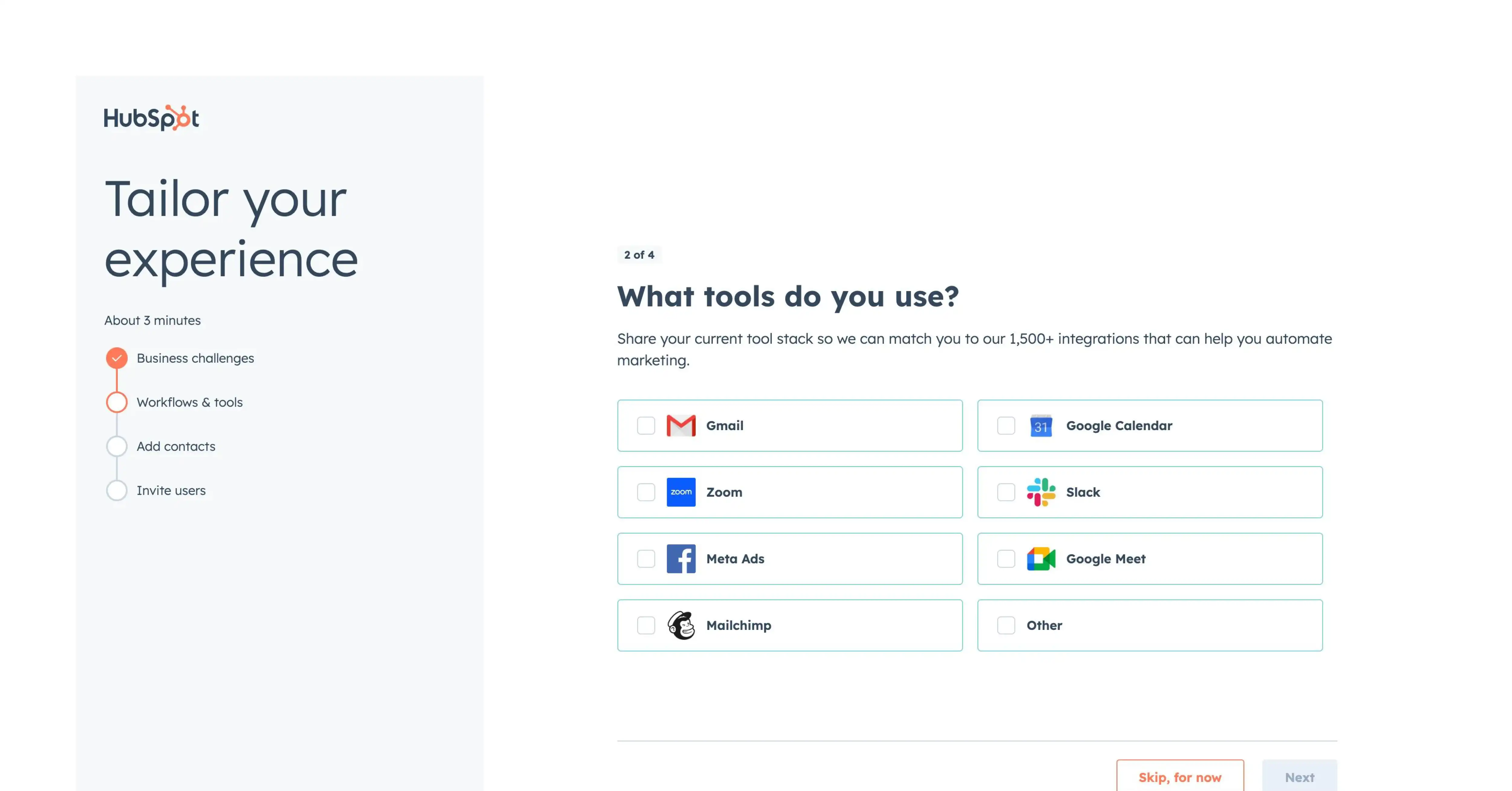
HubSpot doesn't run one onboarding flow; it runs several, each one chosen based on your declared role and goals. A marketer signing up sees a meaningfully different sequence of setup steps, default dashboards, and "quick win" suggestions than a sales rep does, even different terminology in places. It's not the same flow with a different headline; the actual content and order of steps change.
The UX Thinking Behind It
HubSpot is really several products bundled under one name: marketing tools, sales tools, service tools, and CMS tools. A marketer logging in for the first time doesn't care about deal pipelines, and a sales rep doesn't care about email campaign builders. If HubSpot ran one generic onboarding for everyone, most of it would be irrelevant to most users, which is exactly the kind of cognitive overload that makes people give up before reaching anything useful.
So the early questions HubSpot asks aren't just for show, they're a genuine fork in the road. Your answer determines which features get surfaced first, which dashboard you land on, and which "next step" gets recommended to you. This is segmentation pushed further than most products attempt: not just changing what's said to you, but changing what's shown to you.
The UI Thinking Behind It
- Role-based dashboards from the very first login. A marketer's home screen highlights campaign and email tools; a sales rep's highlights deals and pipeline stages. These aren't the same screen with reordered widgets; they're built around different primary objects.
- Terminology shifts to match the audience. Labels, suggested actions, and example data reflect the language of that role's daily work, so the product feels like it was built for that person specifically, not adapted for them.
- Quick-win prompts are role-specific. Instead of a generic "explore the product" checklist, each persona gets a small number of suggested first actions that are actually relevant to their job, such as sending a test email, logging a deal, publishing a page, rather than a one-size-fits-all task list.
Why HubSpot Is the Best SaaS Onboarding Example
For a SaaS founder, HubSpot is the clearest case of what real personalization costs and what it buys you. Most products that "ask a question" during onboarding use the answer cosmetically, a different welcome message, maybe a reordered checklist. HubSpot uses the answer structurally: different dashboards, different default views, different suggested next actions, built and maintained as genuinely separate experiences. That's expensive to build and maintain, which is exactly why most companies don't do it properly. If your product genuinely serves distinct personas with different goals, HubSpot is the example that shows what it looks like to commit to that difference all the way through the interface, not just in the welcome screen copy.
6. Trello
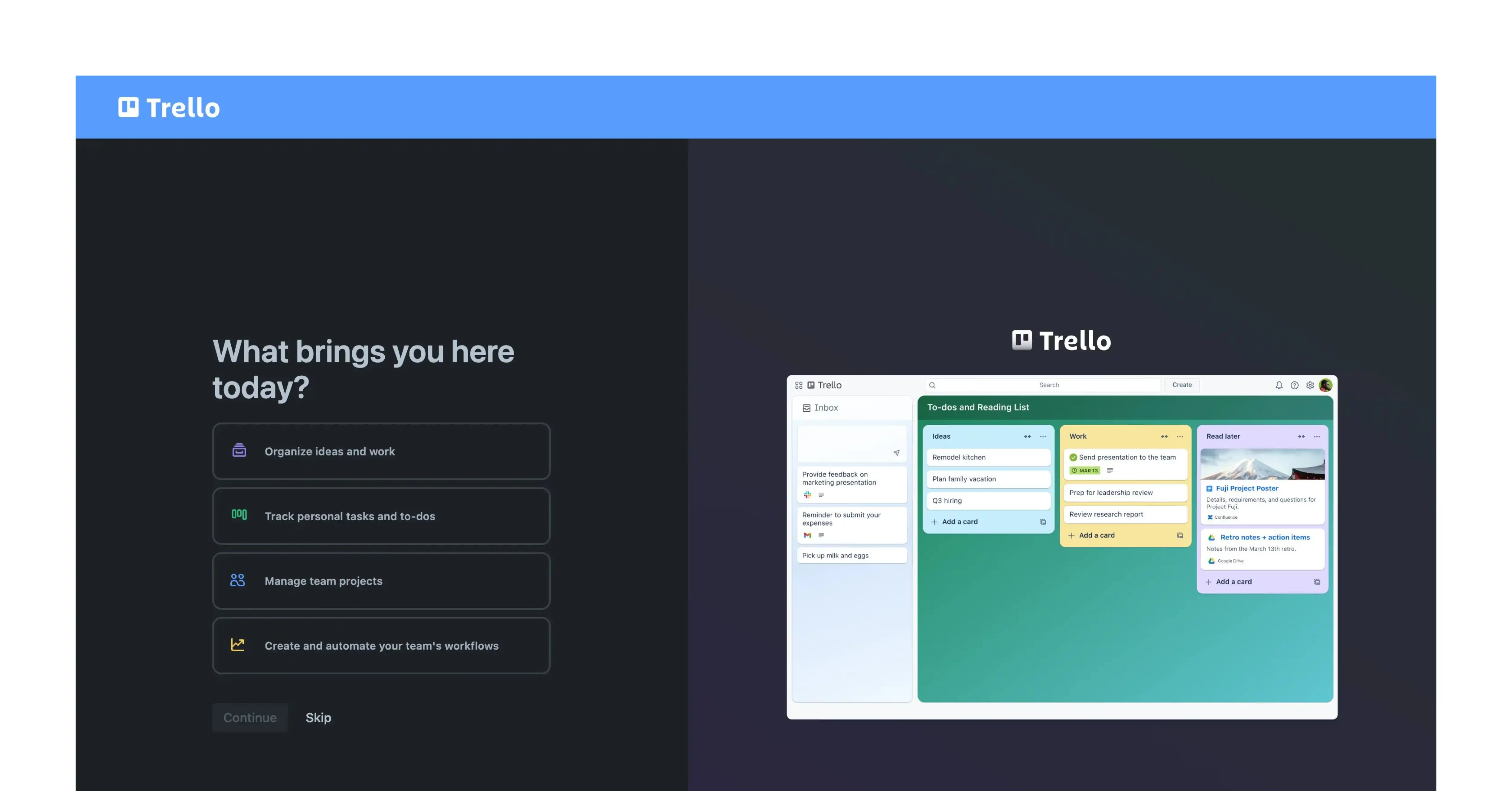
What Trello's Onboarding Does
When you open Trello for the first time, you land inside a sample board that's already populated, lists like "To Do," "Doing," "Done," with real cards sitting in each one, labels already applied, and a checklist already started. There's no tutorial walking you through what a board or a card is. You're just dropped into an example that already works.
The UX Thinking Behind It
Trello's core idea, the Kanban board, organizing work by moving cards across columns, is a mental model that a lot of new users haven't seen before. The usual way to teach a new concept is to explain it: a tooltip, a pop-up, a short video. Trello skips that almost entirely and teaches by example instead. Seeing a card move from "To Do" to "Doing" to "Done" on a board that's already set up communicates the entire concept faster than any explanation could, because you're seeing the system working, not being told how it's supposed to work.
This only works because of restraint elsewhere. Trello doesn't explain every feature up front; it lets you discover labels, due dates, and checklists as you actually encounter them. Feature tooltips appear contextually, only when you hover over or try to use something for the first time, instead of being front-loaded into a tour you'd forget by the time you needed them.
The UI Thinking Behind It
- A populated board, not an empty one. The default view has real-looking cards with titles, not placeholder text like "Card 1" or "Sample Item," so it reads as a working example rather than a demo.
- Visual structure does the teaching. Three clearly labeled columns side by side make the entire workflow visible at a glance, you can see the whole concept of "stages of work" in one screenshot without scrolling or clicking anywhere.
- Color-coded labels are visible but not explained. Small colored tags sit on cards from the start, present enough to notice, quiet enough not to require explanation before you've even understood the basic board.
- Tooltips appear only on interaction. Hovering over or clicking a card surfaces relevant guidance (due dates, checklists, attachments) right at that moment, instead of all at once on first load.
Why Trello Is the Best SaaS Onboarding Example
For a SaaS founder, Trello is the clearest case for a simple but easy-to-ignore principle: showing a working example is usually faster to understand than reading an explanation of one. Most products default to explaining their UI with tooltips and tours because it feels thorough. Trello bets that a populated, realistic example does that job better and faster, while contextual tooltips handle anything the example alone can't teach. If your product has a core concept that's hard to explain in words but easy to recognize visually, a Kanban board, a calendar, a pipeline, Trello's approach is the one to study first..
7. Airtable
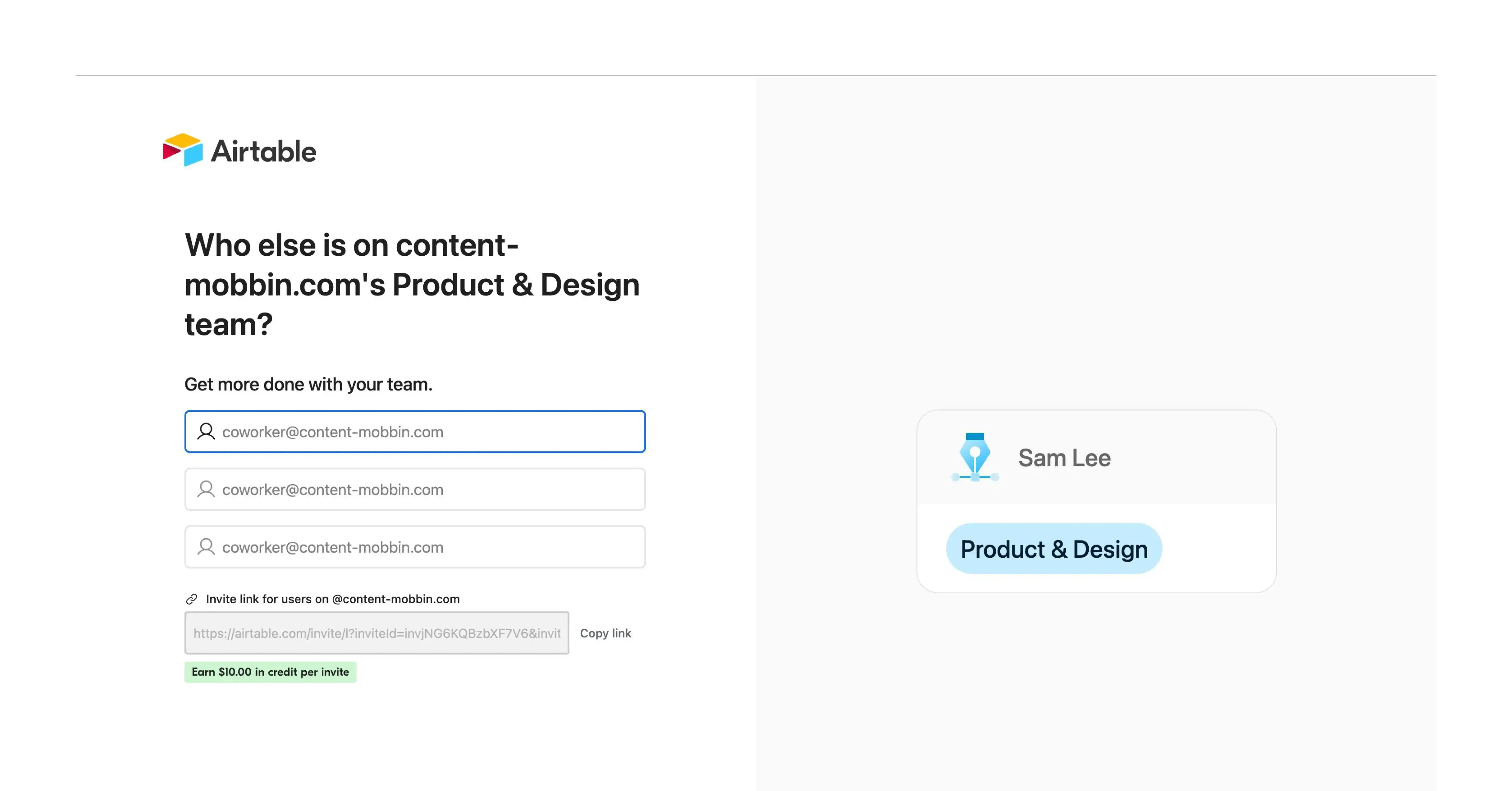
What Airtable's Onboarding Does
Airtable opens with templates already filled in with realistic, working data, organized by what you're actually trying to do, like a content calendar, a CRM, or a product roadmap. You don't start with an empty grid; you start inside something that already looks finished and useful.
The UX Thinking Behind It
An empty spreadsheet-like grid is intimidating for a brand-new user. It asks "what do you want to track?" before the user has any idea what Airtable is even good for. Airtable's answer is to skip that blank-page moment entirely: you pick a use case close to your own, and you land inside a fully populated example. This does two jobs at once. It removes the pressure of starting from nothing, and it silently teaches you what the product is for by showing a real example instead of explaining it in words.
The UI Thinking Behind It
The realism of the template data matters here as much as the idea of templates themselves. A content calendar template with actual sample blog posts, dates, and statuses feels usable in a way that "Row 1, Row 2, Row 3" placeholder text never does. The visual hierarchy also reinforces this: color-coded status tags, recognizable field types (dates, single-select tags, linked records), and a clean grid layout that doesn't feel like a raw spreadsheet, all signal that this is a finished, working system you're stepping into, not a feature you have to build from zero.
Why Airtable Is the Best SaaS Onboarding Example
The principle at work is one we'd point any SaaS founder toward: a blank canvas is a decision-making burden disguised as flexibility. Most new users don't actually want infinite freedom on day one; they want to see what "done well" looks like, then adjust it to fit their own situation. Airtable's templates solve the cognitive load problem directly, by replacing "what should I build?" with "here's a working example, change what doesn't fit." That's a far smaller ask of a new user, and it gets them to a feeling of competence almost immediately. For SaaS owners building tools with any kind of open-ended structure (spreadsheets, dashboards, document builders), this is the clearest lesson Airtable offers: don't make people invent their first use case from nothing. Show them a finished one, and let editing replace creating as their very first action.
8. Notion

What Notion's Onboarding Does
Notion lets you build a private workspace and get real value out of it entirely alone, before it ever pushes you to invite a teammate. Most B2B tools rush to get a second user in the door, assuming the product only proves its worth once a team uses it together. Notion bets the opposite way: you fall in love with it alone first, then bring your team in.
The UX problem this solves
There are two different kinds of value here, and Notion refuses to mix them up:
- Personal value: "This helps me organize my own notes and tasks"
- Team value: "This helps my whole team work together"
Asking a brand-new user to invite teammates before they've felt any personal benefit means asking them to vouch for a tool they haven't tested yet. Most won't do it. Notion removes that pressure entirely. You build a page, organize your own thoughts, try a database, and only once you're actually getting value does a team invite even enter the picture.
How the interface backs this up:
- A genuinely blank, flexible canvas instead of a rigid template-first flow
- A lightweight "/" command menu that teaches you what's possible as you type, instead of a guided tour
- Templates exist, but as optional suggestions, not a forced first step
- Team-invite prompts stay small and easy to ignore, a sidebar option, not a blocking modal
Why it's the best SaaS onboarding example:
Collaborative products almost always default to "more people using it = more value, so get invites out fast." Notion proves that pushing this too early can backfire; a user with no personal value to show has nothing real to invite their team into. Letting individual activation happen first, and treating team adoption as something that follows naturally, makes the onboarding feel slower but builds more durable retention.
9. Propulso: Our Own SaaS Onboarding Examples
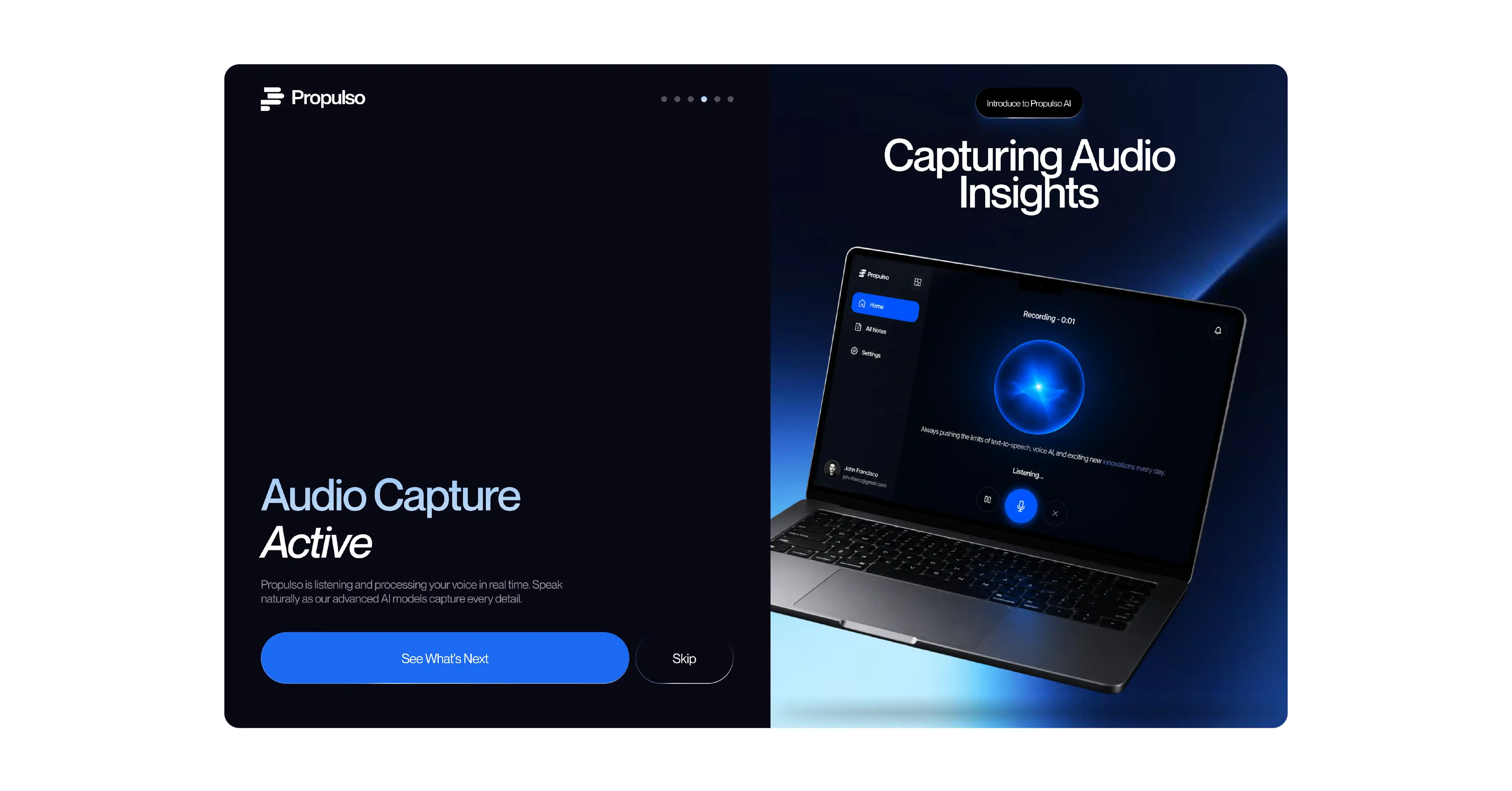
What is it?
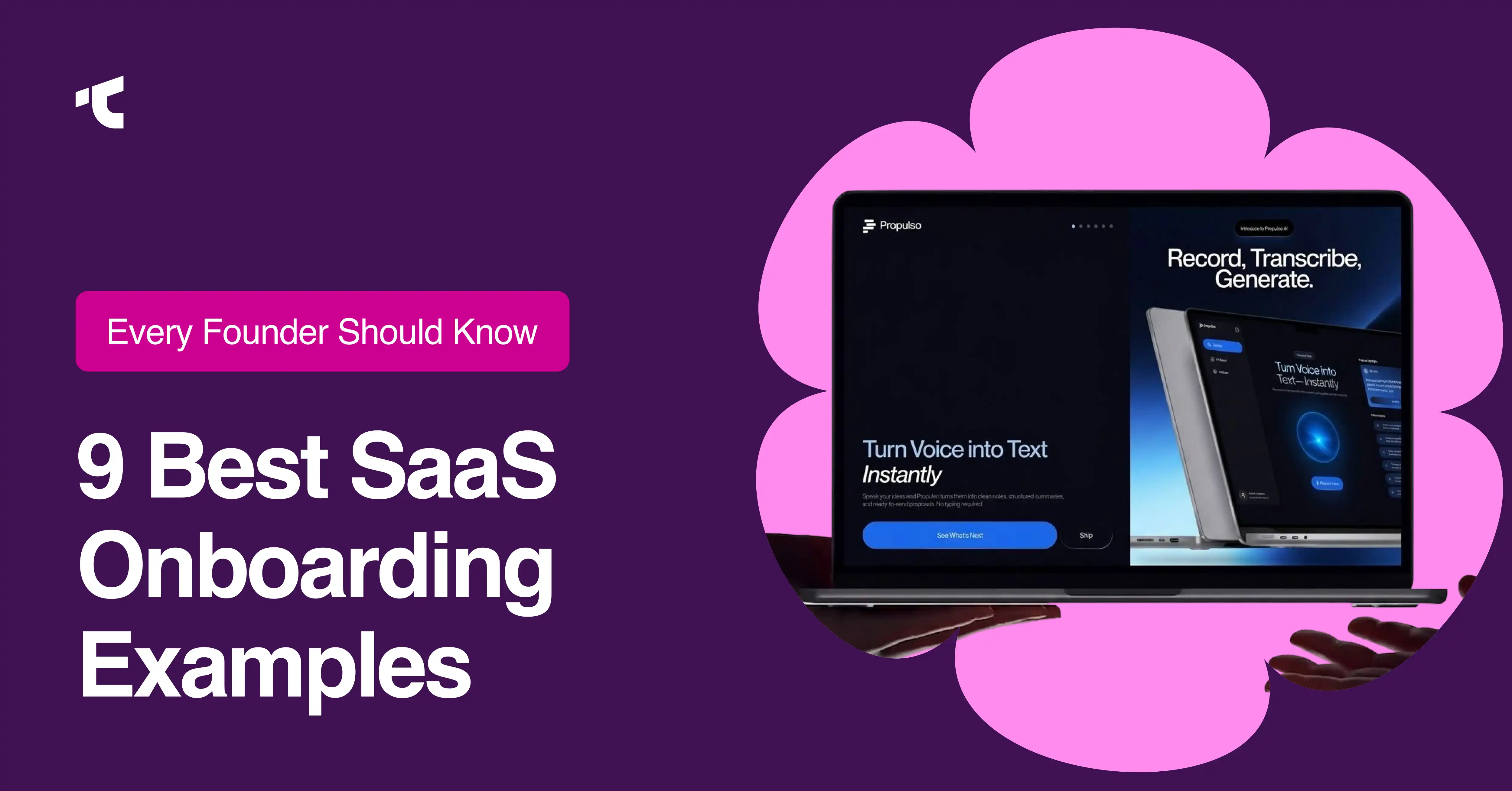
Propulso is an AI voice-to-text SaaS product. As a onboarding design agency, we designed from the ground up at Taqwah. Users record their voice and instantly get clean transcriptions, structured summaries, and ready-to-send proposals. The core audience is sales reps, consultants, and freelancers who'd rather speak a pitch than write one. The onboarding challenge: if users walked away thinking this was just a transcription tool, they'd never reach the real value, which is AI-powered proposal generation from spoken input.
The UX Thinking
Propulso's value chain is layered: record audio, get a transcript, get a summary, and generate a proposal. If onboarding only covers recording, users churn, thinking it's "just another transcription app." If it tries to teach all four steps interactively, it takes too long.
The solution was to walk users through the value chain visually, showing the output of each stage without requiring them to perform it yet. Four screens follow a deliberate narrative arc: product orientation, personalization ("What brings you to Propulso?"), The core recording mechanic is shown in an active state, and the output reveals, ending on the AI-generated summary, not the recording button. The last thing a user sees before entering the product is the value, not the effort. A visible "Skip" button at every step paradoxically increases completion; users who stay feel they chose to, not that they were trapped.
The UI Thinking
Every screen uses the same split-screen structure: the left side carries the headline and CTAs, the right side carries a perspective-angled laptop mockup showing the real product screen. The left tells you what to feel, the right shows you proof. The laptop angle stays consistent across all four screens, creating spatial memory so that changing content inside it reads as "one product, different stages" rather than four separate things.
Dark navy background with a single directional blue glow toward the mockup pulls the eye where the proof lives. Progress dots signal scope without the obligation feel of a progress bar. Dual CTAs (filled "See What's Next" beside ghost-outline "Skip") show confidence in the onboarding; a product that hides the skip button is a product that doesn't trust its own flow.
Why Propulso Is a Strong SaaS Onboarding Example
For SaaS founders building AI-powered tools with multi-step value chains, Propulso demonstrates a principle worth borrowing: don't try to get users to do every step during onboarding. Show them where the steps lead. Let the output sell the input. By the time users enter the product, they've already seen what a completed summary looks like, and that pre-loaded expectation is what drives them to actually complete their first recording.
Conclusion
You've just read through nine of the best SaaS onboarding examples in the industry, ClickUp, Slack, Typeform, Calendly, HubSpot, Trello, Airtable, and Notion. Every single one of them shares the same uncomfortable truth: none of this happened by accident.
Slack's team didn't stumble into "send one message." Someone made the call to hide threads, integrations, and workflows from a brand-new user, even though those features are genuinely good and someone on that team is proud of having built them.
ClickUp's team didn't get lucky with their checklist branching; they chose restraint over the safer, easier option of asking four questions instead of one.
Notion's team made a bet that felt slower on paper, letting people fall in love alone first, even though every instinct in B2B software says push for team invites as fast as possible.
That's the part most SaaS founders miss when they look at onboarding examples for their SaaS, like these: it's tempting to walk away thinking "great, I'll add a progress bar" or "I'll add a sample template."
But a progress bar bolted onto a confusing flow doesn't make it Trello's onboarding.
A template was added to a product, but nobody clarified the activation moment, which doesn't make it Airtable's.
The interface choices only work because someone first did the harder thing, deciding what to cut, what to hide, what to delay until later.
So here's the real question worth sitting with: if a new user landed in your product right now, today, with zero explanation, what's the one thing they'd need to do to actually feel your product's value?
If you can't answer that in one sentence, that's not a UI problem. That's the actual starting point.
This is exactly the kind of audit we do for SaaS teams, sitting inside your real onboarding flow, watching where real users actually get stuck, and finding the one action your product needs to get someone to fast, before we touch a single pixel of the interface.
Want us to look at yours? Get in touch, and we'll walk through your current flow together and tell you exactly where we'd start.




.avif)