.svg)

.svg)
%201.svg)


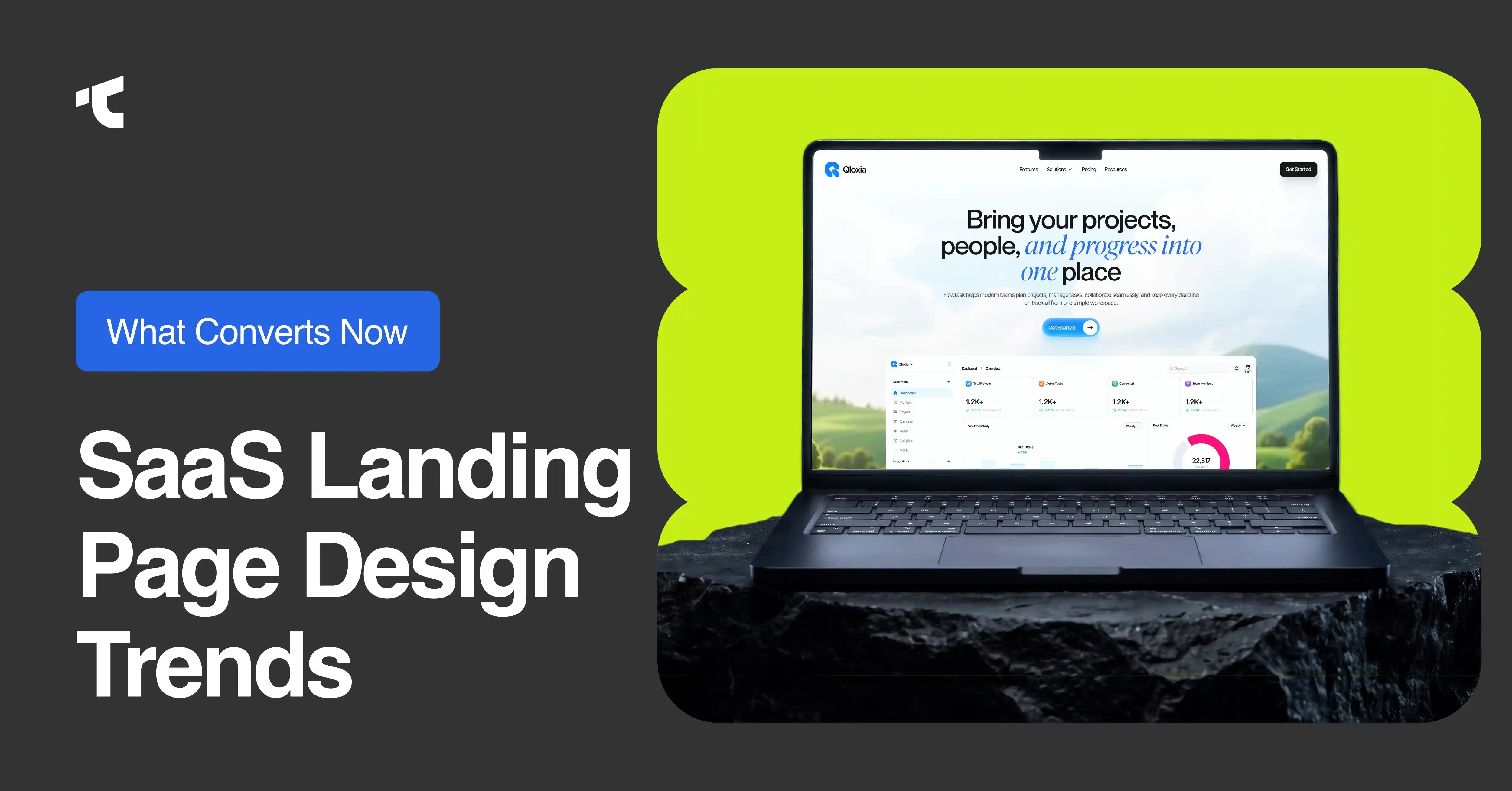
Design decisions determine whether a visitor converts or exits in the first 8 seconds for a SaaS Landing Page. It is not the same as product UI design. A dashboard layout, an onboarding screen, or an in-app modal follows different rules than a public-facing page whose sole job is conversion. This post covers saas landing page design trends 2026 only, with no overlap into product screens or admin interfaces. For a parallel look at product UI patterns, see our post on saas design trends 2026.
The shift from saas landing page design trends 2025 to 2026 shows one consistent direction: pages that remove friction and show the product faster convert higher than pages that describe the product in abstract language. Every trend below maps to that direction.
1. Bento Grid Layouts
Bento grids divide landing page feature sections into modular, self-contained cards arranged in an asymmetric grid. Each card holds one capability: a headline, a short description, and often a supporting visual. Visitors scan modular layouts faster than single-column text blocks because each card represents a complete idea at a glance.
Bento grid feature modules work well for SaaS products with 3 or more distinct use cases. The layout lets each use case occupy its own visual space without demanding that the visitor read top to bottom. Modular layouts also reduce cognitive load by grouping related capabilities visually rather than through body copy alone.
The primary design rule for a bento grid is visual hierarchy inside each card. Every module supports the primary conversion goal instead of competing for attention against adjacent cards. Apply consistent spacing, card sizing, and typographic scale across every module so the grid reads as a unified section rather than a collage.
2. Oversized Bold Typography
Modern saas landing page design trends 2026 place oversized, high-contrast typography in the hero section as the primary visual element. Linear and Stripe use this pattern: a single declarative headline in a large weight occupies the viewport before any image or illustration appears. The headline carries the full weight of the value proposition in 6 to 10 words.
Minimalism and bold typography work together, not in opposition. A page that uses oversized type does not need a hero illustration. The negative space around the headline strengthens its weight. Stripe demonstrates this on its homepage, where a gradient-accented headline sits above a customer logo wall with no competing visual elements in the same viewport.
Playful typography and color systems are expanding this trend beyond developer tools into growth-stage B2B SaaS products targeting marketing or operations teams. Color-blocked letterforms, variable font weights that shift on scroll, and type set in brand-specific geometric faces all appear in 2026 launches. The constraint is legibility: any typeface used at display sizes must render cleanly at 1x pixel density on a low-end Android device.
3. Dark Mode Design
Dark mode design on SaaS landing pages began as a developer tool aesthetic. Linear, Vercel, and Resend built their public pages on near-black or pure-black backgrounds as a direct visual signal to a technical audience. In 2026, premium saas landing page design trends 2026 show this pattern extending to security, infrastructure, AI, and fintech products whose buyers equate dark aesthetics with precision and reliability.
Vercel pioneered dark-mode-first design in developer tooling. Its landing page uses pure black (#000000) as the default canvas, high-contrast white text, and a single brand-blue accent, producing maximum contrast without introducing visual noise. Linear's public marketing site takes the opposite approach: it ships light-mode first on the marketing pages while using dark mode inside the product, which keeps the contrast between marketing and product intentional.
Dark mode contrast requires more typographic precision than light mode. Secondary text weights and sizes that read clearly on white often disappear against a dark surface. Test dark mode designs with real display brightness at 50%, not in a design tool at full screen brightness. Performance considerations apply equally: a dark canvas does not eliminate the need for optimized images and lean CSS.
4. Interactive Product Demos
B2B SaaS landing page design trends 2026 show a decisive move from static hero screenshots to interactive product demos embedded in or directly below the hero section. Notion places a live workspace preview in its hero. Miro embeds a board that visitors can inspect before signing up. Both approaches let buyers verify fit before speaking to sales, which shortens the decision cycle for self-serve products.
According to Navattic's State of the Interactive Product Demo 2026, 18% of approximately 5,000 B2B SaaS websites now include an interactive demo CTA, representing a 50% year-over-year increase and a 260% rise over 4 years.
An interactive product demo in the hero section replaces the abstract illustration that previously occupied that space. Real customer contexts, meaning actual UI with realistic data, outperform illustrated UI mockups because buyers can recognize their own workflows in a real product view. The demo should display the product at the moment of highest value, not a loading screen or an empty state.
4 tools build interactive product demos for SaaS landing pages. Storylane serves mid-market marketing teams who want screenshot and HTML demos with fast setup. Arcade produces video-style demos that also generate GIFs and MP4s from a single recording session. Walnut targets enterprise sales teams that require personalized, full-clone demo environments for 1-to-1 sales use. Guideflow builds guided, embeddable demos suited to teams that want bundled pricing.
Browse verified saas landing page examples to see how leading SaaS products embed demos above and below the fold.
5. Scroll-Driven Motion
Scroll-driven motion ties animation progress directly to scroll position so that content reveals, transitions, and transformations track with the visitor's reading pace. Webflow and Framer are the 2 most common build tools for SaaS landing pages using this technique. Webflow introduced native GSAP integration with ScrollTrigger, SplitText, and stagger effects inside the Designer. Framer builds scroll-linked animations through its Effects panel, including transform, opacity, and blur properties tied to scroll offset.
Micro animations with purpose improve comprehension when they direct attention to a specific element at the moment it becomes relevant. A feature card that fades in as the visitor scrolls to it carries more semantic weight than one that animates on page load before the visitor reaches it. The distinction is timing: motion that confirms reading progress aids comprehension; motion that fires randomly adds visual noise.
Scroll-driven motion carries a direct LCP (Largest Contentful Paint) cost. JavaScript-heavy scroll libraries block the main thread and delay paint. CSS scroll-driven animations, now supported across Chromium and Safari, run on the compositor thread and produce no main-thread cost. Sites that moved from JavaScript scroll animations to CSS scroll-driven animations saw an average 12-point Largest Contentful Paint improvement on mobile, according to Chrome's May 2026 web.dev performance note. Remove any scroll animation that does not clearly guide the visitor toward the primary call to action.
Mobile-first layout applies here too. Scroll animations that require precise gesture control on desktop produce janky, unreliable results on mobile touch screens. Test every scroll-driven effect at 375px width before shipping. Core Web Vitals scores degrade faster on mobile than on desktop when animation libraries are not scoped correctly.
6. Personalized Content Blocks
Personalized content blocks serve different headlines, CTAs, and value propositions to different visitors based on traffic source, company segment, or account identity. A visitor arriving from a LinkedIn ad targeting HR directors sees a headline about team onboarding. The same visitor arriving from a Google search sees a headline about workflow automation. Account-based marketing, the practice of targeting named companies with customized content, drives the enterprise tier of this trend.
Enterprise saas landing page design trends 2026 show personalization expanding from CTA copy into full section-level rewrites. Figma delivers different value propositions depending on whether a visitor arrives from a designer community, an enterprise sales email, or an organic search for collaboration tools. Its page adjusts the primary use-case framing without changing the visual layout, which means design tokens and component libraries must be built to support content variation from the start.
Personalized CTAs outperform static CTAs because they reflect the specific intent that brought the visitor to the page. "Start my free trial" performs differently for a solo designer than for a procurement team evaluating a 500-seat rollout. Dynamic value props require a personalization layer such as a reverse-IP lookup tool or UTM-based rules engine connected to the CMS. Build the default experience first, then layer personalization on top as a second pass.
7. AI-Native Messaging
SaaS pages in 2026 talk about AI capabilities in specific, outcome-oriented language rather than category-level claims. Phrases like "powered by AI" and "AI-enhanced" carry no semantic weight for buyers who have read those phrases on every competitor's page for 3 years. Pages that convert describe what the AI does, what it operates on, and what output the buyer receives.
AI-assisted messaging and visuals include animated token flows, agent thread displays, and live inference visualizations in the hero section. These are honest representations of the product rather than decorative AI aesthetics. A company building an AI writing tool shows the rewrite happening in real time. A company building an AI data connector shows the schema mapping completing without manual steps.
The constraint is specificity. Every AI claim on a landing page should answer 3 questions: what does the model process, what action does it take, and what does the buyer gain. Vague superlatives reduce trust with technical buyers who will evaluate the claim against their own knowledge before booking a demo.
8. Founder and Customer Video Proof
Social proof on SaaS landing pages takes 3 forms in 2026: logo walls, outcome testimonials, and short video. Loom built its early brand credibility through founder-led video content that showed the co-founders using the product in their own workflows, which gave the social proof immediacy that a text quote cannot match. Slack places a logo wall of recognized enterprise clients near the hero and pairs logos with specific outcome statements rather than generic endorsements.
Stacked social proof above the fold places 3 or more proof signals in the first viewport: a logo row, a G2 or Capterra review badge, and a customer quote with a quantified result. Each signal addresses a different objection. Logos signal that peers already trust the product. Review badges signal third-party validation at scale. Outcome quotes signal that the product produced a specific, measurable result for a real buyer.
Short video testimonials should be 45 to 90 seconds, show the customer in their own work environment rather than a studio, and state a quantified result within the first 15 seconds. Abstract statements such as "it changed the way we work" carry less conversion weight than statements such as "we reduced onboarding time from 3 weeks to 4 days." Real customer contexts over illustrated UI: show the buyer's actual screen, not a stylized product mockup.
9. Outcome-First Hero Headlines
Outcome-first hero headlines state the result the buyer achieves, not the feature the product provides. Stripe's hero does not lead with "payment processing." It leads with the outcome: global commerce infrastructure that companies use to build revenue products. The feature is subordinate to the result.
The contrast between an outcome headline and a feature headline is the difference between what the product is and what the buyer gains. 3 before-and-after examples show this distinction clearly:
"Project management software for engineering teams" describes the feature. "Ship features 40% faster without status meetings" describes the outcome for the specific buyer.
"AI writing assistant for content teams" describes the feature. "Write a month of content in 8 hours" describes the outcome with a quantified result.
"Customer success platform with automated playbooks" describes the feature. "Reduce churn by identifying at-risk accounts 30 days earlier" describes the outcome that justifies the purchase.
Story-driven hero sections connect the outcome headline to a specific buyer scenario in the subheadline. A split-screen layout in the hero can display the before state (the problem) on one side and the after state (the product solving it) on the other side, which gives the outcome claim a visual anchor. Browse saas landing page examples for real instances of outcome-first heroes paired with split-screen layouts.
Benefit-driven headlines under 8 words reduce decision fatigue and improve message retention on mobile where the headline often wraps at 3 to 4 words per line. High converting saas landing page design trends 2025 and 2026 both confirm that outcome-first copy in the hero section consistently outperforms feature-first copy across B2B product categories.
10. Sticky Navigation with a Single CTA
Sticky navigation bars with a single primary call to action keep the conversion option visible at every scroll depth. A visitor who reads the entire page and reaches the footer never loses access to the primary action because the sticky nav carries it throughout the session. Linear and Framer both ship sticky CTAs on their marketing pages in 2026.
Call to action copy in the sticky nav follows an outcome-led, first-person format. "Start my free trial" outperforms "Start Free Trial" because the first-person possessive increases personal relevance. "Book a demo" signals certainty; "Request a demo" signals uncertainty. Demo request and free trial pages are the 2 destination types most commonly linked from the sticky CTA.
Minimal navigation reduces the number of competing links in the sticky bar to 3 to 5 items. Pricing receives a light link in the nav without becoming its own section on the landing page. Conversion-optimized navigation removes everything that does not support the primary conversion goal: no blog links, no social icons, no language switchers in the primary nav row. Secondary links that are necessary for enterprise buyers, such as security and compliance, belong in the footer, not the header.
Trends That Hurt Conversion
3 design patterns reliably reduce conversion rate on SaaS landing pages in 2026.
Heavy animation on every section increases Time to Interactive and shifts visitor attention from the value proposition to the motion itself. When a visitor focuses on how the page moves instead of what the product does, the page fails its primary job.
Complex 3D hero elements built with WebGL or Spline load slowly and produce unpredictable Core Web Vitals scores on mid-range devices. A 3D hero that scores poorly on LCP sends the wrong signal to buyers who expect fast, precise software from a SaaS product.
Bold design that buries the call to action subordinates conversion to aesthetics. A visually impressive page that makes the primary CTA hard to locate consistently converts below the category median. The design goal is to guide the visitor to one action; every visual decision should serve that goal.
Conclusion
SaaS landing page design trends in 2026 point in one direction: remove friction between the visitor and the product. Bento grids clarify complex feature sets. Outcome-first headlines make the value case without requiring the visitor to infer it. Interactive demos prove the product before a form appears. Personalized content blocks serve the right message to the right segment. Sticky CTAs keep the conversion option visible at every scroll depth.
Test one trend at a time. Start with the hero headline, because it affects every subsequent decision the visitor makes. A/B testing the headline against the current version gives a clean signal before changing layout or motion. Apply the next trend after the previous test closes. The compounding effect of 10 small improvements is higher than a single complete page redesign.
What are the biggest SaaS landing page design trends in 2026?
The 10 biggest saas landing page design trends 2026 are bento grid layouts, oversized bold typography, dark mode design, interactive product demos, scroll-driven motion, personalized content blocks, AI-native messaging, founder and customer video proof, outcome-first hero headlines, and sticky navigation with a single CTA. Each trend addresses a specific conversion barrier: unclear feature communication, low trust, high friction, or weak hero copy.
Which landing page design trends matter most for B2B SaaS?
For b2b saas landing page design trends 2026, 3 trends produce the largest documented conversion impact. Interactive product demos replace static screenshots and let buyers verify fit before speaking to sales. Outcome-first hero headlines communicate the buyer's result rather than the product's feature set. Stacked social proof in the hero section addresses trust objections before the visitor reaches the feature section. b2b saas landing page design trends 2025 placed the same weight on hero copy and social proof, which confirms that these two elements have remained the highest-leverage conversion variables across both years.
Do enterprise SaaS landing pages follow the same trends?
Enterprise saas landing page design trends 2026 follow the same visual patterns but apply them differently. Personalized content blocks become mandatory rather than optional, because enterprise buyers at different seniority levels and departments need different value propositions. Interactive demos shift from self-serve exploration tools to personalized, presales-managed environments. Social proof requires named enterprise logos with industry-specific outcome statements rather than generic reviews. The hero headline must address a procurement concern, such as security, compliance, or integration depth, alongside the primary outcome claim.
What changed between 2025 and 2026?
The 3 clearest shifts between saas landing page design trends 2025 and saas landing page design trends 2025 2026 are: interactive demos moved from below the fold to the hero section, AI messaging moved from category claims to specific outcome language, and personalization moved from CTA copy to full section-level content variation. Dark mode expanded beyond developer tools into fintech and security SaaS. Scroll-driven motion matured from JavaScript libraries to native CSS, which improved page speed without reducing visual quality.
Working with a saas ui/ux design agency that tracks these trends as they emerge keeps your landing pages ahead of the conversion curve, not behind it.



.avif)