.svg)

.svg)
%201.svg)


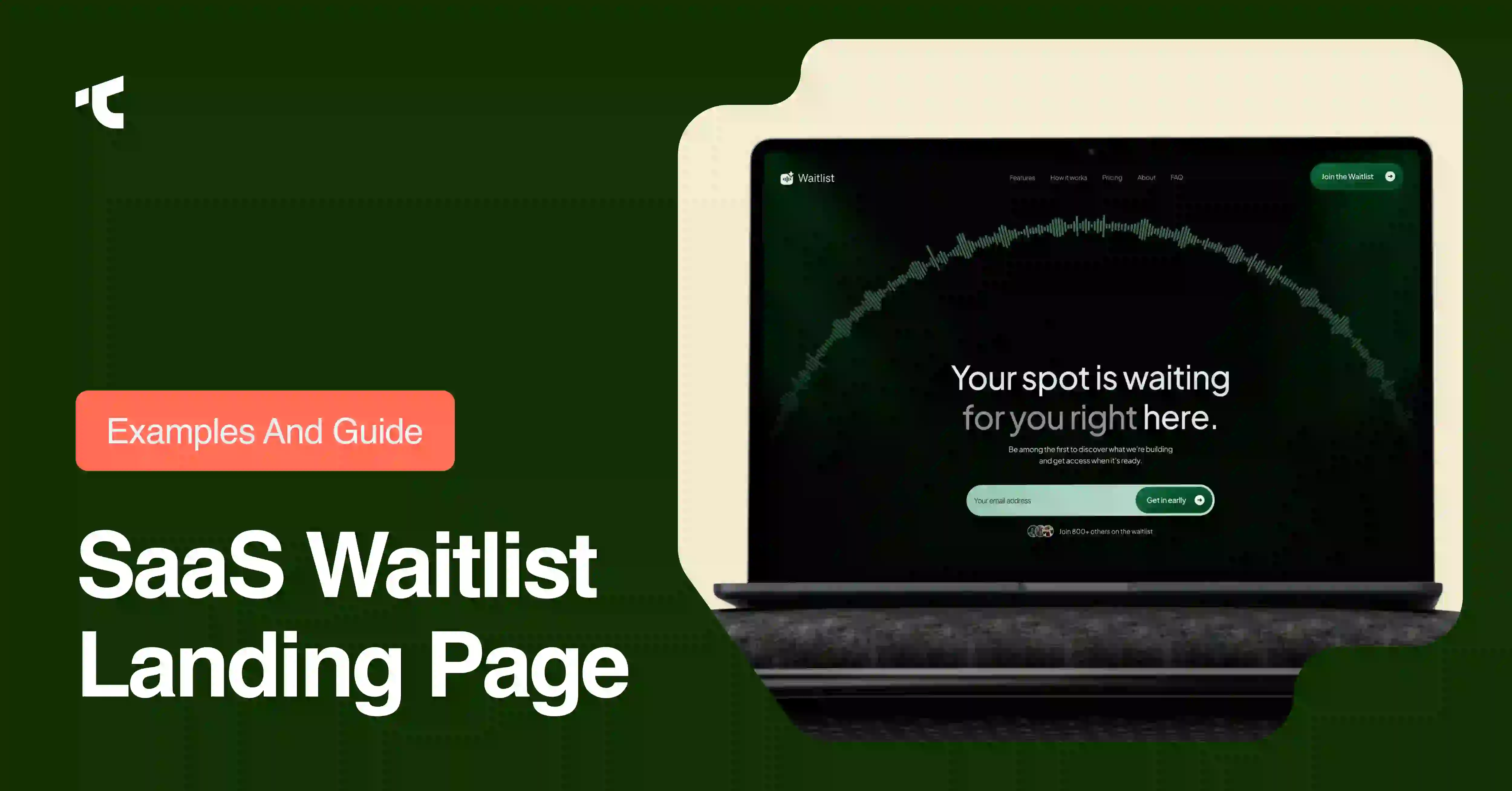
SaaS founders lose months of momentum when they build a product in private and launch to silence. A waitlist landing page solves this problem by collecting emails, validating demand, and building an audience before code ships.
This guide covers 6 core elements every waitlist page needs, a 6-step build process, and 11 real SaaS waitlist landing page examples from Robinhood, Superhuman, Notion, Dropbox, Slack, and other companies that turned pre-launch pages into thousands of signups.
Entrepreneurs, indie hackers, and product marketers use this page type to answer one question before spending months on development: will people actually want this?
Why Build a SaaS Waitlist Landing Page
A waitlist landing page serves 3 main purposes for a SaaS company: validates demand, builds a launch list, and creates momentum.
Demand validation happens first. Visitors who submit an email field signal genuine interest in the product or service. A hundred sign-ups before launch prove that real buyers care, while zero sign-ups reveal a flawed idea before a founder spends 6 months on development.
Launch list building happens next. Every waitlist landing page turns cold traffic into a warm email list. When the launch date arrives, the founder emails an audience that already opted in, instead of buying cold ads to an audience that has never heard of the brand.
Momentum creation compounds these effects. Robinhood grew its waitlist to roughly 1 million sign-ups before launch by pairing a referral mechanic with a visible position counter (GetLaunchList). The page carried one input field, one promise, and a post-signup screen that showed each visitor's exact position in line alongside a share link that moved them up the queue. Each new visitor who saw the growing number decided to join too, and the waitlist compounded itself instead of relying only on paid acquisition.
Startups, fintech apps, ecommerce brands, and B2B SaaS products all use waitlist pages for early access campaigns, beta testing, and pre-launch marketing. The mechanism stays the same across industries: collect an email, promise early access, deliver a clear value proposition.
Essential Elements of a Waitlist Landing Page
6 elements separate a converting waitlist landing page from a page visitors abandon: an outcome-driven headline, one above-the-fold signup form, a clear value proposition, social proof, a referral loop, and a confirmation or success page.
Outcome-driven headline states the specific benefit for a specific audience.
"Commission-free trading for everyone" outperforms "A better way to invest" because it names the outcome instead of describing the category (GetLaunchList). Visitors scan a headline for roughly 2 seconds before deciding whether to keep reading, so vague brand language costs conversions.
One above-the-fold signup form removes every distraction from the primary action. An email field and a single CTA button belong above the fold, without a navigation menu, without a "Learn more" link, and without an "About us" page. Adding a second clickable option drops conversion by 30 percent or more, according to teardown data from GetLaunchList (GetLaunchList).
Value proposition copy answers 3 questions in the first screen: what the product does, who it serves, and why it matters now. Short benefit-driven sentences beat clever, vague copy on every SERP-ranking waitlist guide reviewed for this post.
Social proof builds trust through numbers, not adjectives. A real signup counter, press logos, or testimonials from early users all qualify. Copy like "Join 5,000 others who can't wait to get started" performs better than an unverified claim of popularity, and fabricated numbers erode trust once visitors notice the pattern.
Referral loop mechanics turn each signup into 2 or 3 more. A share link that moves a visitor up the waitlist queue, paired with a visible position number, converts individual signups into a distribution channel. This single mechanic separates pages that merely collect emails from pages that compound their own growth.
Confirmation and success page design closes the loop. After form submission, the success page should restate the value proposition, show the visitor's position or next step, and offer the referral link immediately, while intent is highest.
How to Build a SaaS Waitlist Landing Page (6 Steps)
Building a working waitlist landing page takes 6 steps, and a founder can complete the sequence in under a day, according to build guides from GetLaunchList and FormGrid (GetLaunchList).
- Choose where the page lives. Founders pick either a hosted page on a waitlist tool or a page embedded on an existing site. A hosted page requires no website and launches within minutes, while an embedded page keeps traffic on brand-owned domains.
- Write the headline first. The one-line promise should state what the product does and for whom, in 5 to 8 words. If a founder cannot compress the value proposition into one sentence, the page will not convert regardless of design.
- Add one above-the-fold signup form. An email field and a single CTA button, with no competing links, form the entire primary action zone.
- Turn on the referral loop. A waitlist tool that tracks referral position, generates share links, or displays a leaderboard converts the page from a static form into a growth channel.
- Add honest social proof. A real signup counter, verified testimonials, or press mentions build credibility. Inflated or invented numbers damage trust once visitors compare claims against reality.
- Design the success page and confirmation email. The page a visitor sees immediately after form submission should confirm their spot, show the referral mechanic, and set expectations for the launch date.
Founders without a fixed launch date can still start step 1 today. A "coming soon" message collects emails just as effectively as a page with a confirmed date, and delaying the page until every detail is final costs weeks of list growth.
11 SaaS Waitlist Landing Page Examples
11 companies across fintech, productivity, browsers, and communication used waitlist landing pages to build audiences before launch. Each example below names the mechanic that drove sign-ups.
Robinhood (fintech).
The page combined one promise, commission-free trading, with a post-signup screen showing each visitor's exact position in line. Roughly 1 million people joined before launch, driven almost entirely by the referral mechanic that moved visitors up the queue when friends signed up.
Superhuman (productivity SaaS).
The waitlist required a Zoom interview to gain access. Instead of reducing conversions, the screening process increased them, because the scarcity signal turned waitlist membership into a status symbol. The page converted more than 50 percent of visitors arriving from Product Hunt.
Notion (productivity SaaS).
An early landing page led with real product screenshots instead of stock photography or abstract copy. Visitors saw the actual interface before the tool launched publicly, which built trust through transparency rather than hype.
Dropbox (cloud storage SaaS).
The pre-launch waitlist campaign paired a clear value proposition with referral incentives, and a large share of total growth traced back to referred sign-ups rather than paid acquisition.
Slack (workplace collaboration SaaS).
The waitlist campaign offered exclusive early access alongside referral-driven sign-up incentives. Clear, benefit-driven messaging combined with the referral system grew the email list and created momentum ahead of public launch
Linear (project management SaaS).
The page used opinionated, specific positioning instead of broad, generic messaging. This filtered traffic toward the exact audience the product served, which raised signup quality over raw signup volume.
Arc Browser (browser SaaS).
A video-first hero section replaced static screenshots, communicating the product experience visually before visitors read a single line of copy.
ChatGPT / OpenAI (AI SaaS).
A single launch post doubled as the sign-up mechanism, and OpenAI reached 1 million sign-ups within 5 days by granting access in scarcity-driven batches rather than all at once.
Clubhouse (social audio SaaS).
Time-limited, invite-only access windows created urgency around each new batch of users. Visitors who missed a 48-hour window returned to the back of the line, which manufactured scarcity and drove heavy media coverage.
Conveyor AI (B2B SaaS).
A minimal landing page paired a single signup form with a lead magnet that demonstrated product value before launch, converting cold visitors into engaged email subscribers.
GetResponse (marketing SaaS).
The waitlist page combined a clear headline with a frictionless signup form and visible early-access messaging, following the same 6-element structure that recurs across every high-converting waitlist page in this list.
These 11 examples span 3 core mechanics: referral loops (Robinhood, Dropbox, Slack), engineered scarcity (Superhuman, Clubhouse, ChatGPT), and product transparency (Notion, Arc Browser). A new SaaS waitlist page should borrow at least one mechanic from each category rather than copying a single example wholesale.
Common Mistakes to Avoid
5 mistakes reduce waitlist landing page conversion rates most often: vague headlines, missing referral loops, fabricated social proof, multiple competing CTAs, and delayed follow-up.
Vague headlines describe the category instead of the outcome. "The future of productivity" tells a visitor nothing actionable, while "Ship code reviews in half the time" states a specific, verifiable benefit.
Missing referral loops cap growth at the size of the founder's existing audience. A plain email field on a static page captures addresses but cannot generate position tracking, share links, or a leaderboard, the exact mechanics that let a waitlist compound itself.
Fabricated social proof damages trust permanently. Inventing a signup counter or a fake countdown timer risks exposure once a visitor notices the discrepancy, and the resulting distrust spreads faster than the original hype.
Multiple competing CTAs split visitor attention. A navigation menu, a "Learn more" link, and an email form on the same screen force a decision the visitor did not come to make, and every additional click option lowers the primary conversion rate.
Delayed follow-up wastes the moment of highest intent. A visitor who just submitted an email is maximally engaged for the next few minutes. A confirmation email, a referral link, and a clear next step should arrive immediately, not days later.
Frequently Asked Questions
What is a SaaS waitlist landing page?
SaaS waitlist landing pages are web pages built to collect email addresses from interested users before a software product launches. The page's primary goal is converting visitors into a warm, pre-qualified audience through one signup form.
How long does it take to build a waitlist landing page?
Building a functional waitlist landing page takes under 15 minutes using a dedicated waitlist tool, or a few hours using a general landing page builder. The 6-step process covered above applies regardless of the tool chosen.
What conversion rate should a waitlist landing page target?
Waitlist landing pages converting between 20 and 30 percent of visitors perform well, according to teardown benchmarks from GetLaunchList and FlowJam. Pages below 25 percent typically need a stronger headline, while pages above 30 percent with weak referral numbers usually need a stronger post-signup incentive.
Does a waitlist landing page need a fixed launch date?
No fixed launch date is required. A "coming soon" message collects emails just as effectively as a page with a confirmed date, and delaying the page launch to finalize a date costs weeks of avoidable list growth.
What is the single highest-leverage feature on a waitlist landing page?
The referral loop delivers the highest leverage of any single feature. A visible position counter paired with a share link converts each signup into a distribution channel, the exact mechanic behind Robinhood's roughly 1 million pre-launch signups.
Conclusion
SaaS founders who build a waitlist landing page before writing production code validate demand, build a launch list, and generate momentum in parallel. The 6 essential elements, an outcome-driven headline, a single above-the-fold form, a clear value proposition, honest social proof, a referral loop, and a strong success page, apply across fintech, productivity, ecommerce, and every other SaaS category covered in this guide.
The 11 examples above prove the same 3 mechanics work repeatedly across industries: referral loops compound growth, engineered scarcity builds desire, and product transparency earns trust. A new waitlist landing page should combine at least one mechanic from each category, then iterate based on real conversion data rather than assumptions.




.avif)