.svg)

.svg)
%201.svg)


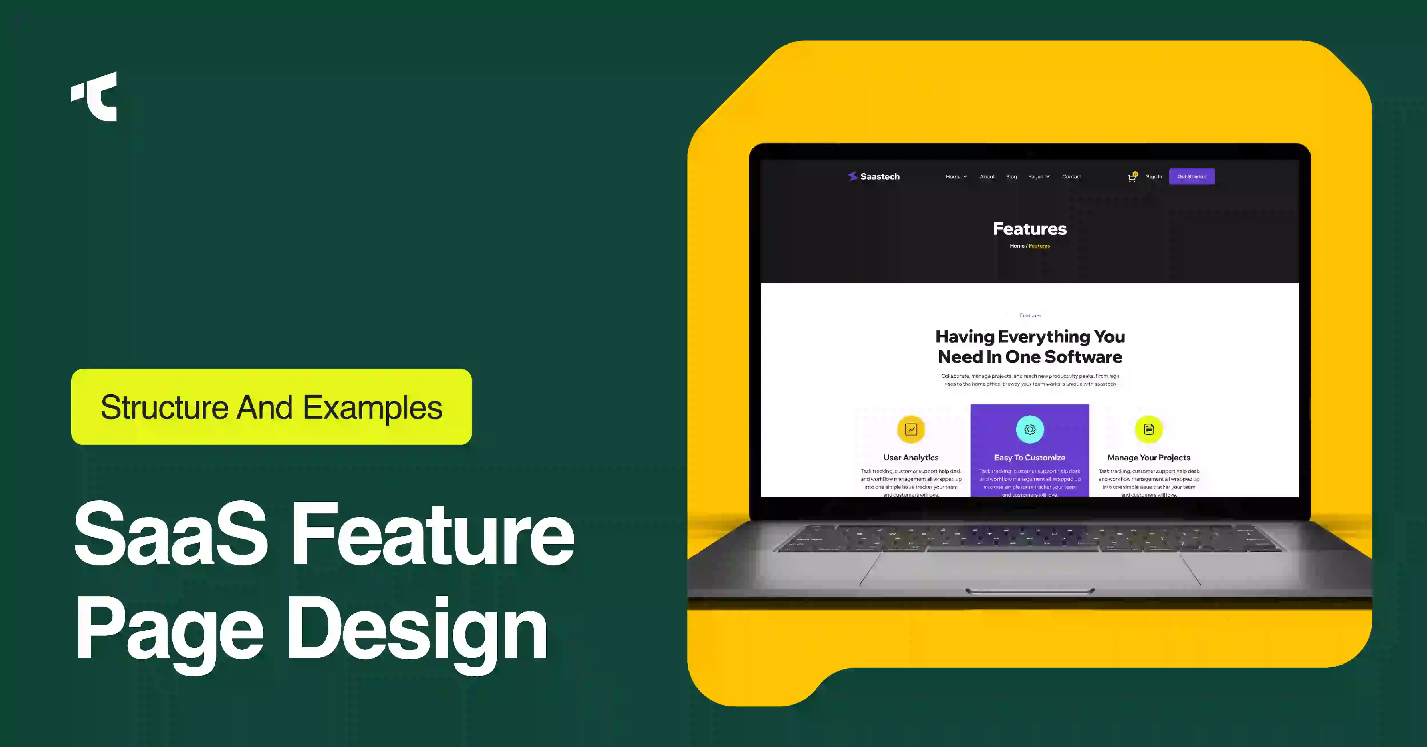
You launch a new feature, pour weeks of engineering into it, then push it live behind a saas feature page design that hides the value and lets qualified SaaS buyers bounce. Most SaaS founders and product owners build a feature page as one screenshot plus a paragraph, so the page states what the feature does and never proves why a buyer should switch, upgrade, or start a trial. That gap costs signups on every launch.
This guide gives you a tested 9-section structure, 7 real SaaS feature page examples, and a design checklist you map onto your next release. Every recommendation below reflects SERP consensus from SaaS design studios and conversion analysts, so you build from proven patterns instead of guesswork.
What is a SaaS feature page?
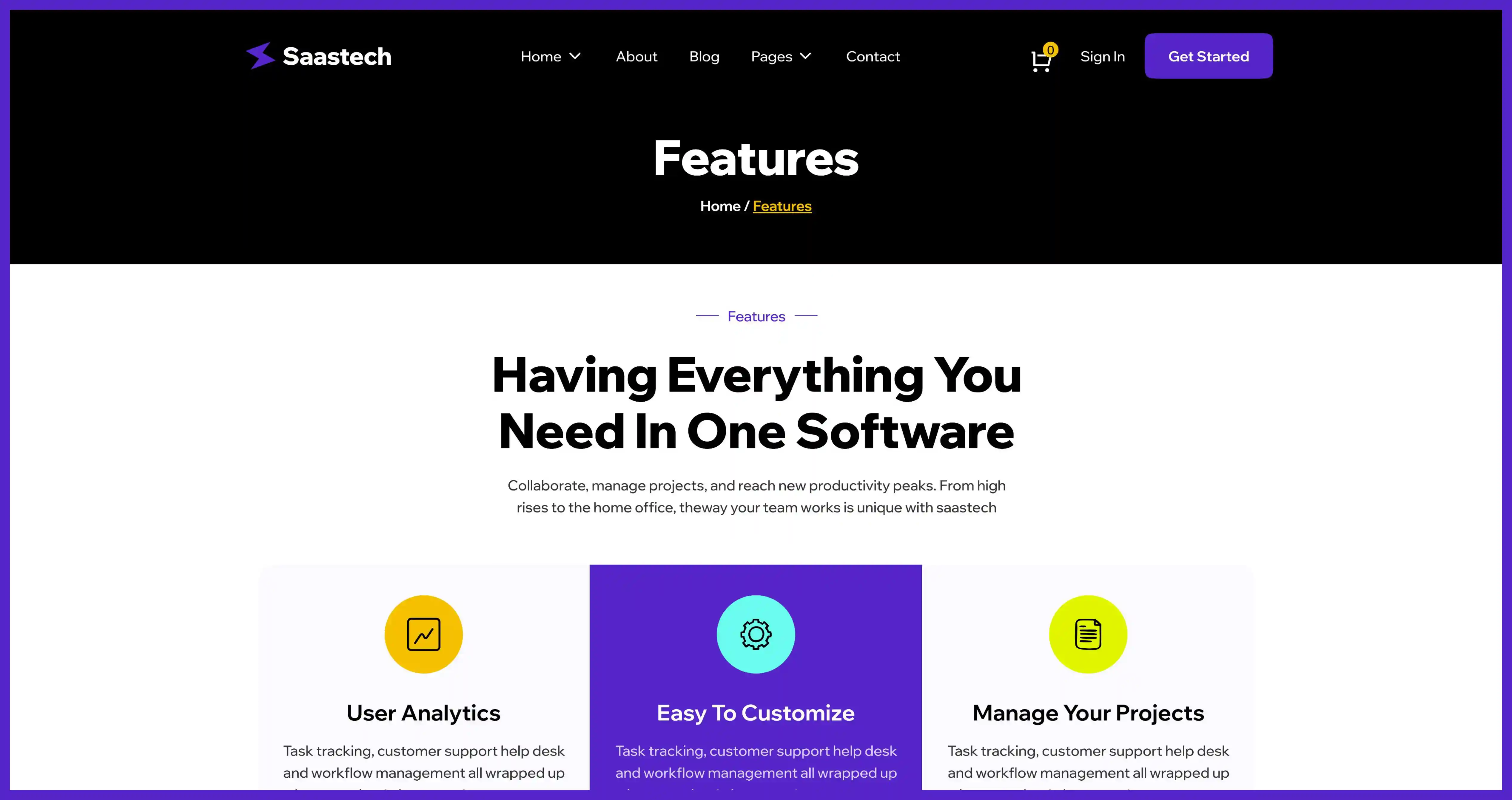
SaaS feature page is a standalone marketing page that explains one product capability, ties that capability to a buyer outcome, and pushes the visitor toward a single conversion action like a trial or a demo. SaaS feature page sells one feature to one buyer segment, unlike a homepage that summarizes the whole product.
Product owners publish feature pages for 3 reasons: to rank for feature-specific search queries, to give sales a link that answers one objection, and to convert visitors who arrive curious about a single capability. Each reason maps to a different visitor, so the page carries a narrower job than your homepage.
SaaS feature page vs landing page vs homepage: what is the difference?
To separate these 3 page types, match each page to its visitor intent and scope. SaaS feature page covers one capability in depth, a landing page targets one campaign or offer, and a homepage introduces the entire product. Scope shrinks from homepage to feature page, so specificity rises in the same direction.
Homepage answers "what is this product and who is it for" for a cold, mixed audience. Landing page answers "should I take this one offer" for traffic from one ad, email, or campaign. Feature page answers "how does this specific capability solve my specific problem" for a detail-seeking buyer who already knows your category. Confusing these 3 jobs produces a bloated feature page that reads like a second homepage and converts like neither.
The 9-section SaaS feature page structure
High-converting SaaS feature pages follow a consistent 9-section order that moves a buyer from attention to action. Orbix Studio and DesignStudio both document a near-identical sequence, and the frame that repeats across every strong example is feature, then benefit, then outcome. Build these 9 sections in order.
1. Hero section
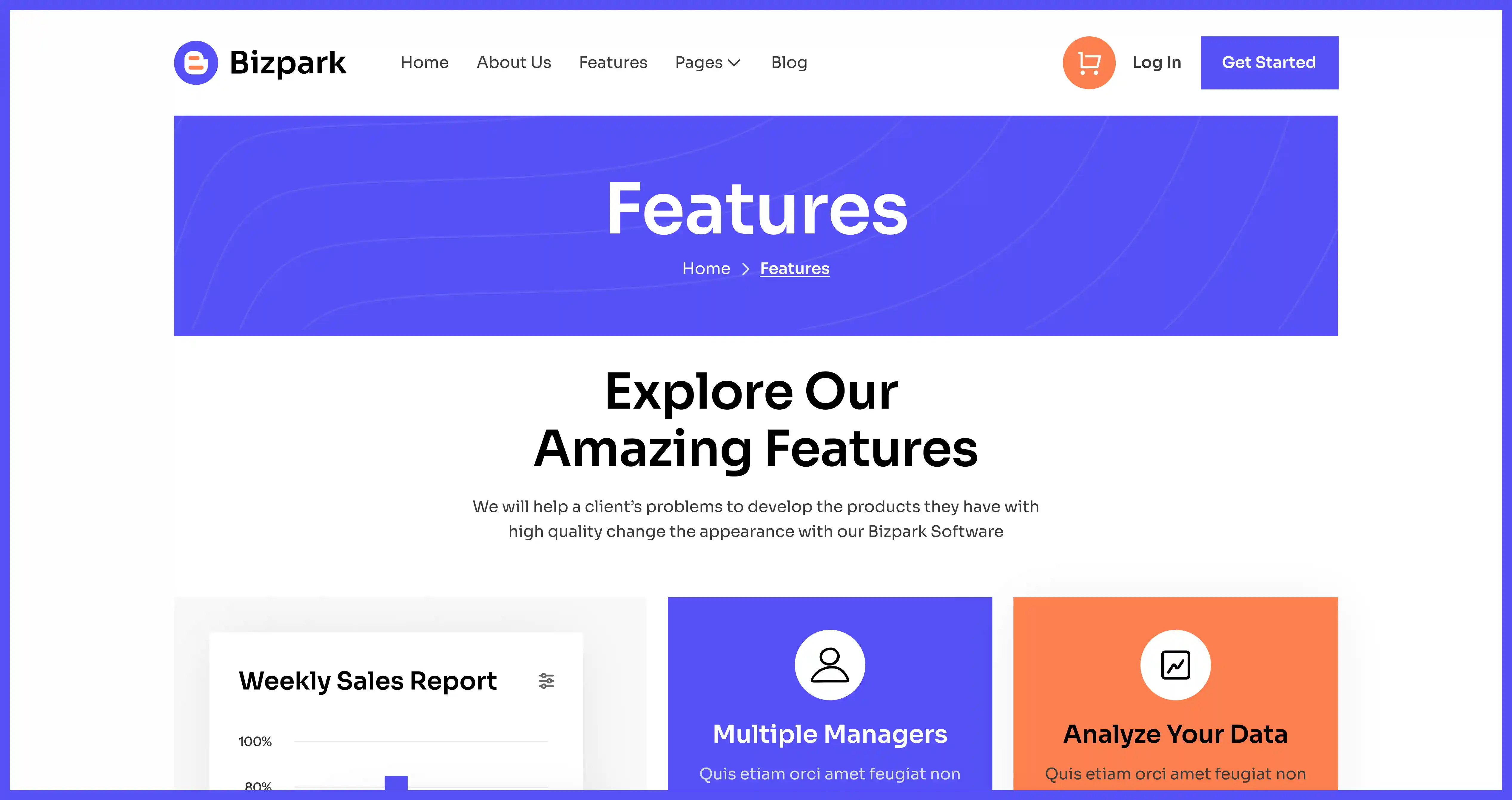
Hero section occupies the top viewport and decides whether the visitor scrolls or leaves. Pack 5 components into it: an outcome headline, a one-line subheadline naming the buyer and the mechanism, a high-contrast primary CTA, a secondary CTA for a different intent, and visual proof through a product screenshot or short demo. Lead the headline with the result the feature delivers, not the feature name, because buyers scan for outcomes first.
2. Social proof bar
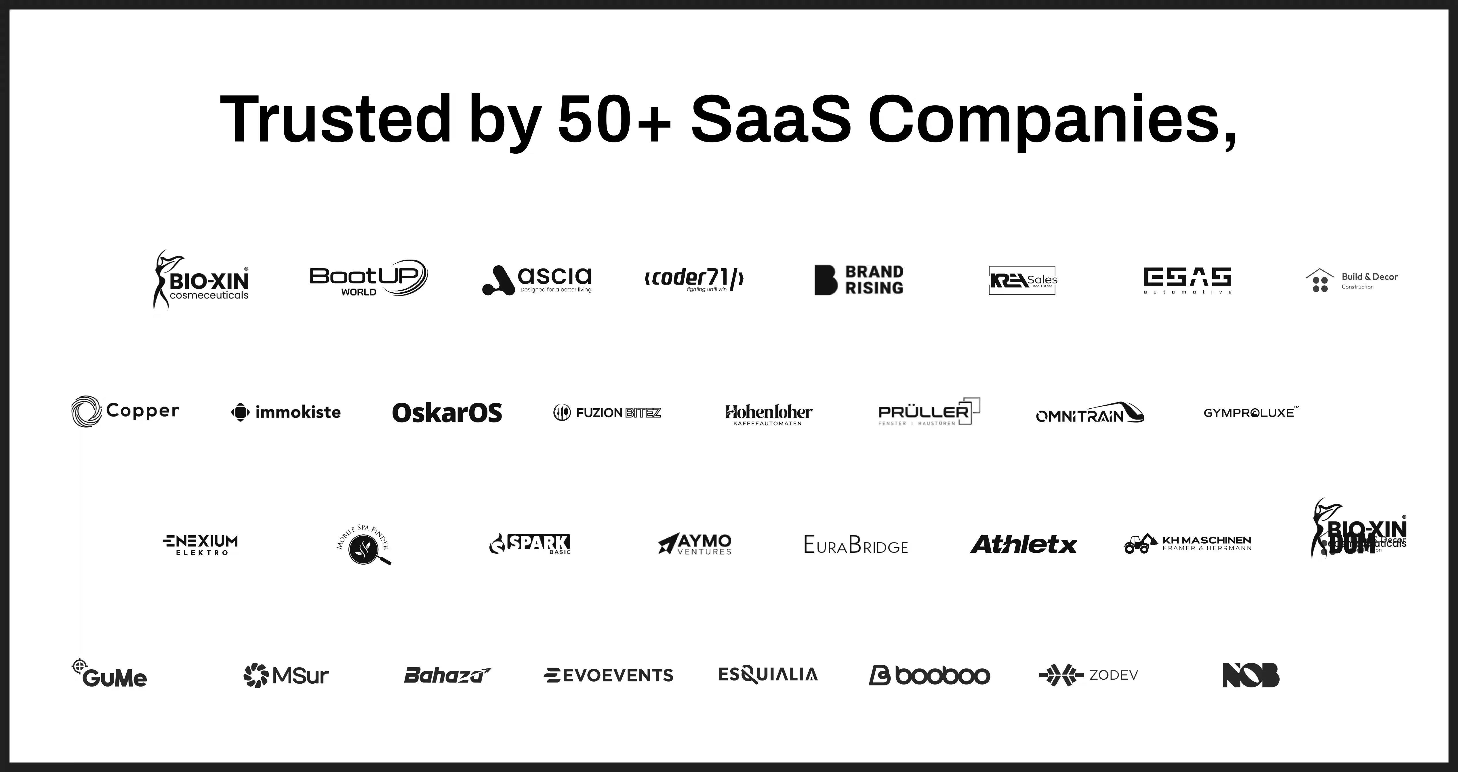
Social proof bar sits directly below the hero and reduces perceived risk at the exact moment a visitor considers the CTA. Show 4 proof formats: recognizable customer logos, a specific customer count, a review badge such as G2, and a one-line metric. Frame the count as a hard number, for example "join 450,000+ companies," because a specific figure builds more entity salience than a vague claim of popularity.
3. Problem and pain framing
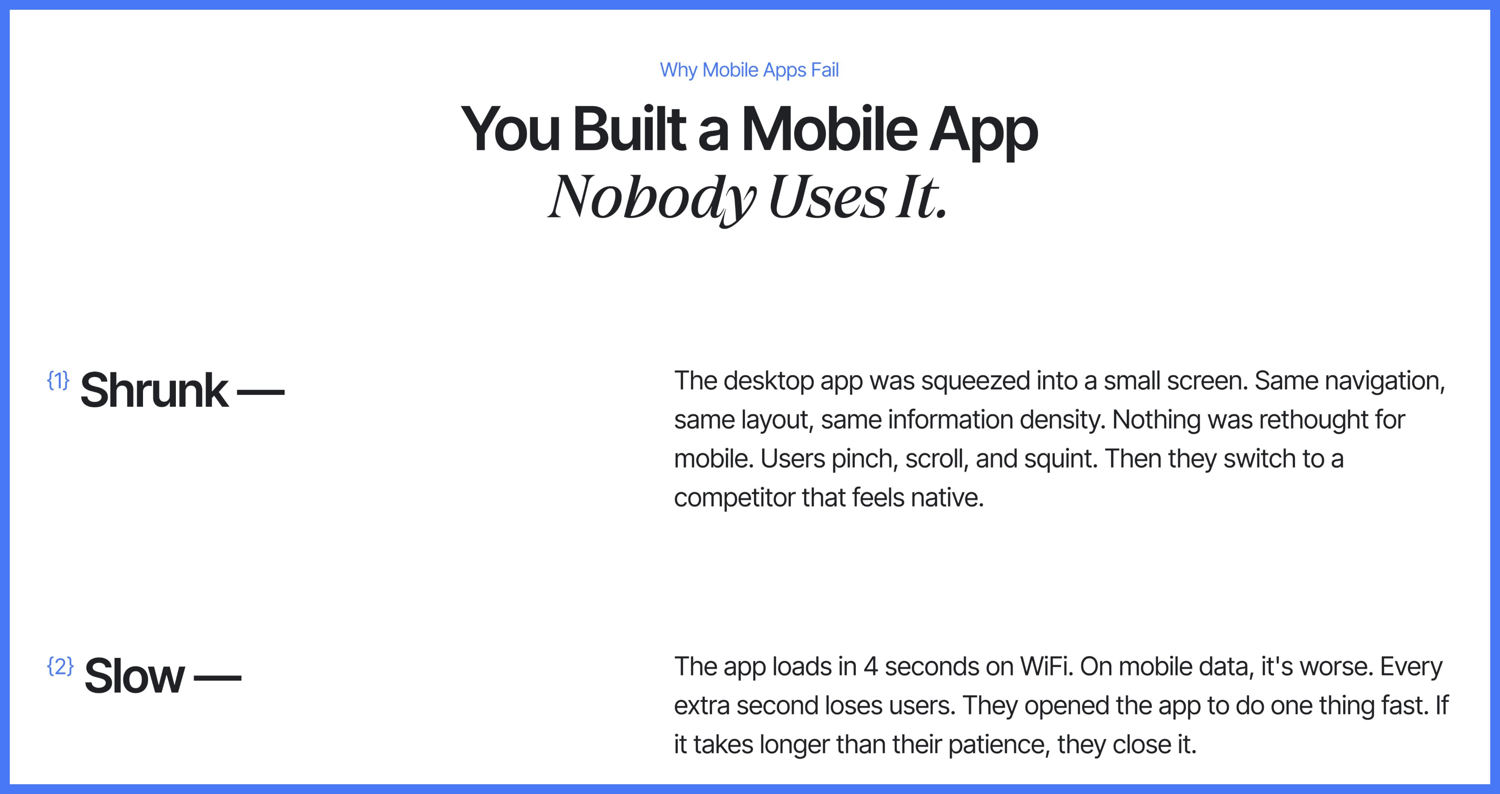
Problem section names the friction your buyer feels before the feature existed. State the cost of the status quo in concrete terms, then position the feature as the mechanism that removes that cost. Keep this block to 2 or 3 sentences, because a detail-seeking buyer wants confirmation you understand the pain, not a lecture on it.
4. Feature to benefit to outcome blocks
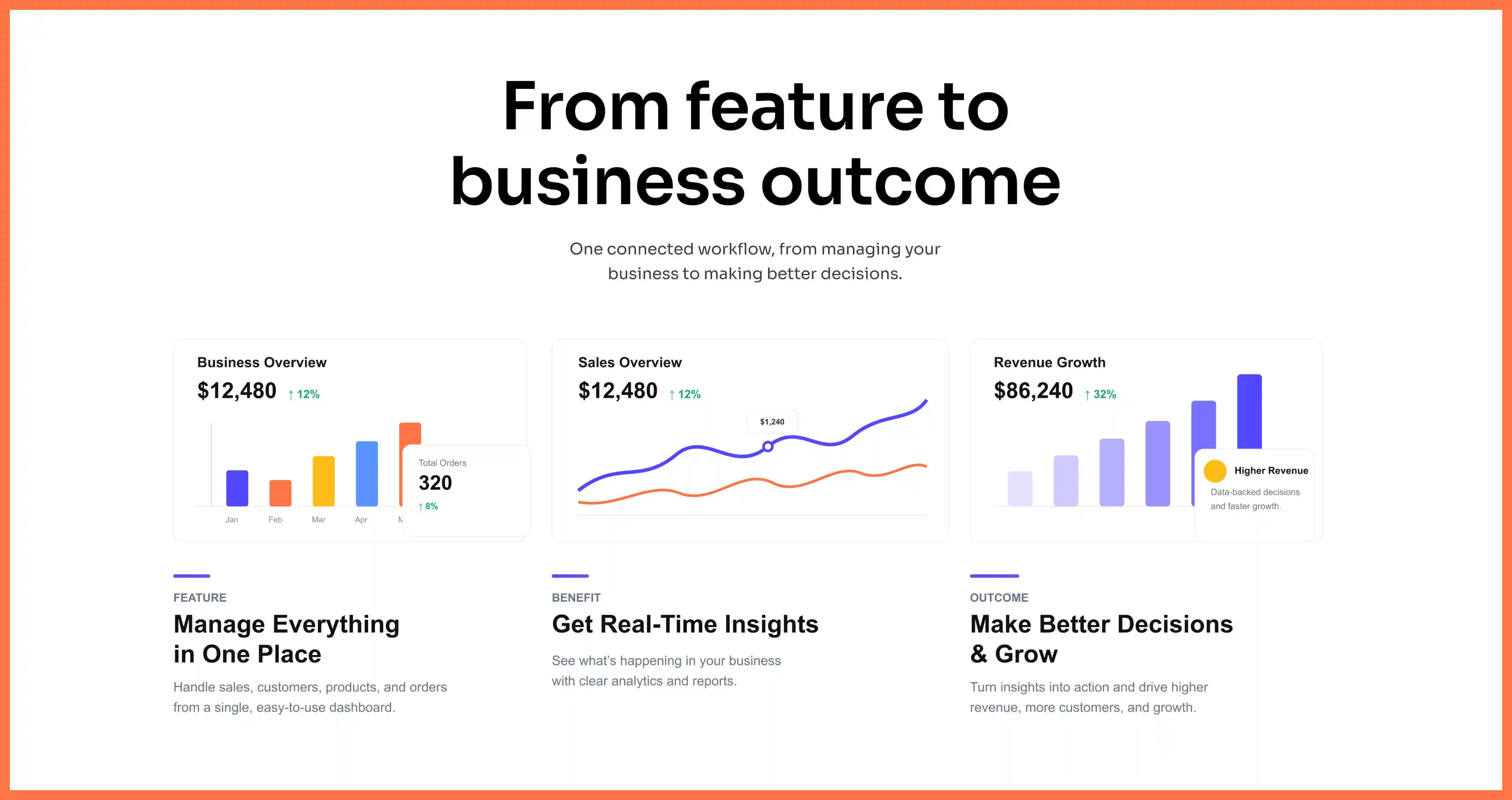
Feature blocks form the core of the page and carry the heaviest conversion load. Structure each block as a triple: the feature, the benefit it produces, and the business outcome that benefit drives. Show a workflow across 2 or 3 connected features instead of listing isolated capabilities, because buyers evaluate whether the feature fits a real job, not whether a checkbox exists.
5. Product visuals and interactive demo
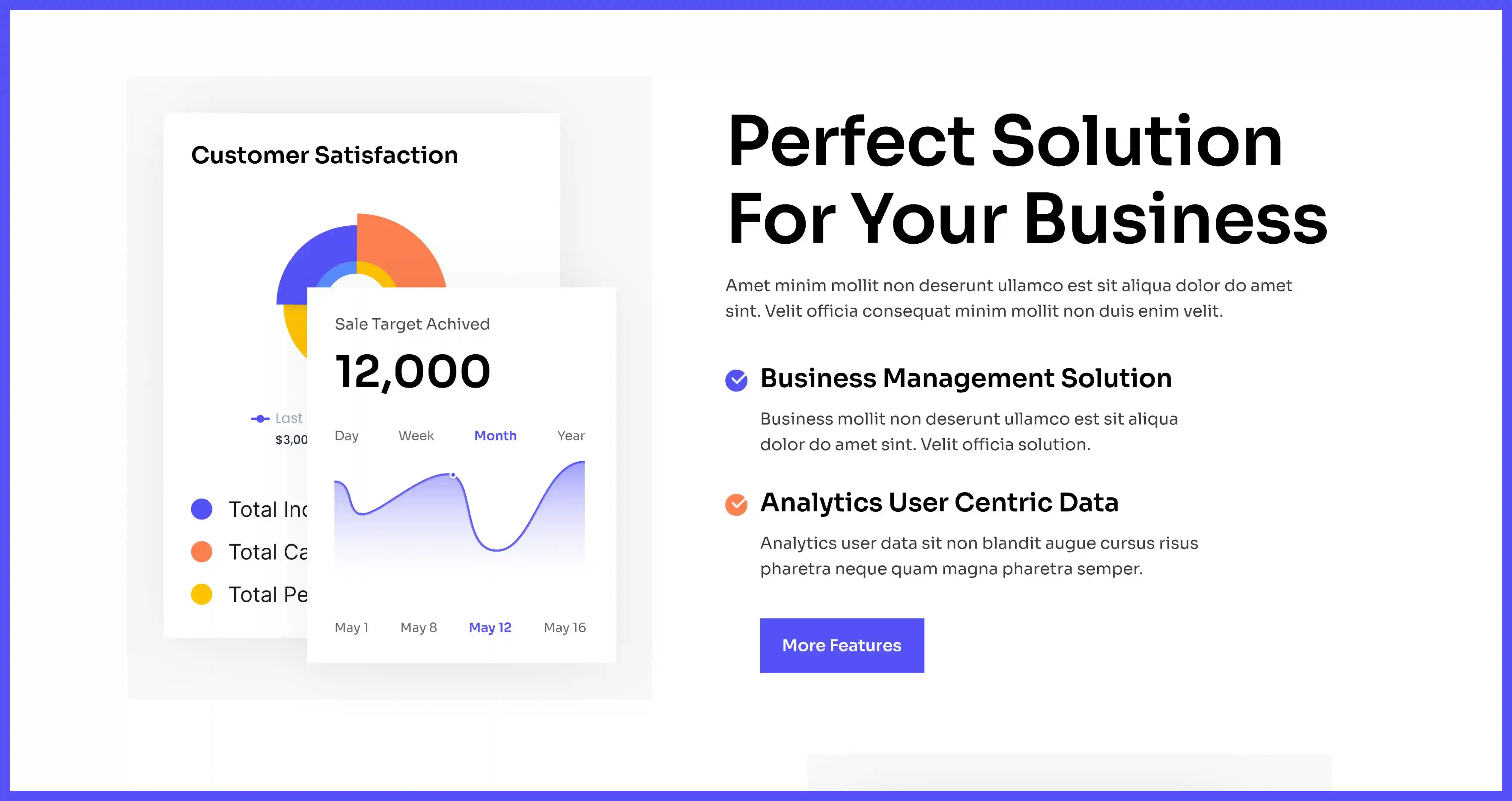
Visual section proves the feature is real and usable. Use 3 asset types: annotated product screenshots, short looping GIFs of the workflow, and an interactive demo where the buyer clicks through the feature. Pair every claim with the matching visual, because a SaaS product stays abstract until the buyer sees the interface that delivers the promised outcome.
6. Use cases and buyer segments
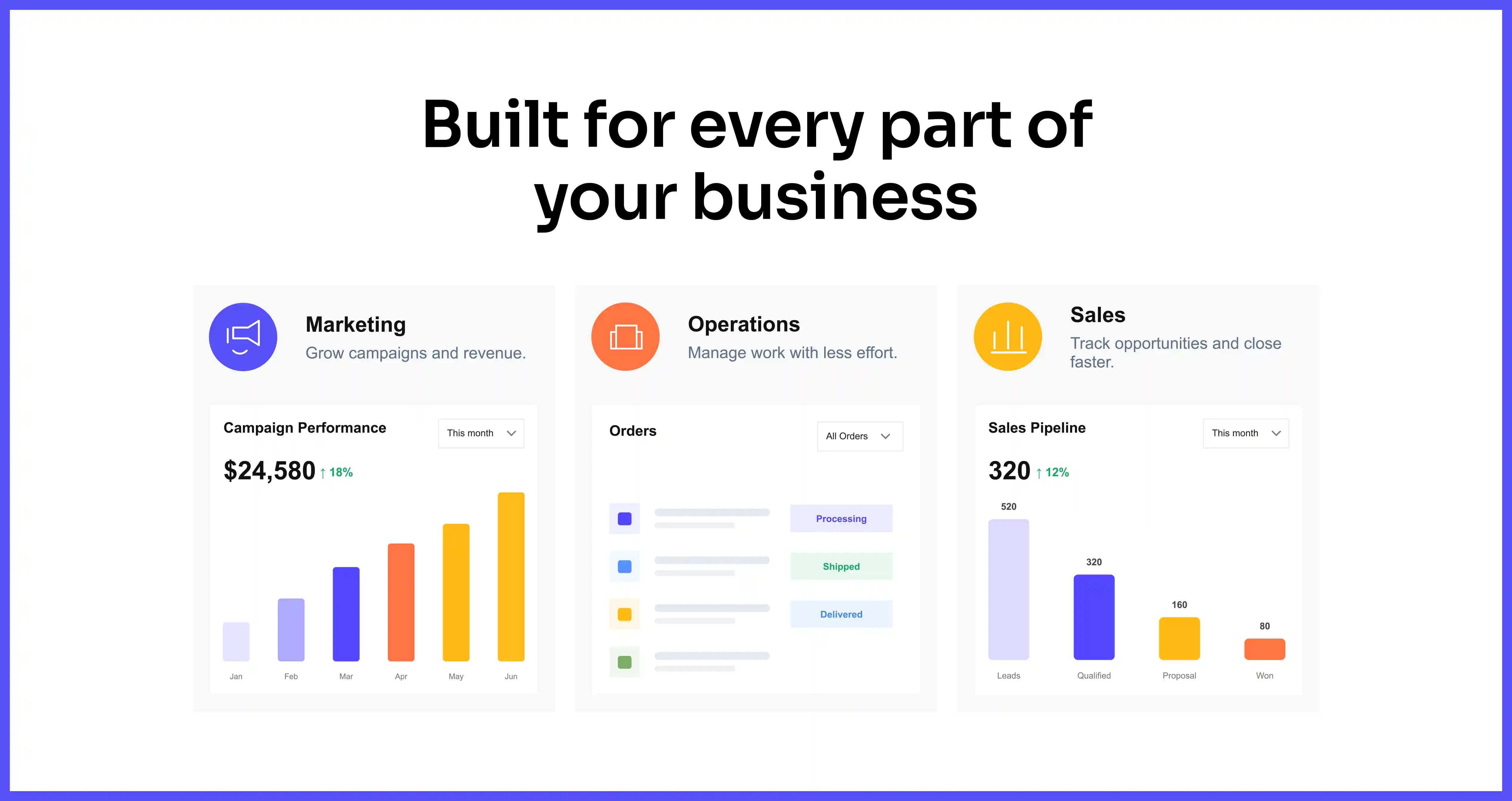
Use-case section shows different visitors that the feature fits their specific job. Split the section into 3 or 4 labeled segments, for example marketing, operations, and IT, and give each segment its own outcome sentence. Add segment blocks, if your product serves multiple personas, so one feature page answers several buyers without losing precision.
7. Customer evidence
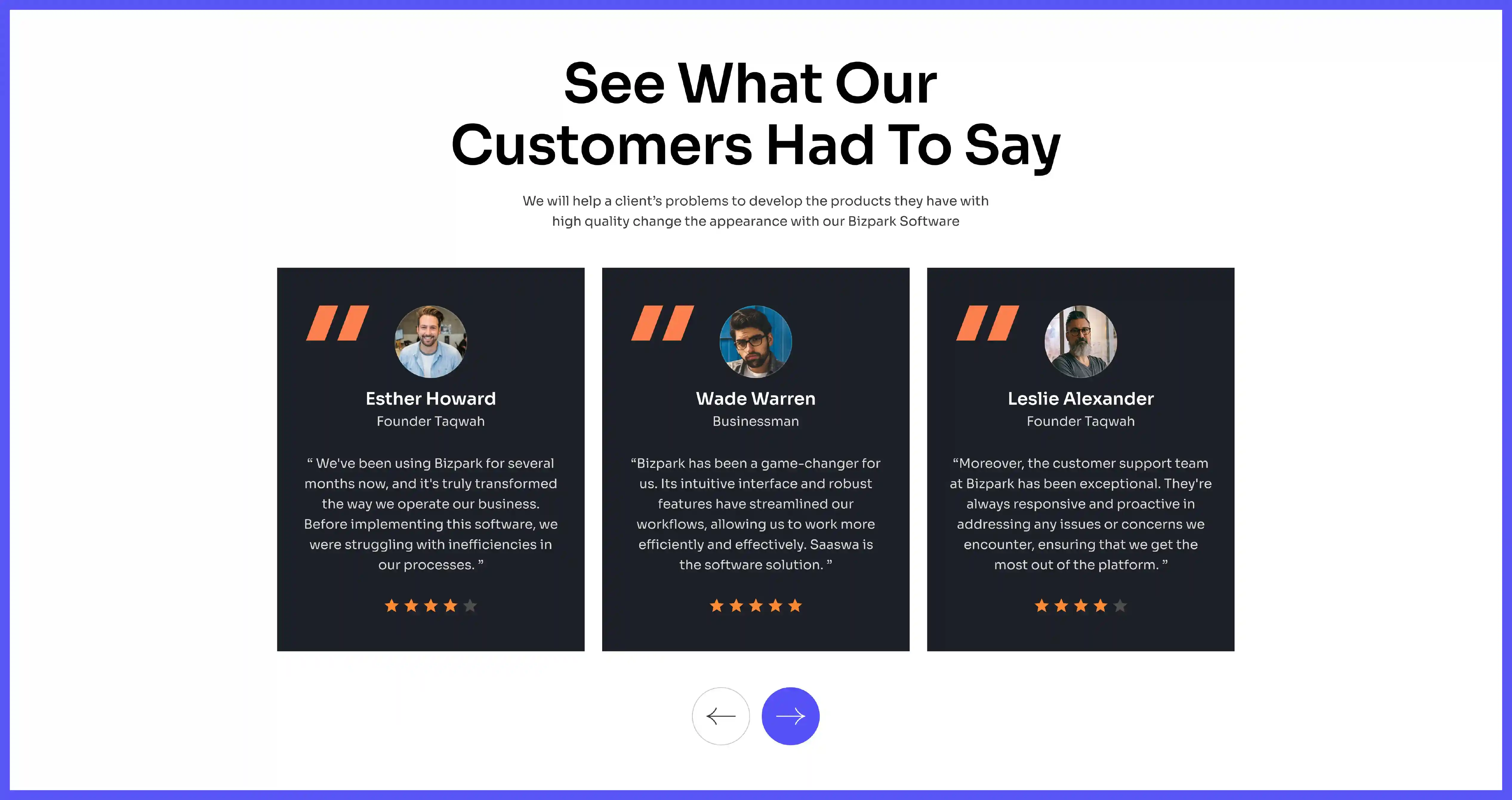
Evidence section places a case study or testimonial next to a conversion point. Attach a named customer, a specific result, and a photo or logo, because proof carries weight only when it is verifiable and attributed. Position this block near a mid-page CTA, since social proof converts best at the moment of decision rather than after it.
8. Objection handling and FAQ
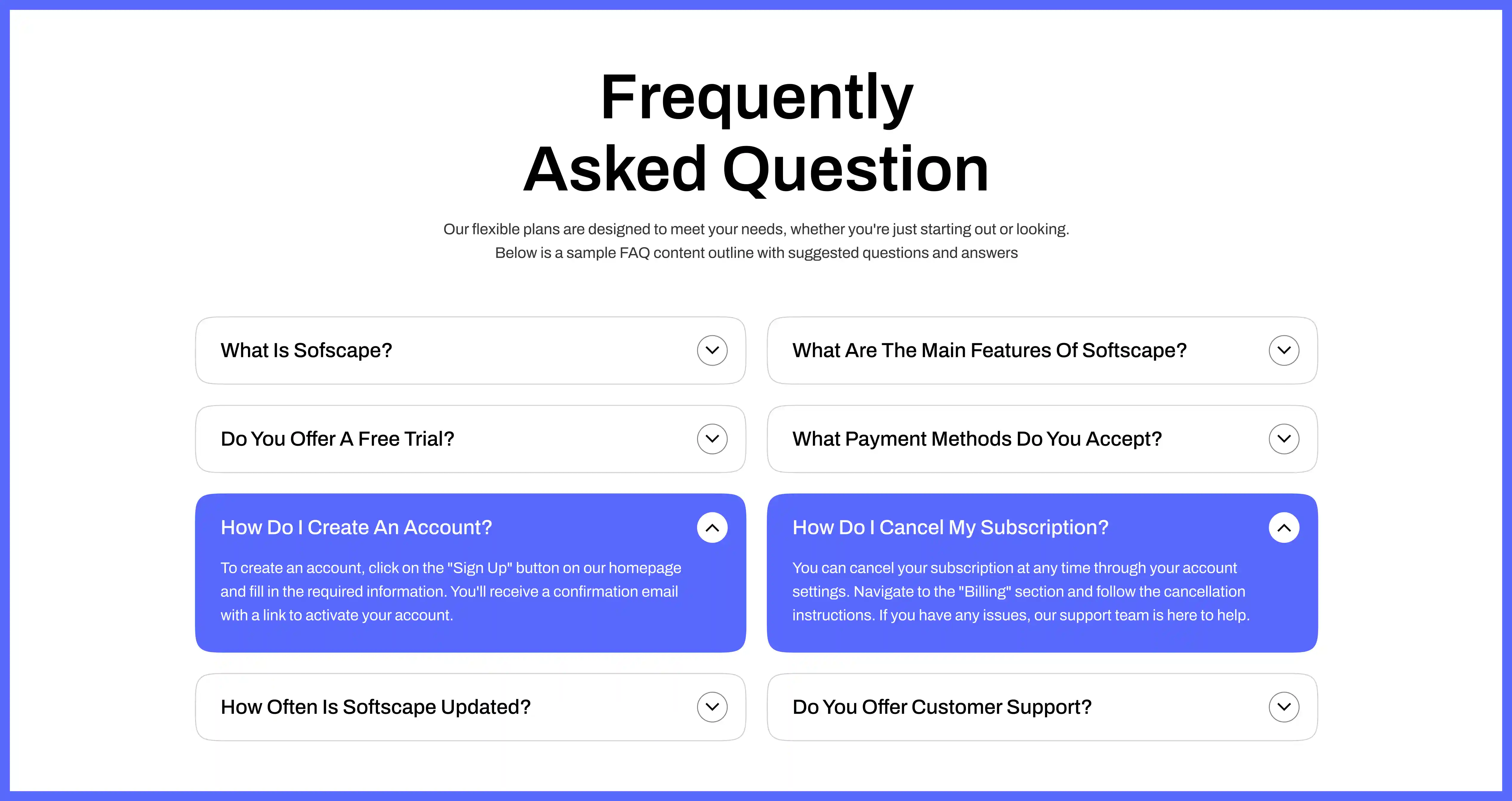
FAQ section answers the 4 or 5 questions that stall a buyer before signup. Cover pricing signals, integrations, security, and migration effort, because these 4 concerns block SaaS purchases most often. Write each answer in 40 words or fewer, so a scanning buyer resolves the objection without leaving the page to search.
9. Closing CTA
Closing section gives the buyer one final, sharpened action after the full page. Offer 1 primary CTA, restate the core outcome above it, and remove competing links that leak attention. Repeat the hero's promise in fresh words, because a visitor who reached the bottom earned a clearer ask than the input box they already saw at the top.
7 SaaS feature page examples that convert
These 7 SaaS companies design feature pages that match the structure above, and each one demonstrates a specific tactic you can copy. Study the pattern, then adapt it to your product.
Notion, a connected workspace and note-taking SaaS platform, frames its agents feature with the headline "Meet the night shift" and the subline "Notion agents keep work moving 24/7 while you sleep." Notion turns a generic proof row into a hard stat with "Trusted by 98% of the Forbes Cloud 100," then offers dual paths through "Get Notion free" and "Request a demo."
Linear, a project and issue-tracking SaaS for software teams, relies on the company it keeps rather than testimonials. Linear lines up premium tech logos as social proof and closes with the CTA "Built for the future," which suits a brand-conscious developer audience.
Miro, a visual collaboration and whiteboard SaaS, places a clean logo bar just below the hero. Miro keeps every logo black and consistently sized, which makes the social proof read as intentional design instead of a cluttered badge wall.
Intercom, an AI-first customer service SaaS, leads its feature pages with an outcome headline like "the complete AI-first customer service platform." Intercom renders the product screenshot in dark mode, matching the visual taste of the product and developer buyers it targets.
Calendly, a scheduling automation SaaS, reduces friction to near zero and stacks a social proof bar of Fortune 500 logos immediately below the hero. Calendly associates its scheduling feature with enterprise credibility before the buyer reads a single benefit.
Salesforce, a CRM and cloud software SaaS, leads with a customer count and G2 award badges above the fold, before any feature appears. Salesforce answers the trust question a buyer never voices, then shows the feature.
Tines, a security automation and low-code workflow SaaS, gives its "Cases" feature page a purple blueprint grid theme with floating UI screenshots. Tines makes the interface feel integrated into the page, which raises immersion for a technical buyer evaluating automation.
How do you design the hero section of a SaaS feature page?
To design a converting hero, combine an outcome headline, a buyer-and-mechanism subheadline, one primary CTA, and visual proof, all visible without scrolling. Hero section carries the highest conversion leverage on the page, so it earns the most testing.
Framiq reports that only 46% of SaaS websites include social proof in the hero section, which leaves an easy advantage for the half that add it. Tenet's analysis of 28 SaaS websites found that 82% of SaaS companies place at least one clear CTA in the hero, and the pages that execute it record measurable lifts. Framiq documents one fintech SaaS platform that recorded a 28% increase in demo bookings after moving the primary CTA above the fold.
Order the hero components by impact when you test: headline copy first, primary CTA wording second, CTA color and placement third, and hero visual fourth. Move the hero visual below the text on mobile, if the screen is small, because text above the fold on mobile is more valuable than an image.
5 SaaS feature page design mistakes to avoid
These 5 mistakes drain conversions from feature pages, and each one appears often in SaaS audits. Fix them before your next launch.
Mistake 1: Listing features without outcomes. Feature lists describe the interface and skip the result, so the buyer cannot judge fit. Rewrite each block as feature, benefit, outcome.
Mistake 2: Placing pricing above value. Pricing shown before proof forces a cost decision before the buyer sees the payoff. Move pricing signals into the FAQ or a later section, and lead with value.
Mistake 3: Stacking 3 competing CTAs above the fold. Multiple equal CTAs split attention and stall the decision. Limit the hero to 1 primary action, then add a secondary CTA lower once intent shifts.
Mistake 4: Using stock illustrations instead of the product. Generic art hides the interface and keeps the feature abstract. Swap illustrations for annotated screenshots and short demos of the real workflow.
Mistake 5: Writing a second homepage. Feature pages that summarize the whole product lose the depth a detail-seeker wants. Cover 1 capability in depth and trust the homepage to carry breadth.
SaaS feature page design checklist
Run your page against these 8 checks before you publish. Complete each one, because a single missing element weakens the conversion path.
Lead the hero with an outcome headline that names the result. Place a social proof bar directly below the hero with logos and a specific count. Show every feature as a feature, benefit, outcome triple. Pair each claim with an annotated screenshot, GIF, or interactive demo. Add labeled use-case blocks for each buyer persona you serve. Attach a named case study with a verifiable result near a CTA. Answer the top 5 objections in 40-word FAQ entries. Close with 1 primary CTA that restates the core outcome.
How long should a SaaS feature page be?
SaaS feature page runs as long as it needs to move a buyer from problem to conversion, usually 6 to 9 sections. Page length follows buyer intent, not a fixed word count, so a complex enterprise feature earns more sections than a simple utility feature.
How many CTAs should a SaaS feature page have?
Feature page uses 1 primary CTA repeated 3 to 4 times down the page, plus 1 secondary CTA for a different intent. One primary action per page keeps the decision simple, so avoid pairing "start free," "book a demo," and "see pricing" as equal buttons above the fold.
Should each feature get its own page?
Products with 2 or more distinct capabilities benefit from a dedicated page per feature. Separate feature pages rank for feature-specific queries and answer one buyer objection each, so a horizontal SaaS with several personas gains more from multiple pages than from one crowded page.
Where should social proof go on a feature page?
Social proof belongs directly below the hero and again beside the closing CTA. Proof converts best next to a conversion point, not buried mid-page, so place logos, counts, and a named result at the 2 moments a buyer weighs the action.
Turn your next feature launch into a page that converts
You now hold a 9-section structure, 7 example patterns, 5 mistakes to avoid, and an 8-point checklist for your saas feature page design. Apply the feature, benefit, outcome frame to one launch, add proof at the 2 decision points, and hold the page to a single primary action. Taqwah, a SaaS product design agency, builds feature pages on this exact structure for founders who want the launch to earn signups instead of impressions.




.avif)