.svg)
%201.svg)

Web app design for B2B SaaS products can have a bigger impact than most people realize. When a new user logs in for the first time on your web app, you have only a few minutes to help them understand your product and see its value.
During that short time, users are making a simple decision: is this product easy to use, or is it going to take too much effort to figure out? If the experience feels clear and straightforward, they keep exploring. If it feels confusing, many will simply stop using the product and may never come back.
That's why UI/UX is so important in modern B2B SaaS products (Web App). Today, many SaaS platforms offer similar features, integrations, and workflows. What usually makes the difference isn't the number of features a product has, it's how easy those features are to find, understand, and use. A strong SaaS UI/UX helps users get started faster, complete tasks with confidence, and see value from the product sooner.
The challenge is that users don't judge your product all at once. They judge it screen by screen. A confusing onboarding flow can slow adoption. A cluttered SaaS dashboard can hide important information. Poor navigation can make simple tasks feel difficult. Even an empty state or loading screen can shape how users feel about your product.
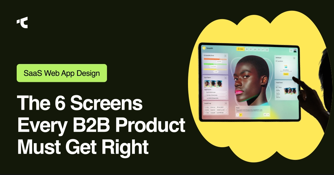
In this article, we'll look at the six screens for SaaS web app that have the biggest impact on
1. User adoption,
2. Customer retention, and
2.SaaS growth.
From onboarding and dashboards to admin settings, navigation, data tables, and empty states, these are the screens every B2B SaaS product needs to get right.
1. Onboarding
Onboarding is where many B2B SaaS products win or lose new users (Screen no one). It's also where SaaS web app design makes its first impression. Many teams try to show every setting, integration, and feature at once, hoping users will quickly understand the product. Instead, the experience becomes crowded and overwhelming. Users end up confused before they have a chance to see any real value, leading to frustration and unnecessary support requests.
Good SaaS web app design treats onboarding as a series of small wins rather than a long setup process. Instead of asking users to configure everything on day one, spread setup tasks across multiple sessions.
Use an interactive walkthrough to guide users through the core workflow that demonstrates your product's value. Contextual guidance should appear when and where users need it, rather than being hidden inside a help center.
The goal is to improve time-to-value by helping users achieve a quick win and become productive as quickly as possible. This approach is a key part of effective B2B SaaS design and a better user experience.
Because B2B SaaS products serve different types of users, role-based onboarding is equally important. A finance lead and a daily operator log in with different goals, responsibilities, and expectations. Sending both through the same onboarding flow can leave one user bored and the other confused.
Effective SaaS web app design recognizes these differences and adapts the experience to match each user's needs. Intercom's Product Tours and HubSpot's role-aware onboarding are strong examples of how guided, in-context onboarding can improve user activation, increase engagement, and create a better SaaS UI/UX experience from the very beginning.
2. Dashboard
For many B2B SaaS products, the dashboard is where users spend most of their time. It's the screen they rely on to track performance, monitor progress, and make decisions. Yet many SaaS dashboards struggle with the same problem: trying to show too much information at once.
A dashboard's role in SaaS web app design is to create a clear information hierarchy. Users should immediately understand what matters most and where their attention belongs.
Key performance indicators (KPIs) should appear in the most visible areas, while supporting details can sit lower on the page or behind a click. Good dashboard design also relies on the right data visualization.
Line charts work well for trends, bar charts are ideal for comparisons, and pie charts should be used sparingly. Users should be able to drill down from summary metrics into detailed reports, and export functionality should be available for analysis that continues outside the platform.
When dashboard design is done well, data visualization helps users make faster decisions with less effort. When it's done poorly, users spend more time searching for information than acting on it.
Many teams assume they have a data problem when the real issue is dashboard design. If users regularly export data to spreadsheets just to understand what's happening, that's a strong sign the dashboard experience needs improvement.
Another challenge in B2B SaaS design is serving different user roles from a single dashboard. Executives want a high-level view of business performance, while analysts need deeper access to reporting and operational data.
Product managers, team leads, and daily operators each have different goals as well. Instead of forcing every user into the same experience, SaaS UI/UX design should adapt to different needs through role-specific dashboards. Showing the right information to the right user reduces complexity and helps users find answers faster.
As SaaS products grow, dashboards become more difficult to manage. New features introduce new metrics, reports, and workflows. Without regular review, dashboards gradually become crowded and harder to use. This is why dashboard redesign is a common part of SaaS product growth. A well-designed dashboard doesn't just display datait helps users understand it, trust it, and act on it.
Shopify's approach of placing high-impact metrics front and center, along with HubSpot's separate views for leaders and operators, are strong examples of SaaS web app design that balances simplicity, usability, and depth without overwhelming users.
3. Admin Panel
Admin panel is one of the most important screens in SaaS web app design. It's where teams manage users, set permissions, connect integrations, and configure the product to match how their organization works. When this part of the product is hard to use, implementation slows down, support requests increase, and user adoption suffers.
Good admin panel design starts with organization. Group settings by task, not by alphabet. Most admins arrive with a clear goal, whether it's setting up SSO, adding new users, managing access control, or connecting an integration. They shouldn't have to dig through dozens of menus just to complete a simple task.
Strong SaaS UI/UX also helps prevent mistakes before they happen. Validation should catch configuration errors before they affect other users. Preview mode gives admins a chance to review changes before making them live. These small details reduce risk, improve trust, and make configuration easier for growing teams.
As B2B SaaS products grow, admin work becomes more complex. User management expands, permissions become harder to control, and new integrations introduce additional setup requirements. This is where bulk operations, templates, and presets become valuable. Instead of repeating the same steps over and over, admins can manage large user groups and launch new setups much faster.
Behind every great admin experience is a strong foundation of permissions, access control, and data governance. Teams need a simple way to grant the right level of access without creating support tickets. Larger organizations also need audit logs, security controls, and compliance-ready systems they can trust. These features may not be visible to every user, but they play a major role in long-term product success.
Zendesk is a strong example of this approach. Its admin panel keeps admin configuration separate from day-to-day work, allowing power users to manage settings without adding complexity for everyone else.
For many SaaS founders, the admin panel becomes a blind spot. New features get added, settings grow, and workflows become harder to manage over time. If admins need extra training, rely on support for routine tasks, or struggle to configure the product on their own, it's usually a sign that the admin panel design needs attention, or a redesign.
4. Navigation
Navigation is the screen users never consciously praise and constantly silently judge. Get the information architecture wrong, and people default to support tickets instead of self-service; get it right and a deep, powerful product still feels effortless.
There's no single correct pattern; the right choice depends on the shape of your product:
- Sidebar navigation is the reliable default for products with roughly 5–15 main sections and a clear hierarchy.
- Command palette suits power users who know exactly where they want to go and prefer keyboard speed over clicking.
- Breadcrumbs are essential in deep hierarchies, so users always know where they are and can backtrack without losing context.
- Search-first approaches shine when the feature set is large, and users arrive with specific, varied goals.
Layered with progressive navigation, revealing advanced areas only to the users who need them, good IA keeps the everyday interface clean while preserving depth. The payoff is self-service: users find what they need without asking, which is the quiet engine behind lower support costs. Intercom's IA redesign is a useful example of balancing simplicity with depth.
5. List View
List view is one of the most used screens in B2B SaaS products. Every CRM, project management tool, admin panel, and business platform relies on it in some form. Yet many teams design list views based on habit instead of real user needs.
Good list view design starts with choosing the right format. Some data works best in cards because it is easy to scan and more visual. Other data belongs in a data table where users need to compare rows, sort records, and work with large datasets. Choosing between cards and tables should depend on how users interact with information, not personal preference.
Strong SaaS web app design also makes it easy for users to find what they need. Filters and sorting should match the way people search, review, and manage data. Pagination and infinite scroll should support the task at hand. Bulk actions are just as important, especially for users who repeat the same tasks throughout the day. Small improvements in list view design can save hours of work over time.
Performance matters as much as layout. Loading states should keep the interface responsive, even when datasets become large. Users should never feel like the product is slowing them down while data loads in the background.
One of the most overlooked parts of SaaS UI/UX design is data density. Show too little information and users waste time opening records. Show too much and screen becomes hard to scan. Good list view design finds the right balance, giving users enough context to make decisions without overwhelming them.
As SaaS products grow, list views become more complex. More users, more records, and more workflows place greater demands on the interface. If users struggle to find data, manage records, or complete routine tasks, list view design may need a review or redesign.
Many of the best examples already exist in products people use every day. Open a well-designed CRM or project management tool and look at how it handles thousands of records without feeling slow, crowded, or difficult to use. That's the standard modern SaaS web app design should aim for.
6. Empty States
The last screen is the one teams forget entirely: the moments when there's nothing to show, or when the user is waiting. These in-between states quietly shape whether a product feels alive or broken.
Start with the empty state. A blank screen on a feature's first use is a missed opportunity at best and a source of confusion at worst. Replace it with a clear next-action suggestion; tell the user what this screen will become and how to get there. A good empty state is really an onboarding moment in disguise.
Then handle waiting honestly. A useful rule of thumb: for waits under about ten seconds, a skeleton screen that hints at the final layout reduces perceived wait time; for anything longer, a progress bar with a real sense of progress keeps users patient. Beyond loading, close every loop with system feedback: a clear, actionable error message that explains what went wrong and how to fix it (never a raw error code), a quiet success confirmation when an action lands, and a visible system status for the background processes and integrations that B2B products run constantly.
The Threads That Run Through All Six
A few principles aren't screens of their own but should show up everywhere: progressive disclosure (reveal complexity only as users need it), role-based interfaces (one product, many tailored views), and a ruthless attention to cognitive load. A shared design system of reusable components keeps all six screens consistent as the product grows, which matters more in B2B than in consumer software because users build muscle memory through repetition. And underneath it all: fight feature bloat by improving feature discoverability, design for a multi-persona reality, and treat WCAG accessibility and consistency as non-negotiable defaults, not afterthoughts.
Conclusion
It's tempting to think product success is decided in the roadmap, in the list of features you ship next quarter. In practice, it's decided on these six screens. Onboarding decides whether users ever reach value. Dashboards, navigation, and listings decide whether they stay efficient day to day. Settings decides whether your product survives a real implementation. And the empty and loading states decide whether the whole thing feels trustworthy.
This is where adoption, retention, and churn are actually settled, long before anyone reads your change-log. If your B2B SaaS product hasn't had these screens looked at since an early build sprint, that's usually where the friction is hiding.
Frequently Asked Questions
What screens does every B2B SaaS app need?
At minimum: onboarding, a primary dashboard, settings/admin, navigation, a listing or data-table view, and well-designed empty and loading states. These six carry the bulk of daily user interaction and decide adoption.
What is the most important screen in a SaaS product?
For new users, it's onboarding, because it determines whether anyone reaches value at all. For existing users, it's the dashboard, since that's the screen they return to every day. The honest answer is that the weakest of your core screens sets your ceiling.
How do you reduce churn through UX design?
Shorten time-to-value with focused onboarding, reduce cognitive load with progressive disclosure, and remove friction from the workflows users repeat daily. Churn usually starts as quiet frustration on a screen users touch often.
What is progressive disclosure in SaaS UX?
It's the practice of revealing complexity gradually, showing only what a user needs for the current task and keeping advanced options accessible but out of the way until they're needed. It keeps powerful products approachable.
How do you design a B2B SaaS dashboard?
Lead with a clear information hierarchy: put the highest-value KPIs where the eye lands first, choose chart types deliberately, offer drill-down to detail, and tailor the view to the user's role rather than showing everyone the same screen.


.avif)