.svg)

.svg)
%201.svg)


Your trial page is asking for something a normal landing page never asks for. It is asking for time, not just an email address. Your demo request page only needs a visitor to agree to a phone call. Your pricing page only needs them to agree to pay. Your free trial landing page needs them to hand over 10, 14, or 30 days of their attention, and that is a bigger ask, so it deserves a page built around three decisions you get to make: how long the trial runs, whether you ask for a credit card up front, and how much you show them about life after signup.
We build these pages for SaaS clients, and we have watched all three decisions go wrong in the same ways, again and again. Get the trial length wrong, and your signups feel like a trap they walked into. Hide your card policy and your support inbox fills up in week one with people asking why they got charged. Skip the product preview and visitors sign up with no idea what they are about to see, then leave before they find out. Our SaaS landing page examples roundup covers the wider landing page category; this post stays narrowly on trial pages.
Sixteen live examples fill out the rest of this post, picked to show you the real range: no-card trials, card-required trials, freemium-to-paid models, and B2B pages that sit behind a lead form instead of a self-serve button. Each one gets broken down into what works and what we would change, so you can borrow the parts that fit your product before you build your own.
What Is a SaaS Free Trial Landing Page?
SaaS free trial landing page is a dedicated page built to convert a visitor into an active trial user, and nothing else. Every headline, screenshot, and form field on it points at one action: start the trial. A homepage carries multiple jobs, from brand story to hiring to investor signaling. A trial page carries one job, so anything that does not move a visitor toward signup does not belong on it.
Confusion with two other page types comes up often, so the boundary is worth stating plainly. A demo request page collects contact details and ends with a scheduled call, not product access. A pricing page compares plans and sends buyers into checkout. A trial page skips both: it gives access first and asks for payment later, or not at all.
Dedicated trial pages earn their build cost once a SaaS moves past the earliest stage. Early on, sending trial traffic to the homepage works fine because volume is low and every visitor gets equal attention. Growth changes that. Paid ads, comparison sites, and affiliate traffic all need a page tuned to one intent, stripped of the nav links and blog teasers that pull a homepage visitor away before they finish the form.
7 Must-Have Elements of a High-Converting Free Trial Landing Page
1. Headline that names the outcome, not the product category. "Project management software" describes a category. "Ship projects two weeks faster" describes an outcome. Visitors skim headlines in under two seconds, so the headline has to answer what changes for them, not what the tool is called.
2. Trial terms stated above the fold. Length, card policy, and what happens when the trial ends all belong near the CTA, not buried in an FAQ accordion three scrolls down. A visitor who has to hunt for "will I be charged" is a visitor who leaves to search for the answer somewhere else, usually a review site that is not rooting for the conversion.
3. Sign-up form with the fewest fields you can defend, plus SSO. Every additional field drops completion rate. Name, work email, and a Google or Microsoft sign-in option cover most B2C and PLG products. Fields like company size or phone number belong in onboarding, after the account exists, not before.
4. A preview of the product after signup. Screenshots, short videos, and interactive demos all work, and any one of them beats a stock photo of people pointing at a laptop. Visitors evaluating software want to see the interface before they commit their time to it.
5. Social proof close to the button, not only at the bottom. Logo strips and one-line quotes placed near the CTA do more work than a testimonials section a visitor never scrolls to reach. Trust signals convert when they sit at the decision point, not after it.
6. Risk removal. Cancel anytime, no card required (when true), data export on cancellation, and a short security note cover the objections that stop a hand on the mouse. State these plainly instead of implying them.
7. One CTA, repeated, with no competing offers in the nav. Nav bars linking to blog, careers, and three other CTAs turn a trial page into a page fighting itself. Strip the nav down to logo and CTA, and repeat that single CTA at the top and bottom of the page.
Design and copy decisions for a full page, not just a trial page, get more room in our how to design a SaaS landing page guide.
3 Free Trial Models and Which One Fits Your Product
Opt-in trial, no card required, suits products with a short time-to-value and a wide top of funnel. Zoho Analytics and Zendesk both run this model. Sign-up volume runs high because friction is low, but trial-to-paid conversion runs lower, since anyone can start a trial on a whim and never return. This model fits products where the first session alone can prove value.
Opt-out trial, card required, suits products with higher price points or higher fraud risk. Semrush, Adobe Creative Cloud, and Hootsuite use this model. Sign-up volume drops because a card is a real commitment for a visitor still deciding, but the users who do sign up convert to paid at a meaningfully higher rate, since the auto-renewal default works in the vendor's favor. Industry trial-conversion benchmarks from Totango put self-serve opt-in trials around 15 to 25 percent conversion and opt-out trials meaningfully higher, though exact figures vary by category and are worth checking against a current benchmark source before quoting in a deck.
Freemium with upgrade, suits products with a usage ceiling that naturally pushes active users toward a paid tier. Trello, Canva, and Hotjar all run some version of this. There is no trial clock, so the page has to sell the paid tier's specific unlocks rather than urgency. This model needs the free tier itself to be genuinely useful, or the freemium label becomes a bait-and-switch in the visitor's eyes.
Whichever model fits, the page has to show it honestly. A visitor who discovers a hidden card requirement after clicking "free trial" does not become a customer.
16 SaaS Free Trial Landing Page Examples
Checked live in September 2026. Trial terms change without notice, so treat these as a snapshot, not a permanent record.
Trello
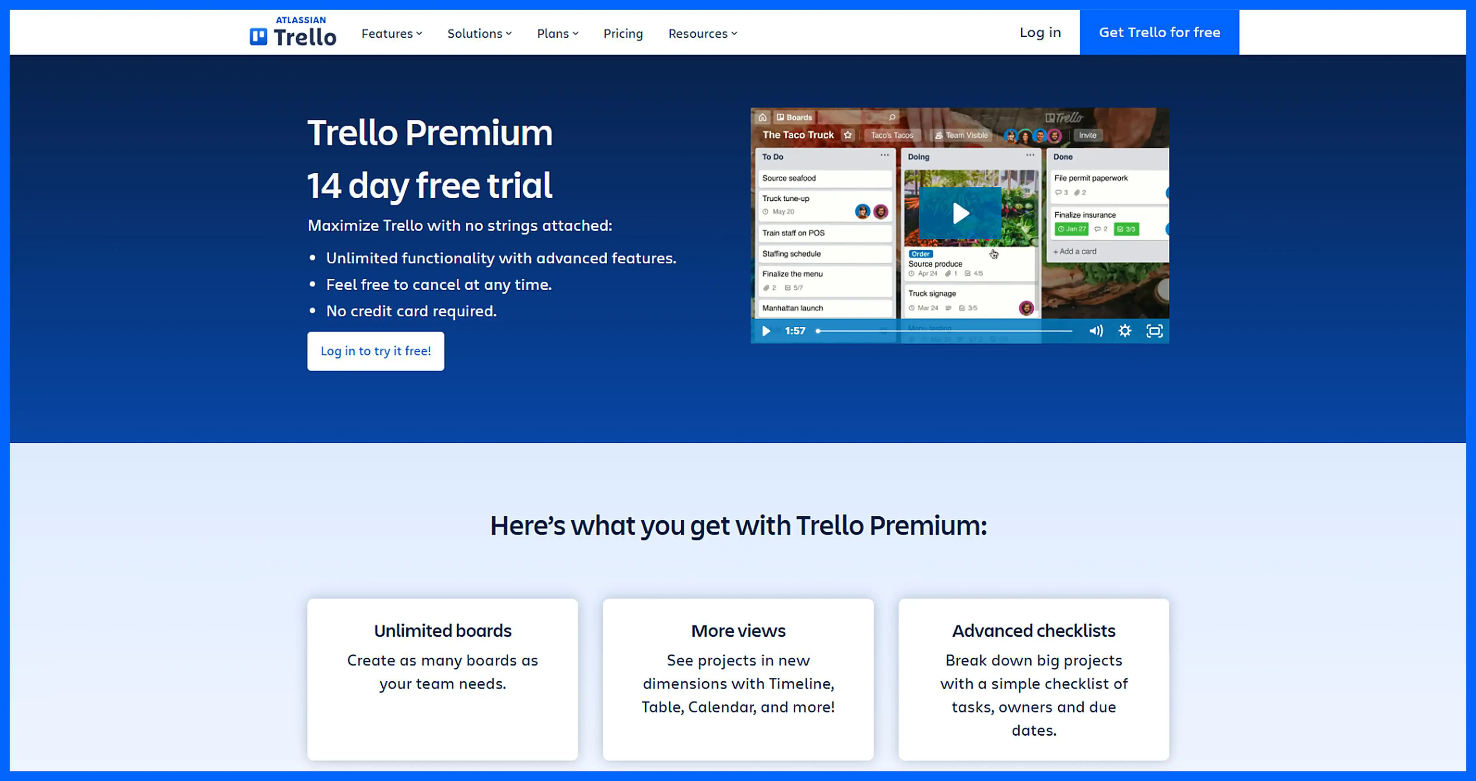
Trello's own pricing page offers a permanent free plan alongside paid tiers, and new signups get auto-enrolled into a 14-day Premium trial with no card required.
What works:
- The free plan sits right next to the trial, so a visitor who does not want to commit to anything still gets a usable product
- No card requirement removes the single biggest signup objection for a tool this widely tried
- The board preview on the pricing page shows the actual interface, not an illustration
What we would change: the auto-enrollment into Premium is not clearly flagged at signup, and community forum threads show real user confusion about being billed after a trial they did not knowingly start. A clear opt-in step would fix this.
Shopify
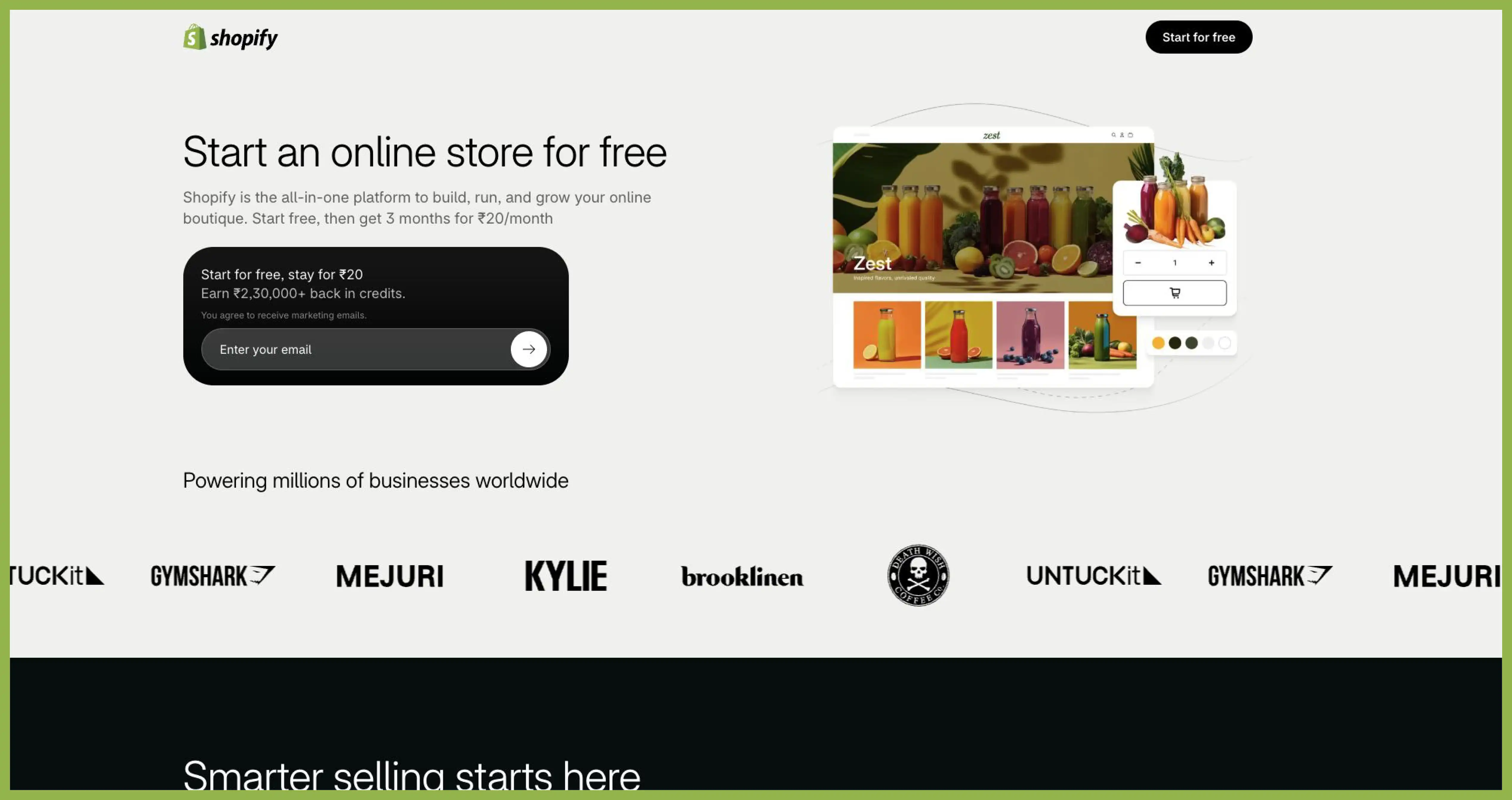
Shopify runs a 3-day free trial with no card required, followed by a promotional 3 months at $1 per month once a card is added.
What works:
- The 3-day window is honest about what it is for: confirming the platform works for your product, not building a finished store
- The $1 promotional bridge lowers the jump from free to paid without asking for a full-price commitment on day one
- Store setup starts immediately after email entry, so the visitor is building before they finish reading the page
What we would change: 3 days is thin for anyone new to ecommerce, and the page could set expectations better by showing a task checklist for what to accomplish before the trial clock runs out.
Canva Pro
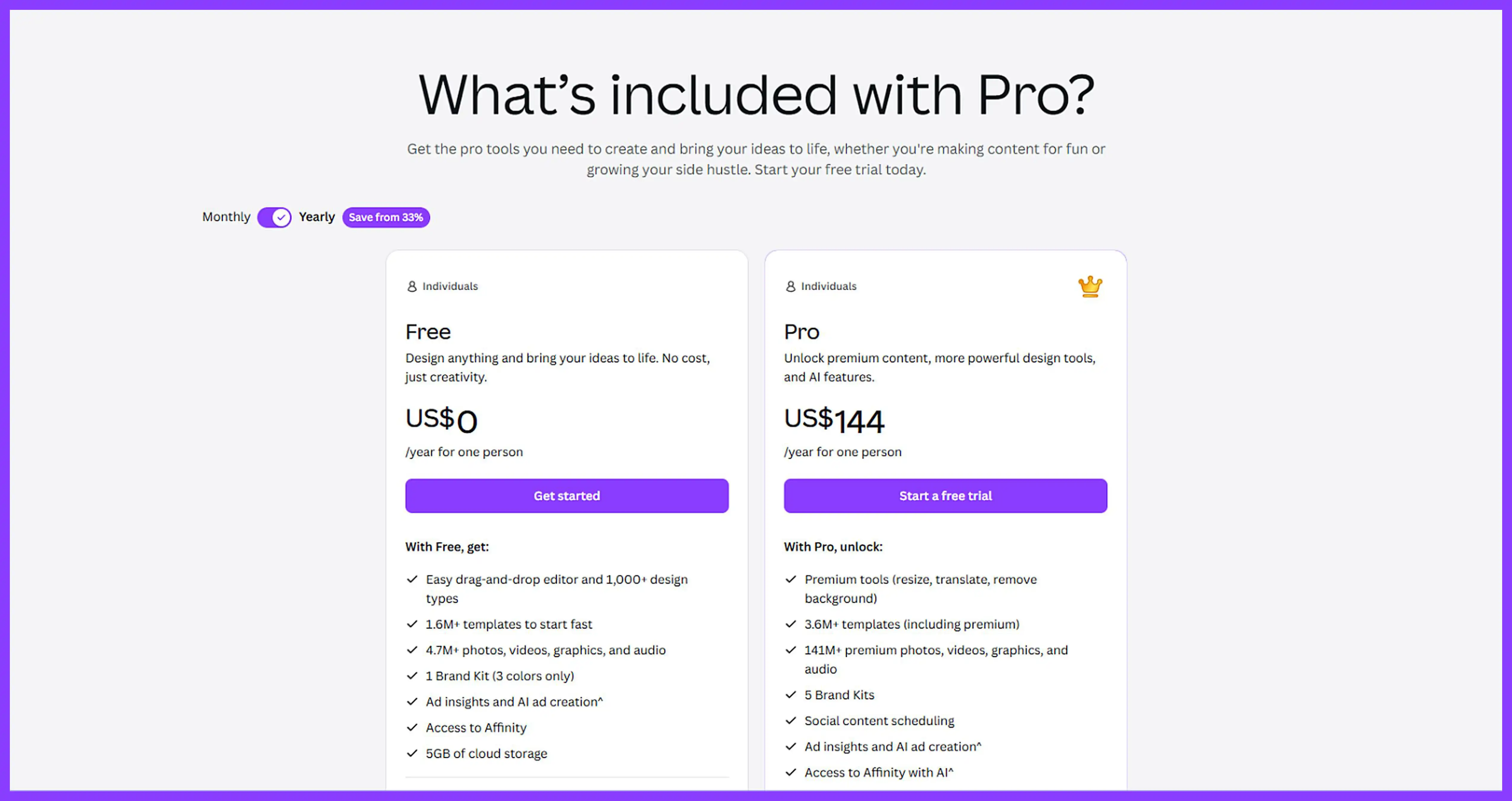
Canva runs a 30-day free trial of Pro, card required, layered on top of a permanent free plan that needs no card at all.
What works:
- The free plan removes pressure entirely for casual users, which builds a huge funnel Canva can later nudge toward Pro
- The trial page shows Pro-only templates and features side by side with what the free tier lacks
- Cancellation is described plainly in the FAQ, which reduces the trust cost of asking for a card
What we would change: the card requirement sits below the fold in the signup flow rather than stated at the first CTA, so some visitors do not see it until step two.
Lovable
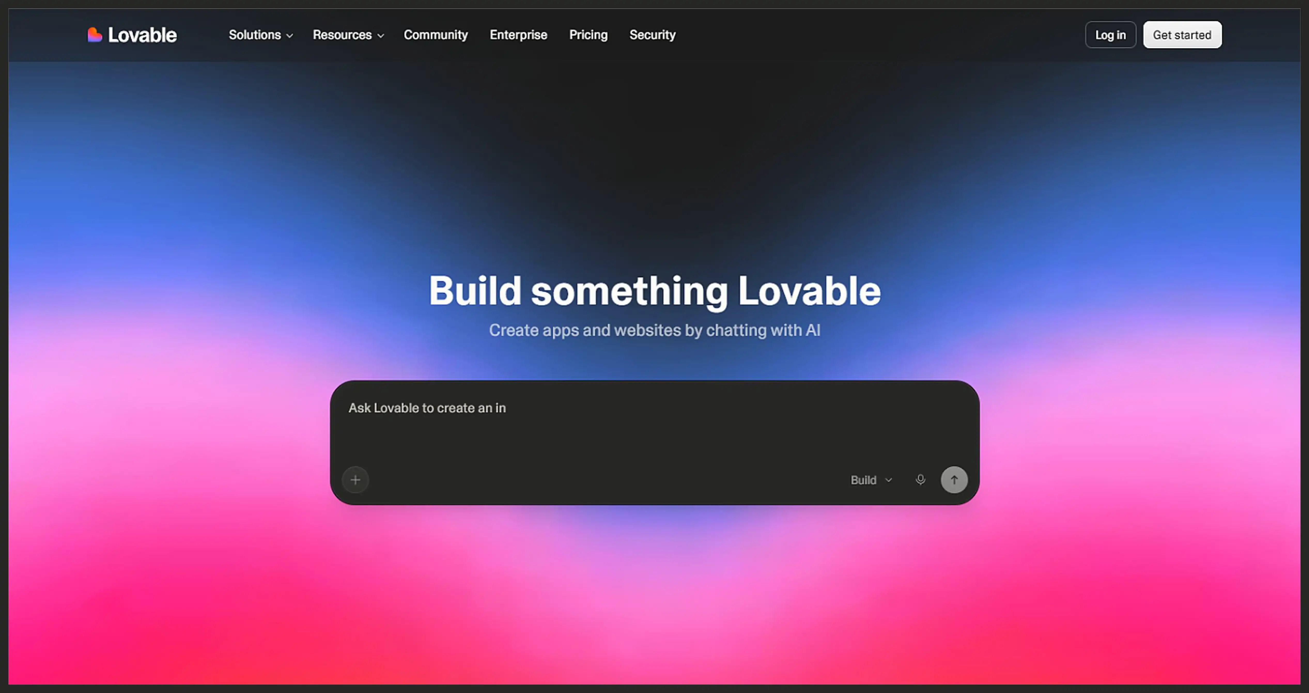
Lovable runs a freemium model. The free plan needs no card and gives daily and monthly AI build credits; Pro and Business are paid upgrades with no separate trial period.
What works:
- Free credits let a visitor build something real in the first session, which sells the product faster than any page copy could
- The credit system is explained in plain numbers, avoiding vague language like "limited usage"
- Upgrade prompts appear inside the product at the moment credits run low, not as a generic banner
What we would change: the pricing page buries how daily credits differ from monthly credits, and a visitor comparing plans has to dig through an FAQ to understand the cap.
Zoho Analytics
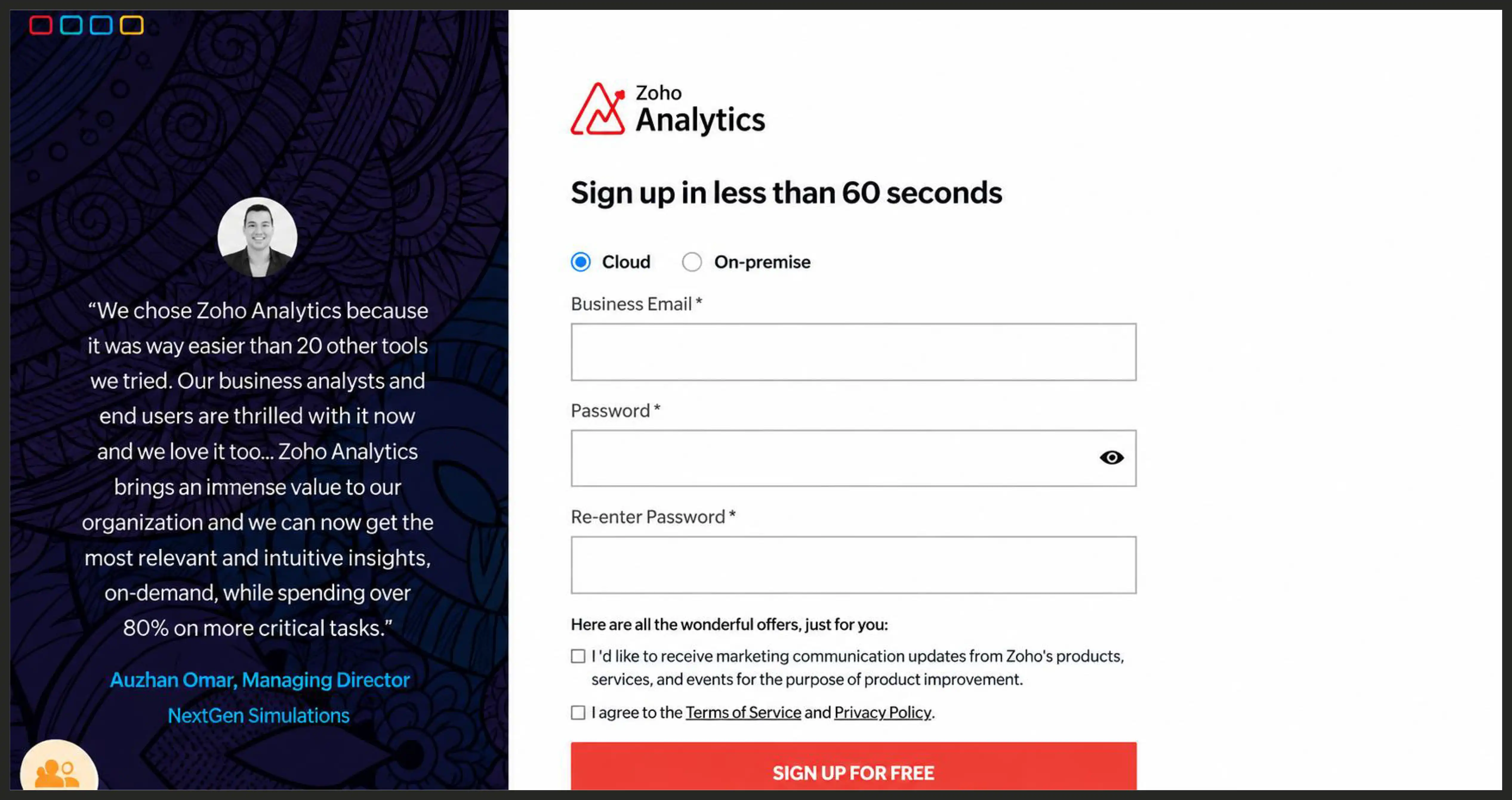
Zoho Analytics gives every signup a 15-day trial of a paid tier, no card required, before downgrading automatically to the free plan.
What works:
- No card required removes friction for a category, business intelligence, where buyers are often still comparing five tools
- The automatic downgrade to a real (if limited) free plan means a lapsed trial does not end in a dead account
- Trial length is stated in the product FAQ in plain terms, with no vague language about "limited time"
What we would change: the trial signup page itself undersells what the 15 days actually unlock compared with the free tier, so the incentive to act before the trial ends is weak.
Semrush
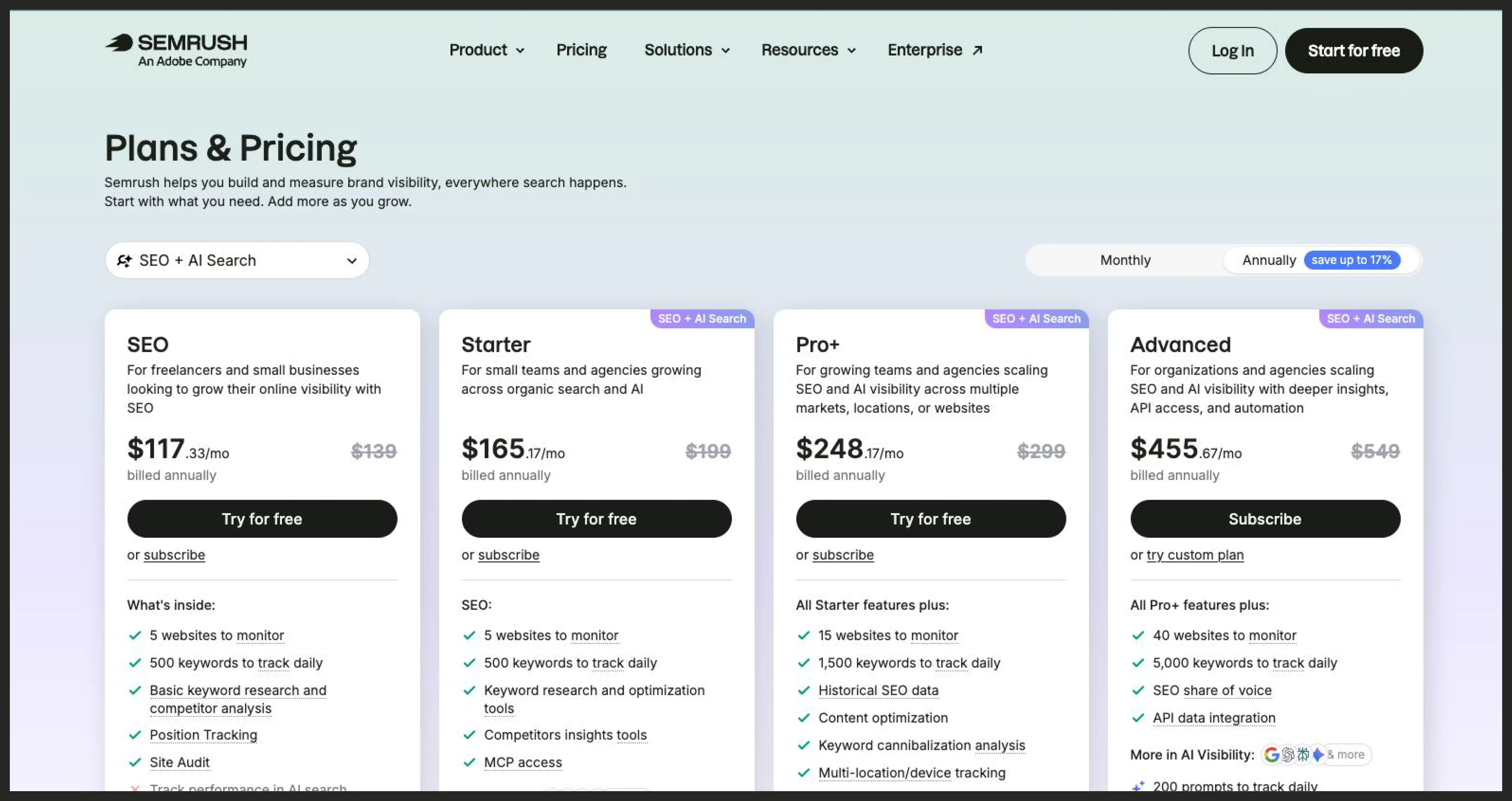
Semrush runs a 7-day free trial on Pro and Guru plans, card required, with a 7-day money-back window after the charge.
What works:
- The refund window functions as a second trial period in practice, which the page communicates without hiding it
- Trial signup routes straight into the tool's Keyword Magic and Site Audit features, so value shows up in minutes
- Plan comparison during signup is specific about what Guru adds over Pro, avoiding generic upsell language
What we would change: 7 days is short for an SEO tool where results (ranking movement, traffic changes) take longer to show than a week, and the page does not set that expectation.
Salesforce
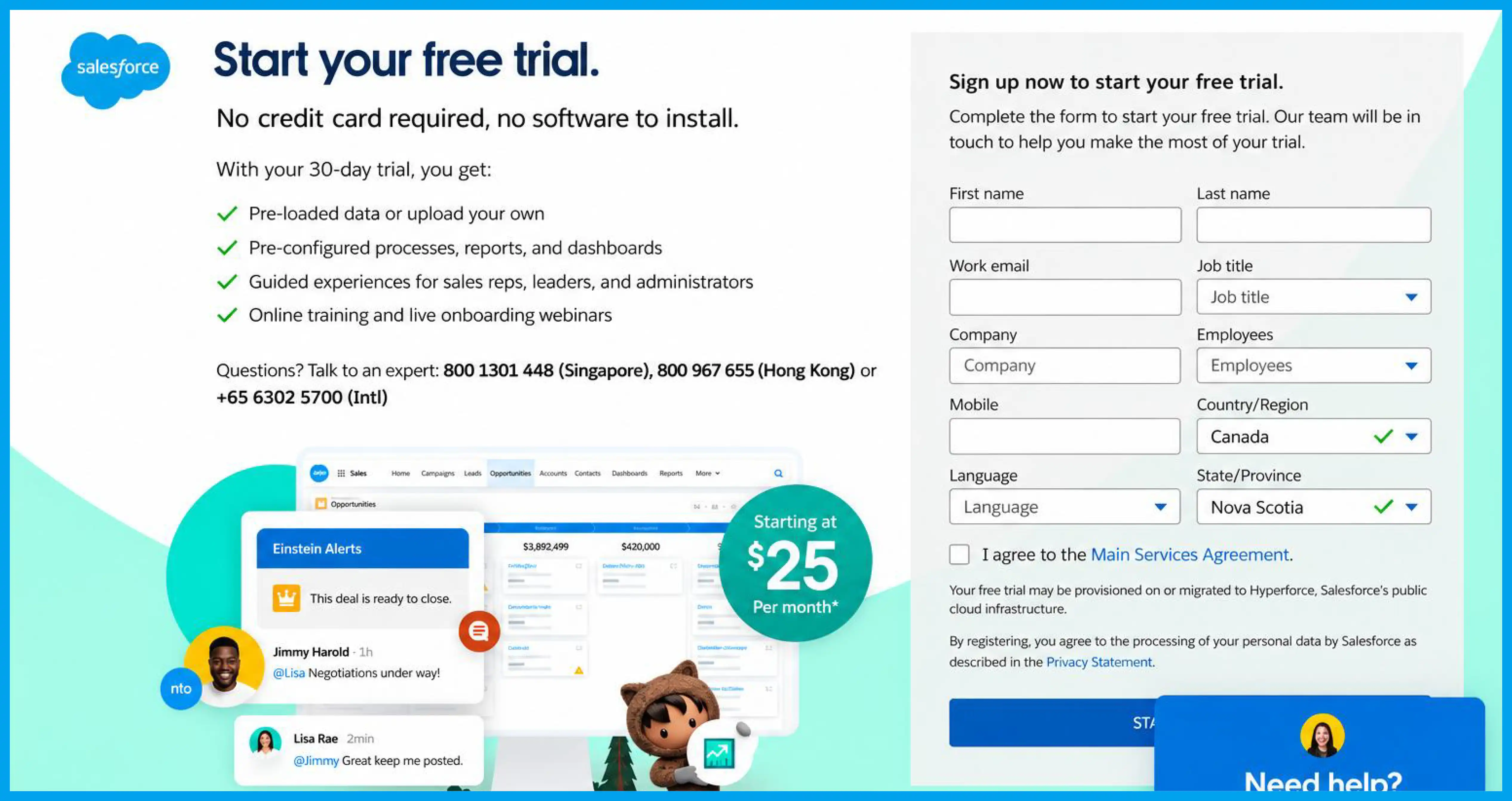
Salesforce runs a 30-day free trial across its CRM products, no card required, gated behind a multi-step qualification form.
What works:
- No card required is a deliberate counterweight to the multi-step form, balancing friction instead of stacking it
- Pre-loaded sample data means a trial account is usable immediately, not an empty shell
- The form segments by company size, which routes small teams and enterprise buyers to different onboarding paths
What we would change: the form itself asks for eight or more fields before granting access, which is heavy for a page whose whole pitch is ease of entry.
Cloudways
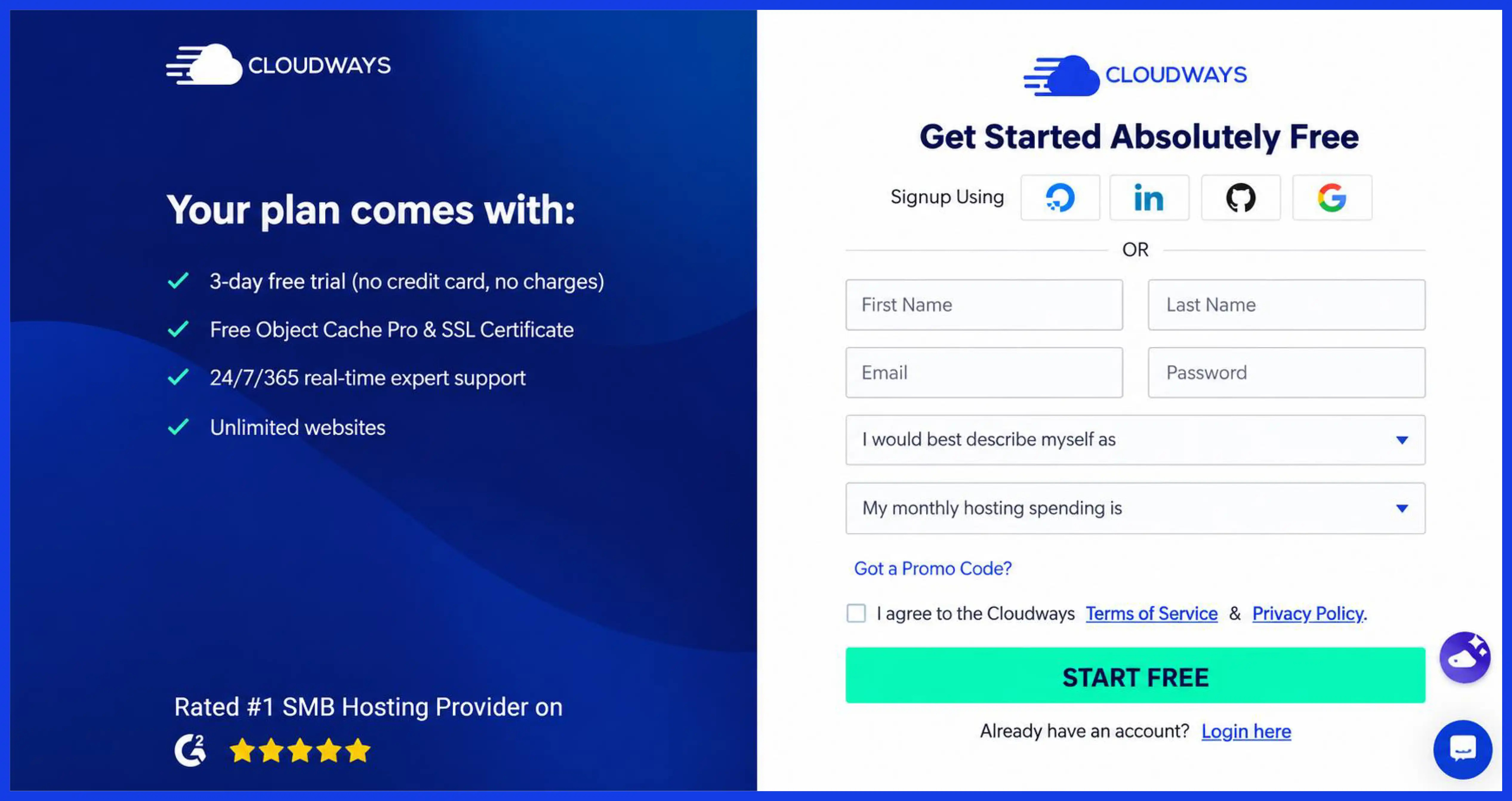
Cloudways offers a 3-day free trial, no card required, on any of its supported cloud providers.
What works:
- No card required matches the audience: developers evaluating infrastructure who will not hand over payment details to test a server
- Monthly, no-contract billing after the trial means the real evaluation period is cheap even after the 3 days end
- Server configuration starts during the trial itself, so the visitor is testing the actual product, not a demo shell
What we would change: 3 days does not give enough time to test uptime or support responsiveness under load, and the page does not point visitors toward the low-cost paid month as the real evaluation window.
Leadpages
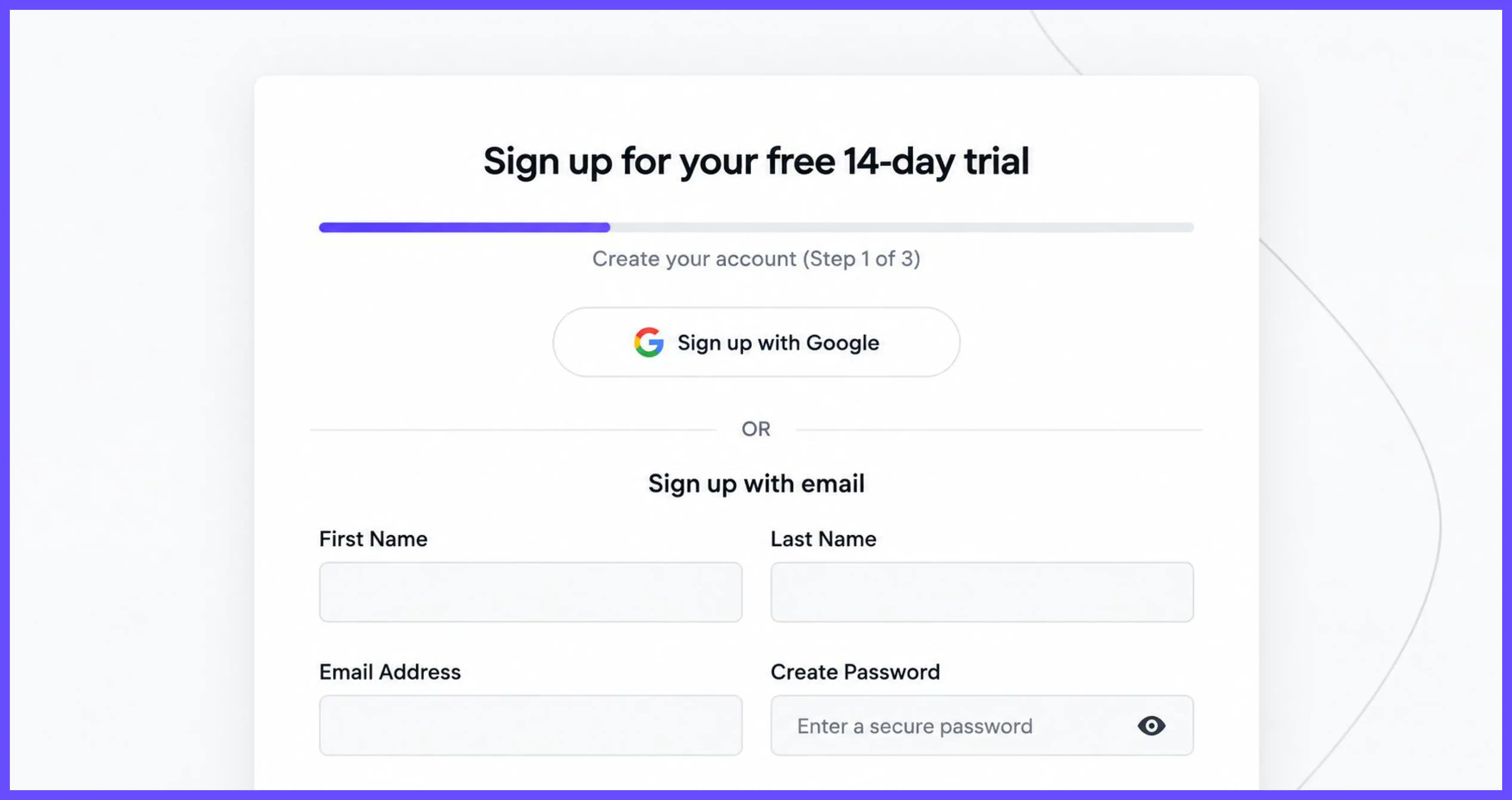
Leadpages runs a 14-day free trial with no card required on its current offer pages, though older support documentation described a card requirement, so this is one to double-check at signup.
What works:
- The trial explicitly includes unlimited traffic and publishing, removing a common trial limitation (traffic caps) before the visitor asks
- A/B testing is shown as a built-in feature during the trial, not an upsell added after conversion
- The comparison against competitor pricing ("$200+/mo for testing alone") is specific and sourced to the product's own feature set
What we would change: the no-card and card-required messaging is inconsistent across Leadpages' own pages, which is exactly the kind of trial-term confusion this whole post warns against.
Hootsuite
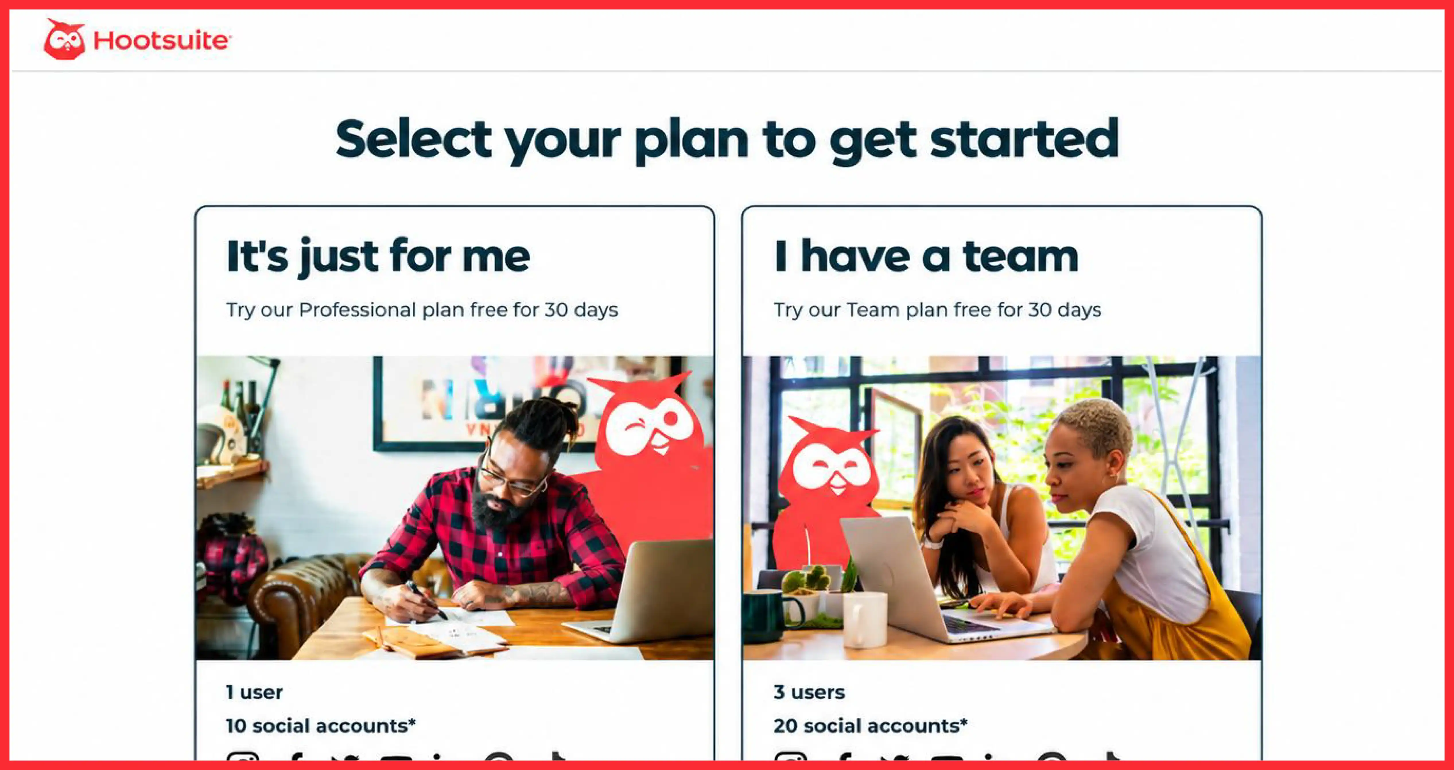
Hootsuite runs a 30-day free trial, card required, with no permanent free plan since 2023.
What works:
- 30 days is generous for a category (social media management) where results take weeks to show across a posting calendar
- Email reminders arrive 7 days before the trial ends, reducing the number of accidental charges
- The trial page states plainly that no free plan exists, avoiding a bait-and-switch when the visitor searches for one
What we would change: the card requirement combined with no free fallback plan is a heavier ask than most competitors in this category now make, and the page does not offset that with any stronger risk-removal copy.
Zendesk
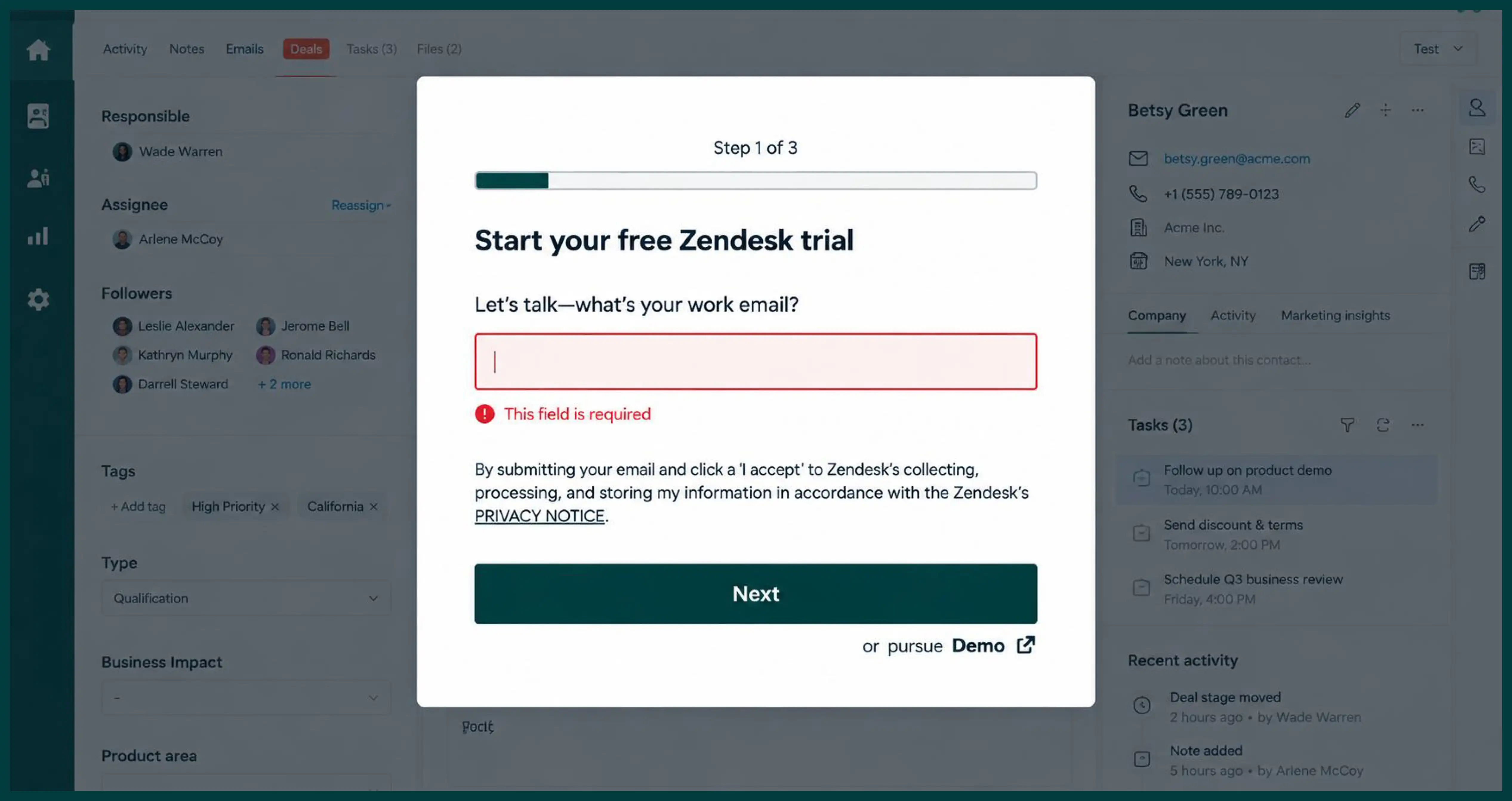
Zendesk offers a 14-day free trial, no card required, with an option to request a one-time extension.
What works:
- The extension offer, mentioned directly on the trial page, reduces the anxiety of a hard 14-day cutoff
- Trial signup defaults to the Suite Professional plan, giving access to AI agent features without an extra upgrade step
- Customer logos (Uber, Squarespace, Tesco) sit directly under the headline, not in a separate section
What we would change: the page does not show a product screenshot until well past the first scroll, which is a missed chance for a category where interface complexity is a real buying concern.
Hotjar
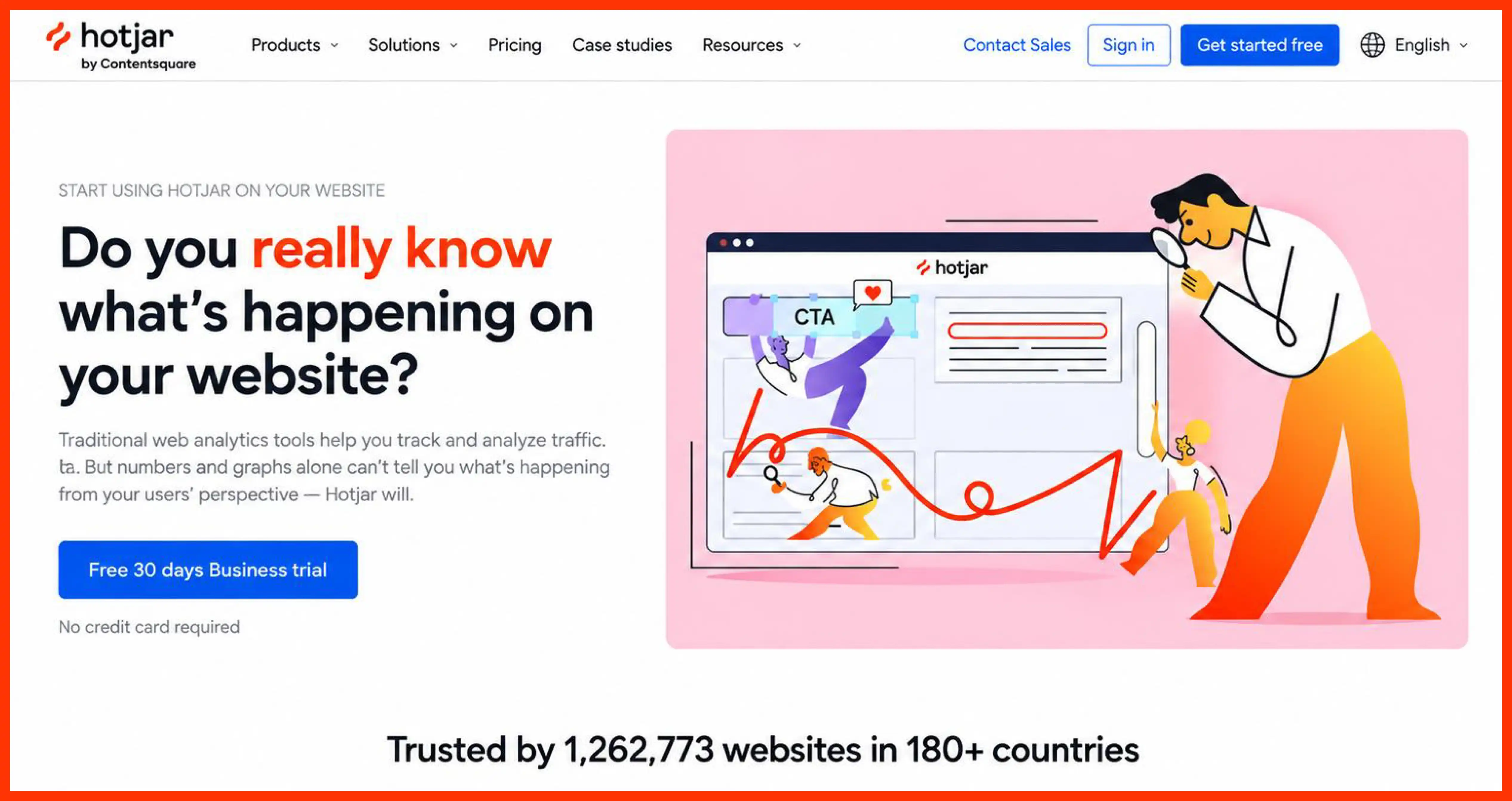
Hotjar runs a freemium model with a generous free tier (up to 200,000 monthly sessions), no card, and no separate paid trial.
What works:
- The free tier is functional enough to be a real product, not a crippled teaser, which builds trust before any upgrade ask
- Session limits are stated in exact numbers on the pricing page, not vague language like "limited sessions"
- Heatmaps and recordings both work on the free tier, so the core value proposition is fully testable
What we would change: with no time-boxed trial of the paid Growth tier, visitors evaluating advanced features have to upgrade on faith rather than testing first, which raises the cost of that decision.
Adobe Creative Cloud
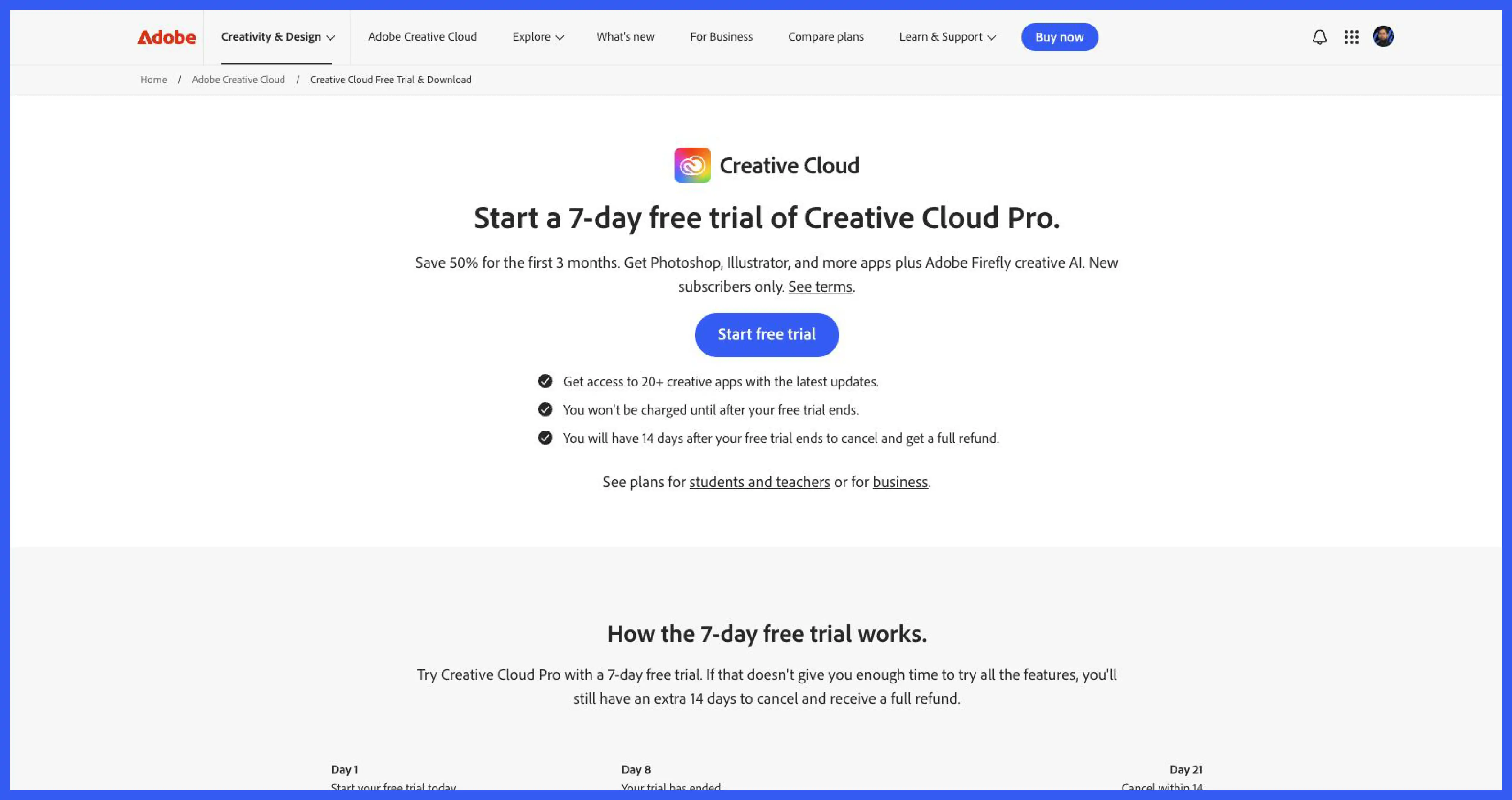
Adobe runs a 7-day free trial across its Creative Cloud apps, card required, down from a 30-day trial in earlier years.
What works:
- The trial covers the full app suite, not one product at a time, so a visitor testing Photoshop can also open Illustrator without a second signup
- 100GB of cloud storage is included during the trial, letting a visitor keep real project files rather than throwaway tests
- A permanent free tier exists after the trial ends, softening the drop from paid access to nothing
What we would change: the shortened 7-day window is genuinely tight for software this complex, and Adobe's own community forum shows recurring frustration from users who needed more time to learn the tools before deciding.
Dropbox
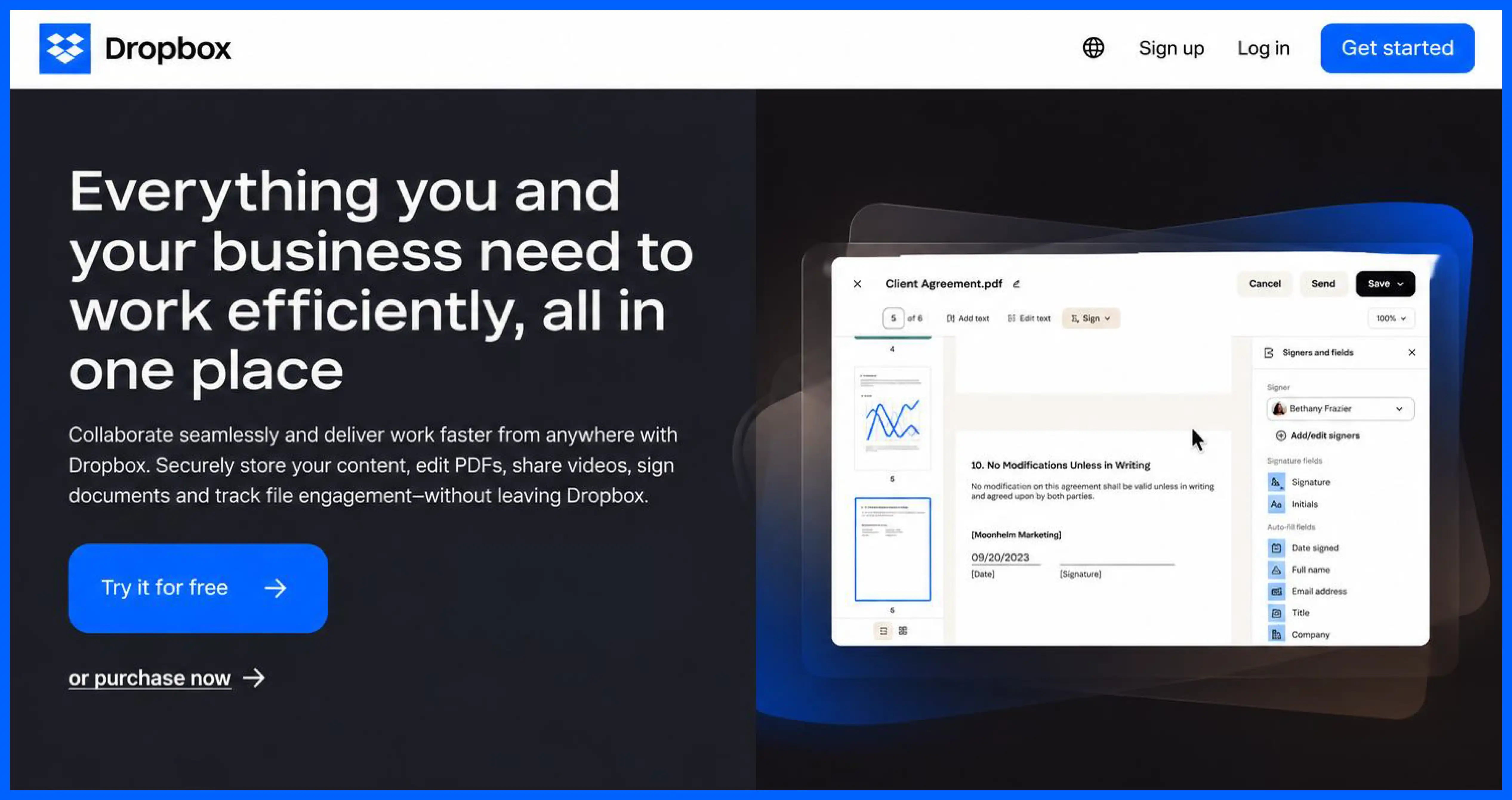
Dropbox offers a 30-day free trial of Professional, card required, layered on top of a permanent free Basic plan.
What works:
- The free Basic plan gives a fallback that keeps files accessible even after a lapsed trial, unlike products that lock everything at trial end
- Trial cancellation is described in a dedicated help article with exact steps, reducing support ticket volume
- Storage upgrade (2GB to 3,000GB) is stated as a concrete number, not a vague "more storage" claim
What we would change: community forum threads show repeated confusion about when a trial actually starts and ends, especially across billing changes like joining a Family plan mid-trial, which points to a gap in the confirmation email, not just the page.
Teamwork.com
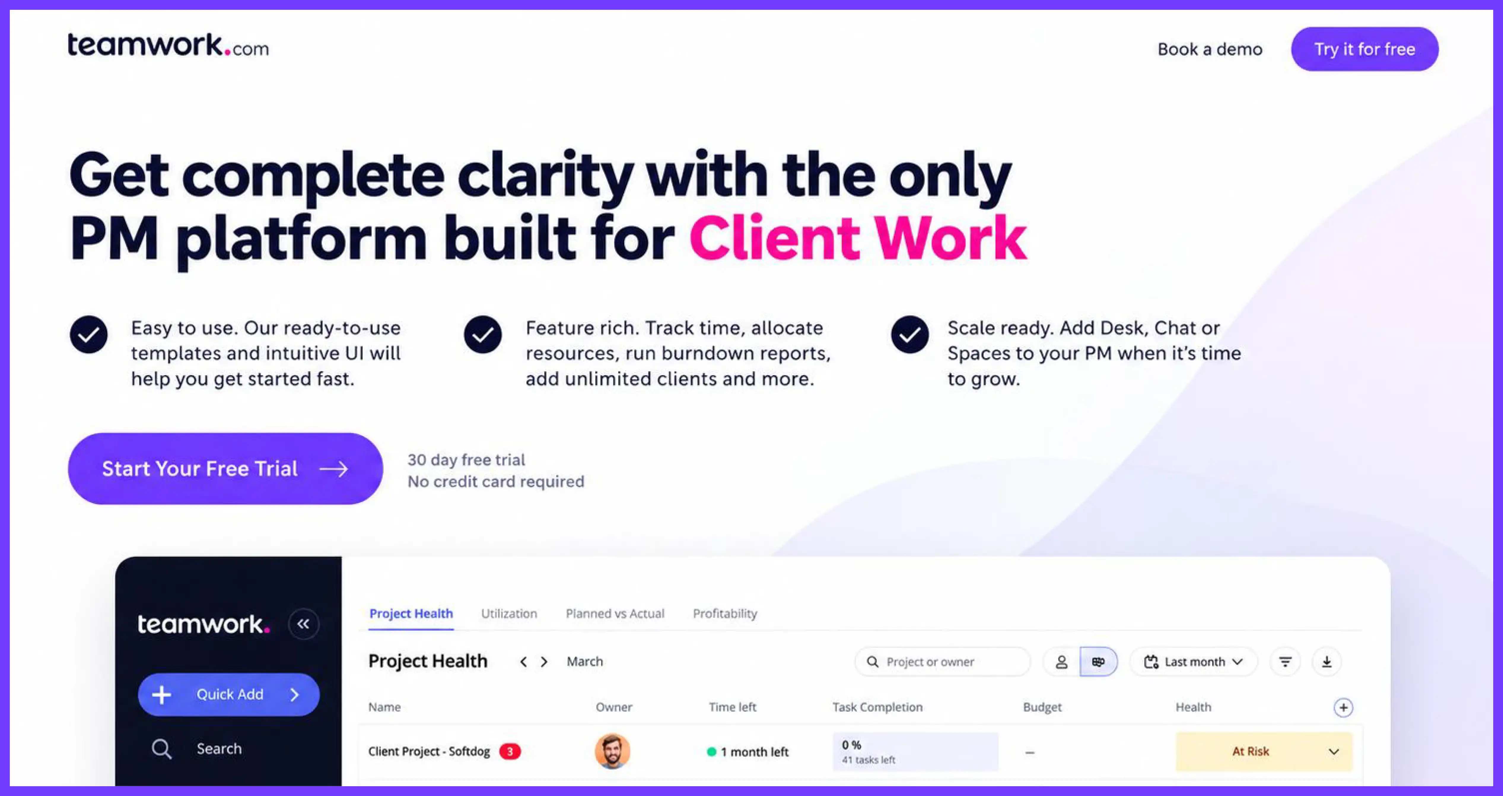
Teamwork.com runs a 30-day free trial, no card required, on every paid plan.
What works:
- No card required across all four paid tiers, not just the entry tier, removes friction consistently instead of gating it behind the cheapest plan
- A free plan exists below the trial tiers, giving small teams a permanent option if the trial does not convert
- One-click project import from five competitor tools (Asana, ClickUp, Trello, among others) removes a real switching cost during the trial itself
What we would change: the pricing page currently shows both 14-day and 30-day trial lengths across different page variants, which is the kind of inconsistency that should get fixed before this page runs any more traffic.
Grammarly
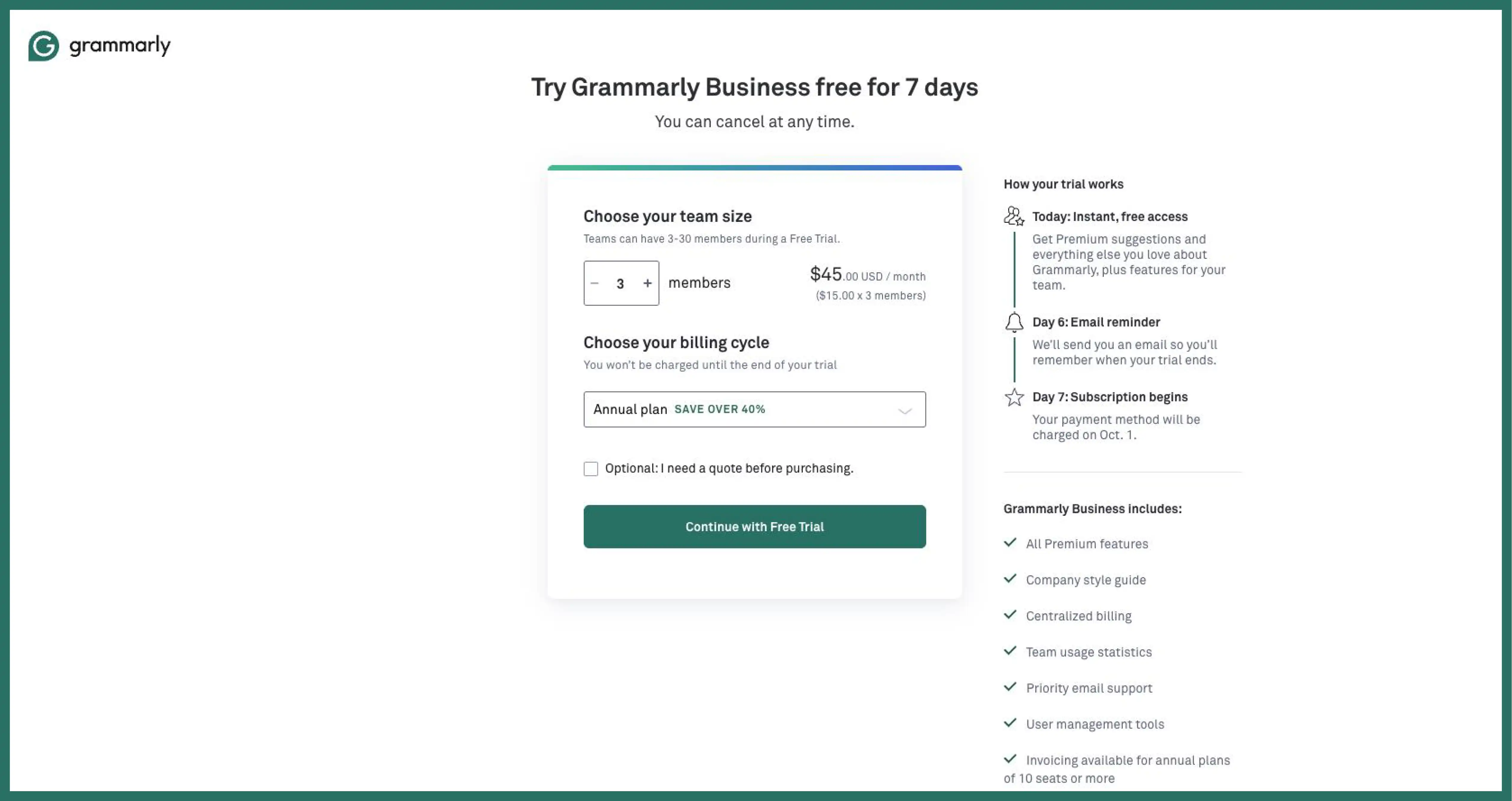
Grammarly runs a permanent free plan with no card required, and its paid Pro tier (renamed from Premium) generally has no standing self-serve trial, though the Business plan runs a 7-day trial with a card.
What works:
- The free plan is genuinely functional for basic grammar and spelling checks, which builds a large user base before any upgrade ask
- Seasonal promotional trials for Pro appear periodically, and the page states trial availability plainly rather than implying one exists year-round
- Student and education discounts are surfaced directly on the pricing page for a segment that would otherwise churn to a free competitor
What we would change: the lack of a standing Pro trial means a visitor evaluating advanced features like tone rewrites has to buy first or wait for a promotional window, which is a real conversion drag compared with competitors that trial the top tier by default.
5 Design Decisions That Separate High-Converting Free Trial Pages
Form length trades against lead quality. Two-field forms (email and password) maximize signup volume, which suits products like Trello or Hotjar where the product itself qualifies the user. Longer forms with company size and phone number, like Salesforce's, filter for buyers a sales team can act on immediately. Neither approach is wrong; the mismatch happens when a self-serve product uses a sales-qualification form, or the reverse.
Showing the product beats describing it. Every page in this list that leads with a real screenshot or an in-product first session, Lovable, Shopify, Hotjar, converts attention faster than pages relying on marketing copy alone. Visitors evaluating software are visual before they are verbal.
Trial terms sitting above the fold remove the single most common objection before it forms. Zendesk and Teamwork both state length and card policy in the first screen. Hootsuite, by contrast, requires more scrolling to find the same information, and the page has to work harder elsewhere to compensate.
One CTA beats a trial-and-demo split for most self-serve products. Salesforce is the exception that proves the rule: enterprise buyers often want the demo path, so offering both makes sense there. For a product with a five-minute time-to-value, splitting attention between "start trial" and "book a demo" just slows the visitor down.
Mobile form behavior gets tested least and breaks most. Long forms with multi-select dropdowns, the kind Salesforce and Hootsuite both use, are the most likely to misbehave on a phone keyboard. A page converting well on desktop can quietly lose half its mobile traffic to a broken field.
What Happens After Signup
Trial pages sell one thing: the click. Everything after that click is activation, and activation decides whether the trial converts to revenue, not the landing page itself.
First sessions should do three things in order. Show the user a result inside two minutes, whether that is a generated design in Canva or a completed audit in Semrush. Prompt one specific action tied to that result, not a generic "explore the dashboard" nudge. Send a follow-up, in-app or by email, before the halfway point of the trial, timed to when usage data shows engagement typically drops off. Our SaaS onboarding guide covers this in more depth.
Common Free Trial Landing Page Mistakes
- Too many form fields. Fix: cut to name, email, and an SSO option; move everything else to onboarding.
- Hiding trial length. Fix: state the number of days next to the CTA, not in a footnote.
- No card policy stated. Fix: say "no card required" or "card required, cancel anytime" directly on the button or beside it.
- No product preview. Fix: add one real screenshot or a short video before the visitor scrolls past the fold.
- Nav full of exits. Fix: strip the header down to logo and CTA for this page specifically.
- Form broken on mobile. Fix: test every field, especially dropdowns, on an actual phone before launch.
- No proof near the button. Fix: place one logo strip or short quote within sight of the primary CTA.
FAQ
How long should a SaaS free trial be? Most B2B SaaS trials run 14 to 30 days, matching the time needed to reach a real result. Complex products lean toward 30 days; simple, fast-value products like AI writing tools can work with 7.
Should a free trial ask for a credit card? No-card trials get more signups but fewer engaged users. Card-required trials get fewer signups but higher trial-to-paid conversion. The right choice depends on price point and how self-explanatory the product is.
Why are my free trial signups not converting to paid? Landing pages rarely cause this on their own. Weak first-session activation, unclear pricing after the trial, or a trial length mismatched to actual time-to-value are the usual causes. Check onboarding data before rebuilding the page.
Free trial or demo, which page should a B2B SaaS build first? Build the demo page first if the average contract value is high and sales cycles involve multiple stakeholders. Build the trial page first if the product can prove value without a salesperson in the room.
How many form fields should a trial signup page have? Two to four fields covers most self-serve products: name, email, password or SSO. Add fields only when a sales team genuinely needs them to qualify or route the lead.
Conclusion
Free trial landing pages convert on honesty more than on design polish. State the trial length, state the card policy, and show the product before asking for anything. Every example in this post that underperforms does so on one of those three points, not on font choice or button color. Our SaaS product launch checklist walks through where this page fits into a broader launch.
Work With Us
Taqwah builds landing pages, onboarding flows, and product interfaces for SaaS teams who need a trial page that converts without resorting to dark patterns. If a SaaS UI/UX design agency sounds like what your trial page needs right now, that is exactly the work we do.



.avif)