.svg)

.svg)
%201.svg)


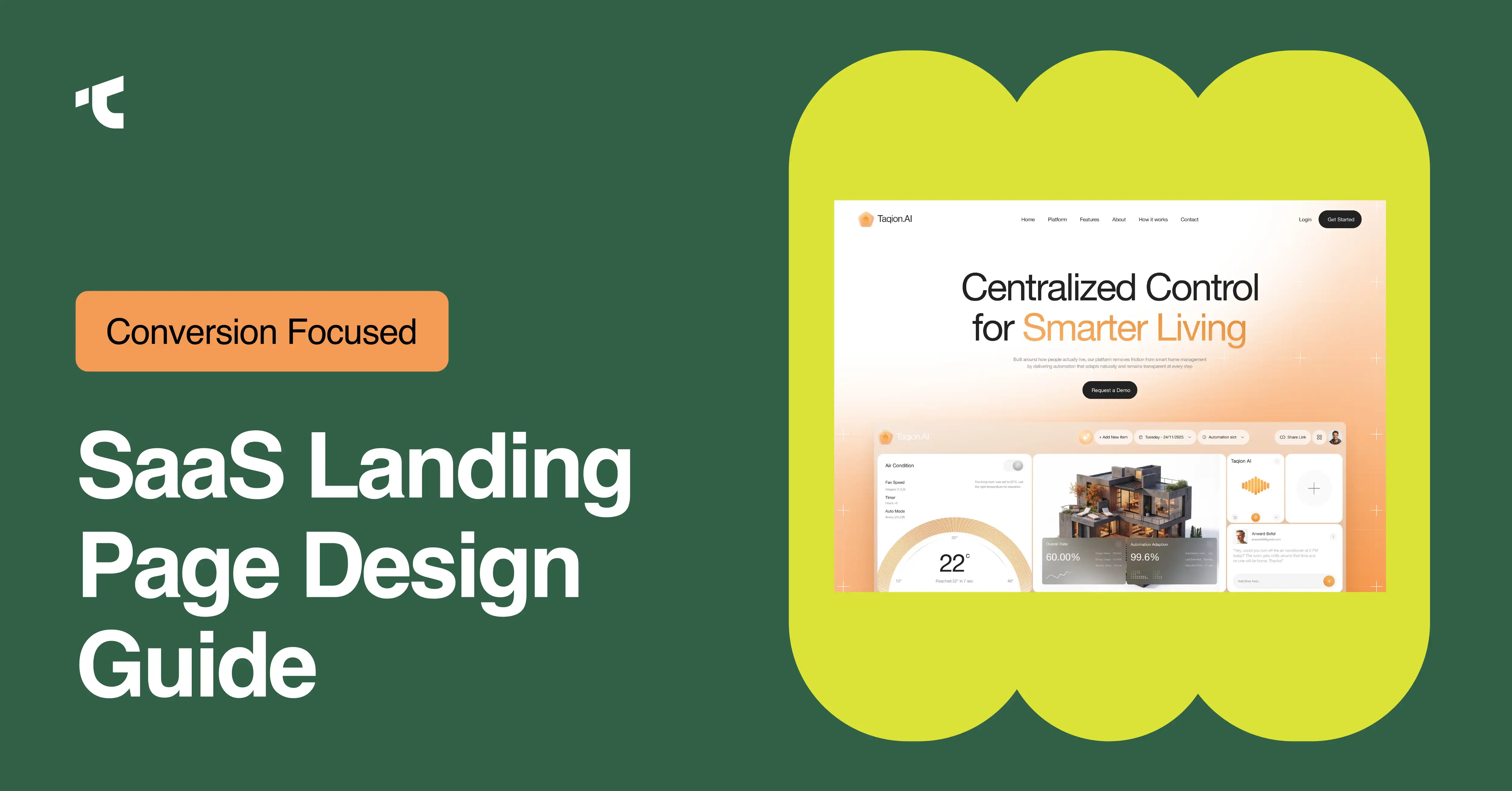
Designing a SaaS landing page that converts follows 8 core steps: writing a clear headline, structuring the hero section, placing the value proposition above the fold, adding social proof, building a focused pricing section, including an FAQ section, applying mobile-first design, and running A/B tests. Each step removes friction before a visitor reaches the signup button.
SaaS landing pages carry more pressure than a typical marketing page. Visitors arrive with one question in mind: does this product solve my problem? Landing page design determines whether that question gets answered in five seconds or fifty. Weak structure, unclear copy, and buried pricing push visitors away before they ever see a demo.
Trial signups, demo bookings, and free-plan activations all depend on landing page structure working correctly on the first visit. Small design decisions, such as where a CTA button sits or how early social proof appears, shape whether a visitor keeps scrolling or leaves. SaaS companies that treat landing page design as a structured process, rather than a one-time design task, tend to build pages that hold attention longer.
This guide breaks the process into 8 practical steps, covering hero section structure, value proposition placement, pricing section layout, trust signal positioning, and mobile design considerations. Each step includes what to build and why that structure supports conversion.
What is the step-by-step process for designing a SaaS landing page that converts?
Designing a SaaS landing page that converts requires 8 sequential steps: headline clarity, hero section structure, value proposition placement, social proof positioning, pricing section design, FAQ section inclusion, mobile-first optimization, and A/B testing. Each step builds on the previous one to reduce visitor friction.
Step 1: Write a headline that states the product's core benefit
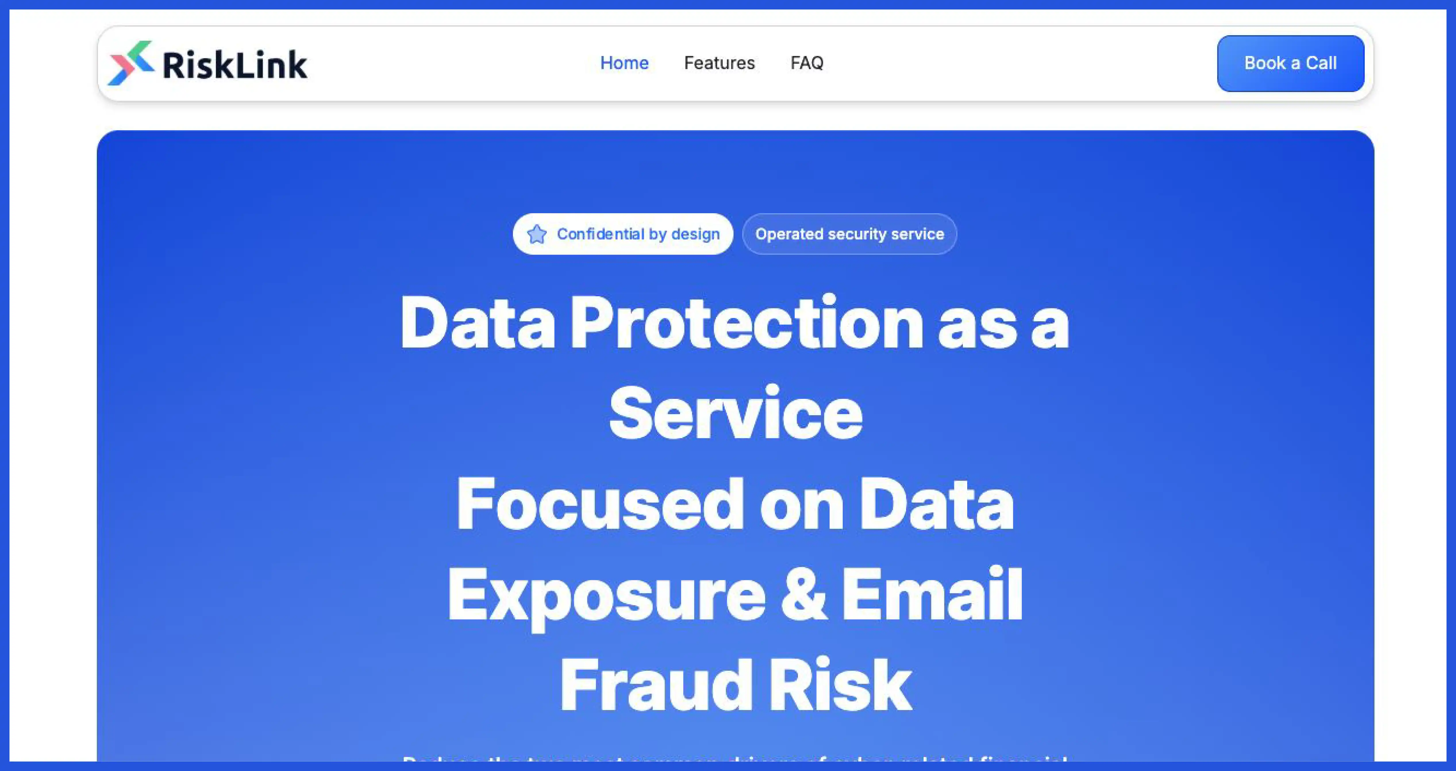
Headline clarity determines whether a visitor understands the product within seconds. Strong headlines name the outcome the product delivers, not the technology behind it. "Manage your team's projects in one dashboard" communicates more than "AI-powered workflow orchestration platform." Support copy below the headline should clarify who the product serves and how it delivers that outcome.
Step 2: Structure the hero section without a distracting navigation menu
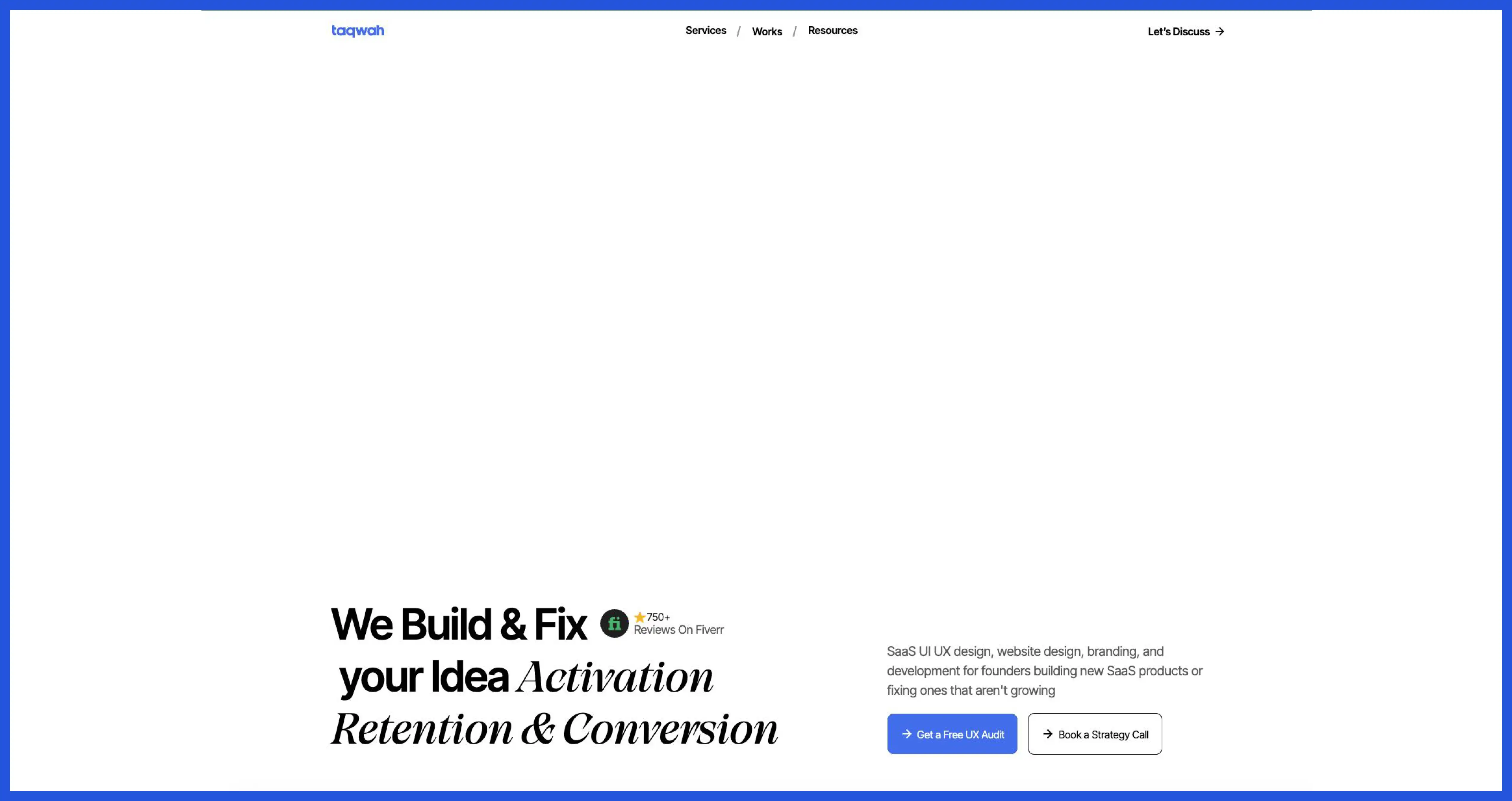
Hero sections sit above the fold and carry the highest visibility on the entire page. Effective hero sections combine a headline, a short supporting sentence, and one CTA button. Navigation removal from landing pages keeps visitor attention on the CTA instead of routing traffic to unrelated pages. Fewer exit points inside a hero section mean fewer distractions before the CTA button gets seen.
Step 3: Place the value proposition above the fold
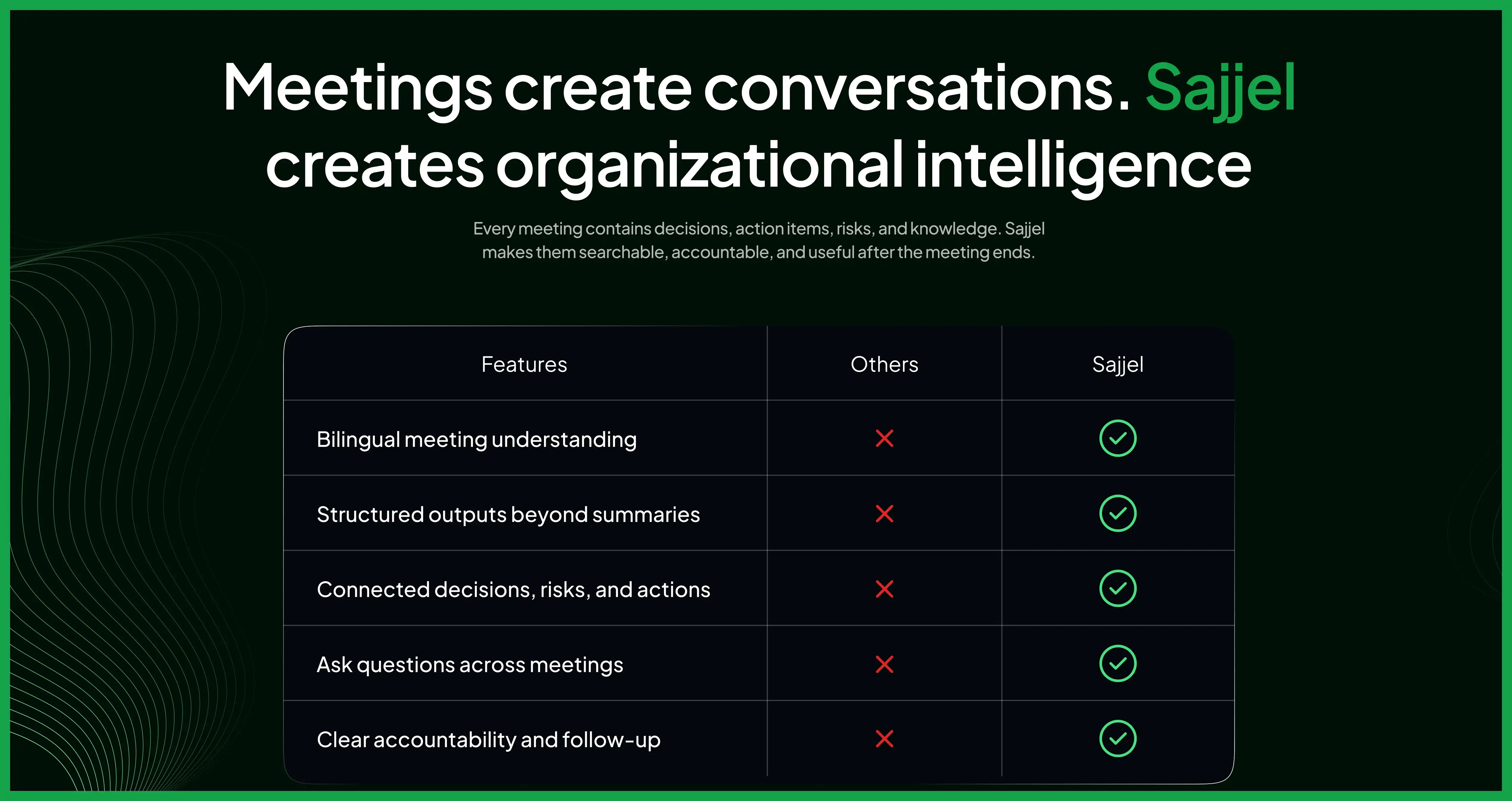
Value proposition sections explain product benefits before visitors need to scroll far. Placing this section above the fold, or immediately below the hero section, keeps benefit-focused messaging visible early. Features vs. benefits framing matters here: list what the product does, then pair each feature with the outcome it produces for the user.
Step 4: Add social proof and trust signals early in the layout
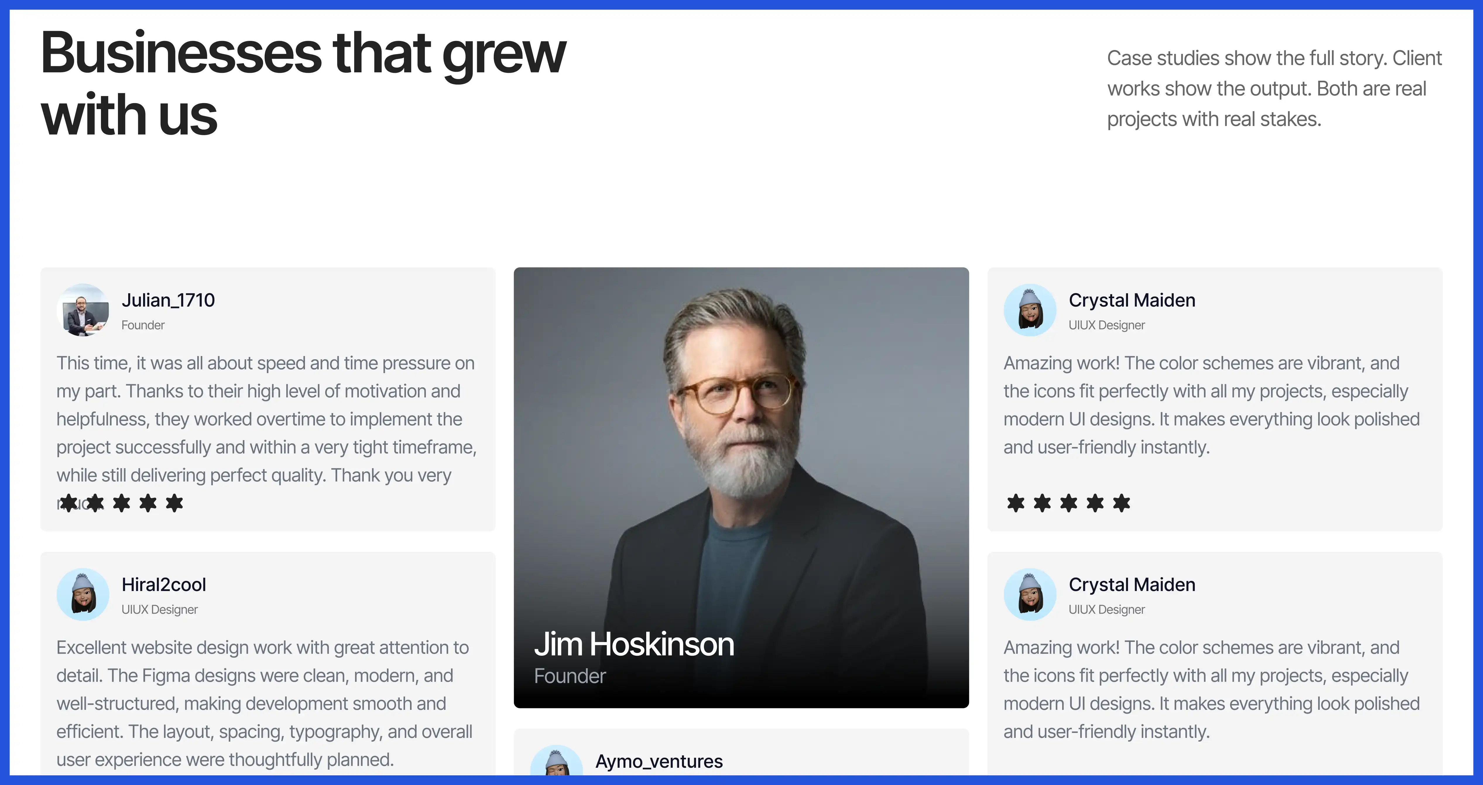
Social proof sections build credibility before a visitor reaches the pricing section. Customer logo bars, testimonials, and case study snippets all count as trust signals that reduce visitor hesitation. Positioning these elements directly below the value proposition section, rather than at the bottom of the page, gives skeptical visitors a reason to keep reading.
Step 5: Design the pricing section with clear CTA placement
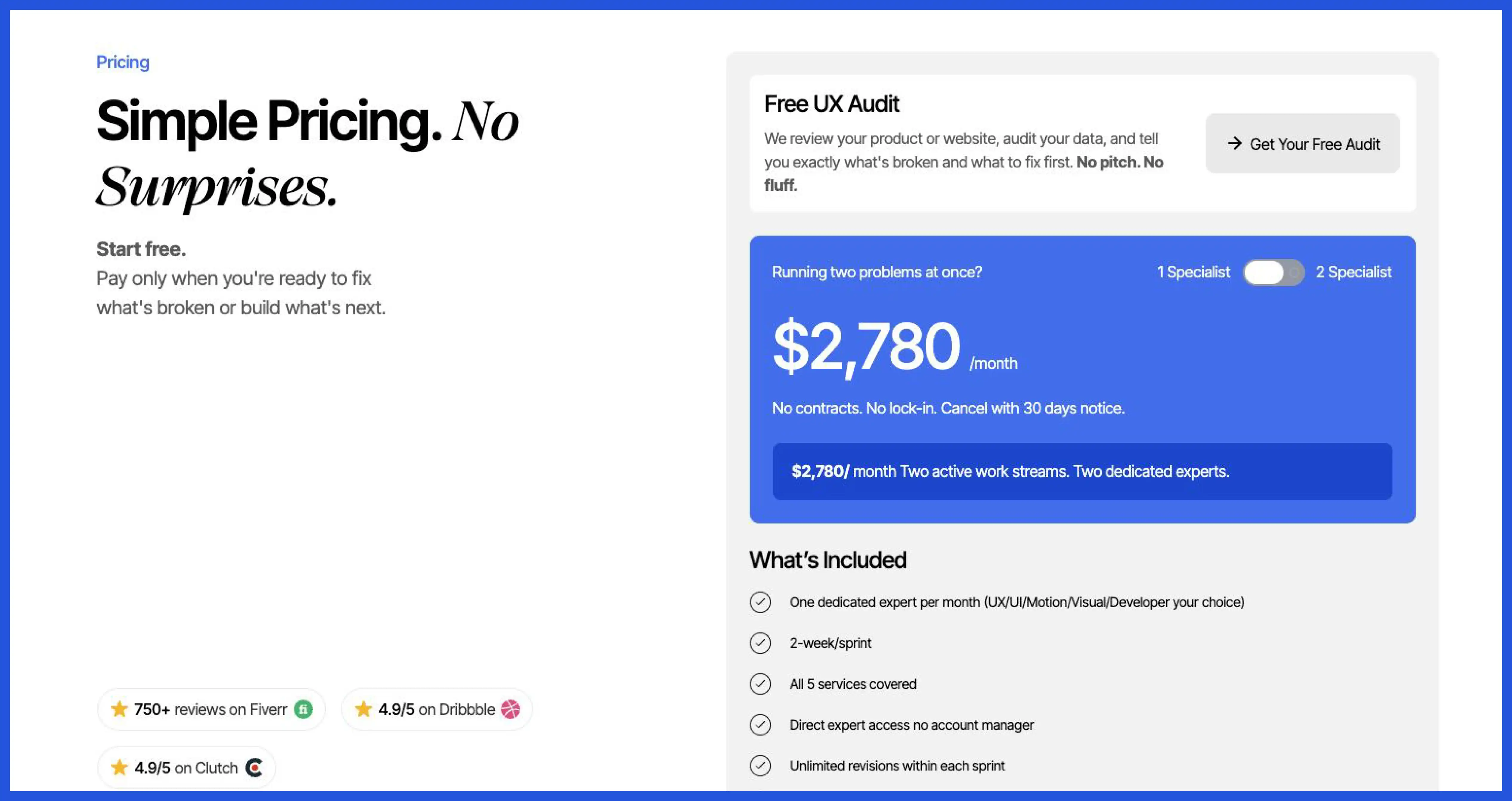
Pricing sections need clear plan names, transparent costs, and one obvious CTA button per plan. CTA copy should match the action a visitor takes next, using phrases like "Start free trial" instead of generic labels like "Submit." CTA placement directly beside pricing details removes the extra step of scrolling to find a signup button.
Step 6: Include an FAQ section to remove remaining objections
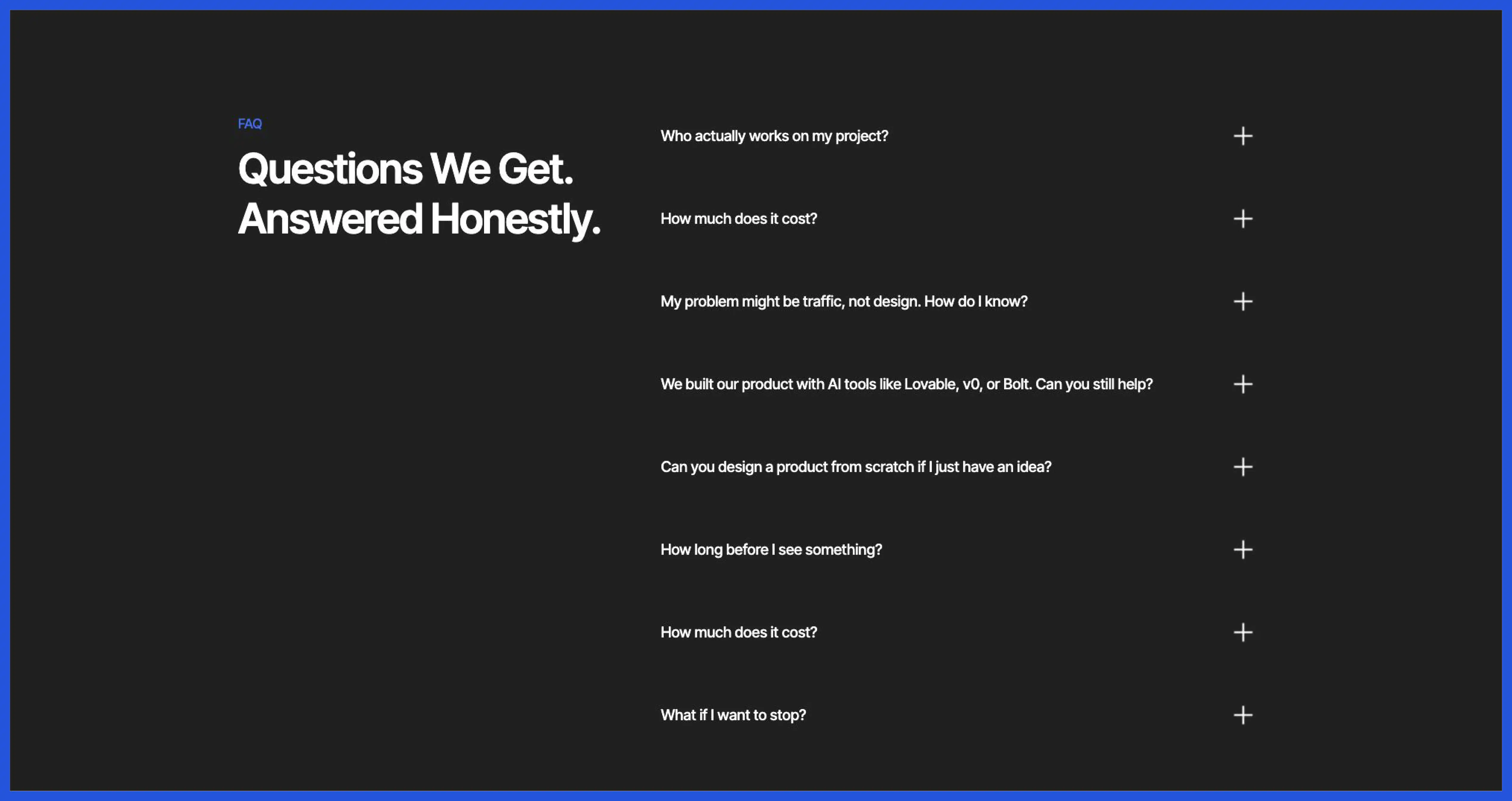
FAQ sections answer objections that block a demo booking or trial signup. Common objections include pricing structure, integration support, and contract terms. Placing an FAQ section near the bottom of the page, just before the final CTA, catches hesitant visitors before they leave the page entirely.
Step 7: Apply mobile-first design and optimize page speed
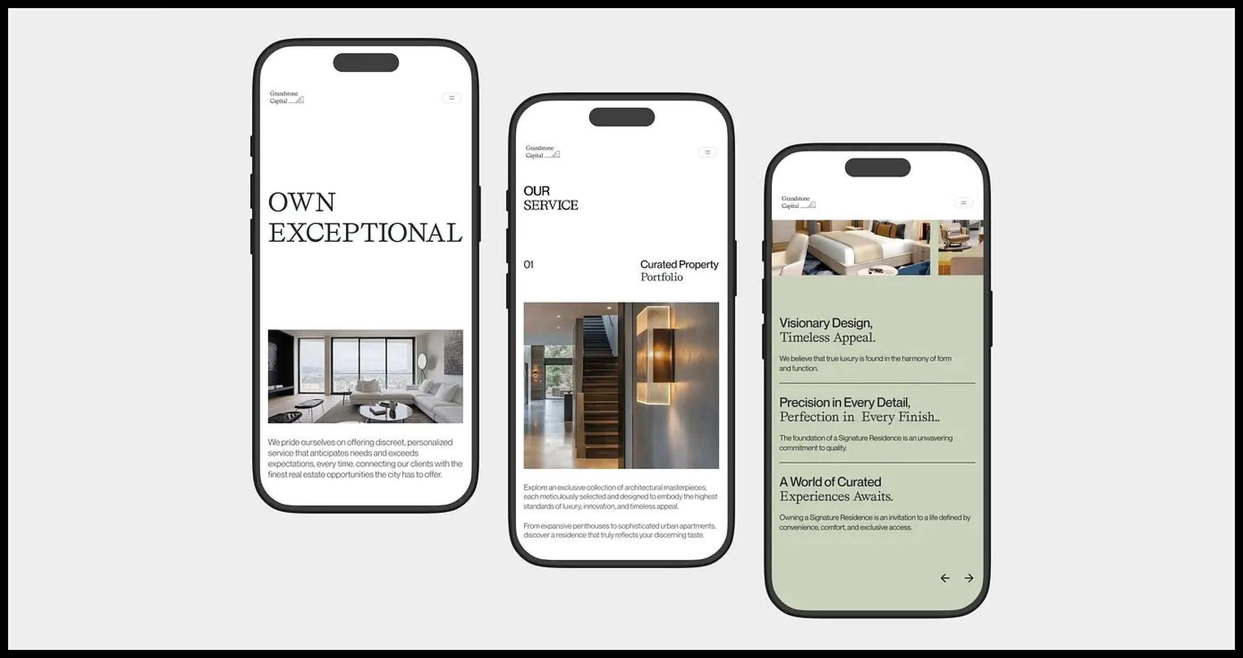
Mobile-first design treats small-screen layouts as the primary design target, then scales up for desktop. Buttons need enough spacing for touch input, and hero sections need to compress without losing the headline or CTA button. Page speed affects mobile visitors more than desktop visitors, since slower mobile networks amplify load-time delays. Compressing images and limiting third-party scripts both reduce page speed issues on mobile devices.
Step 8: Validate design decisions with a design system and A/B testing
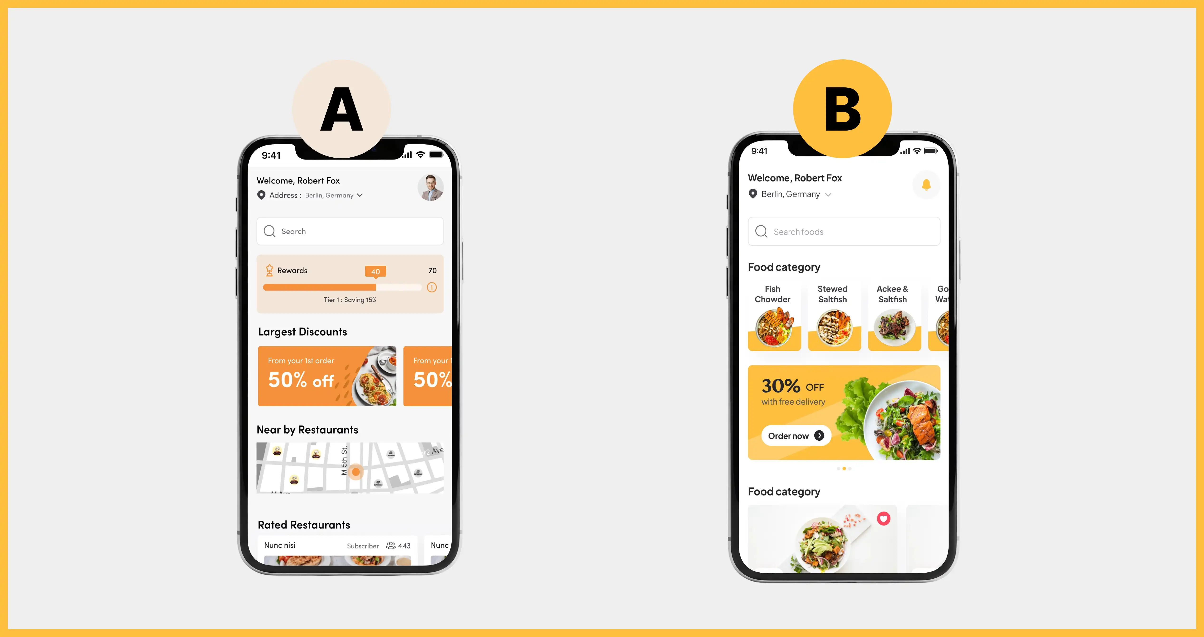
Design systems keep button styles, spacing, and typography consistent across every section of the landing page. Tools like Figma allow design teams to build and update these components without rebuilding each page section from scratch. A/B testing then validates which headline, CTA copy, or pricing section layout performs best with real visitors, supporting conversion rate optimization through evidence rather than guesswork.
What are the most common SaaS landing page design mistakes?
SaaS landing pages commonly fail due to 3 recurring mistakes: cluttered navigation menus, buried pricing information, and delayed value propositions. Each mistake adds friction between a visitor's first impression and the CTA button.
- Cluttered navigation menus pull visitor attention away from the hero section's CTA button, sending traffic to blog pages or unrelated product pages instead.
- Buried pricing information forces visitors to search for costs, which increases hesitation and abandonment before a trial signup happens.
- Delayed value propositions push benefit-focused messaging below multiple scrolls, leaving visitors uncertain about the product's purpose before they lose interest.
Avoiding these three landing page design mistakes keeps the design process aligned with core landing page design principles: clarity first, friction last.
Start applying this landing page design process to your next SaaS page
Landing page design works best as a repeatable process rather than a one-time project. Following the 8 steps above, from headline clarity through A/B testing, gives SaaS teams a structure that holds up across product launches and redesigns. Teams building their first high-converting landing page can review real saas landing page examples for additional layout inspiration before starting their own design.
Frequently Asked Questions
What tools do designers use to build a SaaS landing page?
Design teams typically use Figma to build SaaS landing pages, paired with a design system for consistency. Figma allows teams to prototype hero sections, pricing layouts, and CTA buttons before handing designs to developers. Design systems keep typography, spacing, and button styles consistent across every section.
How long does it take to design a SaaS landing page?
A typical SaaS landing page design process takes 2 to 4 weeks, covering wireframing, copywriting, and design review stages. Timelines extend when A/B testing or additional stakeholder review cycles get added to the process.
Should you hire an agency or design a SaaS landing page yourself?
Hiring an agency suits SaaS teams without in-house design resources or design system experience. Agencies bring established landing page design processes and prior conversion data. Teams with existing design systems and copywriting resources can often manage the process internally. Teams comparing options can review the best saas landing page design agencies before deciding.
What conversion rate should a SaaS landing page achieve?
SaaS landing page conversion rate benchmarks vary widely by industry, traffic source, and offer type. Rather than targeting a fixed percentage, teams should track conversion rate changes after each design update through A/B testing.




.avif)