.svg)

.svg)
%201.svg)


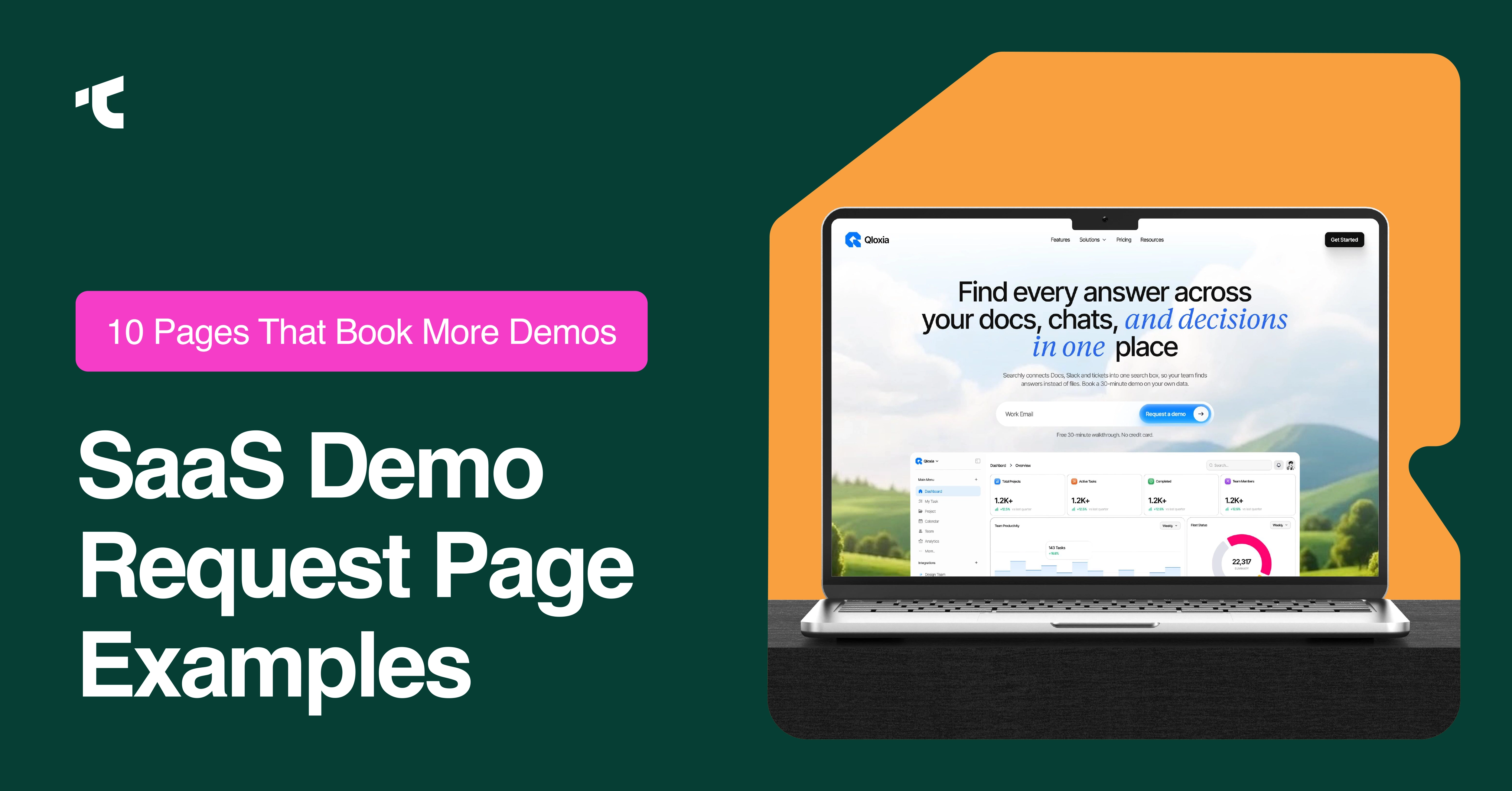
Your SaaS demo request page carries more weight than any other page in your funnel, since it sits between a visitor's interest and your sales team's calendar. We reviewed 10 SaaS demo request page examples from companies with proven conversion records, and we break down what each page does well and where it falls short.
See our SaaS landing page examples for the broader landing page patterns behind these demo pages.
Below, we walk through what works on each of these 10 pages, followed by the six factors that decide whether a demo page actually books a meeting.
1. Calendly
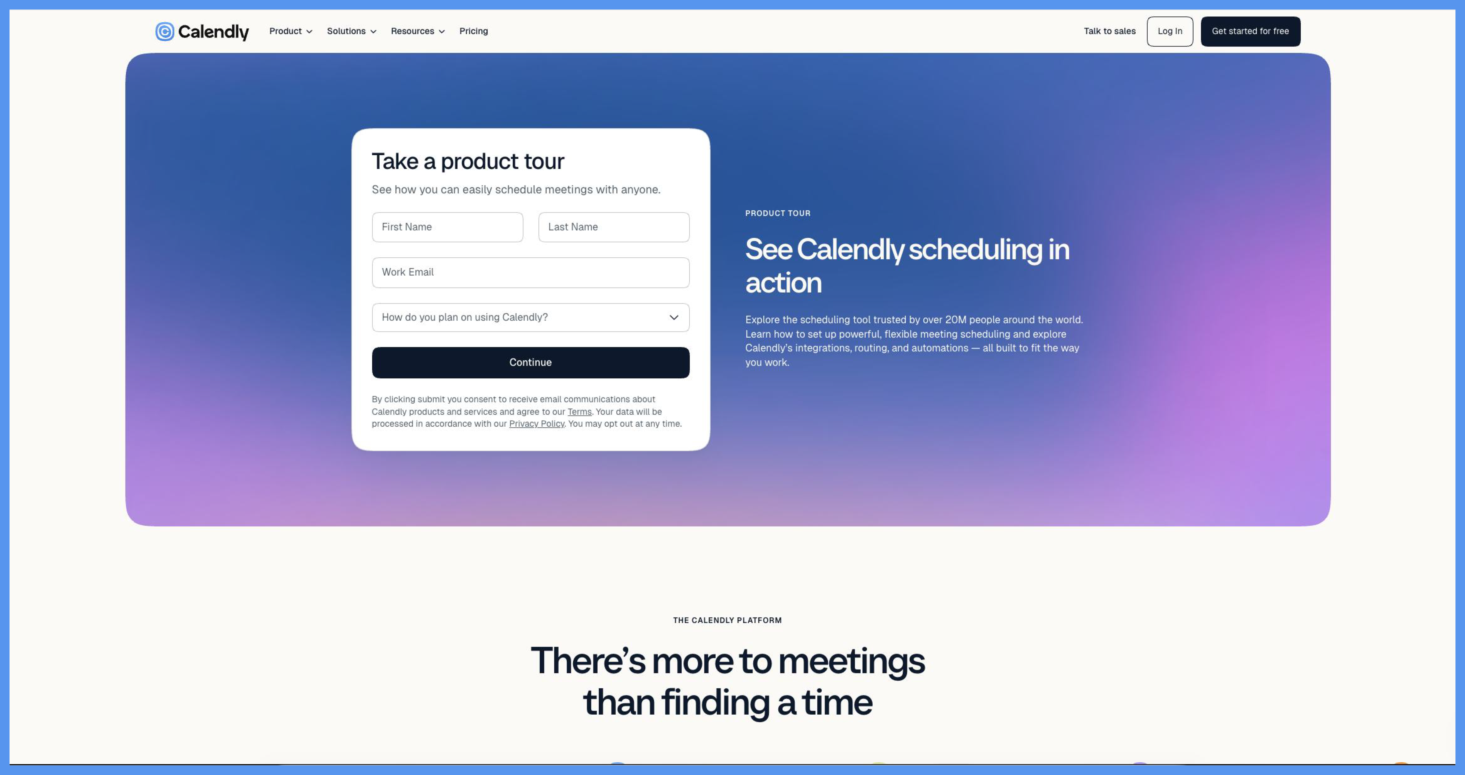
Calendly sells scheduling automation, and its own sales page pairs a "Talk to Sales" button with a "Sign up for free" button side by side. Clicking through drops a visitor straight into Calendly's own booking interface, so the product demonstrates itself before a rep ever joins the call. We'd add a short qualification step before the calendar, since an open calendar invites unqualified leads to book a slot meant for a sales call.
2. HubSpot
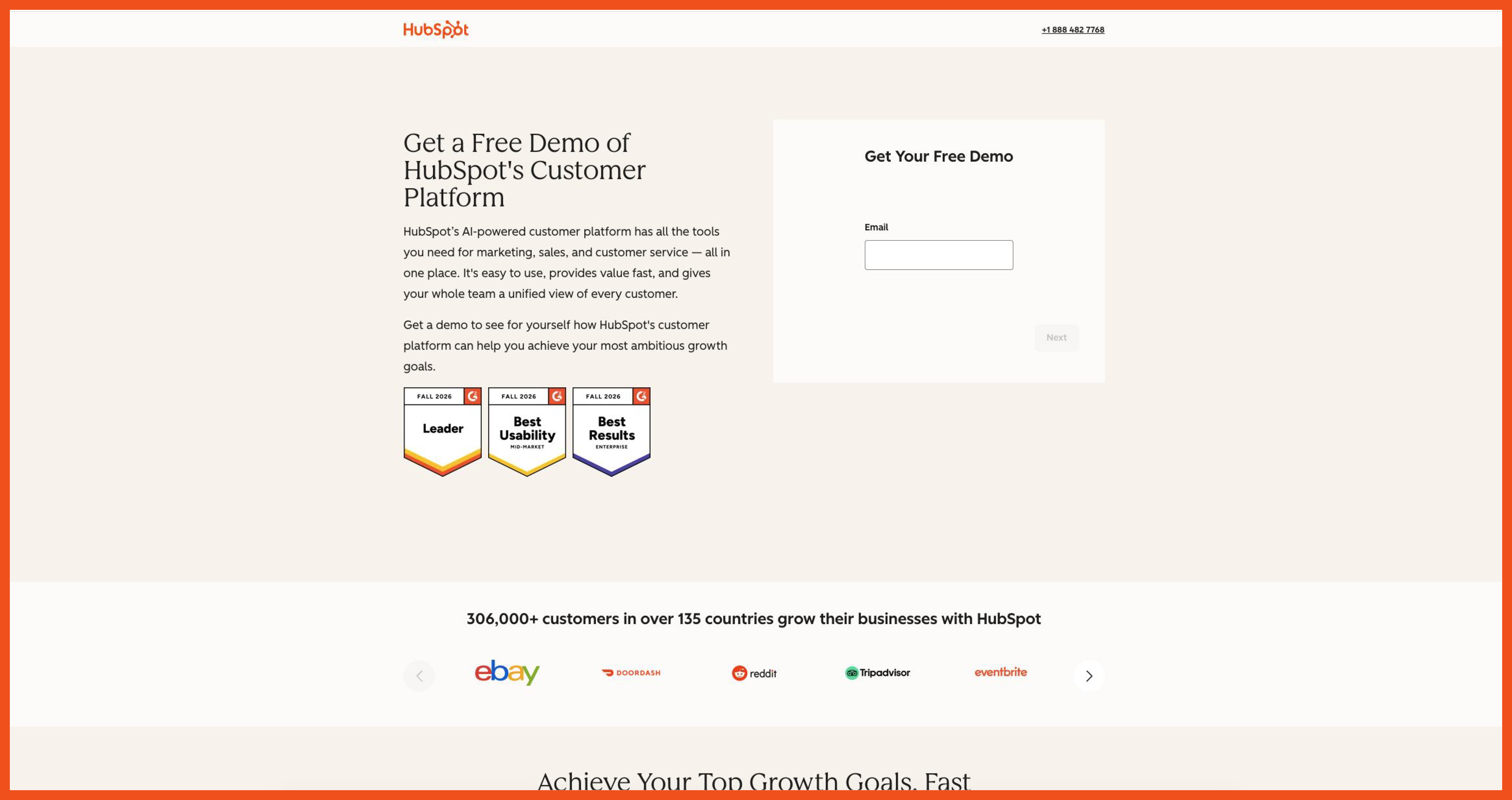
HubSpot sells a CRM platform split into Marketing, Sales, Service, and Content hubs, and its demo pages route each visitor toward the hub that matches their stated interest. This segmentation keeps the sales conversation relevant to the specific hub a visitor came to evaluate, instead of a generic platform pitch. We'd shorten the routing path, since choosing a hub before reaching the form adds a click that a direct hub-specific page could remove.
3. Gong
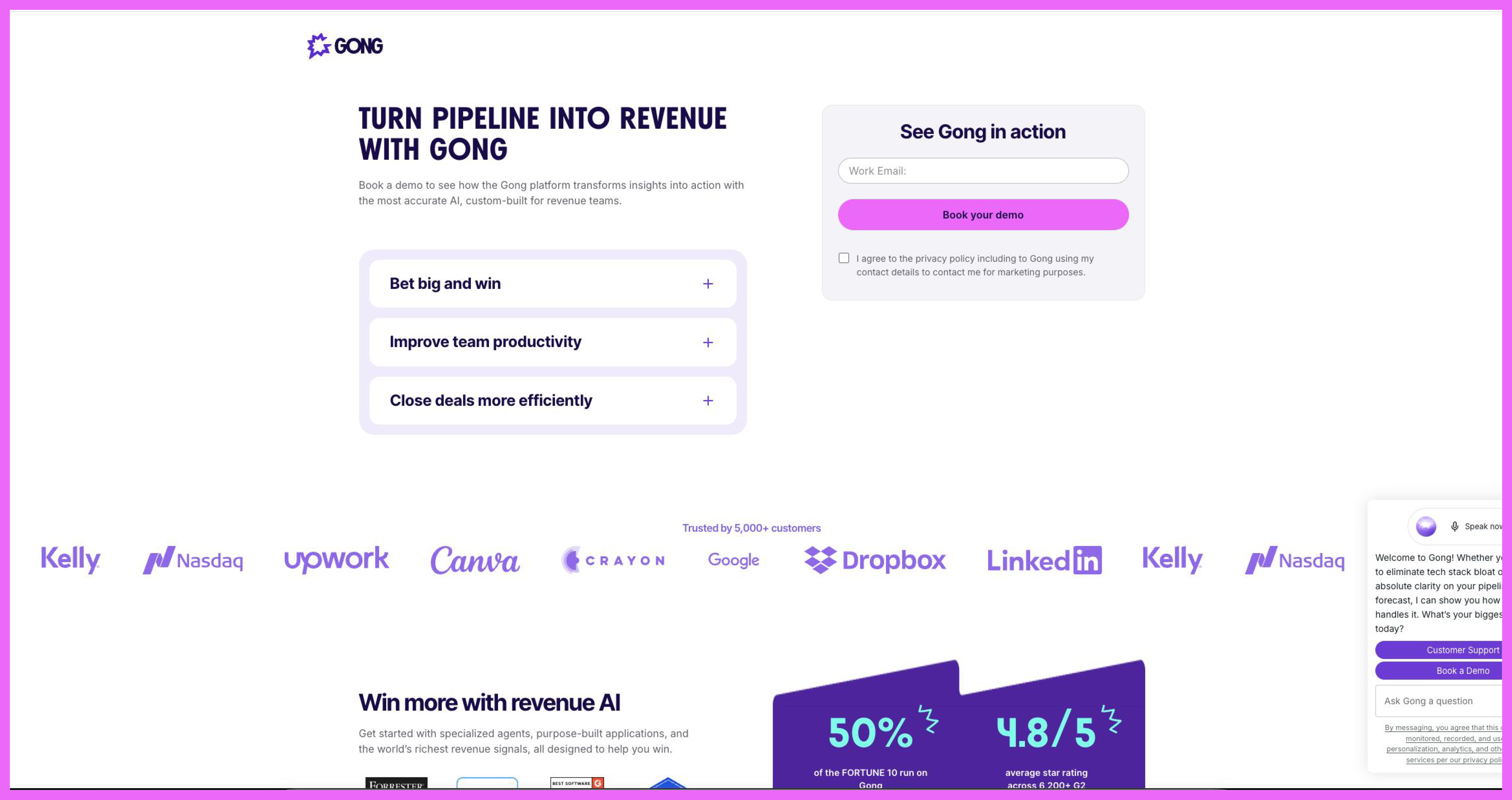
Gong sells revenue intelligence software, and its demo page leads with customer logos and outcome language before the form fields appear. Leading with proof signals to a skeptical revenue leader that other teams in the same role already trust the product, which lowers the hesitation a cold form faces. We'd test moving the strongest customer result higher on the page, since the proof point currently competes with several other headline claims for attention.
4. Intercom
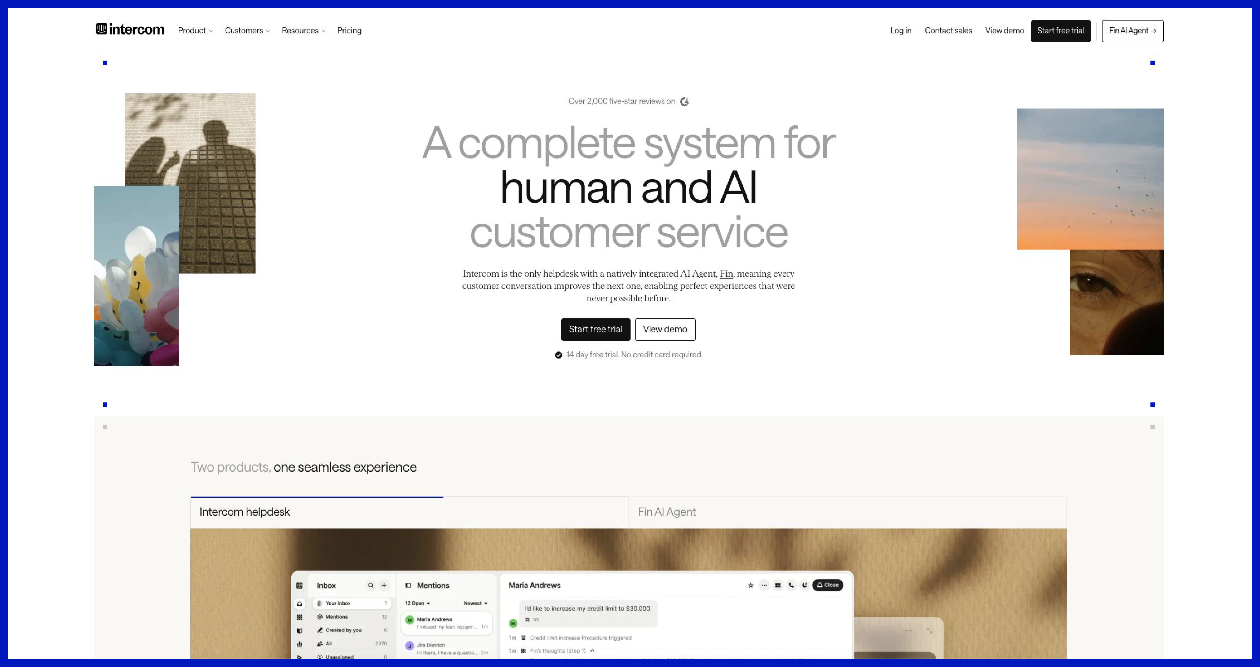
Intercom sells customer messaging and support software, and it places a free trial signup next to its demo request option on the same page. Offering both paths serves two different buyers at once: a small team ready to self-serve and a larger team that wants a guided walkthrough first. We'd add a short line clarifying which path fits which team size, since two equally weighted buttons can stall a visitor who is unsure which one applies to them.
5. Asana
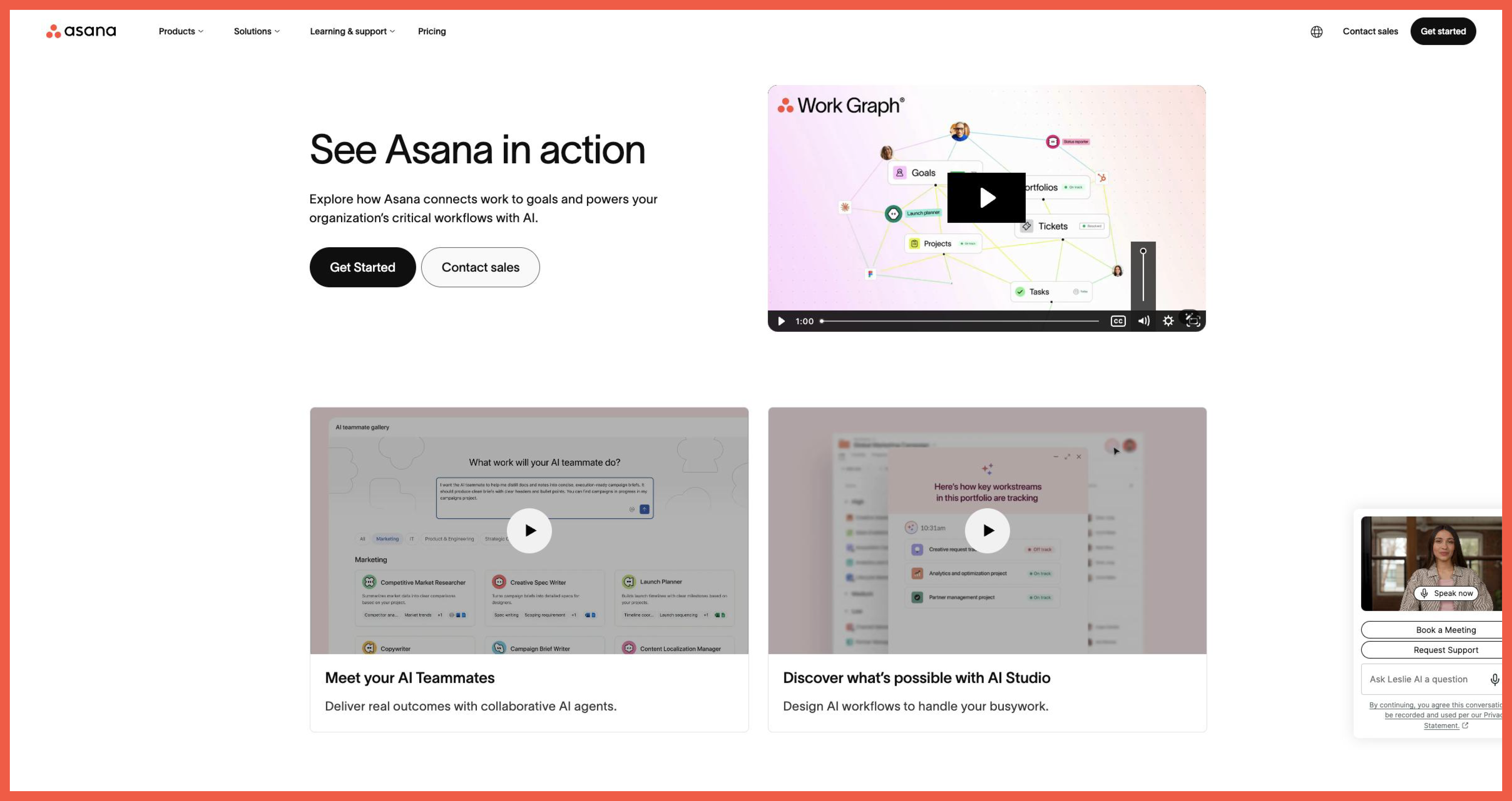
Asana sells work management software, and its enterprise demo page asks for team size before it shows the contact form. Asking team size first lets Asana route a small team toward its free plan, and a large team toward a sales conversation, which keeps the sales queue focused on deals worth a rep's time. We'd separate the free plan promotion from the demo page entirely, since a visitor who already decided to request a demo does not need a competing free plan pitch.
6. Monday.com
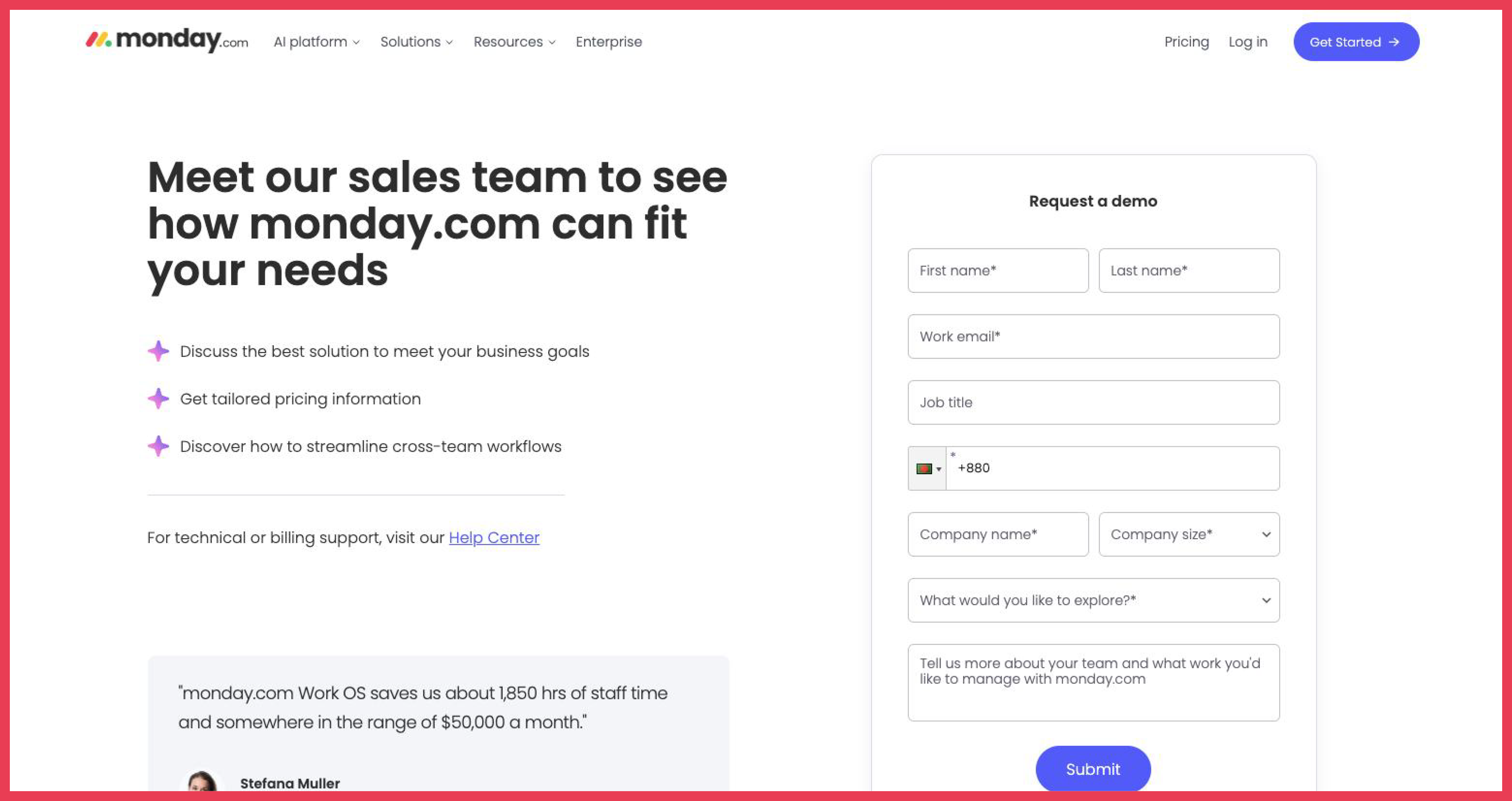
Monday.com sells a work operating system, and its homepage places a free trial button ahead of its demo request link in visual weight. This ordering fits a product-led growth motion, since most visitors try the product themselves before a sales conversation ever starts. We'd give the demo link equal visual weight on pages aimed at larger teams, since an enterprise buyer often wants a guided conversation instead of a self-serve trial.
7. ZoomInfo
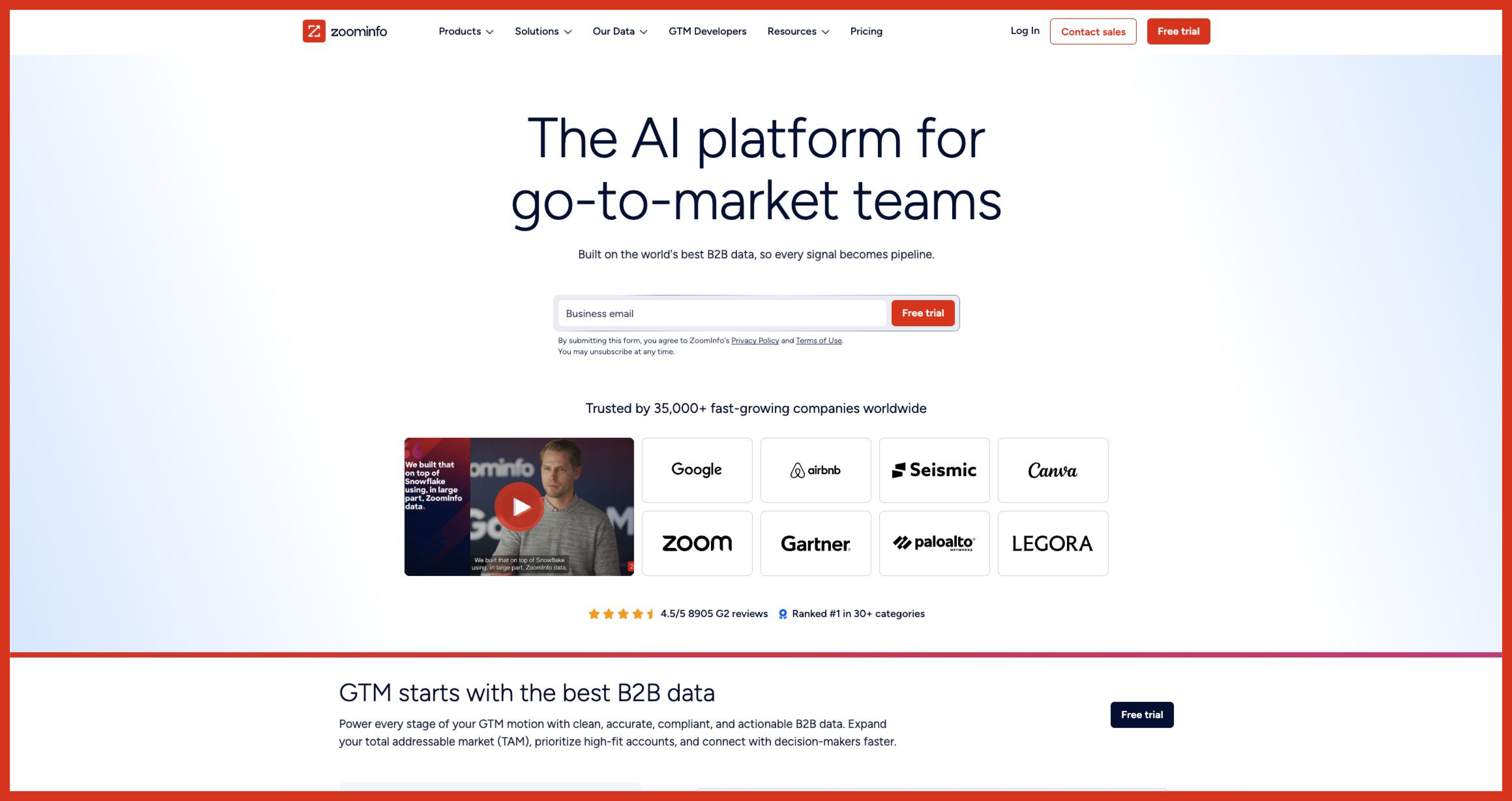
ZoomInfo sells B2B contact and intent data, and its demo request form asks for company, job title, and business email before any scheduling step appears. The longer form matches a high-ACV, sales-assisted motion, since a data platform buyer typically represents a multi-stakeholder purchase that benefits from upfront context. We'd embed a calendar directly after the form submits, since the current flow still requires a rep to reach out before a time gets confirmed.
8. Outreach
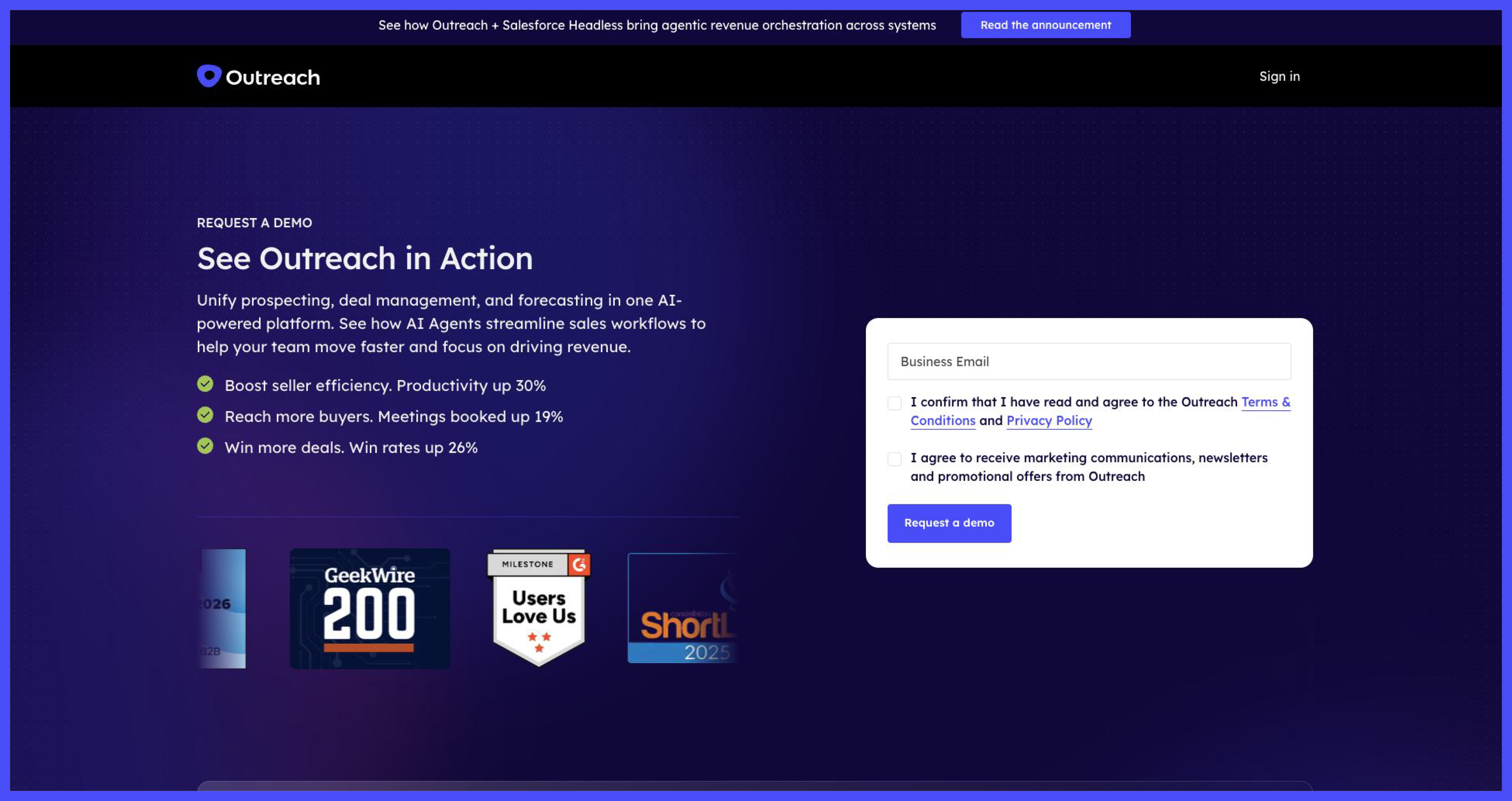
Outreach sells a sales engagement platform, and its demo page asks visitors to select their role and primary use case before the form submits. Segmenting by role lets the follow-up conversation focus on the specific workflow a sales leader, a revenue operations lead, or an individual rep actually cares about. We'd add a visible estimate of response time near the submit button, since a buyer evaluating a sales tool expects the same speed the tool promises to deliver.
9. Zoom
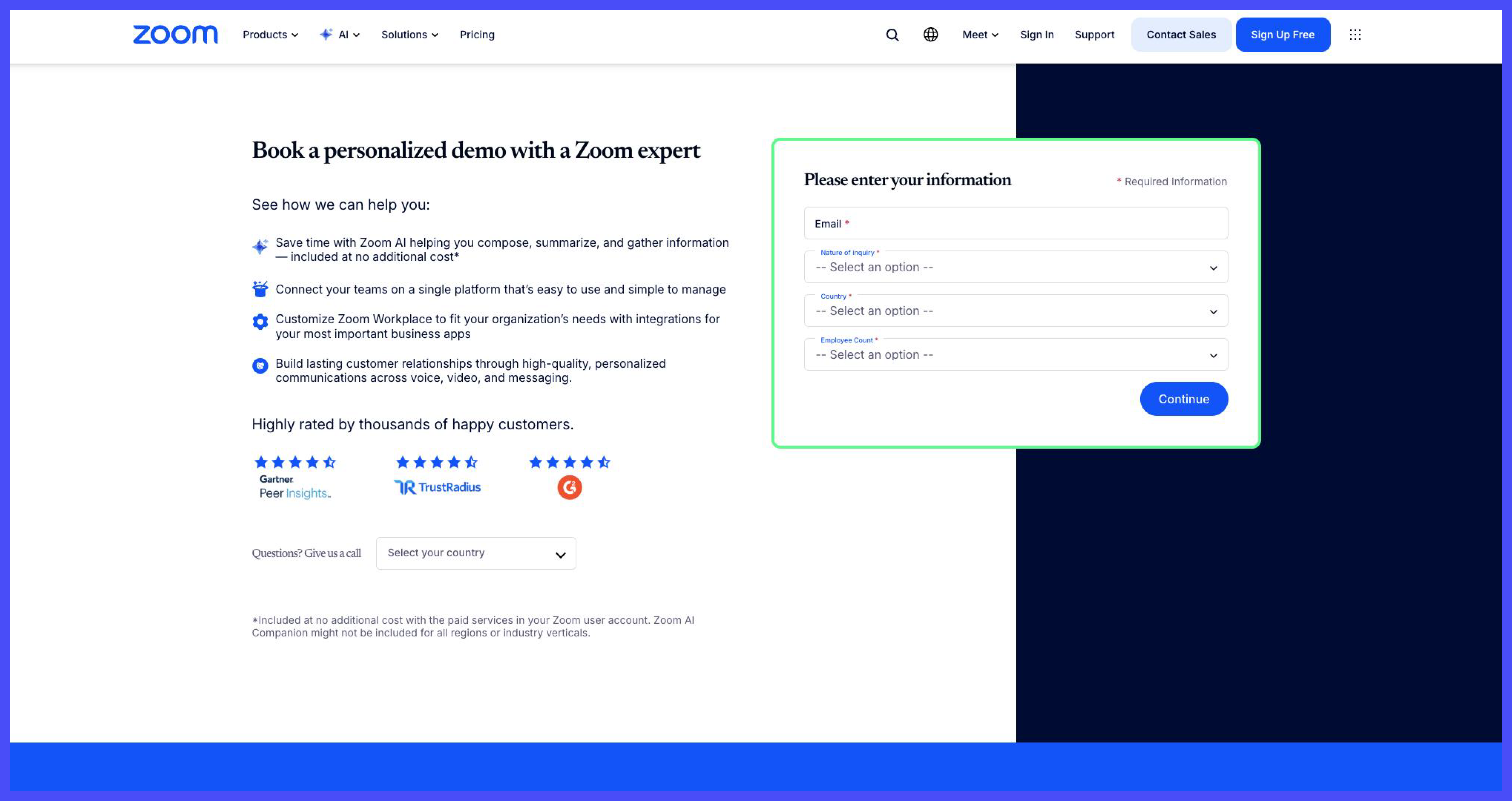
Zoom sells its Workplace and enterprise video communication suite, and its sales contact page gives visitors a form option alongside a direct phone number for enterprise inquiries. Offering a phone line next to the form fits a buyer base that still includes procurement teams used to a phone-based enterprise sales process. We'd move the phone option below the form on the page instead of beside it, since showing both at equal weight can split visitor attention between two competing actions.
10. Salesforce
.webp)
Salesforce sells its CRM platform across Sales, Service, Marketing, and Commerce clouds, and its demo request form collects company size, country, and specific product interest before routing the lead. The detailed qualification matches an enterprise buying process with multiple stakeholders, since the resulting lead data lets Salesforce assign the right specialist rep on the first contact. We'd shorten the form for visitors who arrive from a specific product page, since those visitors already signaled which cloud they want and do not need to restate it.
What Makes Demo Request Pages Convert
Six factors separate a demo request page that fills a sales calendar from one that collects abandoned forms.
Form length versus lead quality. Short forms raise submission volume, and long forms raise lead quality, so the right length depends on your sales capacity. Teams with 2 or fewer sales development reps should keep forms to 5 fields, since every extra field filters out leads a small team cannot chase anyway.
What to show before the form. Visitors convert faster when the page proves the product works before it asks for contact details. Customer logos, a 1-line outcome stat, or a short product screenshot placed above the form build the trust a blank form cannot.
Calendar booking versus form-then-email. Calendar booking lets a visitor pick a time on the spot, and form-then-email adds a wait of hours or days before a rep replies. Pages that embed a calendar directly after the form close meetings faster than pages that route visitors to a separate scheduling step.
Qualification questions and how many to ask. Company size, job title, and use case let sales route leads to the right rep, but each added question lowers completion. Two to three qualification questions strike the balance most B2B SaaS teams need without stalling the form.
Self-serve or interactive product demos as an option. A self-serve or interactive walkthrough next to the demo request form captures visitors who want to explore before they talk to a rep. This option keeps product-led visitors on your site instead of losing them to a competitor's free trial.
What happens right after submission? A confirmation screen that names the next step, a specific rep, or a confirmed time reduces no-shows. A generic "we'll be in touch" message gives the visitor no reason to keep the meeting on their calendar.
Design choices on the rest of the page, covered in how to design a SaaS landing page, shape how many visitors reach the form at all.
Common Demo Page Mistakes
- Asking 10 or more fields before the first contact. Cut the form to the fields your sales team actually uses in the first call.
- Hiding the form behind a second page click. Place the form on the same page as the headline, not behind a separate "Learn More" step.
- Showing no confirmation of a specific next step. Confirm a date, a time, or a named rep on the thank-you screen, not a generic acknowledgment.
- Repeating the same form fields a returning visitor already submitted. Pre-fill known fields through progressive profiling instead of asking twice.
- Using the same generic form for a free trial and an enterprise demo. Split the two paths so each visitor answers questions that match their actual intent.
Work With Us
Taqwah is a SaaS UI/UX design agency that builds demo request pages around how a specific sales team actually qualifies and books leads, not a generic template. We design the form length, the calendar flow, and the proof placement around your sales capacity and your buyer's expectations. Our team has shipped demo pages for SaaS companies across sales-led and product-led motions, and we measure every page against form completion rate and booked meeting rate, not page views alone. Reach out if your current demo page collects forms but does not fill your sales calendar.




.avif)