.svg)

.svg)
%201.svg)


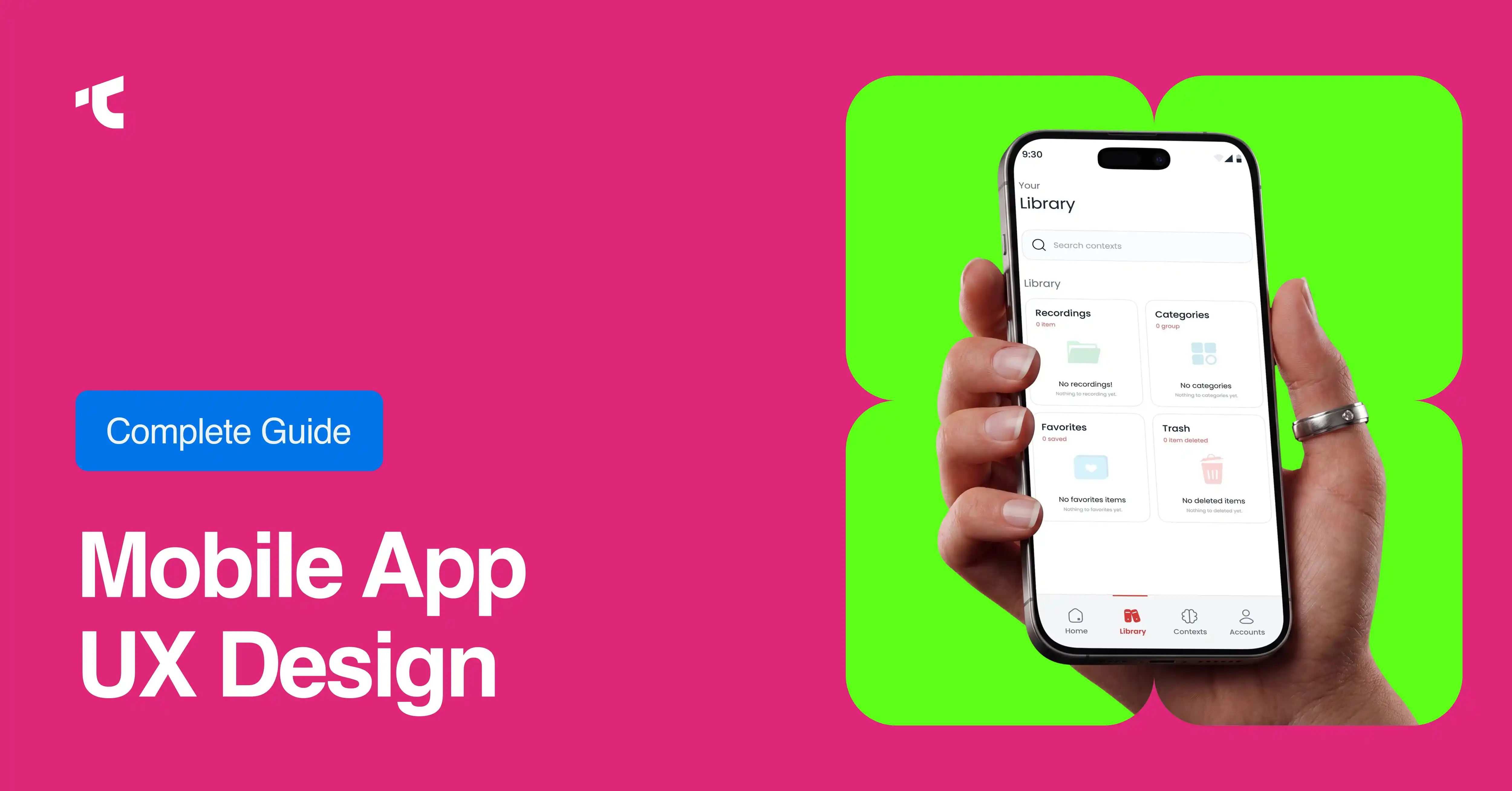
Mobile app UX design determines whether users complete tasks, return to an app, or delete it after one bad experience. Strong UX follows a structured process: research, ideation, prototyping, and testing, while avoiding common mistakes like feature overload and poor onboarding. Apps like Airbnb, Spotify, and Duolingo succeed because they apply core principles: simplicity, personalization, and consistency.
Every tap, swipe, and pause inside a mobile app tells a story about whether the design is working. Users don't read manuals or sit through tutorials before they decide if an app deserves their time. They form judgments within milliseconds, and those judgments compound into decisions about whether to keep browsing, complete a purchase, or delete the app entirely.
That reality makes mobile app UX design one of the highest-leverage investments a business can make. According to Forrester Research, every $1 invested in UX design returns $100, an ROI of 9,900%. Yet plenty of apps still get it wrong. Business of Apps reports that 49% of Android apps are uninstalled within 30 days of download, and much of that churn traces back to friction users encountered in their first few sessions.
This guide breaks down why mobile app UX design matters, how the design process actually works, which apps do it best, where teams commonly go wrong, and the principles that separate forgettable apps from ones people can't stop using.
What Is the Importance of Mobile App UX Design?
Mobile app UX design shapes nearly every business outcome that matters: retention, conversion, and brand trust. When users can't find what they need, or the app behaves unpredictably, they don't file a complaint. They leave.
The numbers back this up. UXCam reports that 88% of users are less likely to return to an app after a bad experience, and mobile users are five times more likely to abandon a task if an app isn't optimized for their device. Meanwhile, 83% of consumers say a seamless experience across devices is essential to their loyalty.
First impressions form fast. Research cited by Maze shows it takes roughly 50 milliseconds for users to form an opinion about a digital product, and 75% of users judge a company's credibility based on design alone. That's a narrow window to prove an app is worth keeping.
Why Is Mobile App UX Design Important for Business Growth?
Beyond user sentiment, UX design has a direct line to revenue. McKinsey's Design Index found that companies in the top quartile for design achieved 32 percentage points higher revenue growth and 56 percentage points higher shareholder returns than their industry peers over five years. A well-designed interface can lift conversion rates by up to 200%, according to Forrester, while superior UX design can push that figure to 400%.
Mobile-specific data makes the case even clearer. Criteo found that mobile apps convert at a rate 150% higher than mobile websites, but only when the experience justifies the download. Poor UX erases that advantage quickly: 90% of users say they've stopped using an app due to poor performance, and 52% of customers have stopped buying from a brand entirely after a single bad experience.
For businesses weighing whether to prioritize UX investment, the decision criteria are straightforward: choose to invest early in UX research and testing if long-term retention and lifetime value matter more than a faster time-to-market. Cutting UX corners to launch sooner tends to cost more in redesigns and lost users later.
What Are the Mobile App UX Design Process Steps?
Good mobile UX doesn't happen by accident. It follows a repeatable process that moves from understanding users to validating solutions with real people.
1. Research and Discovery
Every effective design starts with understanding actual user behavior, not assumptions. This phase relies on field studies, interviews, and contextual inquiry to uncover what users are trying to accomplish and where they get stuck. Skipping this step is one of the fastest ways to build a beautifully designed app that nobody needs.
2. Define User Problems and Personas
Once research is complete, teams translate findings into journey maps and personas that represent real user segments. These tools keep design decisions grounded in evidence rather than internal opinions about what "feels right."
3. Ideate Solutions
With defined problems in hand, teams brainstorm potential solutions without immediately worrying about technical constraints. This creative phase intentionally delays feasibility judgments so that the best ideas surface before practical limitations narrow the field.
4. Prototype
Ideas become tangible through wireframes and interactive prototypes, using tools like Figma or Sketch. Prototypes range from simple paper sketches to high-fidelity mockups that simulate real functionality, allowing teams to catch usability issues before writing a single line of code.
5. Usability Testing
Testing validates whether a design actually solves the problem it was built for. Teams observe real users completing tasks in guided scenarios, which reveals friction points that internal reviews often miss. Mobile testing specifically accounts for touch targets, gesture behavior, and screen size variation.
6. Implementation and Continuous Iteration
Launch isn't the finish line. Accessibility standards, like the W3C's mobile accessibility guidelines, need to be built in rather than retrofitted. After launch, teams should keep monitoring real usage data to refine the experience based on how people actually behave, not just how they behaved in a controlled test.
What Are the Best Examples of Mobile App UX Design?
Some apps have become reference points for mobile UX because they solve specific user problems with unusual clarity.
Airbnb: Simplifying a Complex Journey
Airbnb condenses a complicated travel-planning process - discovery, comparison, decision-making, and booking - into a single, coherent mobile experience. Its search function groups location, dates, and guest count together, applying the Law of Proximity so related inputs feel connected. After a redesign focused on usability, Airbnb saw a 10% increase in bookings, proof that UX improvements translate directly into business results.
Spotify: Personalization as a Retention Engine
Spotify keeps users engaged through features like Discover Weekly and Made For You, which use listening behavior to surface relevant content without requiring users to search for it. This personalization contributes to an average daily usage of 148 minutes per user, demonstrating how reducing discovery effort drives loyalty.
Duolingo: Gamification That Sustains Engagement
Duolingo turns language learning into a habit through progress tracking, streaks, and adaptive difficulty that adjusts to user performance. These game mechanics aren't decoration; they're the mechanism that keeps users returning daily rather than abandoning the app after a few sessions.
Uber: Reducing Decision Fatigue
Uber applies Hick's Law, the UX principle that decision time increases with the number of choices presented. By surfacing price, vehicle type, and estimated arrival time upfront, Uber helps users compare options without navigating multiple screens. The fare-split feature also reflects a specific understanding of how groups actually use the service.
Headspace: Designing Around Emotional State
Headspace uses warm colors, calming illustrations, and short onboarding questionnaires to personalize the experience without disrupting the user journey. Its navigation is structured around four clear categories - meditate, sleep, move, and music; making a broad, emotionally sensitive topic feel approachable.
What Are the Most Common Mistakes in Mobile App UX Design?
Even well-funded apps fall into predictable traps. Recognizing these patterns early can prevent expensive redesigns later.
Skipping User Research
Building an app based on internal assumptions rather than validated user needs is one of the most common, and costly, mistakes. Without research, teams end up guessing at what users want, and guesses rarely scale.
Confusing Navigation and Poor User Flow
If users have to backtrack or guess where to click next, they'll quit rather than push through the confusion. Every screen should make the next step obvious.
Weak or Missing Onboarding
Localytics research shows that 21% of users abandon an app after just one use, often because onboarding either overwhelms them with information upfront or fails to explain the app's value quickly enough.
Feature Overload
Packing too many features and visual elements into a single screen creates clutter that slows the app down and overwhelms users. A helpful discipline: prioritize features as high, medium, or low, and resist adding anything that doesn't serve a core user goal.
Forms That Reset and Context That Disappears
Gnosari's research puts mobile form abandonment at 81%, and a meaningful share of that comes from forms that reset when a user is interrupted mid-task. Search filters that clear, onboarding that restarts from scratch, and scroll positions that don't persist all signal the same underlying failure: the app isn't designed for how people actually use their phones, in short, interrupted bursts throughout the day.
Design Inconsistencies
Mismatched color schemes, unpredictable button behavior, and inconsistent typography erode trust even when each screen looks fine in isolation.
What Are the Core Mobile UX Design Principles?
The apps that get UX right tend to follow a consistent set of principles, regardless of industry.
Design for interruption, not just completion. Mobile users rarely finish a task in one uninterrupted sitting. Apps should preserve state and let users resume exactly where they left off, whether they were interrupted by a phone call or a dead zone.
Prioritize simplicity over feature count. Fewer, well-executed features consistently outperform a long list of half-built ones. Choose simplicity if your primary goal is first-session retention; only add complexity once core flows are proven.
Design for thumbs, not cursors. Touch targets should meet minimum size guidelines: 44×44 points on iOS, 48dp on Android; and sit within easy thumb reach.
Personalize where it reduces effort. Personalization works best when it removes steps for users, not when it simply adds novelty.
Maintain consistency across every screen. Consistent color, typography, and interaction patterns build trust and reduce the mental effort required to use an app.
Build in accessibility from the start. WCAG-aligned design isn't optional for reaching the full range of potential users, and retrofitting accessibility after launch is far more expensive than designing for it upfront.
How Does a Design Agency Help With Mobile App UX Design?
Building strong mobile UX in-house requires research capacity, design expertise, and testing infrastructure that many teams don't have readily available. Mobile app design agency brings dedicated UX researchers who can run structured discovery work, designers experienced in prototyping across iOS and Android patterns, and testers who can surface usability issues before launch rather than after a wave of one-star reviews.
Agencies also bring outside perspective. Internal teams often carry assumptions about how users behave; an experienced agency partner challenges those assumptions with evidence. For teams that need to move quickly without compromising on quality, agency partnerships often shorten the distance between an early concept and a validated, production-ready design.
Making Mobile UX a Competitive Advantage
Mobile app UX design isn't a finishing touch applied after development wraps up. It's the foundation that determines whether users stay engaged, return regularly, and recommend the app to others. The businesses that treat UX as a continuous discipline, rooted in research, tested through prototypes, and refined based on real usage data, consistently outperform those that treat it as a one-time checklist.
Start by auditing your current app against the principles and mistakes outlined here. Identify where users are dropping off, and use that data to guide your next round of design decisions. Small, evidence-based improvements compound over time, just as they did for Airbnb's 10% booking increase after a usability-focused redesign.
Frequently Asked Questions
How much does mobile app UX design typically cost?
Mobile app desing costs vary widely based on app complexity, the number of screens, and whether you're working with a freelancer, agency, or in-house team. Early-stage research and prototyping are generally the most cost-effective phases to invest in, since fixing usability issues after launch costs significantly more than catching them during design.
How long does the mobile UX design process take?
Timelines range from a few weeks for a simple feature update to several months for a full app redesign. The process is also iterative, meaning UX work continues well past launch as teams refine the experience based on real user data.
What's the difference between UX design and UI design for mobile apps?
UX design covers the full user journey, including research, information architecture, and how users move through the app. UI design focuses on the visual layer colors, typography, and button styling that makes those journeys look and feel polished.
Can small businesses afford professional mobile UX design?
Yes. Many design agencies like taqwah offer scoped engagements focused on specific problems, like onboarding or checkout flow, rather than requiring a full app redesign. Prioritizing the highest-friction parts of the user journey delivers strong returns even on a limited budget.
What's the biggest risk of ignoring mobile UX design?
The most common outcome is silent churn: users don't complain; they simply stop opening the app. With 49% of Android apps uninstalled within 30 days of download, ignoring UX issues rarely leads to a dramatic failure. It leads to a slow, hard-to-diagnose decline in engagement.




.avif)