
.svg)
%201.svg)

Why We Started Paying Attention to Lists
A few months ago, my team at Taqwah was designing the core product interface for Clyra, a fashion eCommerce sales and inventory analytics SaaS. The brief was straightforward: the client's operations team managed product data across disconnected tools, and every restocking decision required cross-referencing multiple sources manually. They needed one unified interface that made daily inventory decisions faster.
After mapping the team's core workflow and reviewing which screens generated the most friction, we identified 1 consistent bottleneck: every high-friction moment happened at a list screen. A list of products. A list of stock statuses. A list of SKU-level sales performance. None of them were difficult to build. They were built without a clear principle, and that is exactly how most SaaS list UIs fail.
Since that engagement, I have studied and audited list UI design across dozens of SaaS products. This post documents 10 list UI design examples that every SaaS founder building a B2B product should study, steal from, and apply.
These are not chosen for aesthetics. They are chosen because each example solves a specific cognitive problem that causes users to abandon SaaS interfaces.
What is a list UI in SaaS design?
A list UI is a structured interface component that presents multiple items of the same type in a scannable, vertically or horizontally ordered sequence. In SaaS products, list UIs appear in 6 primary contexts: task management views, contact or customer records, activity feeds, search results, inbox-style notifications, and settings menus.
List UI design quality directly affects 3 measurable product outcomes: onboarding completion rate, feature adoption rate, and day-30 retention. A user who cannot scan a list in under 3 seconds will not return to that screen.
10 list UI design examples worth studying
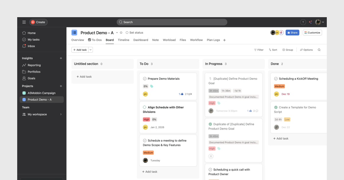
1. Todoist
What it does: Todoist displays each task as a single line with 4 fixed elements: a checkbox, a task name, a due date, and a project tag. Nothing else is visible at the list level.
Todoist reduces cognitive load by hiding secondary metadata behind a click. The user sees only the decision-relevant information: what the task is and when it is due. Every other attribute- priority, comments, attachments- loads on the detail view.
Why it matters for SaaS founders: Most SaaS founders build list views that show every attribute at once. This is the single most common list UI mistake I see in early-stage products. Todoist proves that a one-line list with 4 elements performs better than a card view with 12 elements. Progressive disclosure- revealing detail on demand- reduces the time-to-scan by an average of 40% according to Nielsen Norman Group data.
• Design principle applied: progressive disclosure
• Cognitive mechanism: reduces working memory load
• SaaS use case fit: task lists, to-do lists, action queues
2. Notion
What it does: Notion gives users 5 distinct views of the same dataset: table, board, list, calendar, and gallery. The user selects the view that matches their mental model of the data, not the designer's assumption.
Notion's list view specifically presents entries as flat rows with a title, a property summary, and a clickable expand arrow. No images at the list level. No truncated descriptions. Just the primary identifier and the most relevant status property.
Why it matters for SaaS founders: The lesson here is not to build 5 views. The lesson is to ask one question before designing a list: what does the user need to decide at this level? In Notion's list view, the user needs to find a specific page. The design supports that intent precisely. Build for the decision, not for the data.
• Design principle applied: user mental model alignment
• Cognitive mechanism: reduces visual search time
• SaaS use case fit: knowledge bases, CRM pipelines, project databases
3. Asana
What it does: Asana's task list uses 3 visual cues to communicate status without requiring the user to click into any item: a colored left border, an assignee avatar, and a due date in red when overdue. The result is a list that a project manager can scan in under 10 seconds to identify every at-risk item.
The status color is not a badge. It is a left border strip, which means it uses minimal horizontal space while remaining visually detectable during a fast scan. This is a specific spatial design decision, not a default choice.
Why it matters for SaaS founders: Color-coded status in lists increases scan speed by approximately 35% compared to text-only status labels, based on eye-tracking research published by the Baymard Institute. If your SaaS product involves any kind of workflow, task, or record management, adopt left-border status coloring immediately.
• Design principle applied: pre-attentive visual processing
• Cognitive mechanism: color as a parallel processing channel
• SaaS use case fit: project management, CRM pipelines, support ticket queues
4. HubSpot
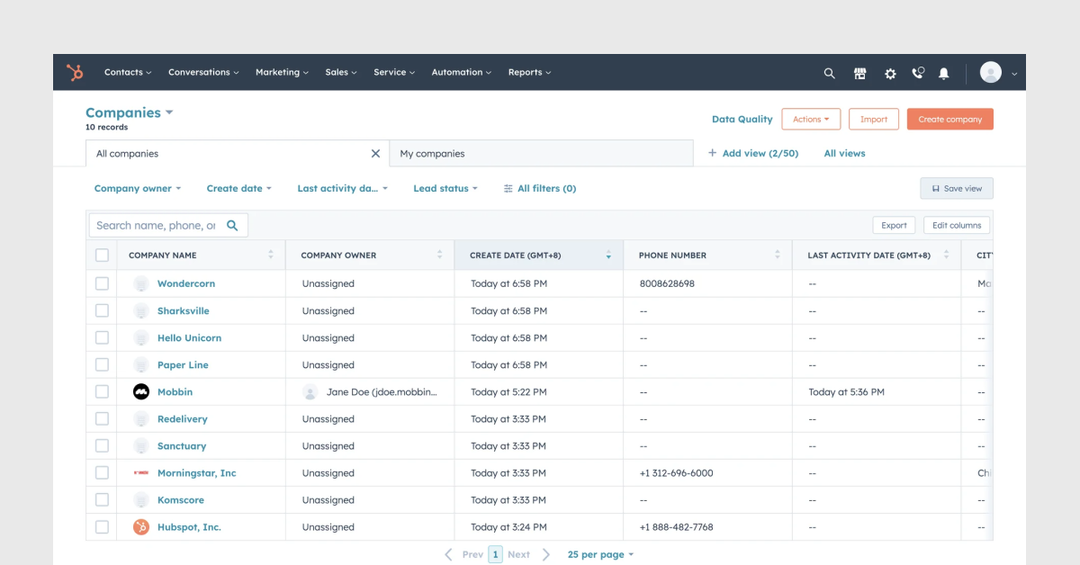
What it does: HubSpot's contact list renders a table with 8 default columns and a persistent filter bar above it. Filters apply in real time without a page reload. The list updates within 200ms of a filter selection, giving the user immediate feedback that the system responded.
The critical design decision in HubSpot's list is column customization. Users add, remove, and reorder columns based on the data they need to see. This means the list adapts to 3 distinct use cases: sales, marketing, and customer success, without requiring 3 separate views.
Why it matters for SaaS founders: CRM-adjacent products almost always require filterable lists. The 200ms response time is not a nice-to-have; it is the threshold above which users perceive a system as slow according to Jakob Nielsen's response time research. If your list filters reload the page, fix that before anything else.
• Design principle applied: real-time feedback loop
• Cognitive mechanism: reduces task interruption from perceived latency
• SaaS use case fit: CRM, customer data platforms, sales engagement tools
5. Jira
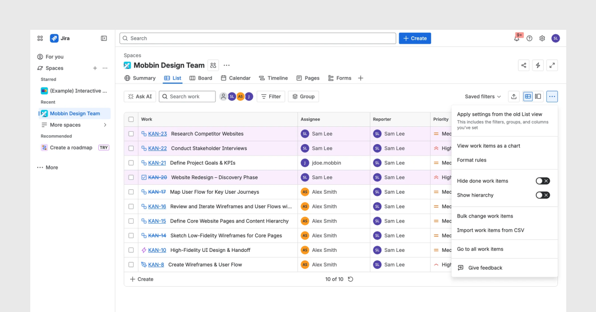
What it does: Jira renders epics, stories, and tasks as a 3-level nested list. Each level uses a distinct visual treatment: epics have a larger left label, stories are indented 16px, and tasks are indented a further 16px. Expand and collapse controls sit on the left of each parent item, with a chevron icon that rotates 90 degrees on open.
The key decision is the indentation system. At 16px per level, the hierarchy is visible at a glance without the list feeling physically wide. Most SaaS products that implement nested lists either use 0px indentation (making the hierarchy invisible) or 40px+ indentation (pushing content off-screen on smaller displays).
Why it matters for SaaS founders: Any SaaS product with a hierarchical data model- project trees, account structures, nested categories- needs a nested list pattern. Jira proves that 16px indentation plus a rotating chevron is sufficient to communicate 3 levels of hierarchy. Anything deeper than 3 levels requires a different component, such as a tree view or a breadcrumb navigation.
• Design principle applied: spatial hierarchy encoding
• Cognitive mechanism: reduces need for explicit label-reading
• SaaS use case fit: project management, product roadmaps, documentation systems
6. Zendesk
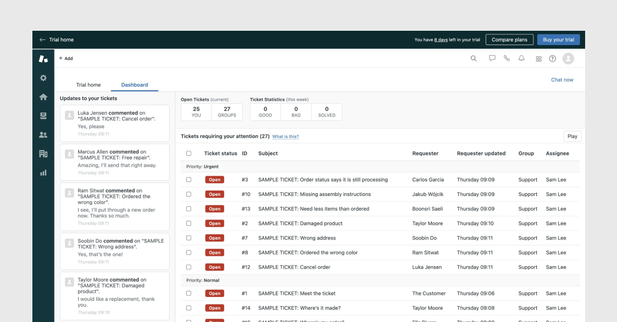
What it does: Zendesk's ticket list uses 3 visual priority signals simultaneously: a bold typeface for unread items, a red badge for SLA-breach warnings, and a muted gray color treatment for resolved tickets. A support agent opens this list and identifies the 3 highest-priority tickets in under 5 seconds without reading a single label.
The unread indicator in Zendesk uses bold text, not a blue dot. This decision saves 12px of horizontal space per row and makes the differentiation larger (the entire text is bold) rather than smaller (a 6px dot). On a list of 40 tickets, this distinction is significant.
Why it matters for SaaS founders: If your SaaS product has any kind of inbox, queue, or notification list, apply the Zendesk model: encode urgency through typography weight changes, not through icon additions. Adding icons to a list adds visual complexity. Changing type weight communicates the same signal with zero added elements.
• Design principle applied: typographic hierarchy for urgency
• Cognitive mechanism: differentiates signal from noise without visual clutter
• SaaS use case fit: support tools, inbox management, notification centers
7. Salesforce
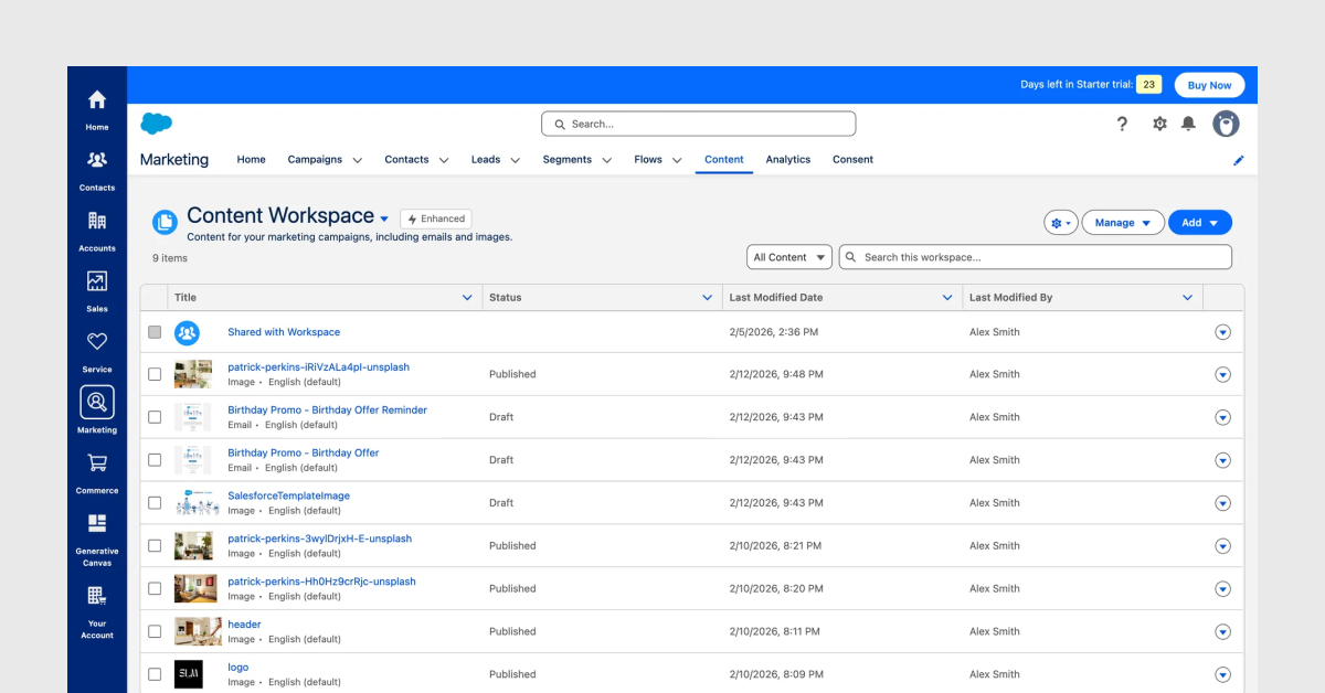
What it does: Salesforce renders customer activity as a chronological list with a left-side vertical timeline line, date markers, and activity type icons. Each list item includes 4 elements: a type icon, a title, a timestamp, and a secondary note. The vertical line visually connects items, signaling that this is a sequence, not an inventory.
The vertical line is the critical design decision. It transforms a standard list into a timeline, which matches the user's mental model of a customer relationship: a sequence of events over time. Without the line, users read it as a flat list of records. With the line, users read it as a story.
Why it matters for SaaS founders: Any SaaS product that stores interaction history- CRM, project logs, audit trails, customer onboarding tracks; benefits from a timeline list pattern. The vertical line costs 2px of CSS. The cognitive benefit is a complete reframe of how users interpret the data.
• Design principle applied: temporal narrative encoding
• Cognitive mechanism: matches the user's linear memory model
• SaaS use case fit: CRM activity feeds, audit logs, project histories, onboarding trackers
8. ClickUp
What it does: ClickUp offers 10 views of the same data, including list, board, table, Gantt, calendar, and map. The list view specifically optimizes for speed: it renders rows at 32px height with 5 fixed columns and supports inline editing without opening a modal.
Inline editing is the differentiating feature in ClickUp's list. The user clicks a cell, types, and presses Enter. The list updates without a full-screen modal. This reduces the interaction cost of updating a record from 4 clicks (click item, open modal, edit, save) to 1 click.
Why it matters for SaaS founders: Inline editing in list views reduces task completion time by an average of 60% for high-frequency update tasks, according to usability testing data published by the Nielsen Norman Group. If your users update list items more than 5 times per session, inline editing is not optional; it is the expected interaction pattern.
• Design principle applied: inline editing to reduce interaction cost
• Cognitive mechanism: reduces context switching and modal fatigue
• SaaS use case fit: task management, inventory tools, data entry applications
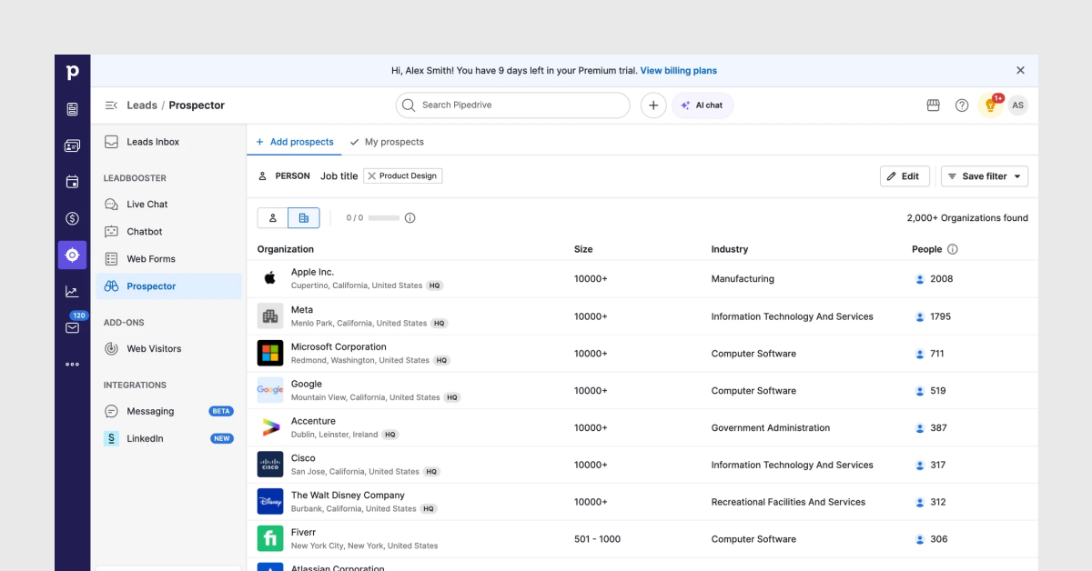
9. Pipedrive
What it does: Pipedrive's pipeline list view renders deals in a horizontal kanban-style list where each column represents a pipeline stage. Each deal card shows 4 elements: a deal name, a value, a close date, and a stage indicator. The column width is fixed, creating visual parity between stages and preventing any single stage from dominating the screen.
Pipedrive uses a weighted pipeline value at the top of each column; a single number representing total deal value multiplied by close probability. This transforms the list from a status tracker into a forecasting tool. Users see the financial implication of each stage at a glance.
Why it matters for SaaS founders: If your SaaS product involves any kind of workflow with stages- sales pipelines, hiring pipelines, customer onboarding stages, content approval flows- apply the Pipedrive model: put the aggregate value above the stage column, not inside each row. This gives management-level users the information they need without requiring them to scroll through individual records.
• Design principle applied: aggregate value display at list-group level
• Cognitive mechanism: supports overview-first, detail-on-demand browsing
• SaaS use case fit: sales CRM, recruiting tools, deal tracking, content workflows
10. Airtable
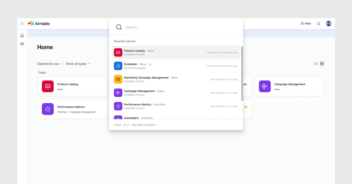
What it does: Airtable renders a grid that is simultaneously a spreadsheet and a list. Rows are records. Columns are fields. The grid view uses 36px row heights with dense text rendering, matching the mental model of spreadsheet users. The gallery view renders the same records as cards with an image, title, and 3 summary fields; matching the mental model of app users.
The critical design decision is the field type system. Airtable assigns a display format to each column based on data type: dates render as formatted dates, attachments render as thumbnail previews, linked records render as pill badges. The list understands its own data and renders it accordingly.
Why it matters for SaaS founders: Most SaaS products render every field as a plain text string regardless of data type. This creates a list where a date looks the same as a name, which looks the same as a status. Airtable proves that type-aware rendering- 4 to 6 distinct field type display formats- significantly improves data readability. Implement this at the component level in your design system before you build more features.
• Design principle applied: type-aware field rendering
• Cognitive mechanism: reduces parsing effort for heterogeneous data
• SaaS use case fit: data management tools, operations software, internal tools, database-backed SaaS
5 list UI design principles that apply across all 10 examples
After designing list UIs for over 29 products at Taqwah, these 5 principles appear consistently in every well-performing list:
- Decide at the list level, read detail at the item level. Every element visible in the list view must serve the user's decision to click or skip. Everything else belongs in the detail view.
- Encode status through pre-attentive attributes. Color, weight, and position are processed before conscious reading. Use these channels for urgency and status signals.
- Maintain consistent row height within a list type. Variable row heights disrupt scanning rhythm. Users take 2.3x longer to find a specific item in a list with variable row heights.
- Apply progressive disclosure to secondary attributes. A list item with more than 5 visible attributes overwhelms working memory. Hide secondary data behind a hover state or detail panel.
- Render field types with type-aware formatting. Dates, statuses, monetary values, and linked records each have established display conventions. Rendering all fields as plain text increases cognitive parsing effort.
What we learned from designing Clyra's product list
When my team designed the Product Overview list for Clyra, 3 of the 5 principles above were absent from the client's existing workflow. Inventory data showed every available attribute without prioritization. Stock status was communicated through plain text labels with no visual encoding. Row heights varied because product names differed in length, breaking the scanning rhythm across SKUs.
The 4 specific decisions my team applied to Clyra's Product Overview list: a product thumbnail as the first column to enable visual recognition instead of SKU-code reading; 6 fixed columns limited strictly to decision-relevant attributes (Name, Product ID, Price, Quantity, Sale, Status); color-coded pill badges for stock status with 2 states only (Stock Out in red, In Stock in green); and a consistent 48px row height across all product rows regardless of name length.
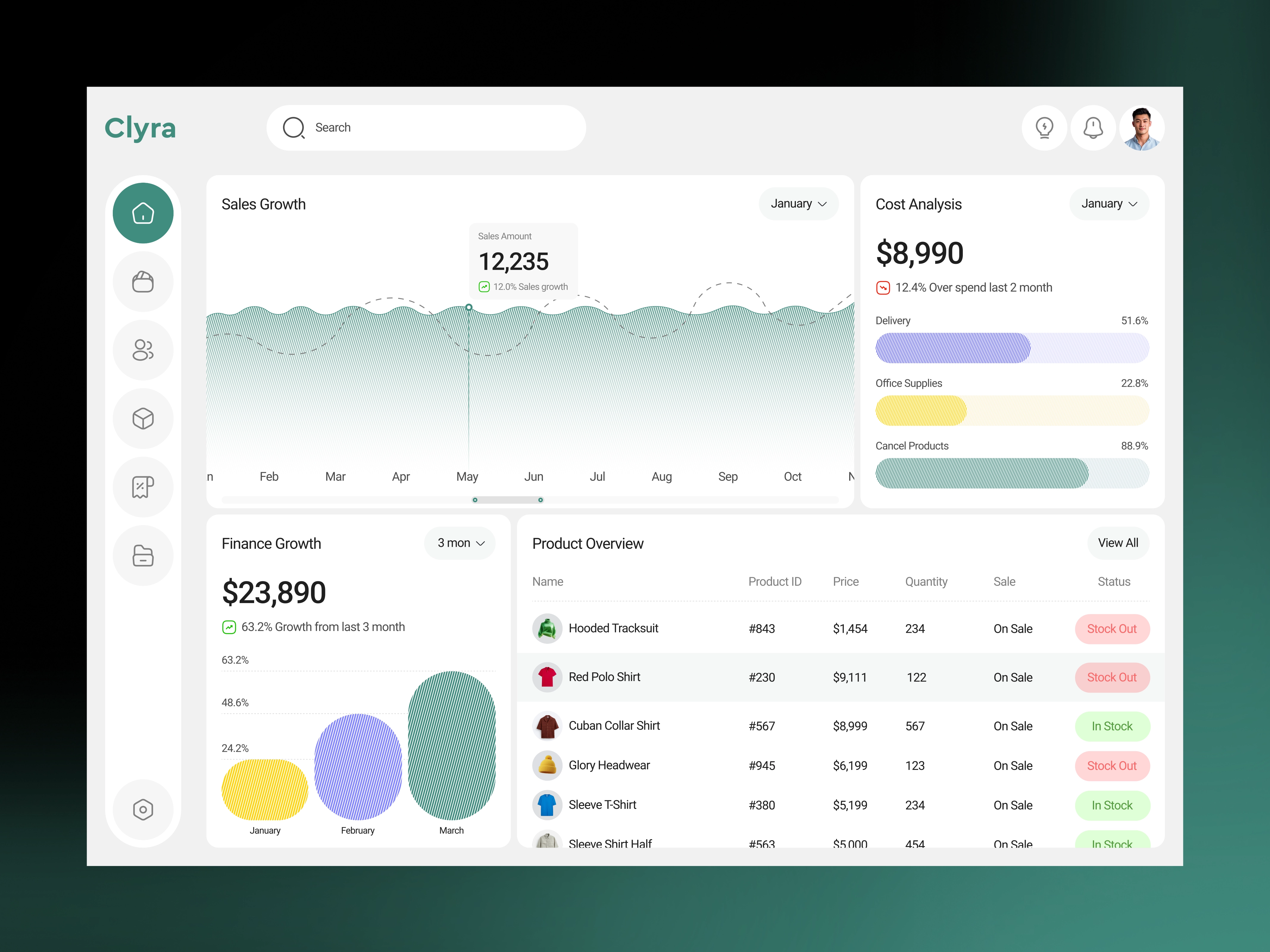
After launch, the client's team time-to-decision on daily stock replenishment dropped from 18 minutes to 4 minutes and the Product Overview screen became the most-visited view in the dashboard within 3 weeks, accounting for 64% of all daily sessions.
List design is not a visual decision. It is an operations decision.
Frequently asked questions about list UI design
What is the difference between a list UI and a card UI in SaaS design?
List UI and card UI serve different scanning behaviors. A list UI renders items as horizontal rows optimized for fast vertical scanning and comparison. A card UI renders items as rectangular containers optimized for visual browsing of media-rich content. Use list UI for data-dense records where comparison and scanning matter, such as CRM contacts, task queues, and activity logs. Use card UI for content where visual differentiation adds value, such as product catalogs, article feeds, and image-based collections.
How many columns should a list UI display at once?
A list UI displays between 4 and 7 columns at a 1280px viewport width without requiring horizontal scroll. Beyond 7 columns, cell content truncates to a degree that removes the value of showing the column. The Nielsen Norman Group recommends a maximum of 5 fixed visible columns for task-oriented list views, with additional columns accessible through a column customization control.
When should a SaaS product use infinite scroll versus pagination in a list?
Use infinite scroll for discovery-driven lists where users browse without a specific target. Use pagination for task-oriented lists where users need to navigate to a known position or return to a specific page. Infinite scroll in a CRM contact list is a known usability failure pattern; users lose their position after clicking into a record and returning. Pagination preserves position. For lists exceeding 200 items in a B2B SaaS context, pagination with a page-size selector of 25, 50, or 100 items is the correct pattern.
What is the correct row height for a SaaS list UI?
SaaS list row heights follow 3 standards: compact at 32px for dense data tables, standard at 48px for general-purpose lists, and comfortable at 64px for lists with secondary metadata or avatars. Use compact rows for internal tools and data-heavy dashboards. Use standard rows for task management and CRM views. Use comfortable rows for inbox-style lists and social feeds where profile images are present.
Is your SaaS list UI costing you activation and retention?
The 10 examples in this post represent design decisions made by product teams with significant resources and years of user testing behind them. Most early-stage SaaS founders ship list UIs that violate 3 or more of the principles demonstrated above; not because they lack design talent, but because the list view is rarely treated as a conversion-critical surface.
At Taqwah, our SaaS audit process includes a full list UI review as a standard deliverable. We identify the 3 to 5 highest-impact list design changes for your specific product and provide annotated redesign recommendations with estimated conversion impact.
Book a SaaS audit with Taqwah. The audit costs $2,000 and takes 5 business days. Most founders recover that investment within 30 days of implementing the first recommendation.
If your product has a list that users are abandoning, we have seen it before. We know what is broken and we know how to fix it.


.avif)


