.svg)
%201.svg)

Typography can make or break a user interface.
The right font improves readability, creates visual hierarchy, and gives your product a distinct personality. At the same time, the wrong one can make even the best UI feel outdated or difficult to use.
From mobile apps and SaaS dashboards to landing pages and design systems, modern interfaces rely heavily on clean, highly legible fonts that work across multiple screen sizes and devices. But with thousands of typefaces available today, choosing the right UI font can quickly become overwhelming.
Highly experienced Design Partners can choose right font for your digital products.
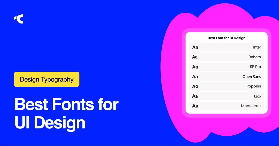
In this guide, we’ll explore 12 proven fonts for UI design that designers consistently use in modern digital products. Whether you’re building a minimalist startup website, a complex web app, or a mobile-first interface, these fonts combine readability, scalability, and modern aesthetics to help your designs feel polished and user-friendly.
12 Best Fonts for UI Design (Tested and Widely Used)
1. Inter (Modern UI System Font)
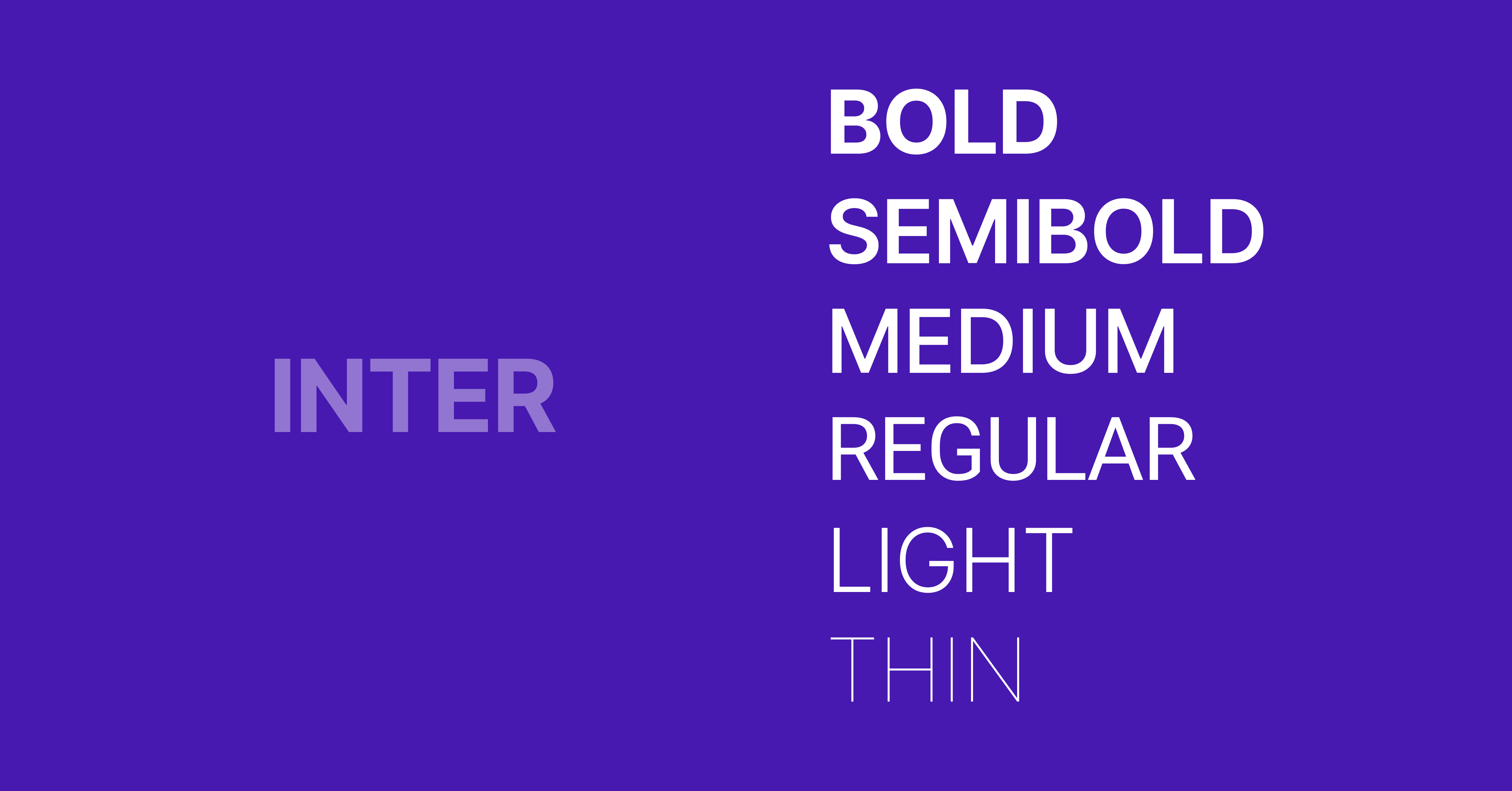
Inter is a sans-serif typeface designed for digital interfaces, optimized for screen readability with high x-height and open letterforms. It supports variable font technology and performs consistently across web and mobile UI systems.
- Category: Sans serif
- Strength: Excellent readability at small sizes
- Use: Body text, dashboards, SaaS products
- Source: Google Fonts (free for personal and commercial use)
2. Roboto (Google System Standard)
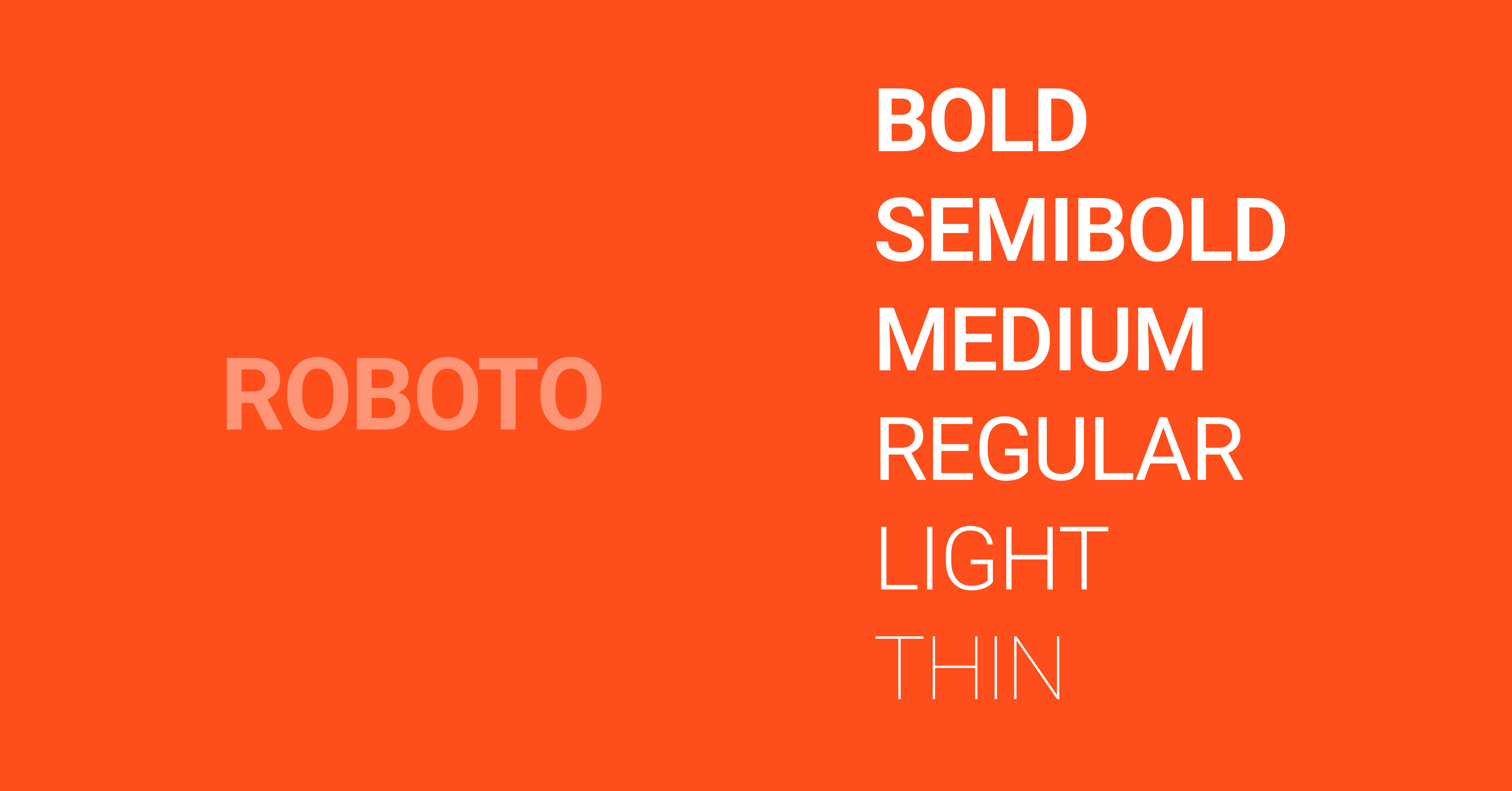
Roboto is a geometric sans-serif typeface developed by Google for Android interfaces, offering balanced spacing and excellent readability across screen sizes. It supports extensive weights and is widely used in modern UI design systems globally.
- Category: Sans serif
- Strength: Neutral, highly scalable
- Use: Apps, Android UI, web design
- Source: Google Fonts
3. SF Pro (Apple System Typeface)
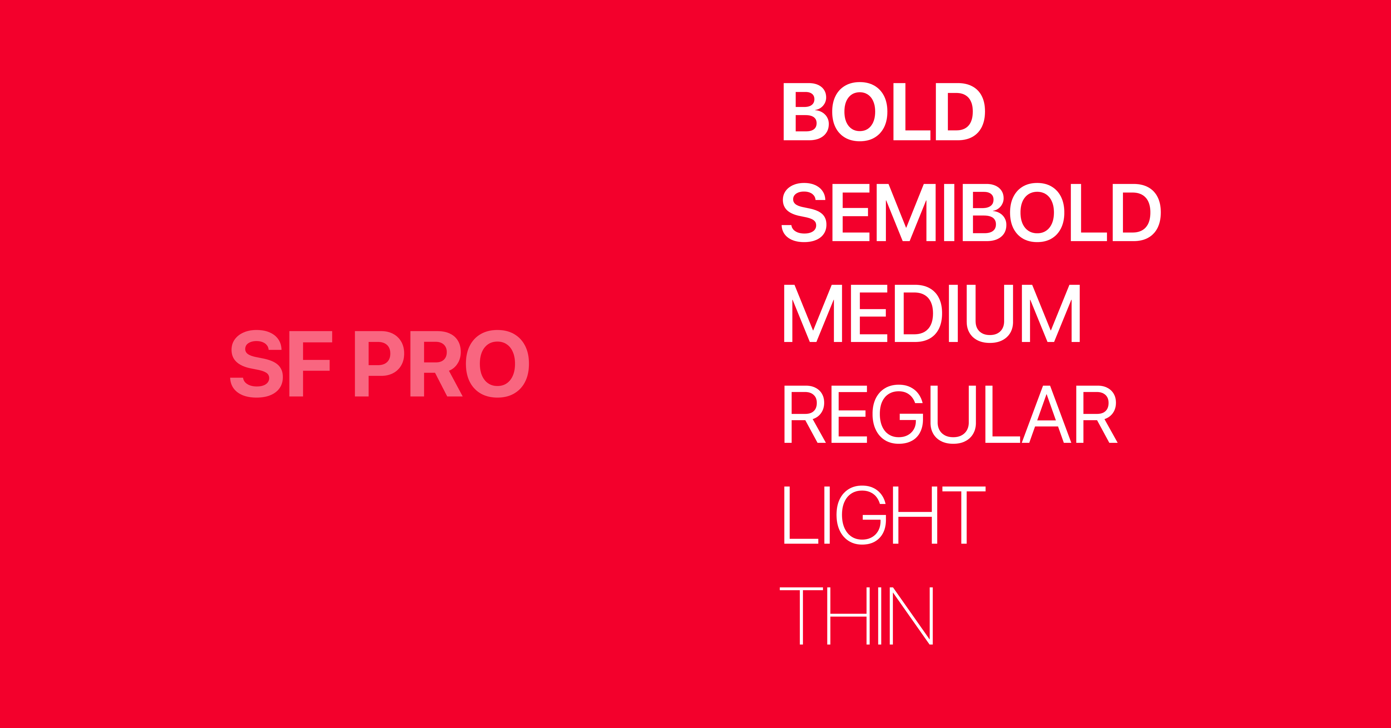
SF Pro is a sans-serif typeface designed by Apple for iOS and macOS interfaces, optimized for dynamic type scaling and high-resolution displays. It enhances readability and maintains consistency across Apple ecosystem products.
- Category: Sans serif
- Strength: Native Apple optimization
- Use: iOS apps, Apple ecosystem UI
4. Open Sans (Highly Readable Web Font)
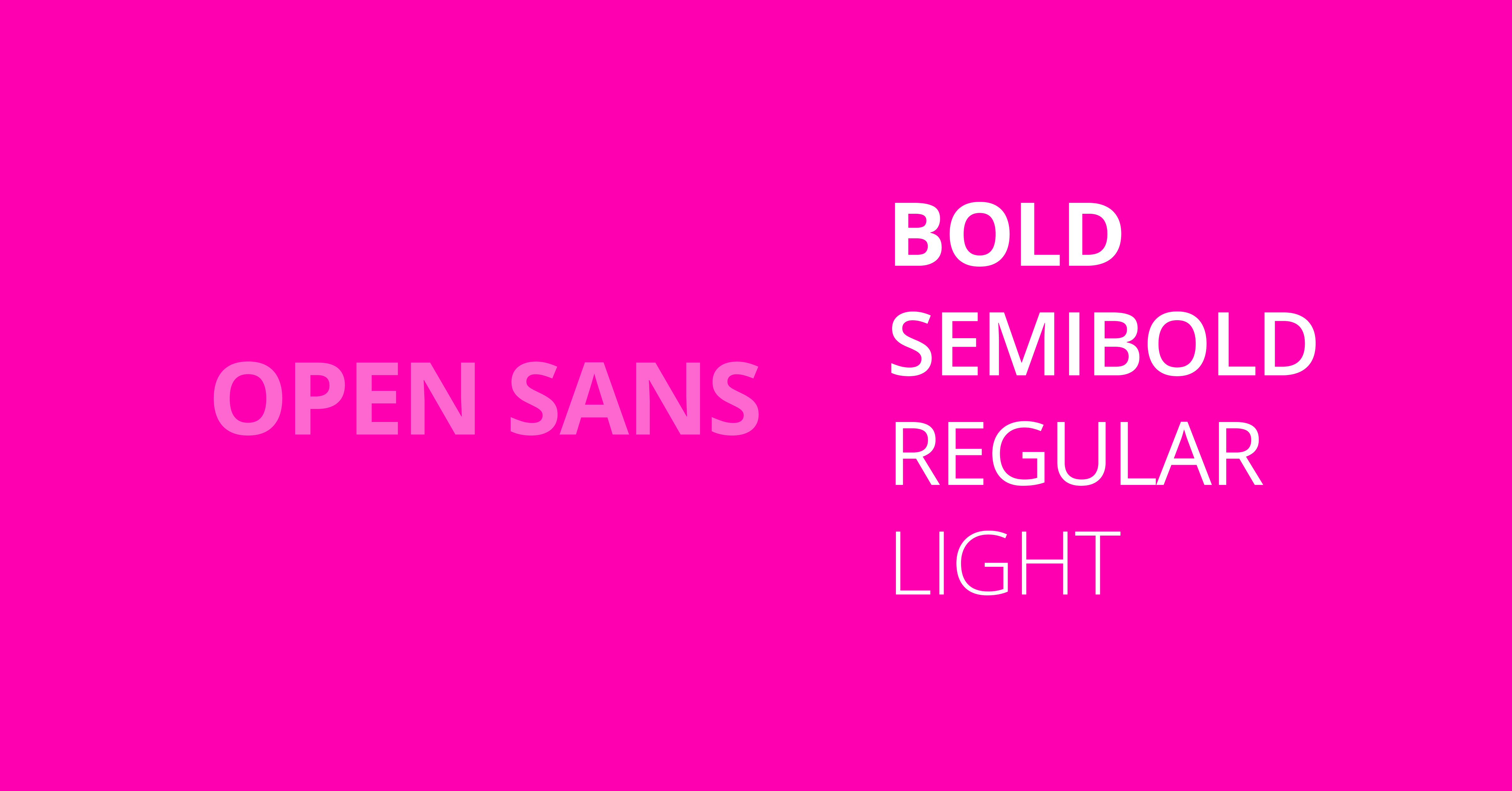
Open Sans is a humanist sans-serif typeface designed for web readability, featuring open forms and neutral styling. It performs well for body text and long-form UI content across responsive web interfaces.
- Category: Sans serif
- Strength: Easy to read for body text
- Use: Websites, dashboards
5. Poppins (Geometric Modern UI Font)
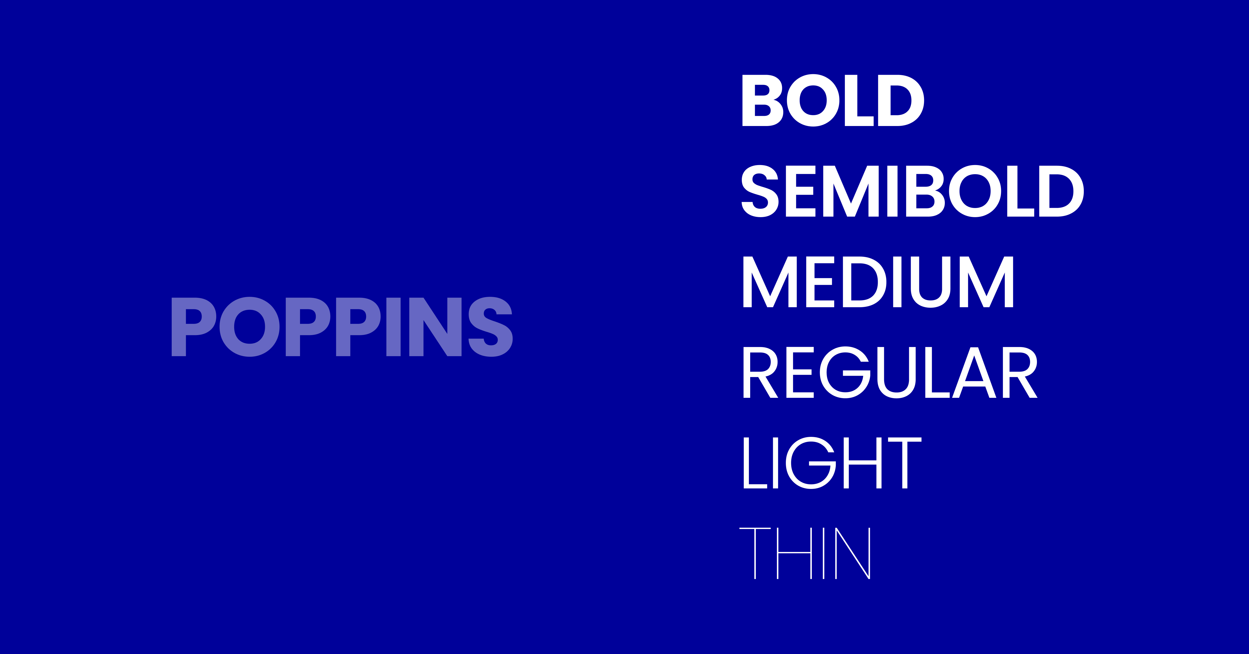
Poppins is a geometric sans-serif typeface with clean circular forms, widely used in modern UI design for headings and branding. It offers a strong visual hierarchy and supports multiple weights for interface systems.
- Category: Geometric sans serif
- Strength: Modern aesthetic
- Use: Headings, hero text
6. Lato (Balanced UI Typography)
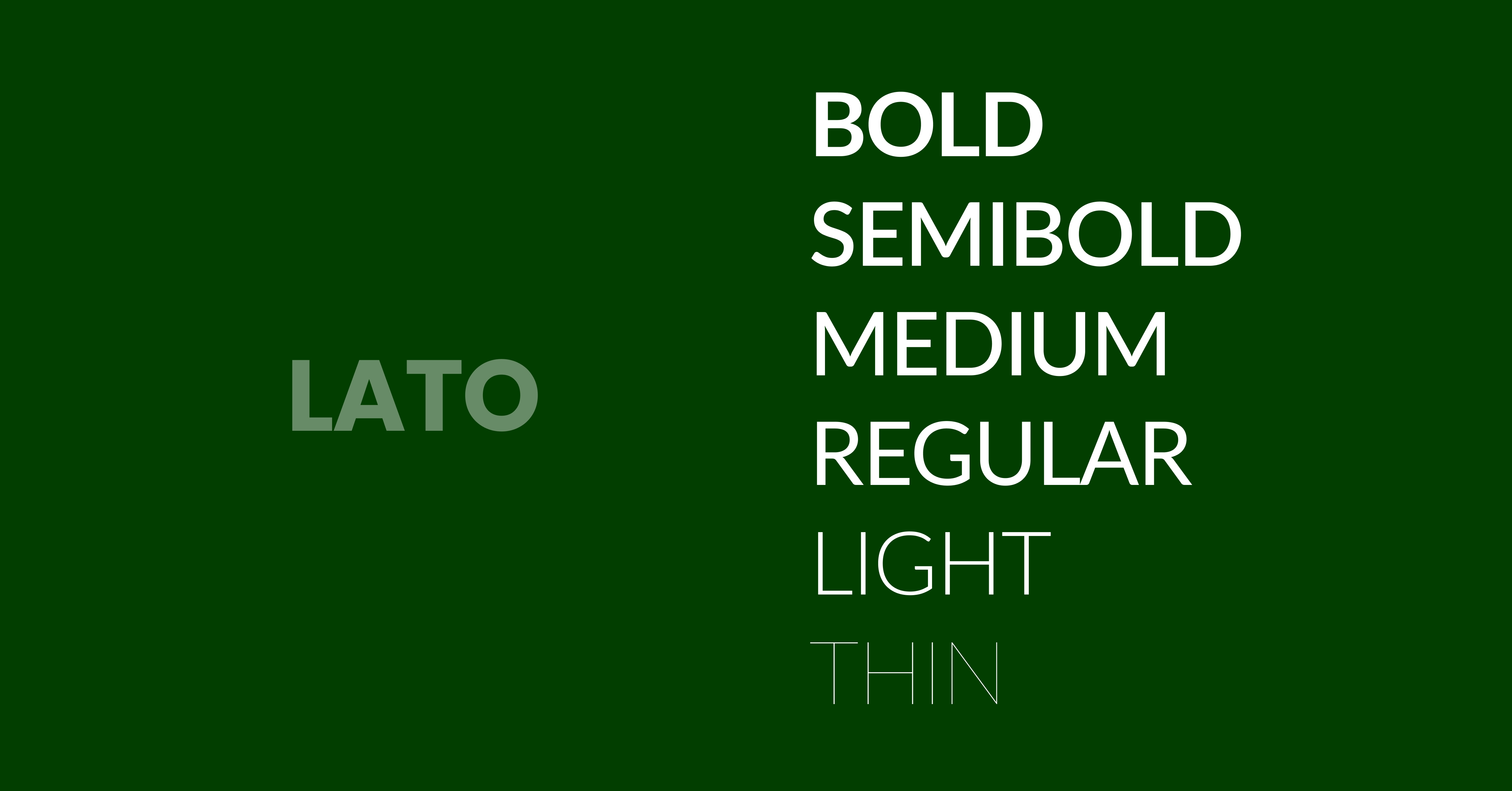
Lato is a sans-serif typeface designed for clarity and warmth, offering balanced proportions that improve readability in UI environments. It works effectively for both headings and body text in web and mobile interfaces.
- Category: Sans serif
- Strength: Friendly readability
- Use: General UI systems
7. Montserrat (Display + UI Hybrid)
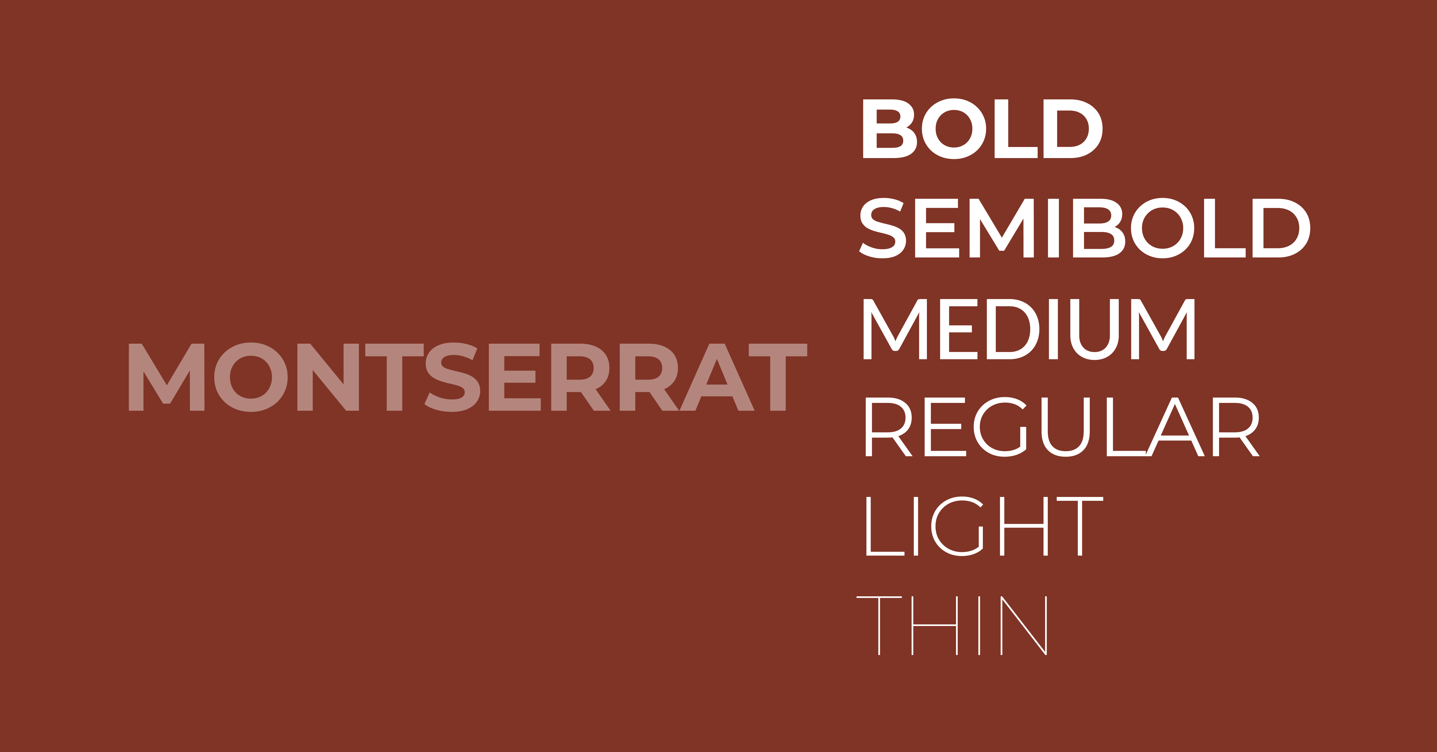
Montserrat is a geometric sans-serif typeface inspired by urban signage, commonly used for headings in UI design. It provides a strong visual impact while maintaining readability in larger interface text elements.
- Category: Display sans-serif
- Strength: Strong headings
- Use: Titles, hero sections
8. Nunito (Soft Rounded UI Font)
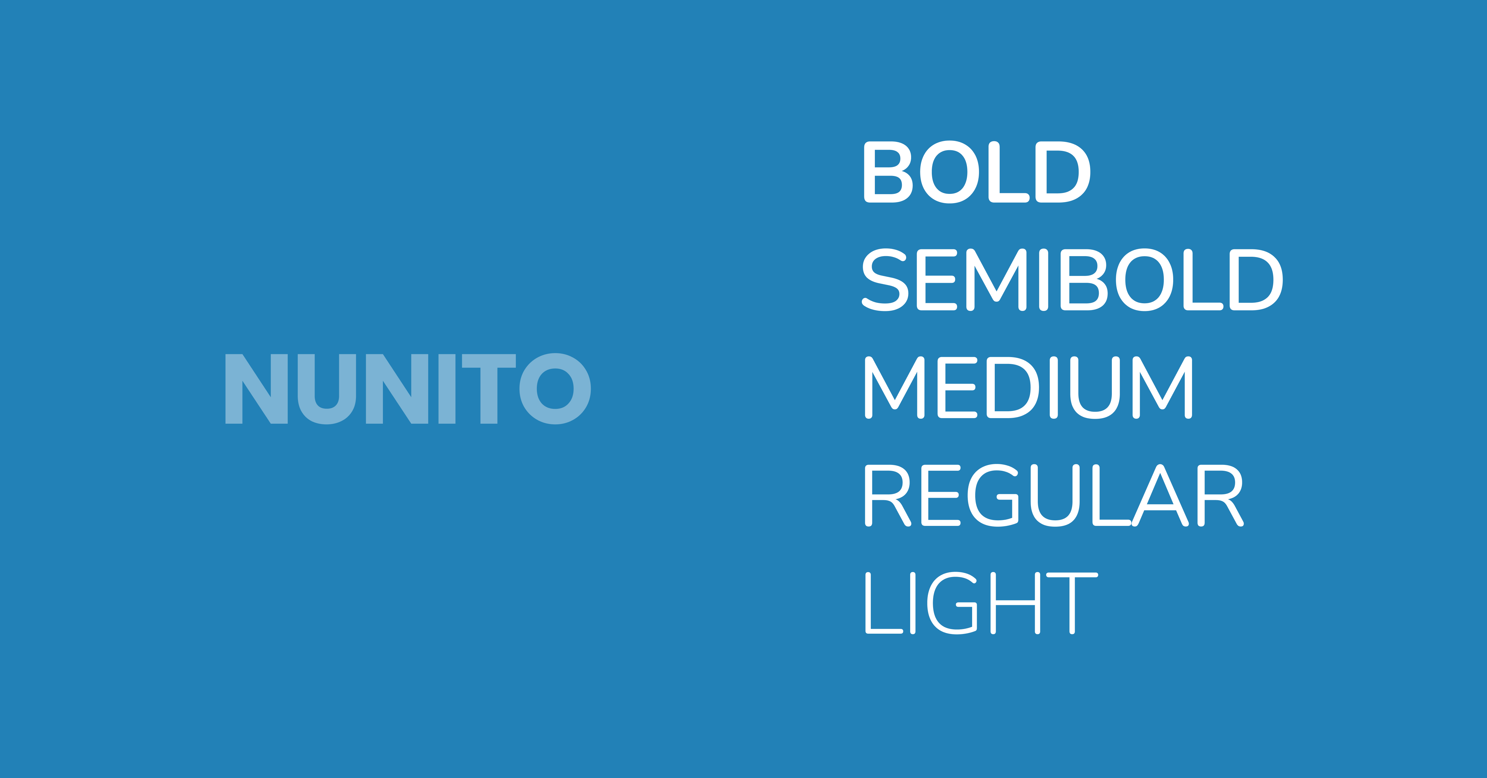
Nunito is a rounded sans serif typeface designed for friendly and accessible UI experiences, offering smooth curves and balanced spacing. It enhances readability while creating a softer visual tone in digital interfaces.
- Category: Rounded sans serif
- Strength: Soft, approachable design
- Use: SaaS, education platforms
9. Source Sans 3 (Adobe UI Font)
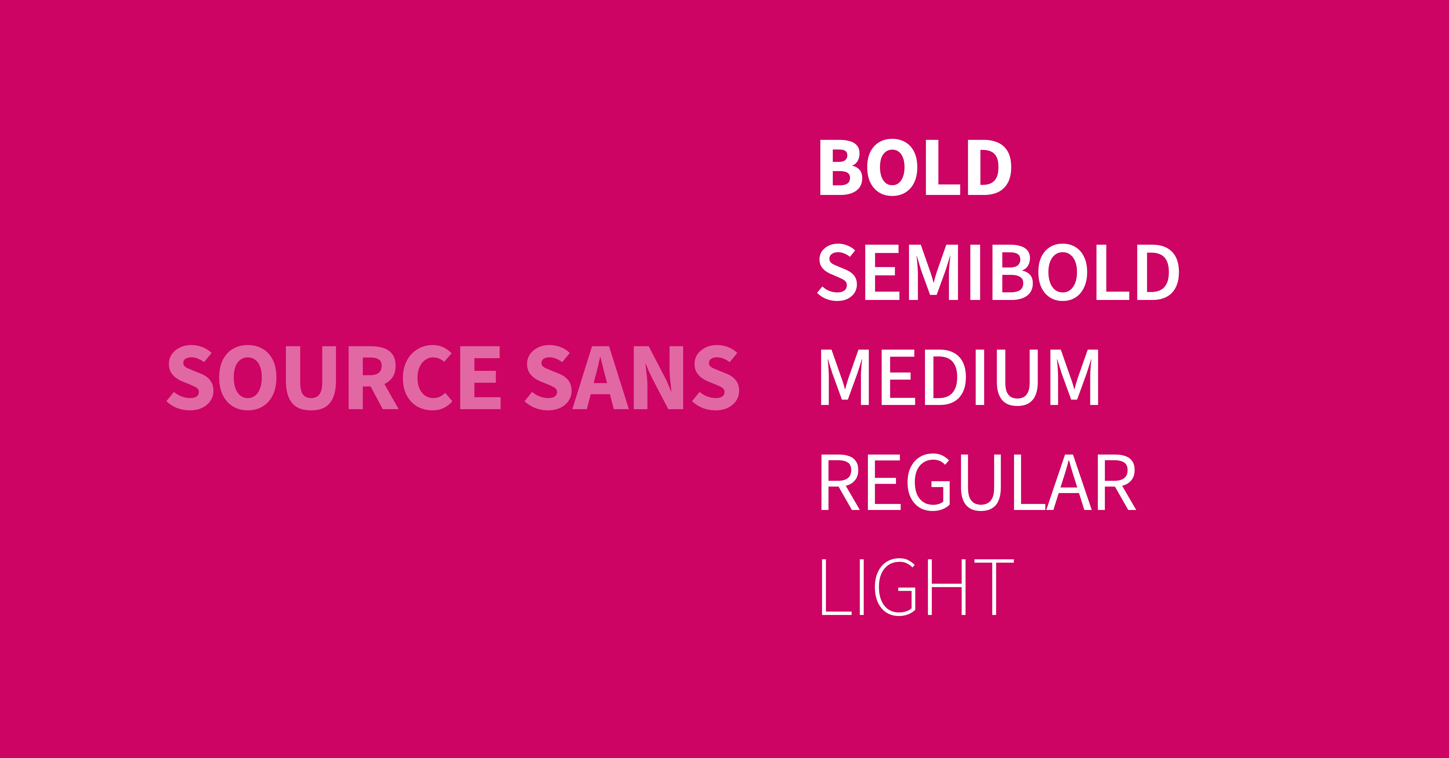
Source Sans 3 is a sans-serif typeface developed by Adobe for user interfaces, optimized for clarity and performance. It provides excellent readability and supports a wide range of weights for scalable UI systems.
- Category: Sans serif
- Strength: Professional UI consistency
- Use: Enterprise applications
10. Helvetica Now (Premium UI Classic)
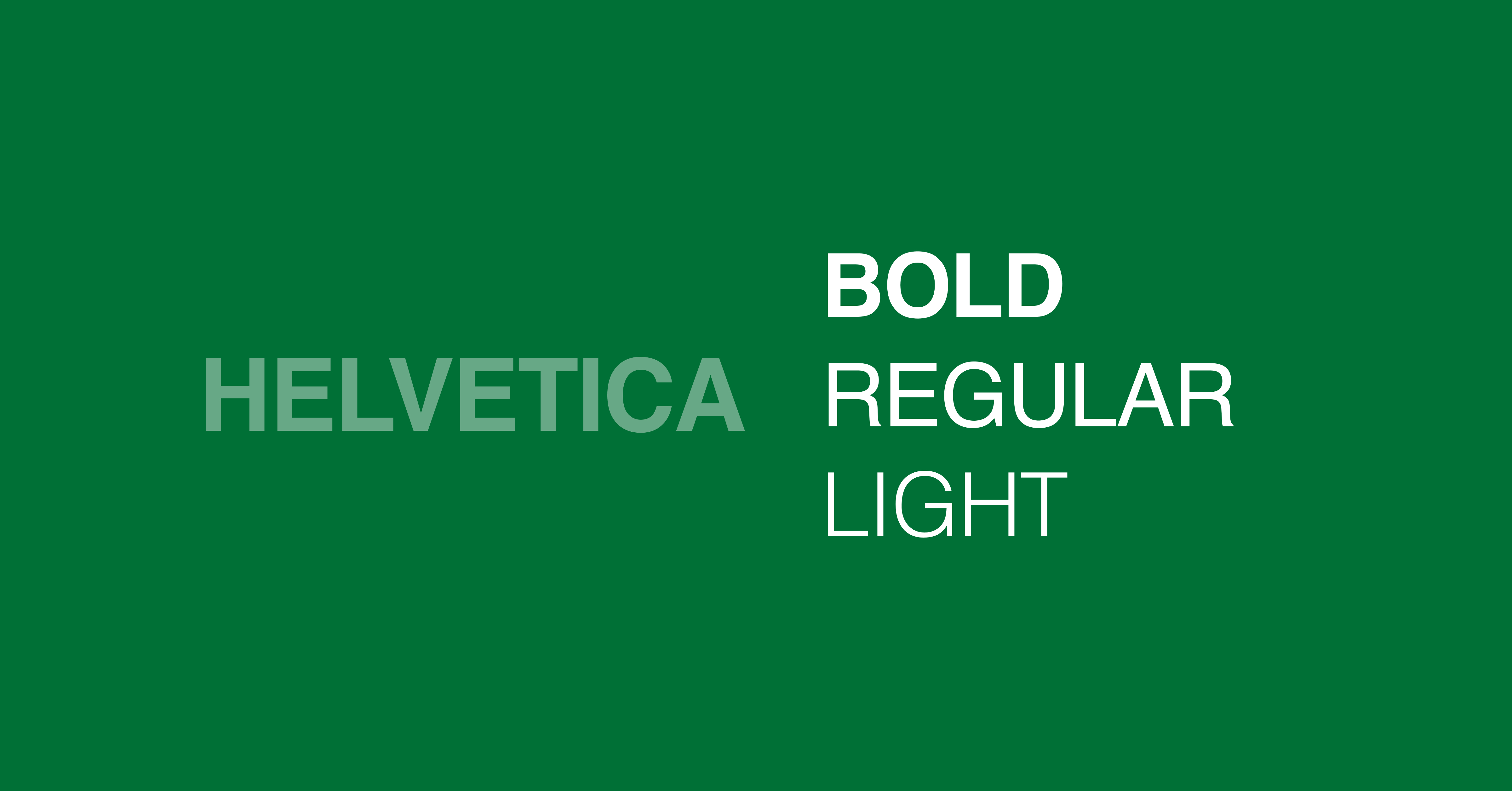
Helvetica Now is a refined version of Helvetica optimized for modern digital use, offering improved spacing and clarity. It remains a standard in UI design due to its neutrality and high readability across platforms.
- Category: Sans serif
- Strength: Timeless clarity
- Use: Enterprise UI, branding
11. DM Sans (Minimal UI Font)
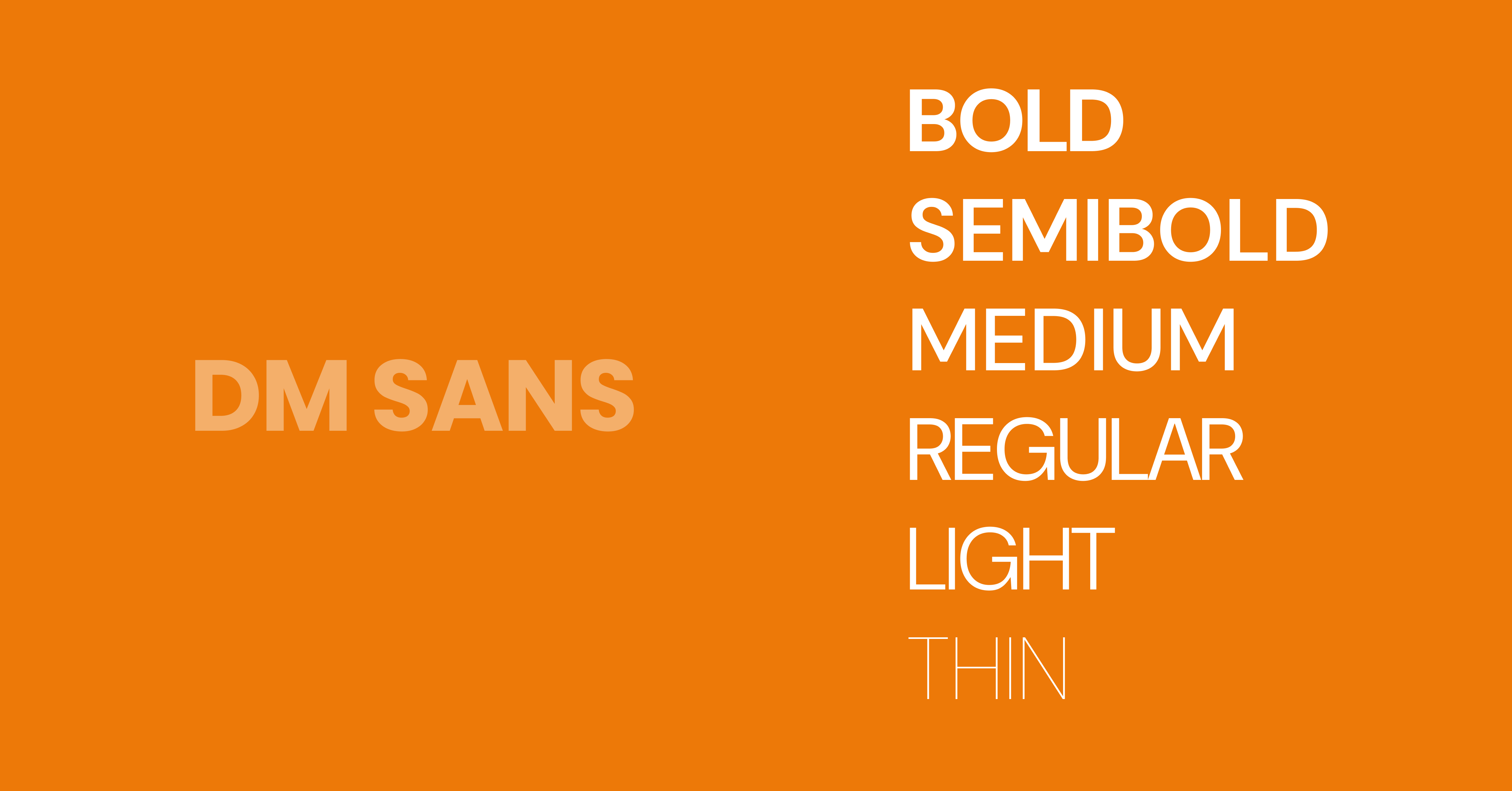
DM Sans is a low-contrast geometric sans serif typeface designed for digital interfaces, offering clean shapes and excellent readability. It is widely used in minimalist UI systems and modern web design.
- Category: Sans serif
- Strength: Clean minimalism
- Use: Startups, landing pages
12. IBM Plex Sans (System-Level UI Font)
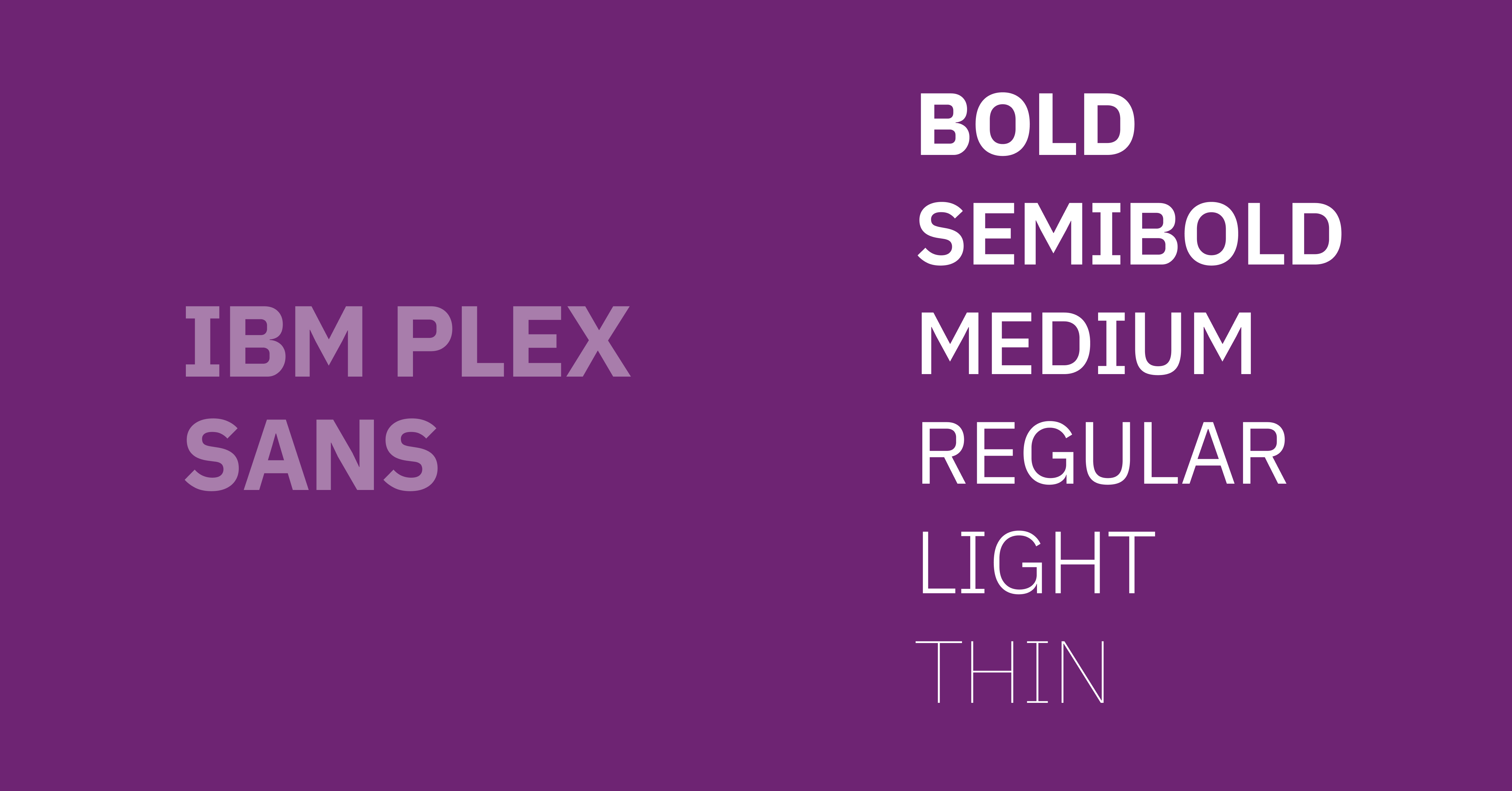
IBM Plex Sans is a sans-serif typeface designed for enterprise interfaces, providing clarity, neutrality, and multilingual support. It enhances readability and consistency across complex UI systems and global products.
- Category: Sans serif
- Strength: Enterprise-grade typography
- Use: Complex UI systems
What fonts are best for SaaS?
The best fonts for SaaS products are clean, highly readable, and optimized for digital interfaces. Popular choices include Inter, Roboto, Manrope, and DM Sans because they improve readability, scalability, and user experience across dashboards, websites, and mobile applications. We have 8 years of experiances, we know what are the best fonts for SaaS designs.
How to Choose the Right Font for Your UI Design?
Choosing the right font for UI design requires evaluating readability, scalability, brand alignment, and performance. Designers must prioritize sans-serif typefaces, test fonts across devices, and ensure accessibility compliance while selecting fonts that support hierarchy for headings and body text effectively.
Follow a structured process:
- Start with purpose: Dashboard, mobile app, or website
- Select category: Sans-serif typeface for most UI
- Test readability: Check at 14px–18px base font size
- Check weights: Minimum 4–6 styles
- Validate performance: Use optimized web fonts
- Ensure accessibility: WCAG compliance
Typography is more than a visual design element; it directly impacts how users interact with and experience a digital product. The right UI font improves readability, strengthens hierarchy, and helps interfaces feel intuitive across websites, mobile apps, dashboards, and SaaS platforms. As modern products become more design-focused, selecting a font that balances usability, scalability, and aesthetics has become an essential part of effective UI design.
From highly functional typefaces like Inter and Roboto to modern favorites like DM Sans and Poppins, each font on this list offers unique strengths for different interface styles and user experiences. Whether your goal is minimalism, accessibility, enterprise consistency, or visual personality, choosing the right typography system can significantly improve the clarity and professionalism of your product.
Ultimately, the best fonts for UI design are the ones that users barely notice, because they make every interaction feel seamless and natural. Focus on readability first, test fonts across devices and screen sizes, and prioritize accessibility throughout your design process. A well-chosen font won’t just make your interface look better; it will make your entire user experience more effective, trustworthy, and enjoyable.


.avif)