
.svg)
Propulso
AI Voice-to-Text
Every template here was pulled from real SaaS products we designed for real founders. Dashboards, admin panels, onboarding flows, landing pages, pricing pages, mobile apps. Pick a kit, customize it in Figma, and ship faster.
.png)
Our Top-Tier
Creative Works
Case studies show the full story. Client works show the output. Both are real projects with real stakes.


Voice Notes Were
Fast to Record, Slow to Use
Paragraph intro: People love speaking their ideas. Using those recordings is a different story.
- Voice notes pile up in folders and never get opened again
- Transcribing audio by hand kills the speed advantage of recording
- Raw transcripts need heavy editing before anyone can use them
- Most speech-to-text tools output messy walls of text, not structured content
.png)
%20(1).png)
Brand Identity Design
for Propulso
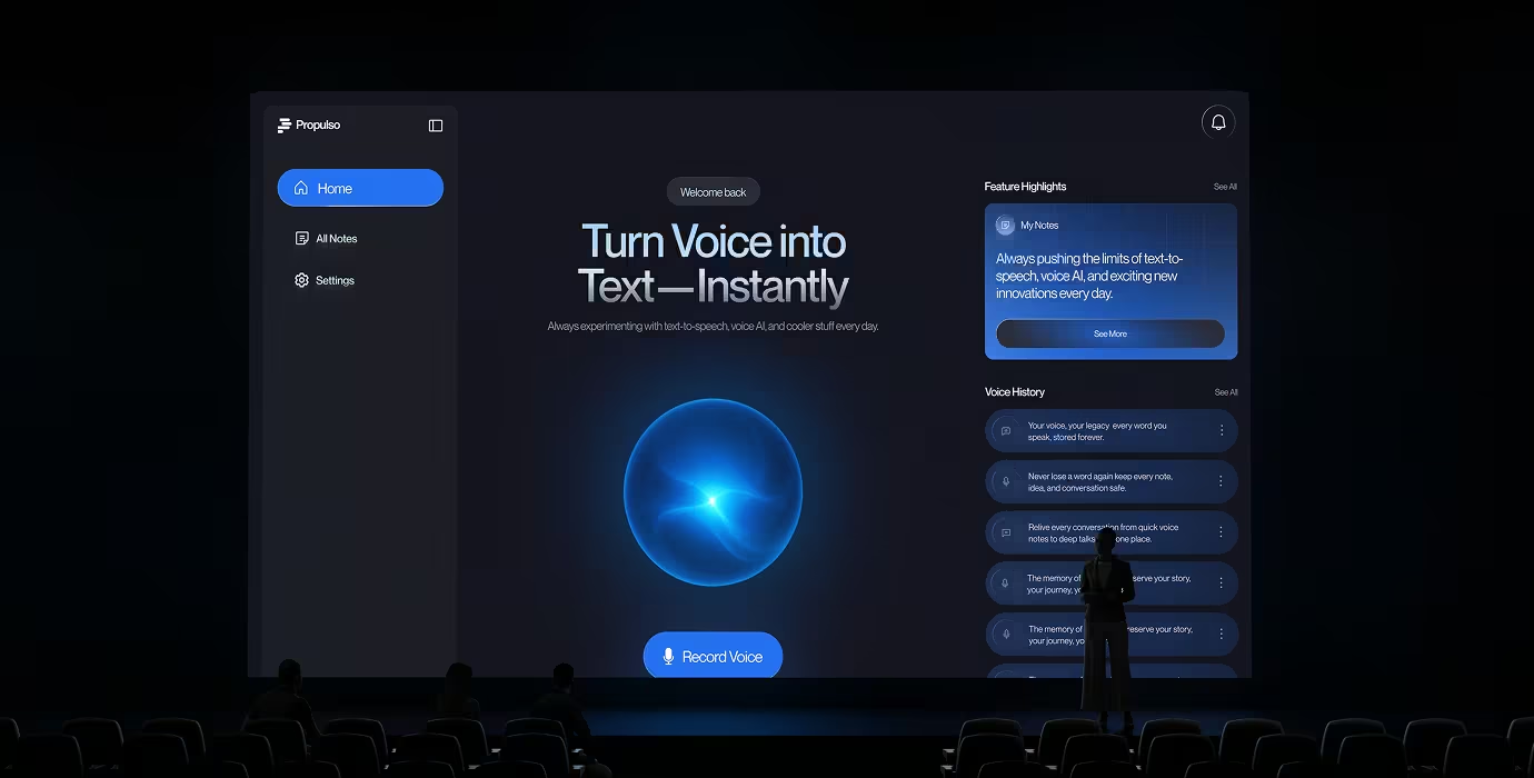
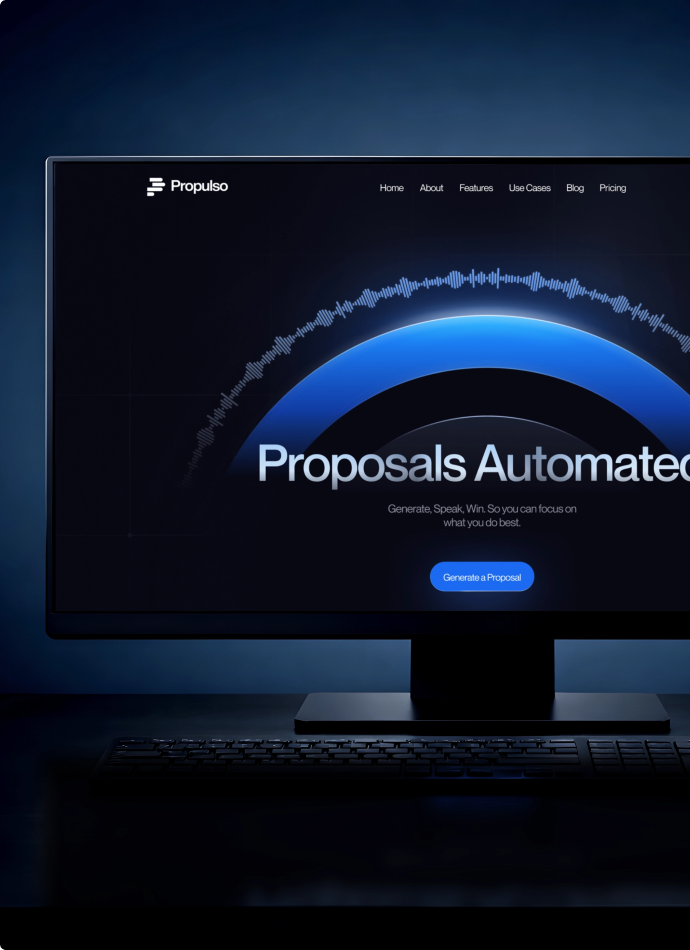
Most speech-to-text tools look like utilities. Propulso needed to feel alive. The glowing orb, deep navy palette, and confident typography give it warmth without losing its technical edge.
AI Transcription,
Instant, Trustworthy, Useful
Recording had to feel effortless. The AI summary had to earn trust. And the path from "I recorded something" to " have a proposal ready" had to feel natural, not like extra work.
Effortless Capture
Recording had to start in one tap and stay out of the way.
Trusted Output
The AI summary had to read clean on the first try, or users would leave.
Real Business Value
A voice note had to become a proposal, summary, or document easily.
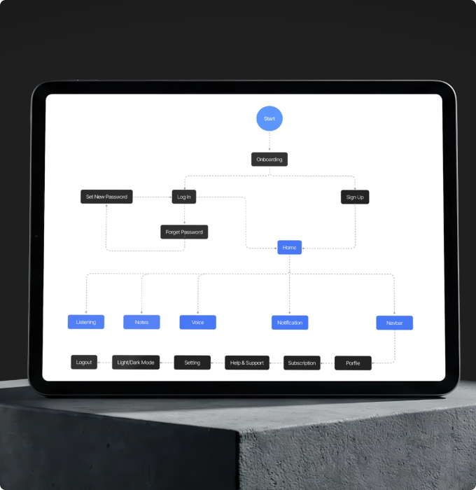
Flow First, Then Identity,
Then Onboarding
Recording had to feel effortless. The AI summary had to earn trust. And the path from "I recorded something" to " have a proposal ready" had to feel natural, not like extra work.
Mobile App Design for
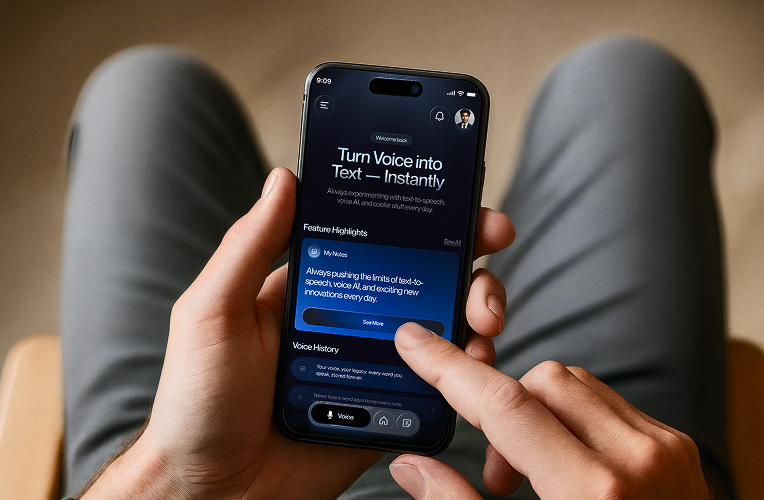
Voice Capture Anywhere
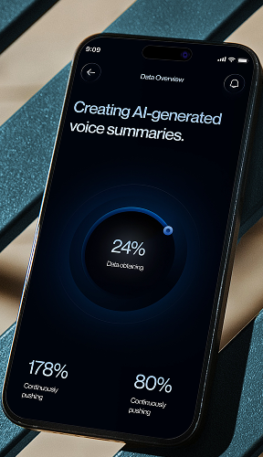
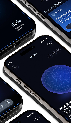
Ideas don't wait for a desktop. The mobile experience keeps the same one-tap recording, live orb feedback, and instant AI notes, designed for capturing thoughts on the go.
.png)
Voice-to-Text Web
App UI Design
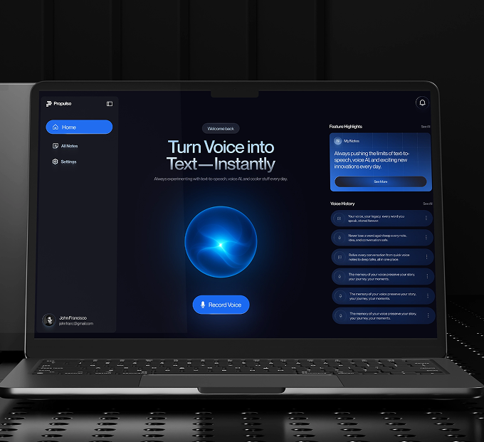
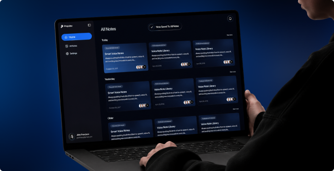
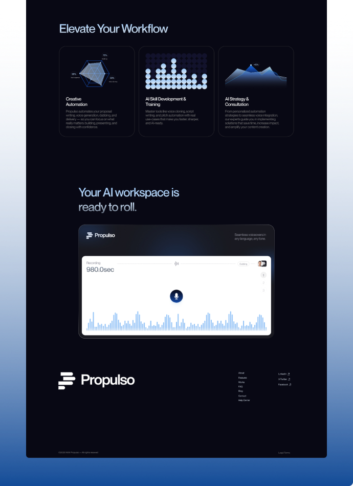
The core product. Every screen cuts a step between speaking and shipping. One click turns voice notes into business documents via "Generate a Proposal.
.png)
The UX Decisions
Behind the Product

Waveforms feel technical and cold. The orb feels alive, giving quiet feedback that the AI is listening.
You book a free audit or a strategy call. We look at your product or idea within 48 hours and tell you exactly what's broken and what to fix first. If it makes sense to work together, we agree on what gets designed, what the result should be, and when you'll see it. No payment before you've seen our thinking.
If people are already visiting your website or signing up but not doing what you want them to do next, that's almost always a design problem, not a traffic problem. More visitors won't fix a confusing product. Start with the free audit. We'll tell you exactly what's causing it and whether design is actually the answer.
From Flow to
Full System
Typing felt slow. Recording felt easier, but recordings piled up unused. Nobody wanted to record, then transcribe, then edit, just to get one clean paragraph.
Map the Core Flow
Every recording state designed first: record, pause, cancel, review. The voice-to-text experience had to work before it looked good.
Build the Identity
A dark interface with a glowing blue orb became Propulso's signature. The orb reacts as you speak, so transcription feels alive.
Design the Onboarding
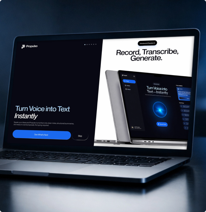
Six focused screens introduce the product's value fast. One idea per screen, no crowding.
Landing Page That Sells
Before Recording
One job: make switching to AI voice-to-text feel obvious. Clear messaging, contextual visuals, and a structure built to convert visitors into signups.
AI Voice-to-Text Product Ready to Build
+50%
Most users sign up and never come back. Not because your product is bad because the first experience is confusing. When we fix how users get started, more of them reach the moment where your product actually clicks. That's when they stay.
2.3%→5.1%
More visitors signing up without spending more on ads. When your website clearly explains what your product does and makes it easy to get started, the same traffic converts at more than double the rate.
3x Faster
Every screen delivered with specs, component documentation, and responsive breakpoints. Your developers build exactly what was designed. No back and forth. No guessing.
-40%
When tables are sortable, settings are findable, and notifications are clear, users stop asking your team for help. Every screen that explains itself is a support ticket that never gets written.


.png)
.avif)












.svg)
%201.svg)
